New design skills I have learnt are how to flip, add graphics patterns, liquify backgrounds, add stoke and find specific typefaces that fit my drama.
What went well was the colours all fit together and are easy to read; the stroke adds some weight which helps make certain information stands out better on the page.
Screenshots of Tools :
The Hand Tool helped me within my magazine to blur, smudge and sharpen my image. I used the sharpen tool to enhance details in my picture and give a crisper image. This helped me convey the fun, lively, young pop teen. This tool particularly helped make the outfit very eye catching through colour and makeup.
![]() The spot healing tool to clone areas of my picture and blend pixels in the targeted area. This makes a face more clear and blemish-free cover.
The spot healing tool to clone areas of my picture and blend pixels in the targeted area. This makes a face more clear and blemish-free cover.

The Liquify tool on Photoshop helped create my background. I used an image of my orange dress the model had on and played with the contrast, colour and vibrancy. The liquify tool let me push, pull, rotate and reflect areas of the image. This helped make a subtle background full of colour. This provided a sweet, flowy and vulnerable look to the cover.
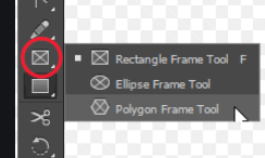
On Indesign, I used the polygon frame tool to create texture and pattern to my magazine. I used yellow and orange colours to add a sweet and playful side to the image, they decode happiness and joy.
The meanings I tried to encode was an energetic, friendly and young vibe. Her bright colours and award adds excitement to the page.
Leave a Reply