The new design skills I have learnt are changing the opacity of the boxes it gives in a contemporary, young and fresh feel to our young target audience. I have also added banners using shapes to create interaction between the audience. Also, I have added extra images by placing and adding shadows to them in InDesign. This brought in a narrative to the articles that follow, without going overboard with text. By doing this younger viewers don’t have to read large amounts of information and can see their preferred articles straight away. I have tried to add these boxes throughout my magazine to keep a recurring pop theme throughout my magazine.
 I used the burn tool on Photoshop to add definition and volume to both models eyebrows. This helped draw the audience to their face and expressions and their outfit. Which helped sharpen my image.
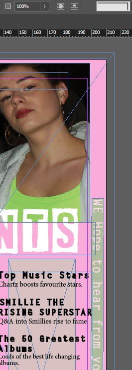
![]() The text tool helped me create my banners along the side of the content page as I could change the colour of the box of the text and opacity and also add colour to my text and the size. By adding the banners Chartz can interact more with their audience on social media platforms and receive feedback. The banners provide a youthful, bright and powerful look to the cover.
The text tool helped me create my banners along the side of the content page as I could change the colour of the box of the text and opacity and also add colour to my text and the size. By adding the banners Chartz can interact more with their audience on social media platforms and receive feedback. The banners provide a youthful, bright and powerful look to the cover.
Overall I am happy with how my magazine is going and that the design techniques are helping me create a pattern throughout my magazine helping me clearly convey the pop genre. These small changes from the tools all help positively towards my magazine and help me greatly in portraying a narrative.
Leave a Reply