Category: Creative Critical Reflection 1
Question 2: So… How does your product engage with audiences and how would it bedistributed as a real media text?
This is my ScreenCastify of my Final Magazine which I presented on a flipsnack. I had to include 2 screencasting recordings as I went over the maximum time recording of 5 minutes for each video.

So… How is it going?
So far I am happy with the progressive I have made with my magazine. I have drafted my magazine pages and each page is linking together well. The pages are linking between the double-page spread and contents page. Furthermore using a colour scheme and using a bright colour palette (pink, green, orange) and choice of fonts have also helped me portray the genre of pop. I have also portrayed the genre through the choice of images, layout and headlines. However, I still have improvements to make throughout my pages. For example, getting rid of Rihanna and either changing it to my own image or adding captions in that space.
Whilst composing my media I have learnt some transferrable skills such as:
- Communication – I have spoken to my peers and got advice and improvements I need to make. By sharing our ideas and skills we have learnt this has built a greater image of how I can adapt my magazine.
- Design Skills – The skills I have learnt on InDesign and Photoshop have helped make my magazine more interesting with a greater range of graphic design and ideas. I will also be able to use these skills on other posts in the future.
- Organisation – Being able to keep on top of the workload and making sure I spend my time wisely and not just on one part of the magazine. This helps me complete my work at the right time.
Design Skills 2
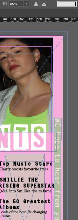
The new design skills I have learnt are changing the opacity of the boxes it gives in a contemporary, young and fresh feel to our young target audience. I have also added banners using shapes to create interaction between the audience. Also, I have added extra images by placing and adding shadows to them in InDesign. This brought in a narrative to the articles that follow, without going overboard with text. By doing this younger viewers don’t have to read large amounts of information and can see their preferred articles straight away. I have tried to add these boxes throughout my magazine to keep a recurring pop theme throughout my magazine.
 I used the burn tool on Photoshop to add definition and volume to both models eyebrows. This helped draw the audience to their face and expressions and their outfit. Which helped sharpen my image.
![]() The text tool helped me create my banners along the side of the content page as I could change the colour of the box of the text and opacity and also add colour to my text and the size. By adding the banners Chartz can interact more with their audience on social media platforms and receive feedback. The banners provide a youthful, bright and powerful look to the cover.
The text tool helped me create my banners along the side of the content page as I could change the colour of the box of the text and opacity and also add colour to my text and the size. By adding the banners Chartz can interact more with their audience on social media platforms and receive feedback. The banners provide a youthful, bright and powerful look to the cover.
Overall I am happy with how my magazine is going and that the design techniques are helping me create a pattern throughout my magazine helping me clearly convey the pop genre. These small changes from the tools all help positively towards my magazine and help me greatly in portraying a narrative.
Design Skills 1
New design skills I have learnt are how to flip, add graphics patterns, liquify backgrounds, add stoke and find specific typefaces that fit my drama.
What went well was the colours all fit together and are easy to read; the stroke adds some weight which helps make certain information stands out better on the page.
Screenshots of Tools :
The Hand Tool helped me within my magazine to blur, smudge and sharpen my image. I used the sharpen tool to enhance details in my picture and give a crisper image. This helped me convey the fun, lively, young pop teen. This tool particularly helped make the outfit very eye catching through colour and makeup.
![]() The spot healing tool to clone areas of my picture and blend pixels in the targeted area. This makes a face more clear and blemish-free cover.
The spot healing tool to clone areas of my picture and blend pixels in the targeted area. This makes a face more clear and blemish-free cover.

The Liquify tool on Photoshop helped create my background. I used an image of my orange dress the model had on and played with the contrast, colour and vibrancy. The liquify tool let me push, pull, rotate and reflect areas of the image. This helped make a subtle background full of colour. This provided a sweet, flowy and vulnerable look to the cover.
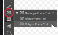
On Indesign, I used the polygon frame tool to create texture and pattern to my magazine. I used yellow and orange colours to add a sweet and playful side to the image, they decode happiness and joy.
The meanings I tried to encode was an energetic, friendly and young vibe. Her bright colours and award adds excitement to the page.
So… I am ready to photograph my star.
Mission Statement: Chartz provides readers with the chance to keep up to date with the latest charts and artists that interest them. We also strive to engage our readers with the magazine by doing so we will create a sense of belonging and interest.
My brand values: Chartz aspires to provide good customer service and give good quality content about the latest hits and gossip.
I have learnt about the camera
- Shutter Speed
- Aperture
- ISO
- Framing
- Distance
- Shot Type
- Angle
- Composition
I have learnt about Mise-en-scene
- Costume (Class and Status)(Time period)
- Lighting
- Acting (Proxemics)(Body Language)
- Make-up
- Props
- Setting
Through everything I have learned about Mise-en-scene and Camera I can think about what Chartz mission is and how they want to be portrayed as a brand to my targeted audience. Furthermore how my Magazine presents a narrative.
Furthermore, I have learnt about star image through the Paradox of the Star and how a performer can seem ordinary and extraordinary and both present and absent. This represents how, as a fan they aim to see and meet there performers. This can be suggested through my target audience demographics, psychographics, situations and cultural experiences which is clearly represented through Stuart Hall and his ‘Reception Theory.’
This all helps me create a bigger picture for my shoot and how my composition with be represented to my target audience.
So… I’m ready to make some media!
When making my own magazine cover I need to think about the many different components that can help represent my specific genre and portray a narrative. This includes :
- Framing – midshot, highshot, long shot
- Camera angles and distance – midshot, highshot, long shot
- Functions – Shutter Speed, ISO, Aperture
- Type of shot – tracking, panning, craine, aerial shot
- Depth of field – Wide angle shot – point of view – rule of thirds
- Mise-en-scene – costume, lighting, acting, make-up, props, setting
- Body Language, Proxemics, Class and Status
- Master Shot, Framing Shot, Two-Shot
- Psychographics – Cultural meaning
Also I will have to focus on :
- Typeface – easily understandable, what it suggests to the reader
- Colour symbolism and emotional response
- The page layout – the cover star and typefaces
- Pugs, call-outs, captions, slogans
- Audience demographics and psychographics – the tone being presented to them.
Focusing forward I need to focus on the ‘AIDA’. My magazine should :
- Attract the audience
- Engage their interest
- Create desire
- Call the action
- I will also take into account Blumler and Katz concept of the Uses and Gratification Theory (1987) which explored Entertainment, Social Interaction, Information and Personal Identity and how audiences are attracted to different social platforms.
So… How can an image communicate meaning?
Overall searching into the Mise en Scene and Camera framing through the camera features, it has given me an insight to the different components that need to be thought-about to represent a narrative through the denotations and connotations.
Mise en Scene also translated as “placing on stage.” This is a French expression that refers to the design or the arrangement of everything as it appears in the framing of a film or photo. For example, the components you need to consider :
- Costume
- Lighting
- Acting
- Makeup and Hair
- Props
- Setting
Each component should link to the narrative to create a specific story and represent a certain image to the audience represented through the denotations and connotations. If one part doesn’t link correctly to the theme, then it will make it very hard to adjust and feel emotions or feelings from the composition, which may lead to misinterpretation of the piece.
Furthermore, the photography techniques provide a significant part to communicate meaning. For example, through the :
- Camera angles (high, low, canted x3, aerial)
- Distance (ECU, MS, LS)
- Composition (rule of thirds, lead space, depth of field x3)
For example, if you were trying to create a phlegmatic styled photo, you would plan it by using Mise en Scene and different Camera techniques. You would use a warm coloured clothing like yellow, light lighting, contempt facial expression, open body language, natural makeup and neat hair, and the photo being taken a cool and calm place (the beach with a cool-toned background or somewhere with nature; in grass). For the photo you could use a low angle to represent power and joy or a mid-shot to show the wholesome of the landscape and how you are at peace. This assembles an idea of freedom and relaxation. This follows the exact theme to create and successfully portray your narrative. If one of the components didn’t fit the message through the account it would become very confusing.
Therefore all of these components have indicated the links between Mise en Scene, narrative and sticking to your theme which needs to interlink throughout for it to be clearly interpreted to the audience when making my media and successfully display the denotations and connotations.