
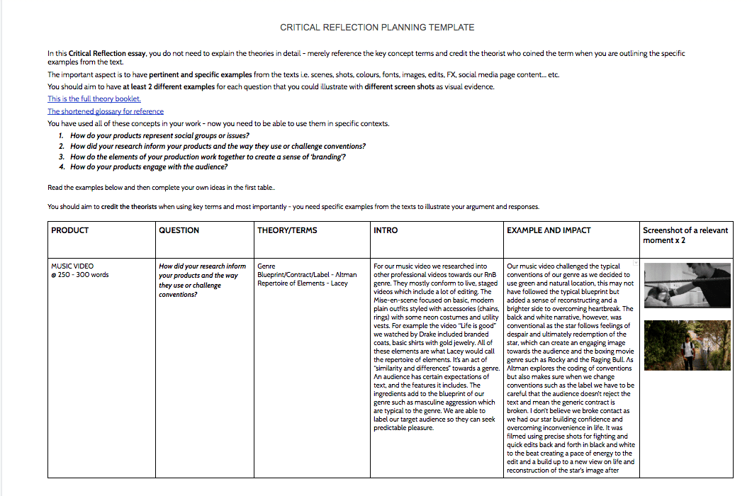
In order to write our critical reflection essay, we had to apply specific questions to specific products and look at theories such as De Saussure, Barthes, Dyer and examples of our Music Video, Digipak and Social Media.
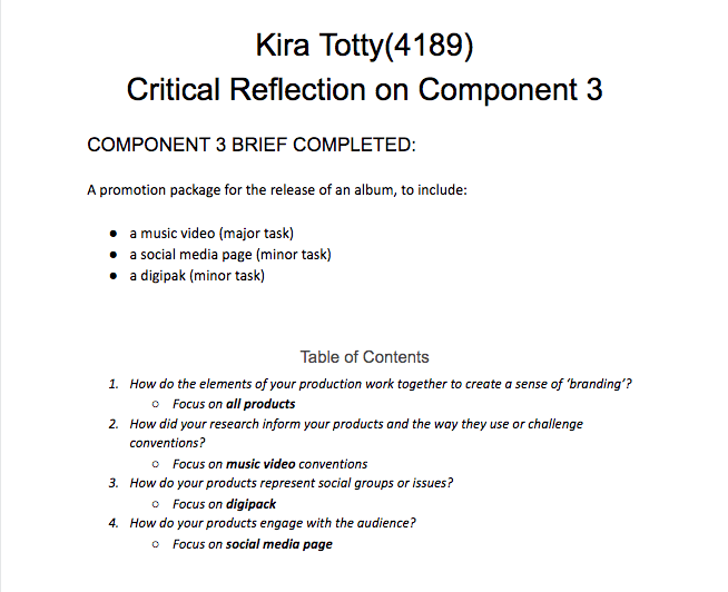
By being able to describe and analyse our products with reference to specific examples and terminology to describe the conventional features that we have used, developed and challenged to construct and represent a specific set of ideas which overall was based around our brand or mission statement!


This is my Draft 2 social media page –
From Draft 1 and my teacher’s feedback I have made improvements, this includes:
This is my Draft 1 Social Media Page –
Below if you click on the post you can see some the captions:
I have embedded the social media page to this screenshot –

I have included:
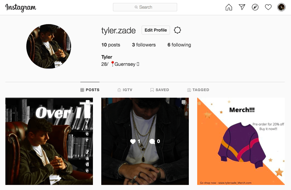
Overall I feel like my social media page went well. I have included a range of posts, from the star looking ordinary on holiday to the stars music video and album cover being extraordinary. I have included the typical conventions of a media page and the specific content such as the bio, captions, cover photo, pinned locations. I have promotional aspects for the artist such as synergy through the merch and brands such as Cernucci. I also used hashtags and tagged accounts which the artist collabs with. By being able to have IGTV videos, emojis, comment and interaction of fans with new posts and double picture, swipeable posts, this allows the audience to see the stars frequent posts and keep updated and engaged. The timeline and order of the posts allowed a build of the sense of excitement towards the release of the album. Furthermore, the cross-media convergence used from linking to Cernucci and their brand quotes from other legends and idols of the star and also birthday posts to friends who have helped along the way.
Focusing forward to my second draft I would like to add a link to Spotify and Itunes and so that the audience can view the music full on other platforms from the comments and the bio, this provides a better call to action for the audience to engage. I would also probably add a live performance post to hype one of the songs and keep the audience engaged through the promotion of live events. I would also like to focus on adding the album from cover to the merch, which means that maybe the merch post should be put after the album so that it doesn’t spoil the cover.
We then received feedback from our teacher:
This is what the feedback included:
Positives –
Improvements –
Below is a plan for the type of posts we want to include on our Instagram and the order we want them posted. The way we have planned these posts will help us attract, interest, desire and make our fans follow us as our artist carries his journey. This will help build a community around the artist and increase social interaction. We want to be able to inform and promote as well as have an informal approach to keep the audience engaged and interested.
The timing of a marketing campaign is very important as having an order can help with teasers, publishes launch dates, offers sneak peeks, offers interactive experiences, builds the excitement through a series of events, building to a climax which is one of our final post being the album launch and maybe even merch to follow.

We are trying to increase excitement towards our release date by giving teasers and sneak peeks behind the scene to engage our audience and keep the posted on the biggest dates and action.
Below is a screencastify from Khalid’s Facebook page, we chose him because he follows the same genre of our star. After looking through the stars page, we deconstructed his professional social media page, which gave us an insight on what we should look into doing for ours. We looked at the Uses and Gratification through Blumler and Katz and the integrated advertising in order for the star to get his albums/videos viral.
Following up from the task of connecting the definitions to the social media terms. We then looked on Facebook for an artist similar to our own, which focused on the RnB genre and then took screenshots of their page and focused on the key terms we just learnt. This was important in order to look for design, promotion and using Facebook pages for information.
Below I analysed the artist Usher’s Facebook page
Below is my Draft 3 Digipak:

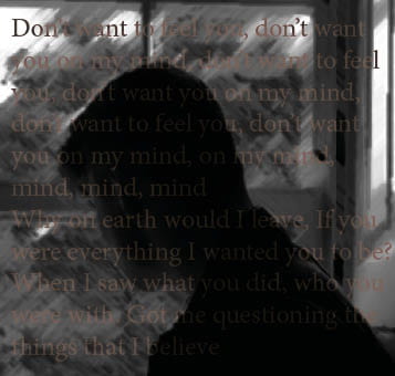

In this draft we have changed:
Overall we were happy with the changes made in our new draft and think it fits our RnB genre well.
Audience Tally of genre
We asked our audience what music genre they thought our digipak cover was from, this is the results we received:
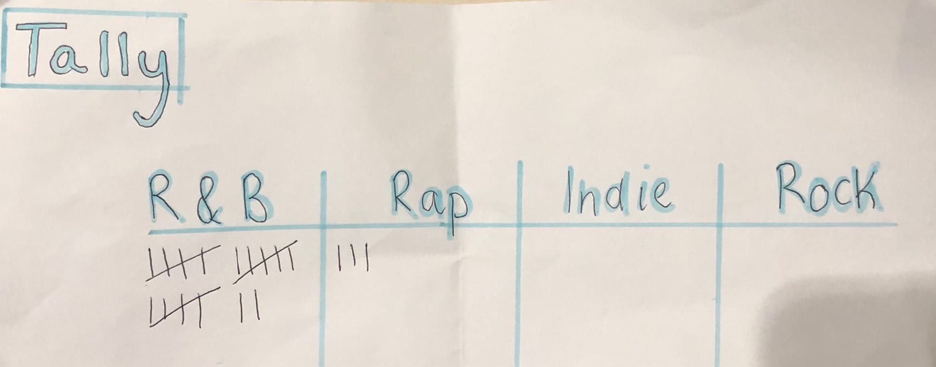
Our audience got a preferred reading of the genre and as an active audience on social platforms, this was great to see how an audience can interpret our Digipak cover.
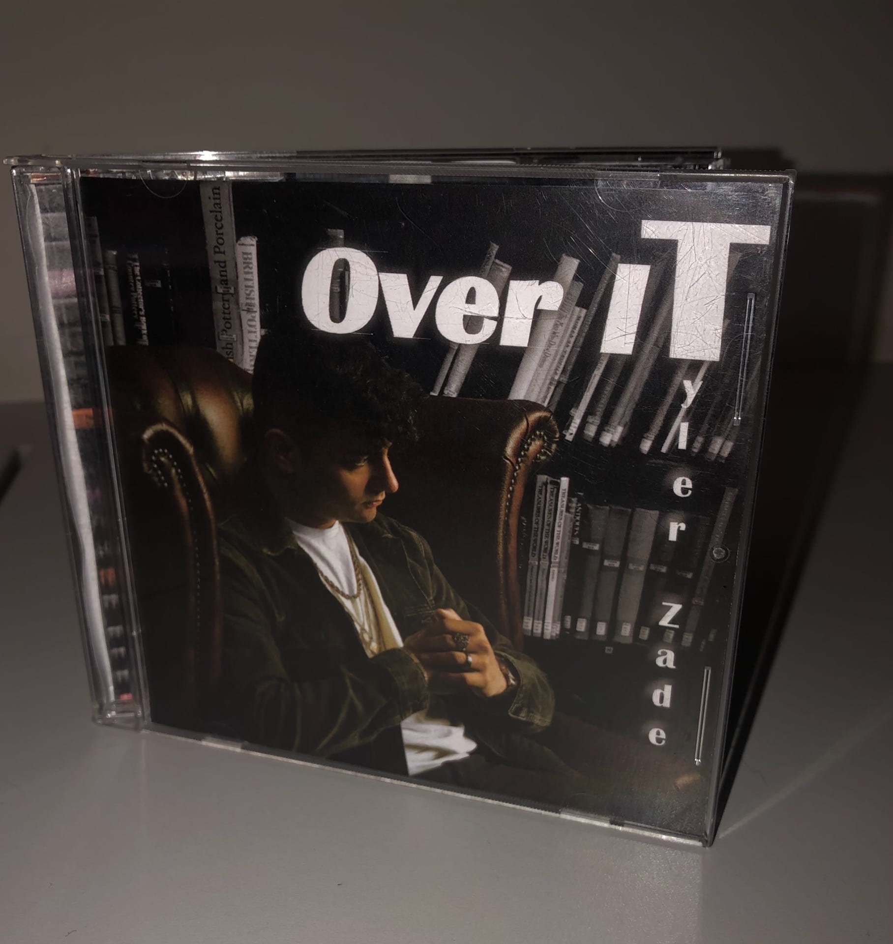
Making it into the cover
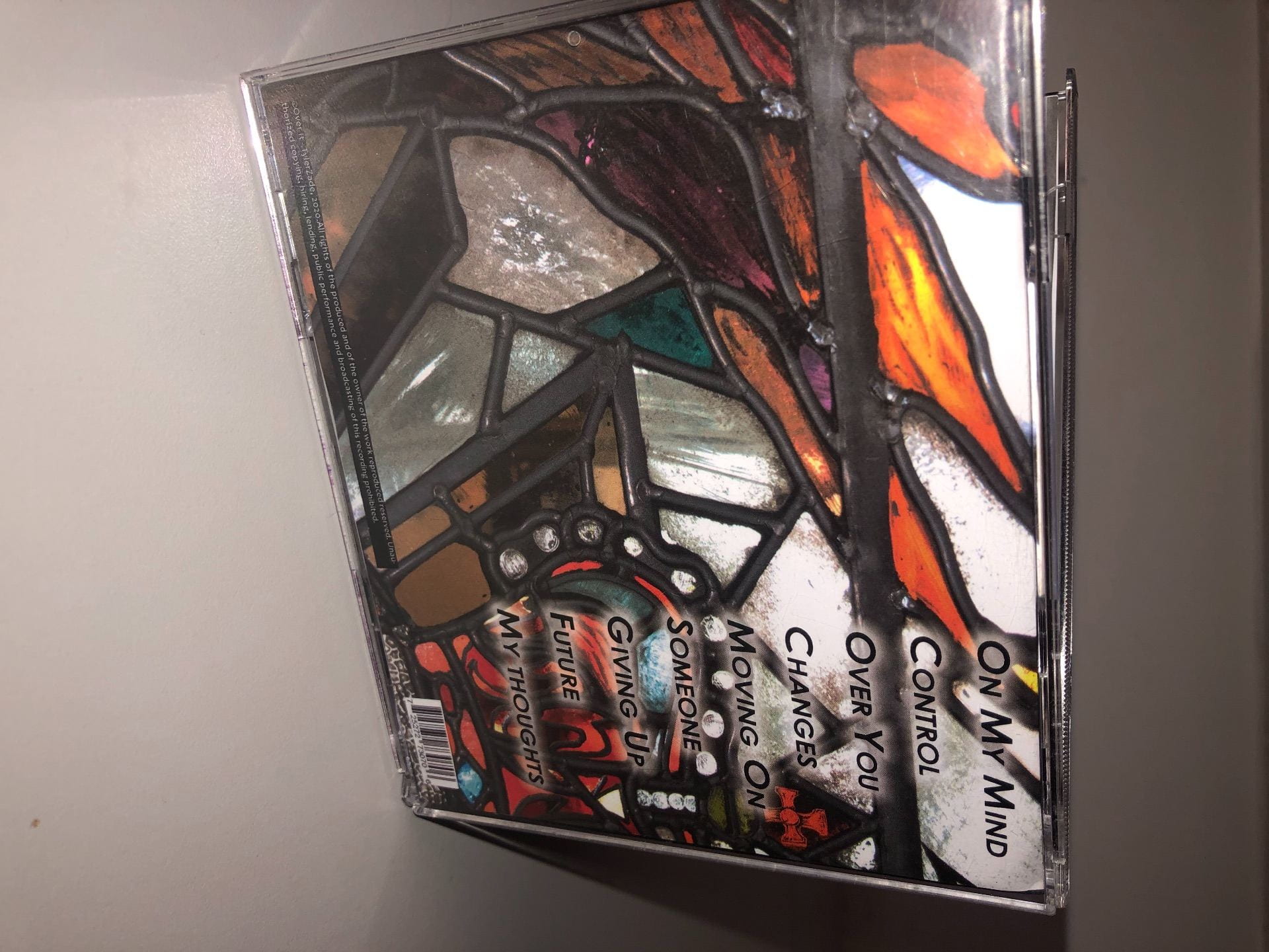
We then printed our digipak off and placed it inside a plastic case with the 4 panels and spine. Below is what it looked like.
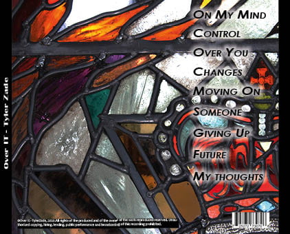
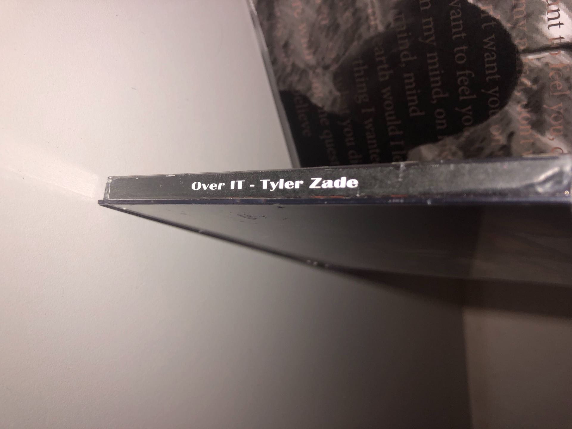
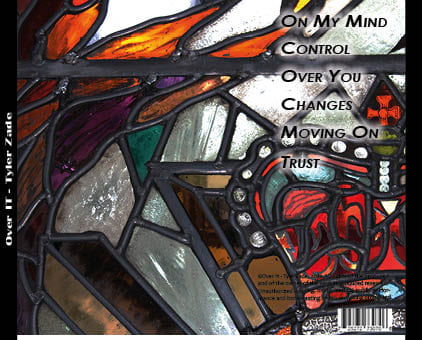
CD Cover:


The PDF is also attached to my Digipak Draft 2 above.
From our first draft we have made some changes, this includes:
Below I have attached our teacher Screen Castify feedback:
Our teachers feedback included:
What went well:
Improvements:
Click here for PDF – DRAFT 1.3
Above is the first draft of our Digipak. Our group are quite happy with our digipak so far, we think it has a clear message to our music video and helps us express an overall image for our star.
What went well:
Even better if:
Assessing the appropriateness of our digipak and the level of production skills
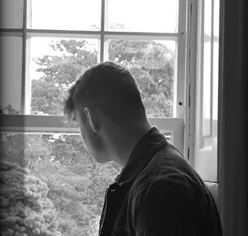
I think that the camera and print production skills in the making of our digipak was successful as we managed to get a variety of shots including close up, high angles, low angles, mid shots, framing shots. Our artist is well framed in the images to make him the main part of the image. We used photoshop to edit our photos for a bigger contrast and darker saturation to the images. By being able to manipulate and crop them to the size we want for a greater depth of field.
The selection of mise-en-scene in the photos and the meaning it communicates
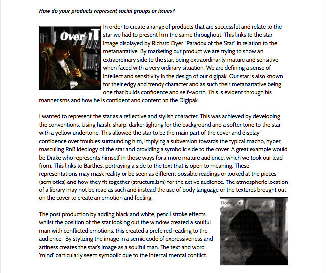
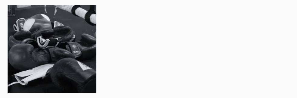
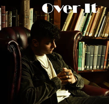
Our mise-en-scene created meaning through the basic, stylish and trendy side to the star with black and white clothing which made the accessories chosen, which was gold jewellery, stand out and signify a sense of wealth and high-status. We also edited our photos in photoshop for a bigger contrast and darker saturation to the images. The mise-en-scene definitely helped the brand and star image, especially the darker black and white image carried through from the music video and the edgy side to the star as he has redemption over the past relationships and is doing a very manly thing. His album is all about reflection. The layout of the cover is partly conventional at this point as it has the barcode, tracklist and the album title but needs extra added in the next draft such as the copyright, publishing notes and spine information.
The creative use of DTP to integrate images and text and use colour/typefaces
Furthermore, the conventions of our layout and page design which we played with on InDesign to compose our digipak. Having the title bold and covering the top corner with no artist name on the front, this allowed the album name to stand our as our artist is already well established, making the album simple and stand out to the audience. However, maybe I feel that we can make our own type of font and scan it in as ours does not depict our genre as best as it could. We were able to position and panel our images how we want them to fit the frame.
Overall we are happy with our digipak as we thought the range of camera angles and framing used allowed us to portray our star image in a way the carried the message through from our music video. The mise-en-scene even though it was basic, we had a trendy and stylish star, which helped the accessories chosen to stand out. Furthermore the InDesign and placement allowed us to explore the placement of our fonts and play with stroke and outer glow. However, moving forward we need more conventional features added in, such as the spine information, publishing notes etc. Furthermore, we need to look over the fonts chosen and if they fit our genre and maybe make our own as there are minimal RnB genre fonts on InDesign.