Category: Digipak

Digipak Draft 3

Below is my Draft 3 Digipak:

In this draft we have changed:

  • Added black backing to the front cover around the star
  • Used a better quality image on the front cover
  • Add more songs to back cover
  • Get rid of shadows on the inside left of the cover
  • Add producer rights in a box so that it is clearer
  • Add contrast to the inside left of the cover

Overall we were happy with the changes made in our new draft and think it fits our RnB genre well.

Audience Tally of genre

We asked our audience what music genre they thought our digipak cover was from, this is the results we received:

Our audience got a preferred reading of the genre and as an active audience on social platforms, this was great to see how an audience can interpret our Digipak cover.

Making it into the cover

We then printed our digipak off and placed it inside a plastic case with the 4 panels and spine. Below is what it looked like.

CD Cover:


Digipack Draft 2

The PDF is also attached to my Digipak Draft 2 above.

From our first draft we have made some changes, this includes:

  • Added the singers name as it is more conventional
  • Coloured the covers of the books
  • Producer Rights
  • Darker Saturation and contrast on the back cover image
  • The spine

Below I have attached our teacher Screen Castify feedback:

Our teachers feedback included:

What went well:

  • Likes Location
  • Likes the contrast
  • Nice sense of thoughtfulness and consideration and textures
  • Colorful books works well
  • back image works well
  • Likes the glow on the back

Improvements:

  • Making the background of the front cover book black and white around our performer
  • Add a bit of Stroke to the artist name on the front
  • Left hand-side of inside cover – photo a little bit flat with the shadows along the outside
  • Could we add some words (lyrics to inside left)
  • Black and white on books around the star in color (inverse selection)
  • The title on front looks a bit flat
  • White bar on bottom because of the accidental shift of the image
  • Highlight text (shading)  for producer rights or use a black box right at bottom of image(white copy)
  • Few more tracks
  • Stroke behind front cover words or white box and reduce opacity


Digipack Draft 1


Click here for PDF – DRAFT 1.3

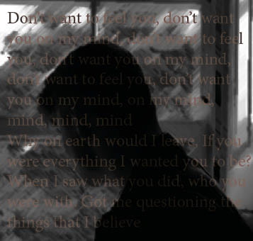
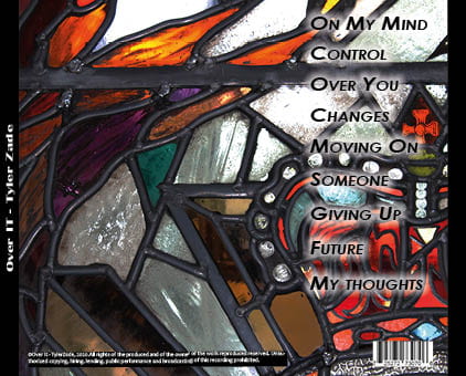
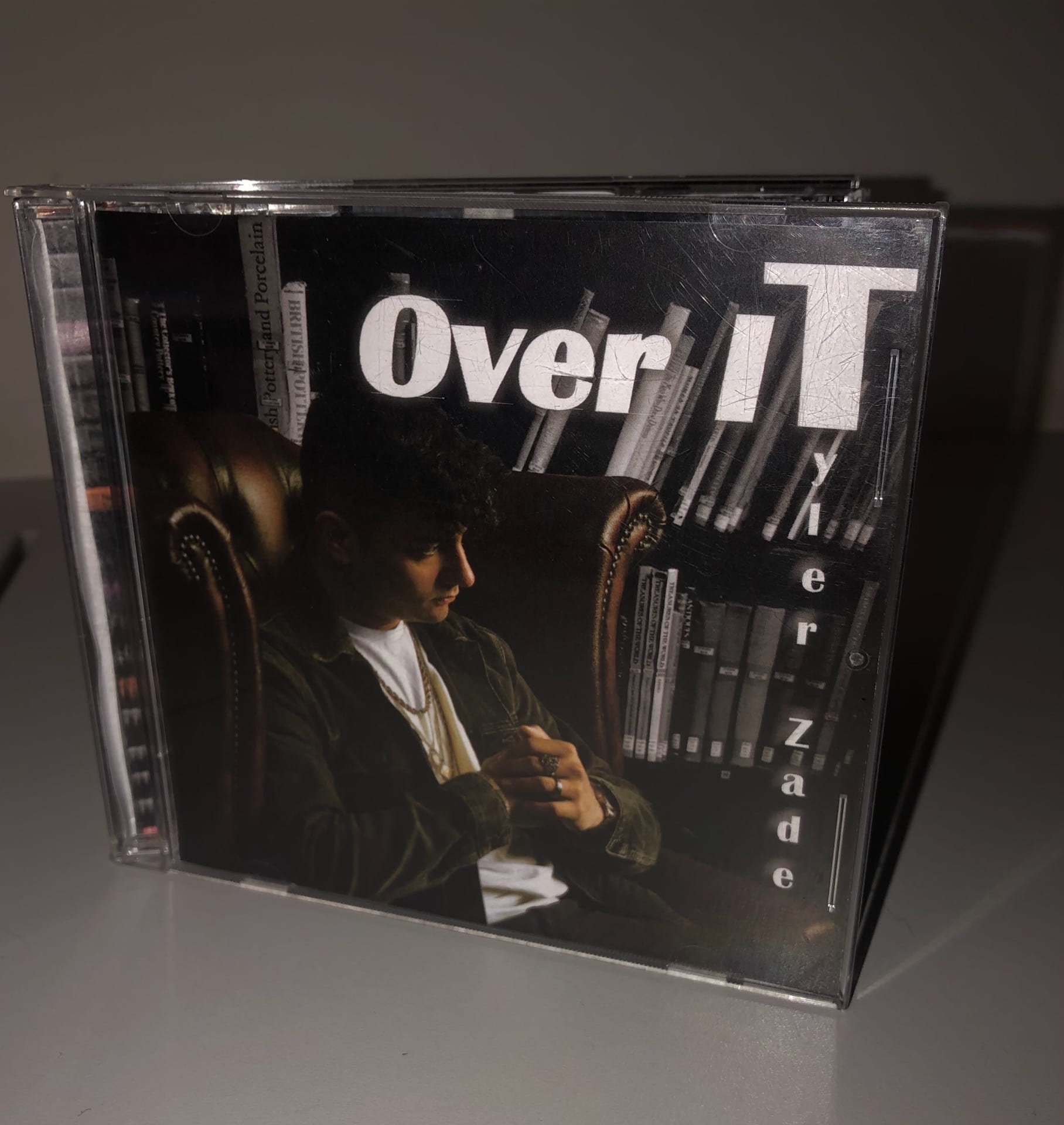
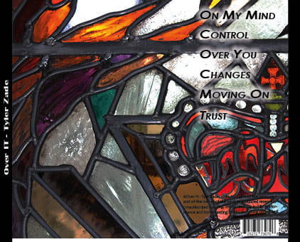
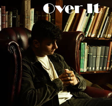
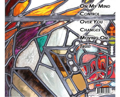
Above is the first draft of our Digipak. Our group are quite happy with our digipak so far, we think it has a clear message to our music video and helps us express an overall image for our star.

What went well:

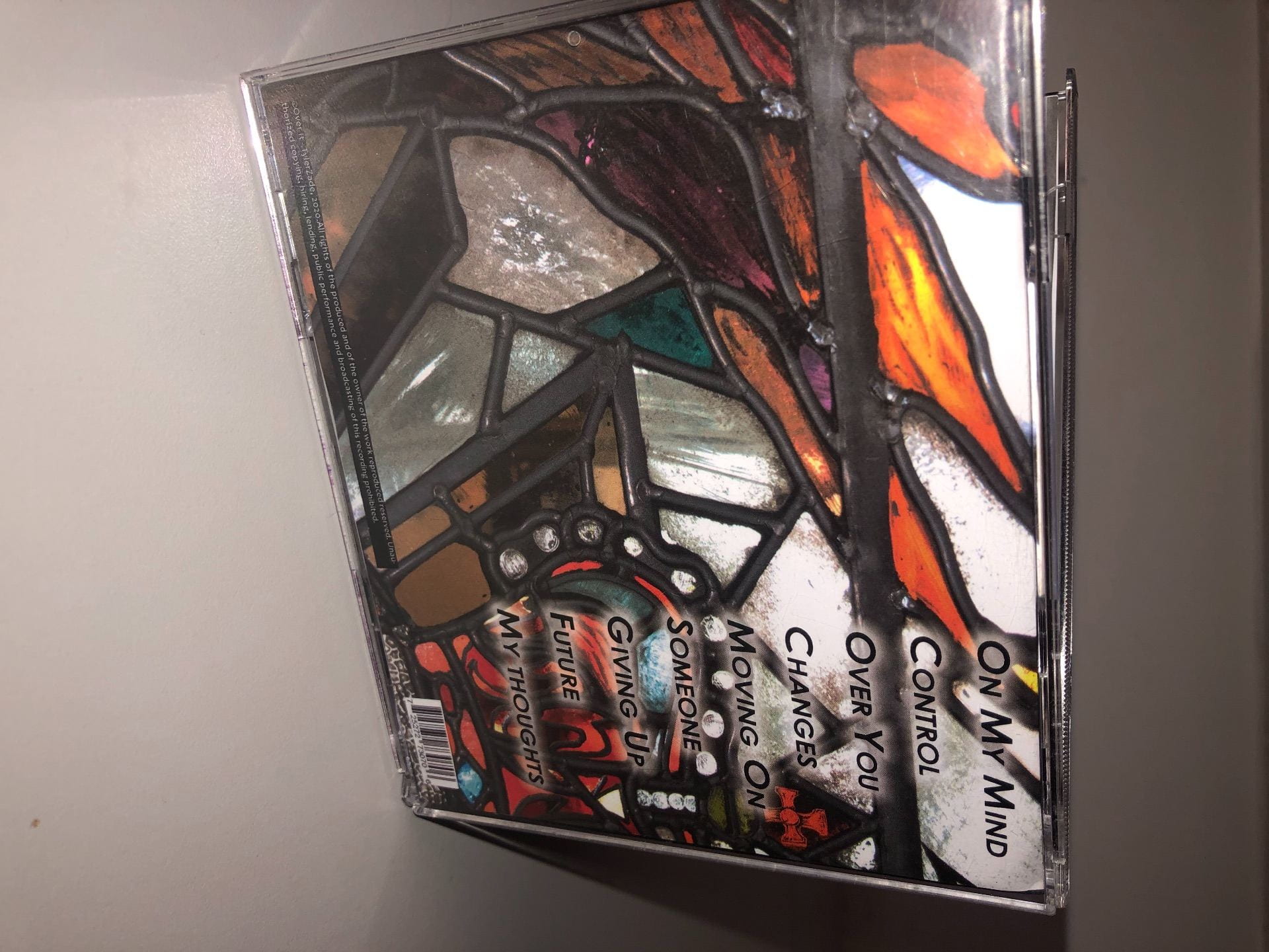
  • The images link for a wealthy, high-status profile (darkened images)
  • The colour scheme of black and white works well with the dark coloured images
  • The tracklist font works well with the backover and the acronym going down to spell the album cover
  • The position of the camera works well with the different angles, textures and framing brought through.

Even better if:

  • A different font on the front cover could display our RnB genre better
  • Add a logo, record company and copyright details
  • Artists name along the spine of the album as extra even though our star is well known
  • More graphic design could be added

Assessing the appropriateness of our digipak and the level of production skills 

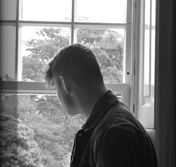
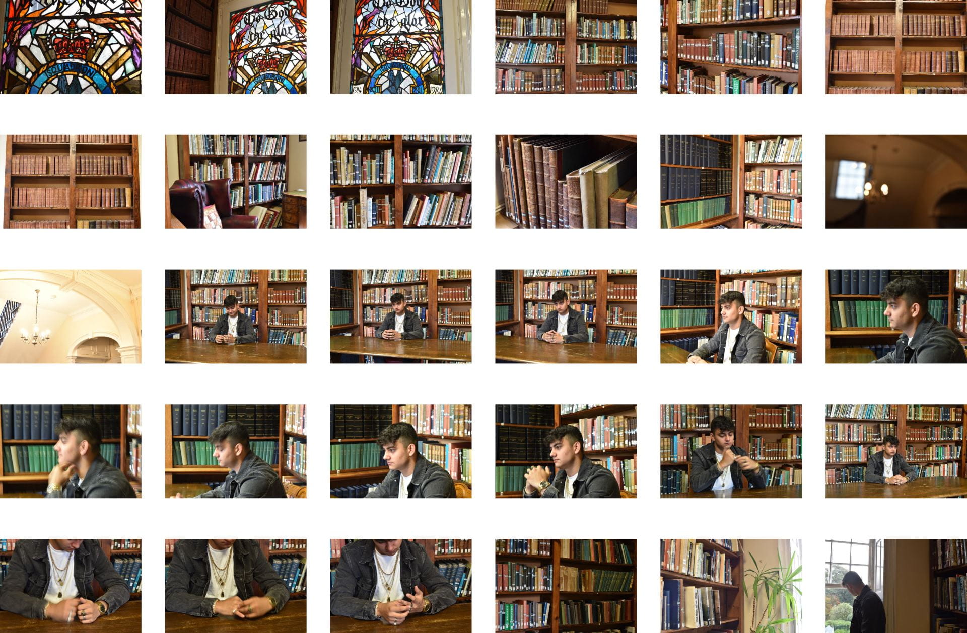
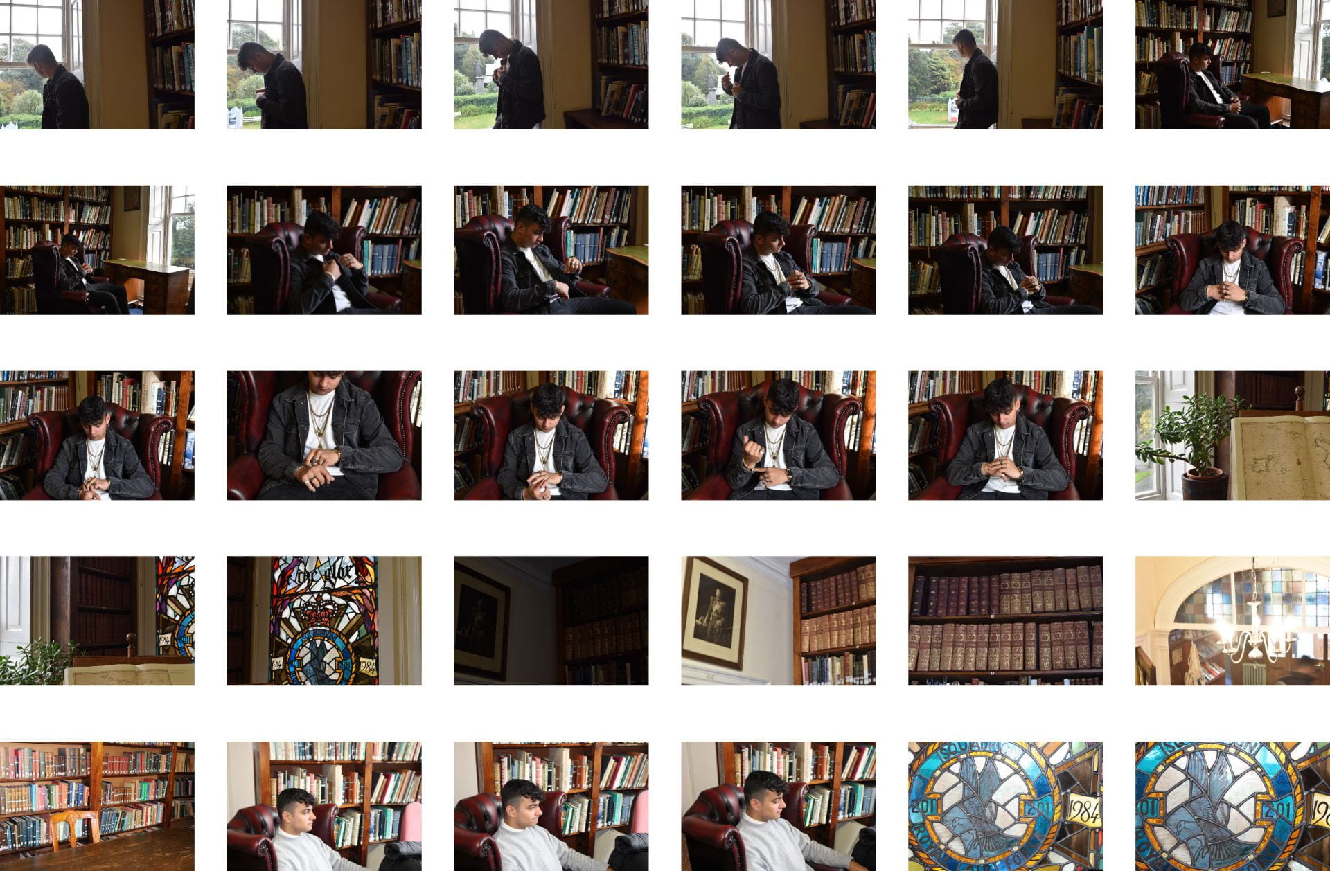
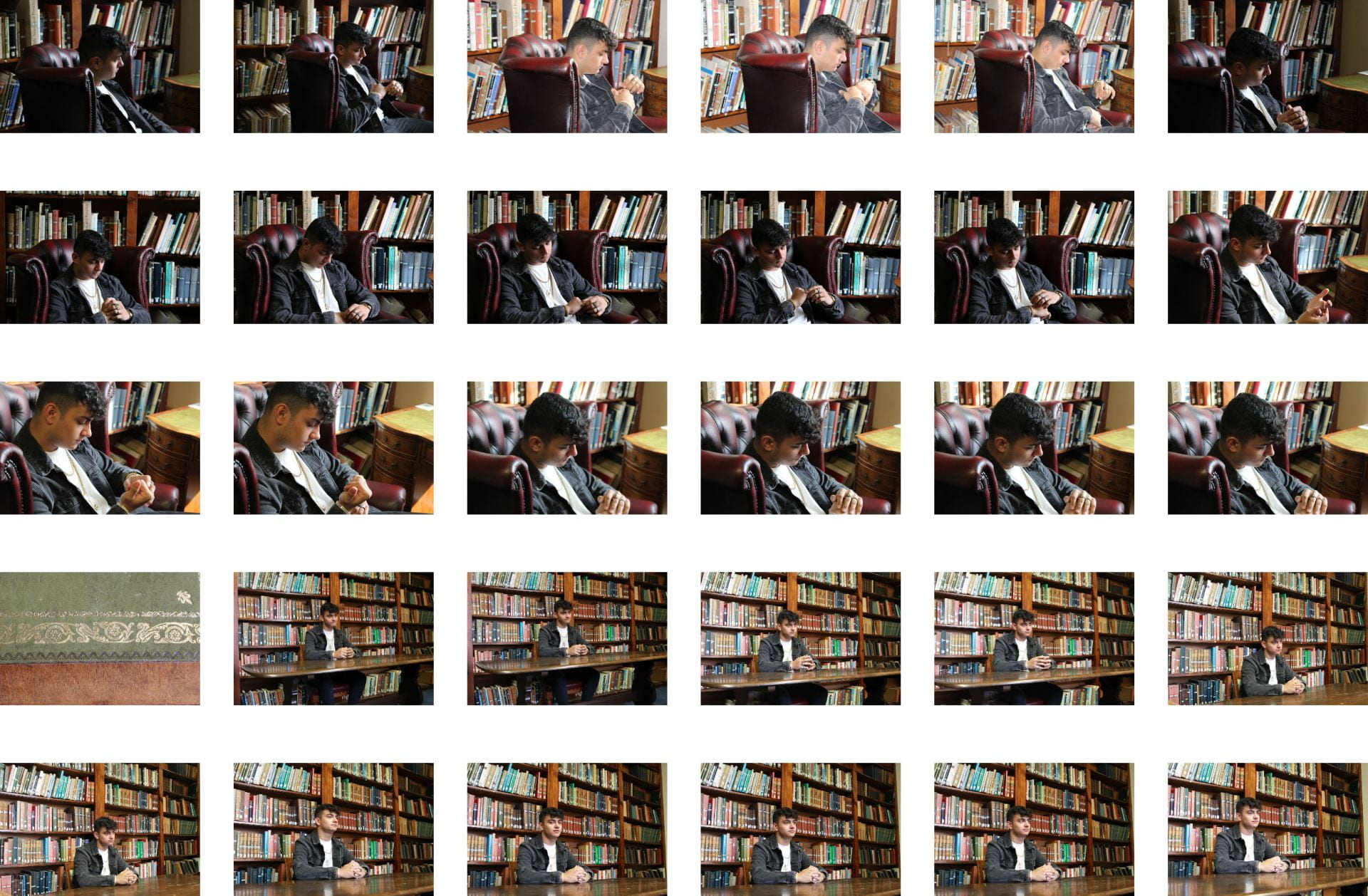
I think that the camera and print production skills in the making of our digipak was successful as we managed to get a variety of shots including close up, high angles, low angles, mid shots, framing shots. Our artist is well framed in the images to make him the main part of the image. We used photoshop to edit our photos for a bigger contrast and darker saturation to the images. By being able to manipulate and crop them to the size we want for a greater depth of field.

The selection of mise-en-scene in the photos and the meaning it communicates

Our mise-en-scene created meaning through the basic, stylish and trendy side to the star with black and white clothing which made the accessories chosen, which was gold jewellery, stand out and signify a sense of wealth and high-status. We also edited our photos in photoshop for a bigger contrast and darker saturation to the images. The mise-en-scene definitely helped the brand and star image, especially the darker black and white image carried through from the music video and the edgy side to the star as he has redemption over the past relationships and is doing a very manly thing. His album is all about reflection. The layout of the cover is partly conventional at this point as it has the barcode, tracklist and the album title but needs extra added in the next draft such as the copyright, publishing notes and spine information.

The creative use of DTP to integrate images and text and use colour/typefaces

Furthermore, the conventions of our layout and page design which we played with on InDesign to compose our digipak. Having the title bold and covering the top corner with no artist name on the front, this allowed the album name to stand our as our artist is already well established, making the album simple and stand out to the audience. However, maybe I feel that we can make our own type of font and scan it in as ours does not depict our genre as best as it could. We were able to position and panel our images how we want them to fit the frame.

Overall we are happy with our digipak as we thought the range of camera angles and framing used allowed us to portray our star image in a way the carried the message through from our music video. The mise-en-scene even though it was basic, we had a trendy and stylish star, which helped the accessories chosen to stand out. Furthermore the InDesign and placement allowed us to explore the placement of our fonts and play with stroke and outer glow. However, moving forward we need more conventional features added in, such as the spine information, publishing notes etc. Furthermore, we need to look over the fonts chosen and if they fit our genre and maybe make our own as there are minimal RnB genre fonts on InDesign.


Contact Sheet

Here are the contact sheets below of our digipak shoot at the Priaulx Library. Overall it was successful with a range of shots with different lighting. The location we chose we were happy with and we think that the overall image that we want to portray will work well. We took multiple photos for each type of shot as we wanted to make sure we had the picture we wanted. We liked the shots of our model looking our the window sat in an old chair and the shots of the old chandelier light.


Hand drawn mock-up

As a group, we have produced a hand-drawn mock-up of our digipack which we are going to make in the next 2 weeks. This was collated through our favourite ideas on our mood board. We looked at conventional aspects for our genre and that our star is presented the same way, from our music video to digipack.

The technical features include

Front Cover: The name of the album (not artists name as he is already very established with a large fan base)

Inside Left: Film (Library, Boxing Shots)

Inside Right: Boxing narrative behind the CD (close up of gloves), no text

Back of case: tracklists, barcode, company recognitions and producer rights

Since looking at the back of our cover of the hand-drawn mock-up, we think that the tea stain should be connected with a page of a book so that we have the old textured pages. This makes it look like a contents page from a book.

Branding Moodboard

After us considering how the genre is reflected in the design of a Digipak, we have now created a padlet mood board to collate ideas for our Digipak cover.

We had to look at ideas that would illustrate the feel of the digipack design. This includes:

  1. Images – MES, locations, characters, designs, graphics, illustrations, photos etc
  2. Typefaces
  3. Colour Schemes
  4. Inspirational Digipacks – something similar?
  5. Logos
  6. Copy Ideas – text

Made with Padlet

This task has been helpful as it has allowed me to identify what is conventional within the R&B genre, for when I create my own digipack, for example the colour palettes I need, image manipulation designs, fonts, text etc. This is so I have a creative digipack that a typical R&B fan would want to engage and interact with.

Digipak Conventions Analysis

Before creating our own digipak, we needed to look at how digipaks are designed to work alongside videos to support the promotion of a new album.

I chose drakes digipak cover from the same genre RnB, below I have annotated the design forms and genre conventions used.

I learned that conventions are digipak include:

  • Name of artists and album
  • Barcode
  • Tracklist
  • Copywrite Information

Specifically for the genre of RnB, I found conventions used on the digipak include:

  • Dark Colours
  • Bold Fonts
  • Simple typeface
  • Minimalistic cover

This will be helpful when I produce my digipak as our audience will have a preferred reading with the typical conventions that fit our genre. Which in return will help make a profit. By sticking to the typical conventions that are listed above, we also need to make sure we are unique so that we can stand out within the industry.


Our Mission Statement – The Package Brand

Before looking directly at our digipak we had to look at the marketing strategies and our mission statement. The question we had to ask ourself were, who is our audience? Such as their demographic and the media they consume. We also looked at our call to action, who our competitors are and our unique selling point and mission statement.

Below is our google slide addressing the various aspects