Category: Component 3

Contact Sheet

Here are the contact sheets below of our digipak shoot at the Priaulx Library. Overall it was successful with a range of shots with different lighting. The location we chose we were happy with and we think that the overall image that we want to portray will work well. We took multiple photos for each type of shot as we wanted to make sure we had the picture we wanted. We liked the shots of our model looking our the window sat in an old chair and the shots of the old chandelier light.


Hand drawn mock-up

As a group, we have produced a hand-drawn mock-up of our digipack which we are going to make in the next 2 weeks. This was collated through our favourite ideas on our mood board. We looked at conventional aspects for our genre and that our star is presented the same way, from our music video to digipack.

The technical features include

Front Cover: The name of the album (not artists name as he is already very established with a large fan base)

Inside Left: Film (Library, Boxing Shots)

Inside Right: Boxing narrative behind the CD (close up of gloves), no text

Back of case: tracklists, barcode, company recognitions and producer rights

Since looking at the back of our cover of the hand-drawn mock-up, we think that the tea stain should be connected with a page of a book so that we have the old textured pages. This makes it look like a contents page from a book.

Branding Moodboard

After us considering how the genre is reflected in the design of a Digipak, we have now created a padlet mood board to collate ideas for our Digipak cover.

We had to look at ideas that would illustrate the feel of the digipack design. This includes:

  1. Images – MES, locations, characters, designs, graphics, illustrations, photos etc
  2. Typefaces
  3. Colour Schemes
  4. Inspirational Digipacks – something similar?
  5. Logos
  6. Copy Ideas – text

Made with Padlet

This task has been helpful as it has allowed me to identify what is conventional within the R&B genre, for when I create my own digipack, for example the colour palettes I need, image manipulation designs, fonts, text etc. This is so I have a creative digipack that a typical R&B fan would want to engage and interact with.

Digipak Conventions Analysis

Before creating our own digipak, we needed to look at how digipaks are designed to work alongside videos to support the promotion of a new album.

I chose drakes digipak cover from the same genre RnB, below I have annotated the design forms and genre conventions used.

I learned that conventions are digipak include:

  • Name of artists and album
  • Barcode
  • Tracklist
  • Copywrite Information

Specifically for the genre of RnB, I found conventions used on the digipak include:

  • Dark Colours
  • Bold Fonts
  • Simple typeface
  • Minimalistic cover

This will be helpful when I produce my digipak as our audience will have a preferred reading with the typical conventions that fit our genre. Which in return will help make a profit. By sticking to the typical conventions that are listed above, we also need to make sure we are unique so that we can stand out within the industry.


Our Mission Statement – The Package Brand

Before looking directly at our digipak we had to look at the marketing strategies and our mission statement. The question we had to ask ourself were, who is our audience? Such as their demographic and the media they consume. We also looked at our call to action, who our competitors are and our unique selling point and mission statement.

Below is our google slide addressing the various aspects

Music Video Draft 4

Below is my Draft 4 Music Video 

What we have changed:

  • More punch bag shots with horizontal flips
  • Added more colour through performance clips
  • Made sure all narrative is in black and white
  • Check lip-syncing
  • Dissolve at the end

Comments from audience/peers:

Targets for improvement:

  • Look at the colours for performance
  • One clip had a van in the background
  • Change one of the lip-syncing clips

These changes were seen necessary by our audience so that the shots are the same colours throughout and that the focus is directly on our star not moving scenery behind. Furthermore having the stars lip-syncing even more on the beat this allows our star to fit the song as if he is actually singing it, which is more realistic to ours audience.

Music Video Draft 3

Below is my Draft 3 video – 

The things that have changed since our Draft 2 include:

  • Going over the lip-syncing to fit the song better
  • Looking at clips to make sure they are on the beat
  • Positioning and scale to zoom in shots to fit the space
  • Getting rid of the existing transition that didn’t quite fit the style of video
  • Playing with the colour – black and white for narrative until our model realizes he is good enough
  • Shortening clips, such as the wraps before the fight and including more montage

5x YouTube Comments from Peers / Audience

The feedback from peers on our YouTube comments helps us as media producers to be able to get impartial audience comments and so we can make improvements. 

Targets for improvement: 

  • Add more colour to performance clips
  • Look at adding more effects
  • Check Lip-syncing again
  • Looking back on our video there is one clip of our narrative not in black and white nearer the start (0:32)


Teacher Feedback – Screen Castify

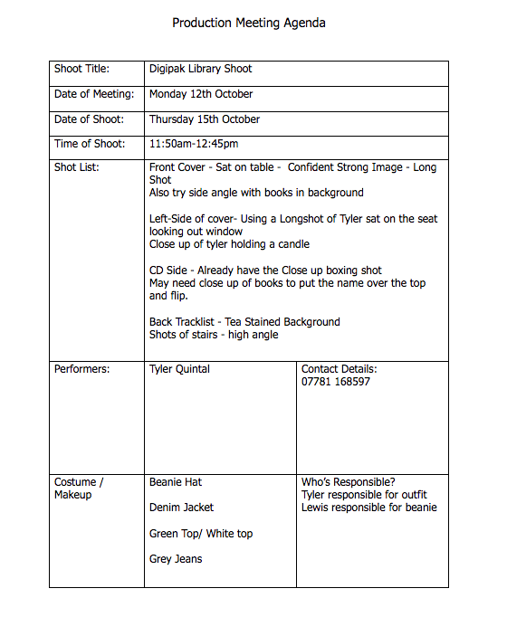
Below I have attached the Screen Castify of my teacher’s feedback:

From the feedback, we have received from our teacher. We need to make sure we duplicate the timeline on Premiere Pro for the next edit. We can go back and have a record of what we have done.  The narrative is clear. However, there can be some changes to make the narrative even clearer. The lip-syncing and clips need to be on the beat, such as when he is sat on the bench at the royal terrace the lip sync can be adjusted and the boxing gloves on the beat with the next clip at the start.

We are also not making enough of the ring. Especially at the end when it is left behind. The shot of the ring close up should be before the performance and connected to the ring before. 

The positive part of the performance is the good frame within frames to portray confinement. However, we should reframe some shots by zooming out to crop the space and make the shot more interesting and shots such as the punch bag should be cut quickly and not have the whole tilt of the boxing bag. 

The transition which we were told through our Specsavers feedback, our teacher believes is more comedic and out of place in our video.

Furthermore, our model’s reaction to the ring could be after he has lost the fight and before he decides to fight back. 

But for our next draft, we should be able to play with the narrative and having some more training before he wins to see if this is easier for our audience to understand for the narrative. 

Finally, he thinks the narrative should be black and white to distinguish what we have from the performance. Could have it back to colour by the end. We should just play around and see what works best or to keep the clips in colour.

Targets for Development:

  • Focus on lipsyncing clips and that they are in a time
  • Make sure the shots are on the beat
  • Make more of the ring (Close up)
  • Get rid of the transitions that were added (have a play with other ones)
  • Play with the colour – see if this distinguishes the performance more

Reflecting on our targets and teacher feedback, we will have to look at specific areas such as the transitions as a group and decide what steps to take forward because we received differing feedback from our Teacher and Specsavers.

Furthermore, I think that the idea presented by our teacher about the two fights, one in which he loses and realises his problems and starts again and then wins could be a good idea and that we should try it to see if our narrative becomes clearer. However, it may defeat the structure of our narrative that we tried to imply throughout our Draft 2. As he looks at the ring leaves it and is upset but as he gets beaten up he realises that this is his passion and he can get over the heartbreak and leave the ring behind.


Specsavers Feedback

Specsavers visited our media group and had a chat with each group about or music videos as a whole.

The feedback we received included:

  • Using smaller clips of the narrative and cut back if the lipsyncing is not as good at times
  • Adding an adjustment layer above to change the whole colour instead of different saturations over each clip
  • Being able to enlarge the videos instead of cropping which left us with one side of the video black
  • Being able to add keys in order to enlarge and zoom videos on premier pro and move the video to the correct place
  • Adding certain transitions to some shots if needed (such as from the action shots to static shots) or to link shots together and add movement for them to interlink.

Overall we knew that we had to finish the edit of our new performance and so that the narrative and performance are interlinked and portraying the right story to our audience. By getting this as the basis, we can then start adding the effects, transitions and adjustment layers going forward.