January 13

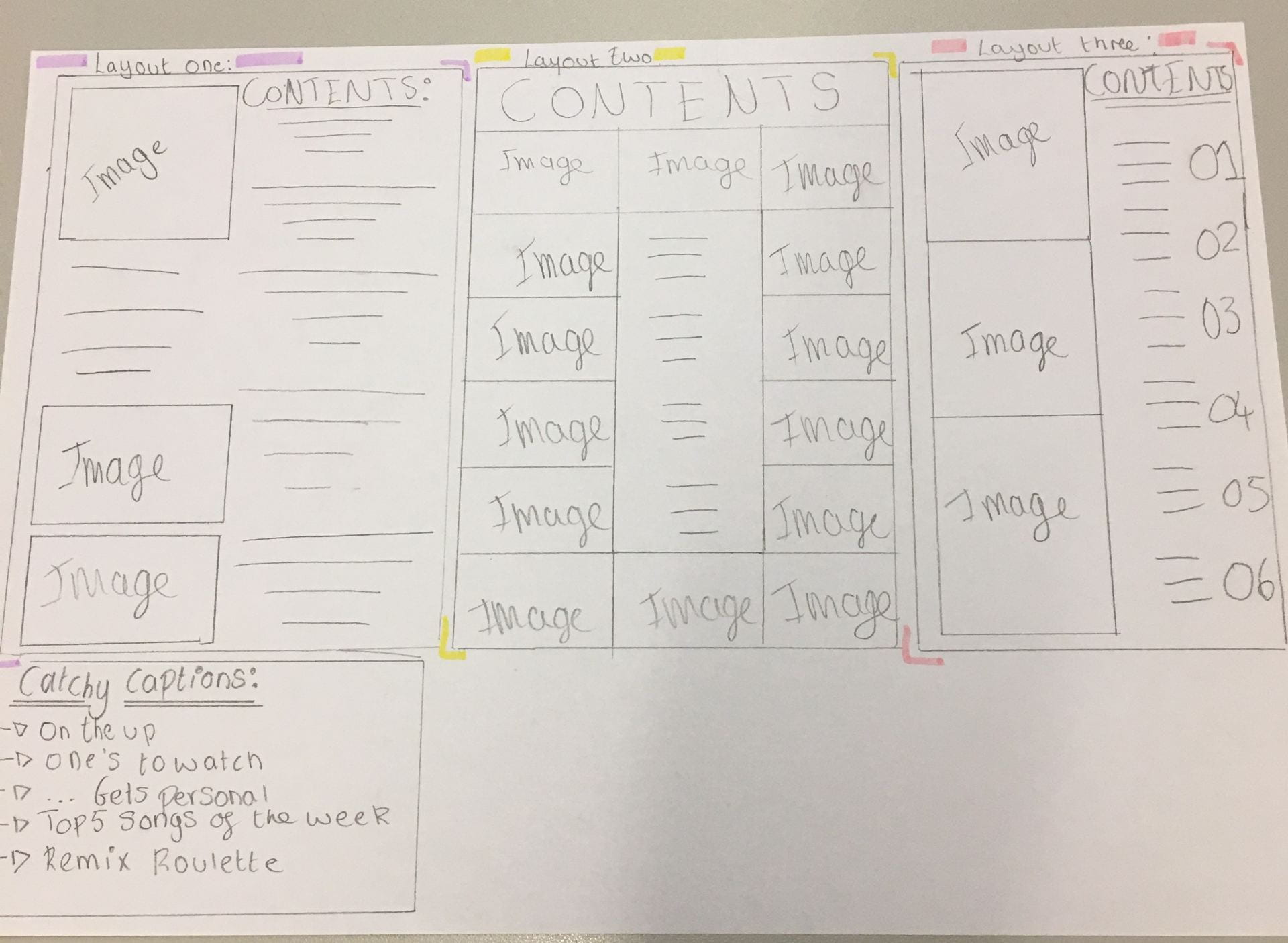
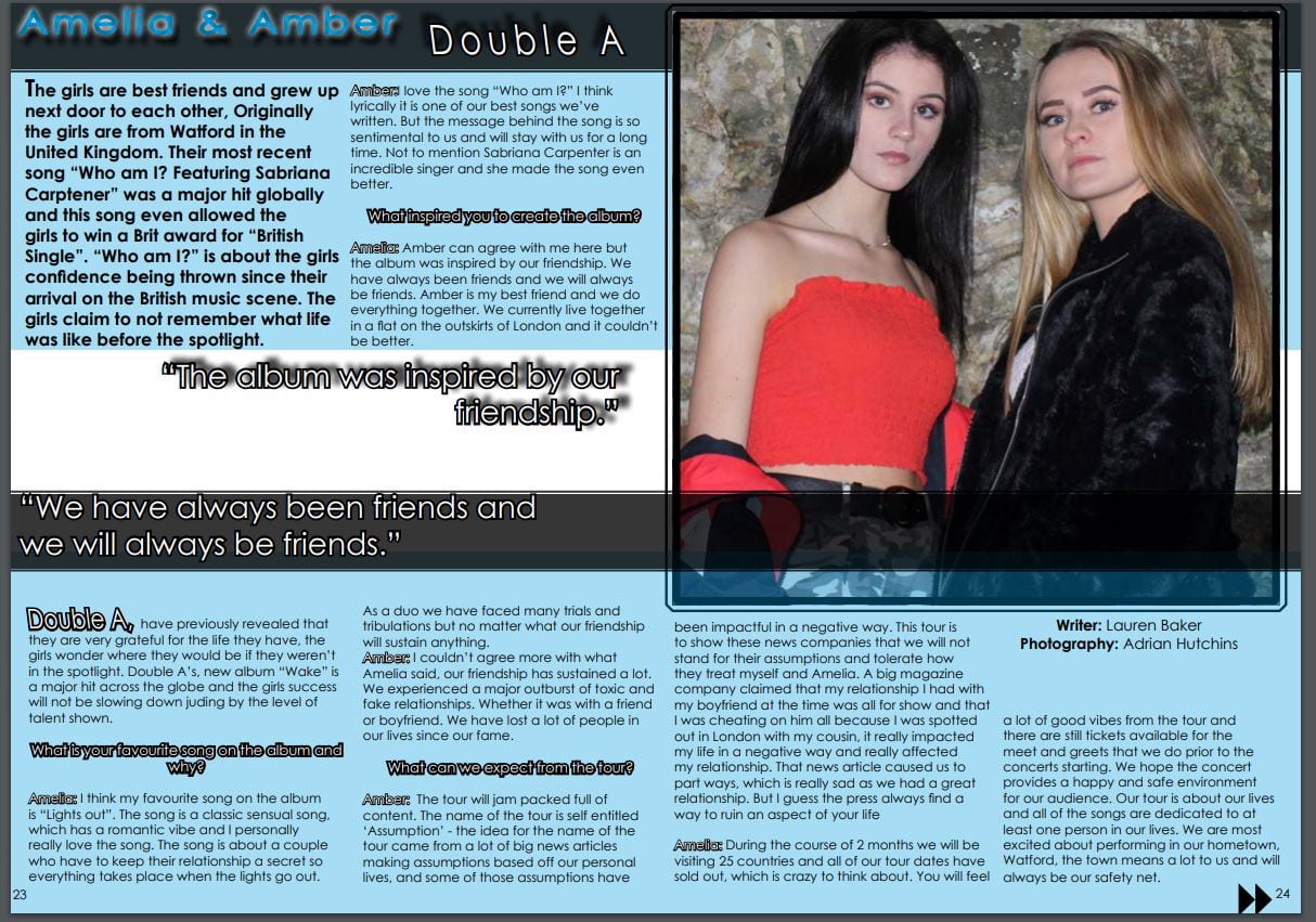
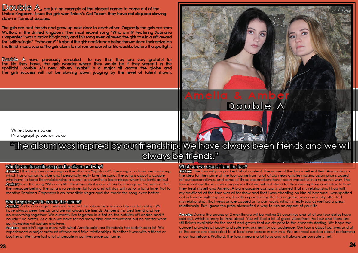
Draft of Content Page


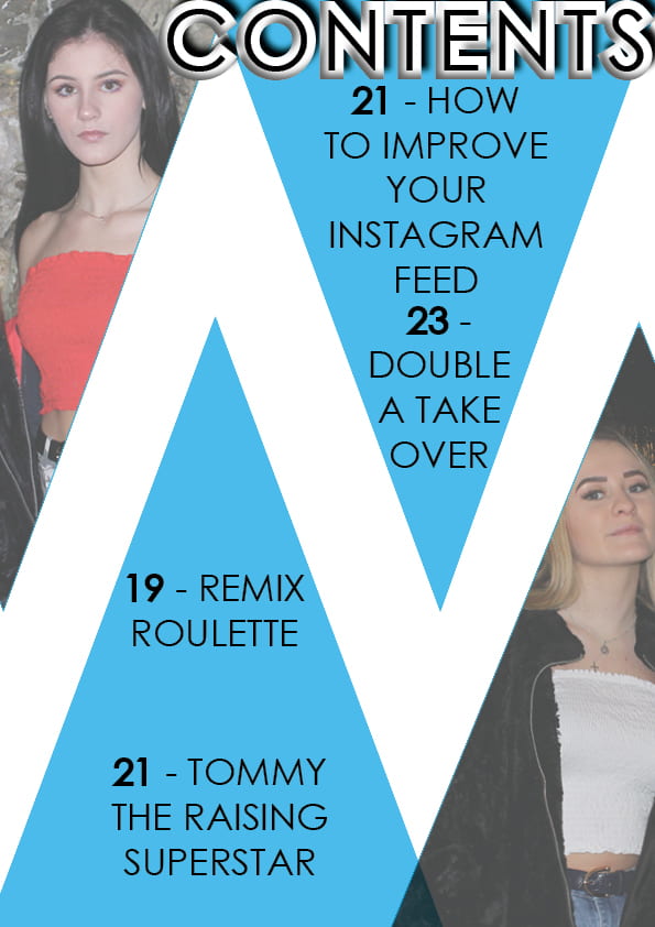
Click here to fully view my first draft of my content page:


What went well?:

  • I learnt how to add an image to text box and make it fade out for dramatic effect
  • Used some catchy captions to draw my target audience into viewing the specific article
  • I have used different shapes and a different shade of blue then my front cover and double page spread.
  • I have made the work ‘contents’ bold and bright by using the Drop Shadow and Inner and Outer Glow

What Can I improve on?:

  • Make the size of the pages smaller so I can fit more in the space
  • Add another image into the page (Of Tyler from first photo shoot)
  • Play around with the white background (It doesn’t have to be plain)

Targets for my second draft:

  • Add another image in so I have a variety of different images
  • Make the page numbers and captions smaller
  • Add more catchy captions to suit my target audience’s preferences
  • Move the ‘contents’ logo down more so we can see all of the word fully
January 8

Design Skills 2

Since my last post on design skills, I have become more confident in using Photoshop and Indesign,  and this has allowed me to be able to experiment with a variety of different tools across both platforms. Although I still use the same tools, I have been able to become more confident when using them. This has helped me to grow confidence with using Adobe programs.

Photoshop:

Above our the tools I have used for photoshop firstly I used the eyedropper tool, to enhance any colouring on the models outfits, this has been done so my model can fully showcase what they are wearing. By using the eyedropper tool you are able to blur out any of the models ‘imperfections’. This makes the model seem perfect and not relatable to the target audience, this reinforces the extraordinary person from Richard Dyer’s ‘Paradox of the Star’ Theory.

In addition to that I have also used this tool to enhance the white on the eyes. Next I used the Crop tool, as one of my image that I have used for my content pages had a lot of excess background. By cropping the image, I am able to highlight the models even more and showcase them.


Indesign:

Since my last post on design skills I have discovered a new tool, the polygon tool, the polygon tool allows me to create a shape in which I can write a catchy caption or an important piece of information in. I have used the triangle for my contents pages and this has created a zig-zag effect on my page. By using the polygon tool, it will allow me to use a variety of shapes that aren’t just a square or a circle. The polygon tool isn’t a conventional feature of my magazine, however it does set my magazine apart of others and brings a whole different air to it.

In addition to that I have used the ‘Stroke tool‘, by using the line tool I have been able to separate the catchy captions from each other. The Stroke tool can be changed by the weight, type of line. Personally I use the triple lines, as this looks a lot better on my content page.

January 8

What is a Contents Page?

content page has a very important role within a magazine. A content page acts as a guideline for the reader so they are able to see what is in the magazine and where they are able to locate a certain topic if it appeals them. Therefore a content page must easy-to-read and eye-catching, as well as clear.

The conventions of a contents page are:

  • A title (i.e ‘Contents’)
  • Page Numbers
  • Reminder of the magazine’s name and mission statement
  • Making sure that the colour scheme remains the same throughout the magazine
  • Catchy headlines to draw in your reader

Below some examples of different variations of content pages. Personally I like the third one the best as although it simple it will give me a lot of idea on how I can improve the page. It follows the conventions and would fit my theme perfectly by the arranging of the columns. In addition to that, I was asked to come up with 5 catchy headlines that I could use in my content pages. My personal favourite is ‘Remix Roulette’  I like the use of alliteration and as my music genre is Pop. I think having a remix roulette would be a great addition, as it would feature the most current and trendy songs of the time.

While creating my contents page i will keep in mind AIDA:

A- Attract

I- Interest

D- Create desire

A- Call to action

In addition to that I will also be thinking about Blumler and Katz ideas:

  • Entertain
  • Inform/Educate
  • Social Interaction
  • Personal Identity
December 18

A New Improved DPS

Click here to access my second draft of my double page spread

Above is a second draft of my double spread since the first draft I have changed many aspects of the article:

  • Fix the gap between the Q & A sign
  • When using text make sure they are all to the same side of the text box. ‘Align to left’
  • SA – Bigger and Bolder
  • Fix the layout of columns
  • Added a name for the photographer
  • Moved the quote “We have always been friends and we will always be friends.” down more to showcase the shadowing more
  • Created a logo of ‘Double A’
  • Changed the colour scheme from red to blue
  • Fixed the columns so it is easier for the reader


Although I am happy with the result of the second draft, I still need to improve on the following:

  • Play around with the background as it is very plain
  • Experiment with the words ‘Amelia and Amber’ as they are a little bit boring at the moment
  • Between the last paragraph and the credits for the writer and photographer I need to fill the gap
December 18

Feedback & Reflection on Draft DPS

Targets for development? What’s new and what’s next?

I have asked my one of my peers and my teacher to conduct some feedback for me on how I am able to improve my double page spread they have said the following:

  • Create a Logo for ‘Double A’
  • Make a name for the photographer
  • Make the second and third paragraph not bold
  • Crop the image even more as it is uneven at the moment
  • Move Double A up as it just on the line
  • Move ‘Amelia and Amber’ and ‘Double A’ to the other side as the other side is very bare

My Targets:

  • Make sure my second and third paragraph aren’t in bold.
  • Design a logo for ‘Double A’
  • Make up a name for the photographer
  • Fill the white gap in
  • Change where the quote goes

How will I do this?:

I will take on board my corrections and ensure to play around and listen to the feedback I have been given by my peer and teacher. As this information is critical for me, as this will allow me to create the best possible double page spread. Using my skills on Photoshop and Indesign I will create a logo for ‘Double A’ as this is bring a new flare of something different to my double page spread.

December 18

Feedback & Reflection on Draft DPS

I have asked my one of my peers and my teacher to conduct some feedback for me on how I am able to improve my double page spread they have said the following:

Miss Cobb:

  • Create a Logo for ‘Double A’
  • Make a name for the photographer
  • Make the second and third paragraph not bold
  • Crop the image even more as it is uneven at the moment

Amy Grief:

  • Make sure some texts are un-bold as it is difficult to read
  •  Move Double A up as it just on the line
  • Move ‘Amelia and Amber’ and ‘Double A’ to the other side as the other side is very bare
  • Move the questions down more and the covering the bottom of the image


December 16

Design Skills 1

Below is my examples of the skills I have learnt using Indesign and Photoshop:

Photoshop: (Below are 4 examples of the tools I regularly use on Photoshop)

The tools I have used for Photoshop:

  • Eyedropper Tool– I used the eyedropper tool to enhance the eye colour and brightening the eyes so they will stand out more. This made my star image more youthful and more livelier.
  • Brush Tool– By using the brush tool I am able to ensure that my model looks the best they can, By using the brush tool it ensured that my model looked youthful which is perfect as my target audience is for teenagers and this will appeal to my audience more.
  • Brightness and Contrast Tool– I have used the brightness and contrast tool to give an extra flare to my image and this has made the image a lot better. My reasoning for using the Brightness and Contrast tool is because I wanted to enlighten my model and ensure they look fresh and appeal to my age demographic. My models should convey the image of youth, as my target audience have a preferred style of reading which would be someone closer to their age.
  • Auto Contrast– Once I upped the brightness and lowered the contrast down, I then used auto contrast just to enhance the features of my models. I used Auto Contrast to bring depth to my model and make them look crispier and sharper as this will bring out the models features a lot more.

By using these tools I am able to ensure my models features stand out and that they look the best they can. By using photoshop, I have learnt how to successfully edit an image of a model, and I know what techniques work on my particular genre of music and what techniques don’t work.


Indesign: (Below are 3 examples of the tools I regularly use on Indesign)

The tools I have used:

  • I sent my stripes backwards so the image of my models is the main focus
  • I used the outer glow effect to enhance the names ‘Amelia and Amber’. This ensured that the target audience know exactly who they are reading the article about
  • In addition to that I used Global Light to make the names of the models stand out.


December 11

Second Shoot Contact Sheet(s)


Above is a collection of my favourite images from my second photo shoot on location. The shoot took place at Castle Cornet on the 11th of December 2019. The lighting is just right and I am impressed with the overall outcome of these images.  The reason they are my favourite images is because my models look relaxed and comfortable with modeling. I like how the models are comfortable with each other as this has created a collection of brilliant images.

The models portrayed their identities really well and I am happy with the outcome, the costumes are exactly how I wanted them to be. When looking at the photos it made it clear how much a pose and stance can convey the message the model is trying to get across. Overall the day was a success, however the main obstacle we had to overcome the rain, as this was a constant issue. It was difficult to deal with the weather however we worked around the issue, we were able to over this issue by shooting inside and some of the photos shot inside turned into my favourite images I selected.