December
21


November
5
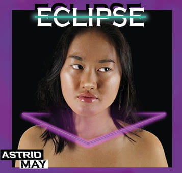
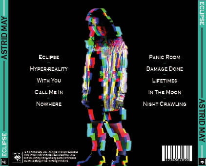
Digipack Draft 3
Below is our draft 3 of our Digipak:


Click here or the image bellow to look at the google form:

Overall 94.9% agree that our genre of our digipak was electropop. The other percentage believed it was R&B
Below is our digipak draft 3 in a CD case:


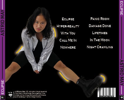
November
5
Digipack Draft 2
Below is our draft 2 of our digipak:


Miss Cobb’s feedback:
Overall our feedback was positive, our teacher liked our second draft and believes it is a massive improvement from the first draft. However we do have some corrections to follow up with then designing the third draft, which are the following:
- For the front cover image of Min, try to darken her eyebrows slightly
- Whiten Min’s eyes on the front cover image
- Try to use another neon colour that isn’t purple, pink or blue, maybe try to use either an orange or lime green
- Make Min bigger on the back cover
- Change the colour of one or two of the songs on the back cover
- Put the name of the album on the spine and the logo as well
- Try to put the neon glow back on Min on the back cover
- The right pane needs to be a bit wide in order to fit in the CD frame
November
3
Digipak Draft 1
Below is our draft 1 of our digipak: Overall, I think that many improvement have to be made as it is quite plain and simple.


Click here to access the PDF file of our Digipak Draft 1
Self Assessment:
I have graded our first draft a D/C currently, as we have many improvements to be made. I have assessed our digipak using the criteria to help me indicate what I think the intial grade is which were the following:
- The use of camera and photoshop to take photographs and to enhance images
- The use of mise en scene in photos and what it conveys and communicates
- The use of DPT to intergate images/texts and the use of colour/typefaces
My critical self assessment of the draft 1 of the digipak is below:
October
19
Evaluation of shoot


Above are some images taken during our recent shoot, all of our images appear to be well lit and of a high quality. We were able to take almost 400 images, which is good as it will mean that we have a lot more choice when picking what images we want to use for our digipak.
The PMA that we produced was very helpful as it allowed us to have a clear understanding as to what we specifically needed, equally are plan of what we wanted our digipak to look like was useful as it allowed us to think about the exact shots we desired.
Overall, I am pleased with the final result of the shots as we were able to capture a wide variety of different angles all at different lengths. In my opinion, we were able to convey the star image we wanted and we ensured that it fit within the electropop genre.
October
19
Contact Sheet
Above is a slideshow of all of our contact sheets for our digipak. Overall I think the shoot went well, we have vast variety of different shots in which we will use them for our front, inside right and back page digipak. Upon examining the photographs myself and my group have found that the vast majority of our shots are clear and in focus, this is amazing as we have more images to choose from.
In addition to this, I believe this photoshoot has fit in with the ideal electropop genre we are trying to convey, it equally highlights the star image we wish to portray. However if I could change one thing about the shoot it is that we could of used a different chair as it didn’t fit in with our original edgy and unconventional star image. Due to this being an issue we will have to edit the chair during photoshop if we decide to use any of the images with the chair featuring.
October
12
Photoshoot / Design Production Meeting and Risk Assessment

Click here or on the image to fully view our production meeting agenda:
When planning a photoshoot, production meeting agendas are key if we wish for our digipak to be a success. A PMA highlights what we need for our shoot and who brings what equipment. Everything must be there in order for the star and brand image to be correct. We are portraying our star to be extraordinary rather then ordinary, which is why we are dressing her in a silver shirt as it adds to the eccentric and edginess of the star image. Myself and my group want our star to stand out and we feel that this outfit will be able to convey the right star and brand image that we want.
As we are conducting the photoshoot onsite at school, we do not need to produce a risk assessment as it wasn’t needed.
October
8
Hand drawn mock up
When planning our digipak, we have to consider what kind of vibe we are going for. Below is myself and my groups hand drawn mock up alongside a colour palette which we will take into consideration when planning and inside our shoot.
When drawing this handmock up of our digipak we ensured that we have included any techinal conventions, for example a barcode and a title for the album, equally including the genre conventions of the electropop genre. An example of this is a neon colour palette of the different colours we wish to use alongside graphics and a bold typeface.
These are important things to remember as if we encode the right information for our target audience, they will have a preferred style of reading resulting in our digipak to become a success. If we can highlight the stars edgy and quirky side then we have successfully highlighted the star and brand image to the target audience.


October
8
Branding Moodboard
Above is myself and my groups mood board inspired by the electro-pop genre. This is what we are hoping to be our brand image. We used padlet in order to plan and organise our own ideas/inspiration as to what we want our star image to be and equally what we want our digipak to look like. The repertorie of elements and the general conventions of a typical electropop digipak combined, will ensure to engage our ideal star image, thus meaning the audience can decode and deconstruct it efficiently.
October
7
Digipak Conventions Analysis
The slideshow above, is a detailed analysis of an album which is typical of the electro pop genre. I have found that the star image has been conveys through the use of imagery and colours. The overall vibe for the album is that it is grungy and edgy. The vibe of the album is represented by the artists star image, which suggests that Billie has made a brand for herself and wishes to stick by the edgy and eerie star image. When creating an album you have to be able to consider all of the technical conventions of the album an example of this is the barcode.
The denotations of this album is that the audience can see Billie sat on the edge of a bed dressed in all white. However the connotations of this particular album is having night terror and expecting the unexpected.
Billie has stated the following about this particular album:
“what happens when you fall asleep it is basically supposed to be a bad dream, or a good dream”.
Below are some of the conventions that are featured in a digipak:
- Imagery
- Spine
- Bar code
- Copyright information
- Music producers logo
- Song names
- Album Title
- Name of the star / or band
In terms of the electro-pop genre I have found that it is conventional for a digipak to include the following:
- Faded images / Distorted Images
- Bright colours which contrast with the darker colours shown on the album too
- Bold fonts
- minimal covers leaving a lot of bare space