November
4
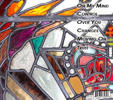
Digipack Draft 1
Here is our First Draft of our Digipak


Self Assessment
WWW –
- I like the contrast of colours I have used on the front cover with the books and on the back with the glass panes.
- Good photo choices.
- Fonts work well with position of photo, very clear.
EBI –
- Back of digipak is over exposed, change the exposure.
- Unintentional shadow on the inside page.
- Add a bit of colour on the inside to contrast to the black and white.