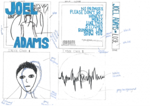
Please click on the image above to view our digipak mock up in more detail.
After completing our digipak research, we felt we had enough sufficient knowledge and understanding to create our very own one. We decided to follow the same sort of theme that an indie- pop genre album cover would normally have. Moreover, we believed that there should infact be a significant connection to nature, as this seems to be a common running theme throughout the preferred genre. We also like the idea of having an almost ‘sketched’ theme throughout our digipak. Furthermore, we thought this would be our direct link to the indie genre and therefore we thoroughly believe this idea will work very well in our digipak. We also felt that we ensure the the digipak remains simple, as once again we believe this will most definitely fit best with our chosen genre. Moreover, we have also decided on an almost dull toned colour theme to ensure there is a clear link to the indie genre, however we also would like a bright pop of electric blue running throughout our digipak.
From this task, we have learnt just how important it is to plan out a set idea for the digipak before we actually begin production. This will ensure that we use our time effectively and therefore create a digipak that really links to the artist’s star image. By completing the above document, we are now a lot more prepared to create a physical copy of our future digipak. Furthermore, this also allows us to see our idea before actually creating it. This has allowed us to really analyse if our idea will actually work and correspond with the entirety of our project.