Print Production Draft 3- Digipak and Advert

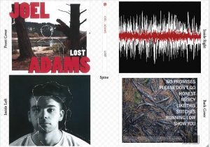
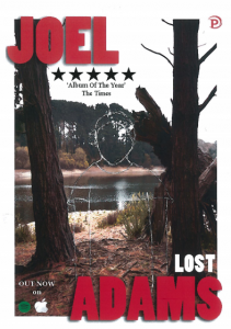
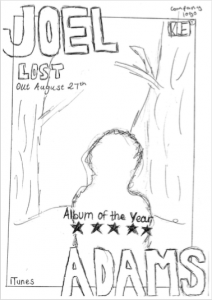
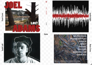
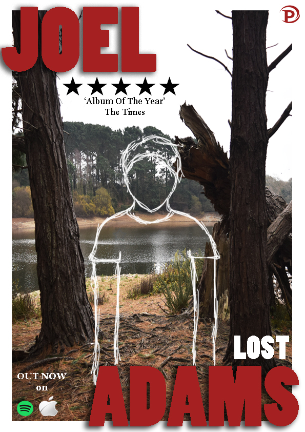
Upon reviewing the print products, it was somewhat evident that the process of scanning clearly decreased the quality of our images dramatically. The difference in image quality was extremely evident when comparing the front and inside left panel to that of the back and inside right panel. Therefore, instead of hand- drawing our sketched outlines and scanning in the final product, I decided it would probably result in a better product if this process were to be completed over photoshop. By using the ‘paintbrush’ tool and the colour white, I was able to achieve the sketched look we were hoping for. This resulted in a much more clear, professional product that appeared to be in much better quality than our previous print products. Above are the results we received upon experimenting with the use of this programme.

From this, I learnt how important it is to reflect back on my work. This allowed me to really focus on the elements which perhaps decreased the professional look of our project overall. With the use of experimentation, I was able to complete print products which I was much more happy with. Furthermore, I believe this more clean cut, authentic look would appeal to our target audience a lot more, creating a more successful product.

Feedback and Targets Draft 2- Digipak and Advert


Here, we decided to shoot several vines to capture the necessary feedback for our second draft of the advert. We gathered a number of our peers to complete a 3-6 second video where they spoke about an element which worked well or one which should either be changed or improved on. We believed that this would be an effective way to collect criticism for our draft two. This is simply because we felt this was an effective, quick and precise way to gather the exact feedback we needed in order to quickly and efficiently improve our product to the next level. We listened to all the feedback we received and started to immediately work on improving our product to what our audience suggested, therefore making it much more appealing and interesting for them.
By completing this task, we learnt just how necessary it is to take on the constructive criticism of our peers. This is imply because they are aware of what elements need to be in place in order to meet the criteria necessary. Moreover, they also know which conventions should appear in order to appeal to the target audience and represent the artist successfully.

Targets:

  • Re- draw the sketched outline of the performer, perhaps do this in a different medium.
  • Experiment with drawing the red part of the sound wave in the digipak, this would show more continuity between the panels.

Print Production Draft 2- Digipak and Advert

Please click on the image to view our digipak in more detail.

Please click on the image to see our advert in more detail.

Above, you can see that we now have both of our second drafts for the advert and digipak. After receiving feedback for both products, we went back to the production stage and perfected our projects by taking on board the feedback we had received from our audience. This enabled us to really get across our artist’s star image and therefore provide the audience with the products they are expecting from the particular genre we are advertising. We were able to really perfect the authentic and simplistic image we were trying to connect with our artist and therefore we believe these second drafts really depict this. By focusing on our previous target and adjusting a few minor elements, we were able to include all of the necessary conventions to both the product and the genre. Therefore we feel these products are completely appropriate to the task we were set.

We fully believe that we have learnt just how important it is to revise construction criticism on your work who in the production process. this has most definitely aided us to really create products that are to the best of our ability and furthermore wok well with the star image we are displaying throughout the project.We have also learnt how important it is to make visual resemblance between the advert and the digipak. This ensures that the audience are aware it is all part of the same album and therefore an obvious connection can be made.

Advert Feedback and Targets- Draft 1


Please click on the image to view all of the feedback forms.

We believed it would be appropriate to collect written criticism of our advert at this stage. Therefore, we thought that receiving this from our peers would work out to be the best option in this situation. Some of the questions that the form asked the individual to answer we things like; whether the shots were well composed, if ICT had been skillfully used and if photoshop actually helps to enhance the pictures. Moreover, we also felt this would be a good way to gather feedback on our first draft, as it was a clear and simple way to evaluate whether or not we has met the criteria necessary to make a good product. Due to this, once again we requested that our peers filled the form in to the best of their ability. This was in order for us to achieve and receive the criticism necessary to continue to move our product forward.

From this task, we are now much more aware of how important it is to gather constructive criticism throughout the production stage. This is due to the fact, that it will most definitely ensure that we know the conventions that do not really work and those which make the advert look even more professional. Therefore this will help to improve the product before we eventually decide to finalise it.

Targets:

  • Ensure that all of the text is visible, so it can be easily read on the advert.
  • Edit the image more, perhaps experiment with more colour correction to improve the visual look of the image.
  • Make sure to improve the quality of the advert as a whole to gain a much more professional look.

Advert Draft 1

screenshot-2017-01-11-at-18-01-29

Please click on the image to view it in more detail.

We created the first draft of our advert here. With the use of our digipak front cover, we were able to create the necessary, appropriate advert that clearly linked to our project as a whole. We will shortly be gathering written feedback on how we can visually improve our advert in order to directly connect with our chosen audience. This will also help us to much more accurately portray our star and his image through something simple like ur advert. By adjusting a few elements of our advert after feedback, we will ensure that this section fully connects to the entirety of our project.

Here, we have learnt just how crucial it is to have a mock up of what we hoped our advert would look like. This helped us throughout this production stage, as we were able to continuously refer to this and therefore create the advert a to more efficiently and effectively. It ensured that we saved a mass amount of time in this process and so we were able to really refine and perfect our advert to suit the star image we were hoping to achieve.

Advert Mock Up

screen-shot-2017-01-03-at-16-58-29

Please click on the image to view our advert in more detail.

For this task, we had to sketch a rough draft of what we hope our advert will look like. We took inspiration from our digipak and therefore it is evident that we have used the same lay our for our advert. This will ensure that the audience are aware it is part of the same project and therefore all sections of the task will easily be connected wit one another visually. We have also been sure to include the general conventions of an advert, for example elements like the image, artist name, album title, star rating, company logo and release date are all displayed clearly on our advert. Moreover, we have also ensured that we have remained conventional to our artists star image and genre. We did this by keeping an authentic, simplistic feel to the appearance of the advert.

From this, we leant just how important it is to have a clear plan of what our product should look like before we have entered the production stage. This enabled us to see what things worked well and what perhaps didn’t work so well. Therefore, ultimately, this aided us to save time and create our product effectively without wasting so much time.

Advert Conventions

For this task, I completed a power point about advert conventions. Here I spoke about elements like advert conventions, indie- pop conventions and how the pair needed to intertwine in order to make a successful product. Key factors involved aspects such as: the artist’s name, the album title, ratings, genre conventional images and an appropriate colour palette. By doing this, producers are able to both display the star they are portraying and the product they are trying to sell (the music). Therefore, by creating a conventional product to the genre, producers can attract their target audience and therefore gain the predictable pleasure expected. It is also clear that in order to make a successful product, the advert most definitely has to represent the selected genre. Producers can do this through the use of font, images and colour palette.

Furthermore, from  this task I have learnt just how important every detail is on an aspect like the advert. It allows the audience to have a brief insight into the music, star and most definitely the genre before even consuming the product that has been made. It allows the producer to draw in the right audience and therefore making sure the product is as successful as possible. Ensuring that even the smallest detail is conventional to the advert, star and genre is extremely crucial, therefore without doing this the product may simply not sell leaving the star to not be as successful as they could have been if advertised efficiently.