By creating my magazine I have learnt new skills that would help me in future jobs. I have learnt techniques in Photoshop that I am able to develop to make photos look more effective. I have learnt to take criticism well to make my magazine better. Also, my time management has improved which will help me to work towards a deadline. My communication has improved as I am able to talk to my models and discuss what they are going to wear. This will help me in the future as I will have more confidence to be able to talk to people I do not know. I believe my brand is clearly reflected in the design as my pages have the masthead in the top corner. My models do convey the genre I chose as I have dressed them up in cute, co-ordinated outfits. I have also given them girly makeup which conveys the genre well.
Category: Component 1
Design Skills 2

For my updated double page spread, I made my own background. I started off with colouring half the page pink, and the other purple. I then used the mixer brush tool to blend the purple and pink together to create a gradient. This made it less harsh on the eyes. I used pink and purple as it suits my cute and girly concept of the genre I chose.
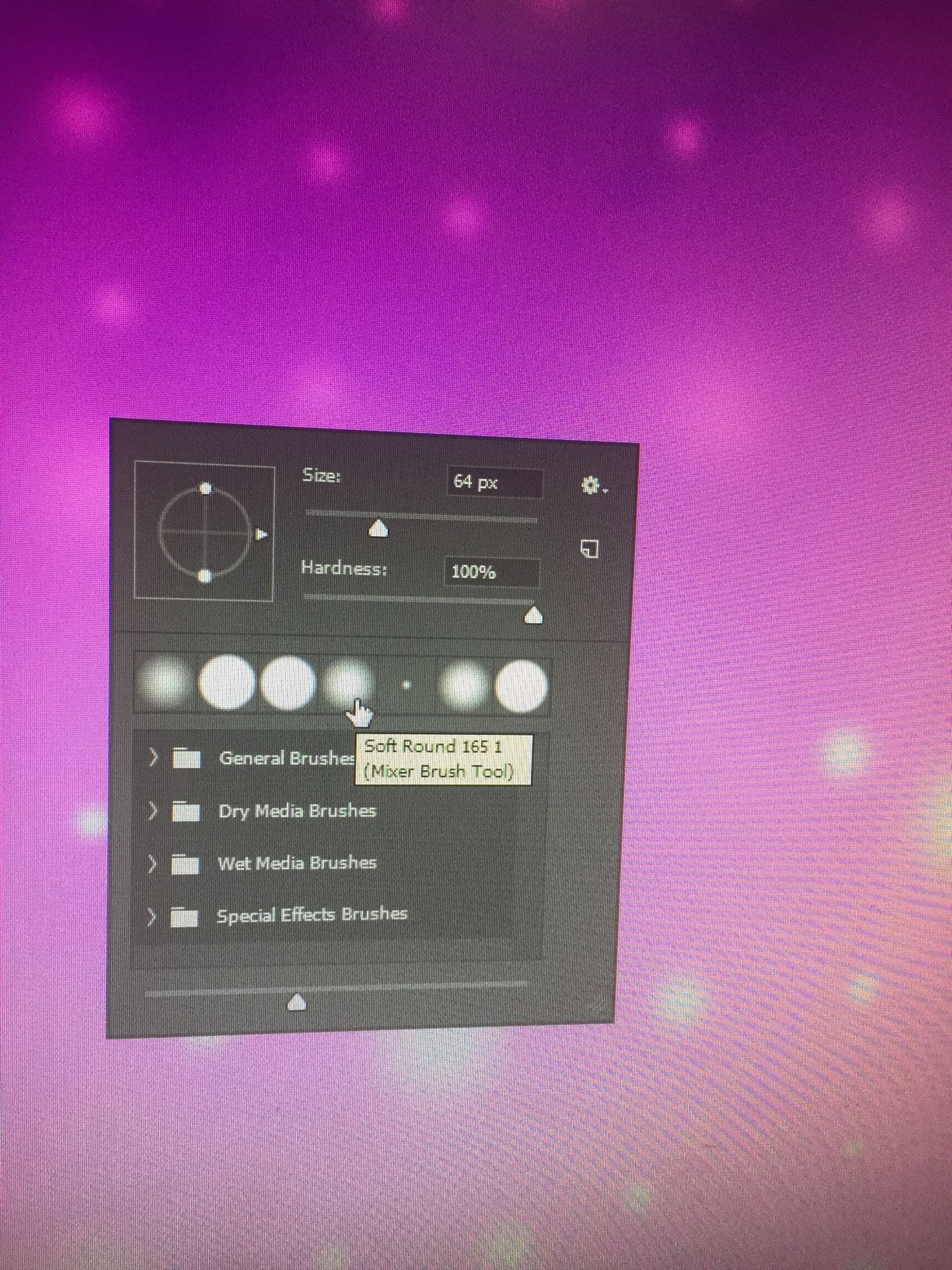
After this, I used a soft round tool to create the star effect. I used white and pink to create them. I believe this adds interest so it’s not a plain background. I changed the size of the circle tool and made it the soft tool as the original one looked too harsh on the eyes.
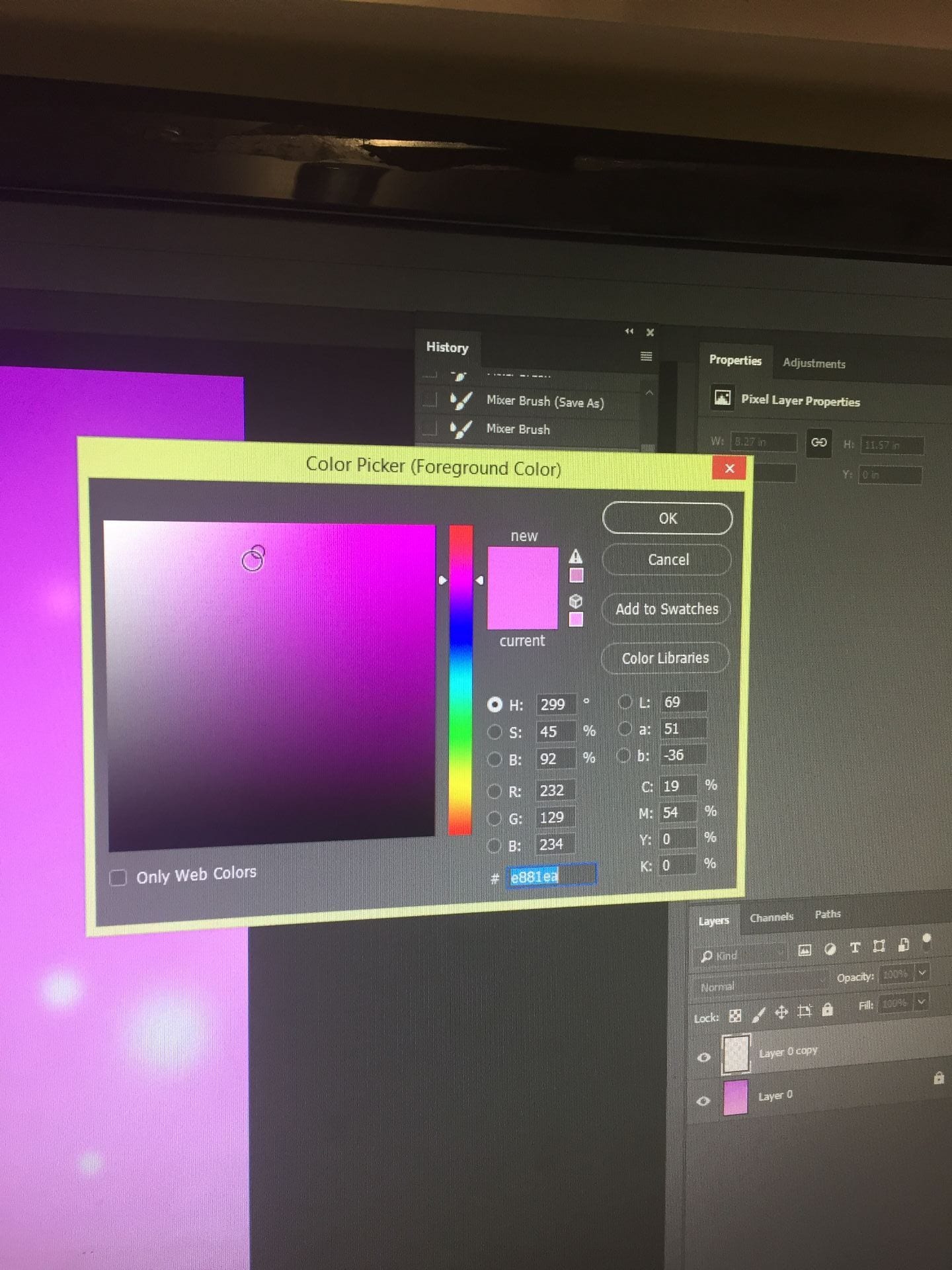
I chose the pink and purple colours as it fits my concept. I believe it makes the model look girly and cute. This also suits my audience’s demographics as the age range is around teenagers. The pink and purple also match with my model’s star image. My model is wearing lighter, pastel pink so the colours don’t blend together.
A New Improved Double Page Spread

This is my new and updated draft of my double page spread. I have included more components to make my magazine look effective. Before, I didn’t have a headline and even columns which I have now included. I have also added a drop capital to show where the article starts. I prefer this version of my double page spread as it looks more professional than the other. I have also made my own background which I prefer as the colours are more warmer and softer.
Draft 3 – The Double Page Spread

This is my first draft of my double page spread. I like the colours I used as they suit my theme and music genre. It makes the model seem cute and lively. A double page spread should contain a body of text, a headline, an image, page numbers, columns and quotes. These factors make a double page spread effective and interesting to read.
Peer Feedback
There are a few media forms present, such as a stand first, page number and column text. However I feel that the column text is rather inconsistent as the boxes are all different widths, making it look a bit messy. Furthermore there is not a byline, a headline, or any drop capitals, so they could be included in a further draft. The staple line has been slightly considered as the page is split into two parts, however the title and the stand first may get cut off. The image seems fun and intriguing which may make a reader stop to look at this article.
Targets for improvements
- Flip the image and put her on the left – tempt the reader to read on
- Columns should be a more even width
- Two page numbers
- Byline – who wrote it
- Name of the photographer
- Drop capital
- Stand first should be nearer the copy and instead have a catchy headline
- Paragraphs in the text columns
Design Skills 1
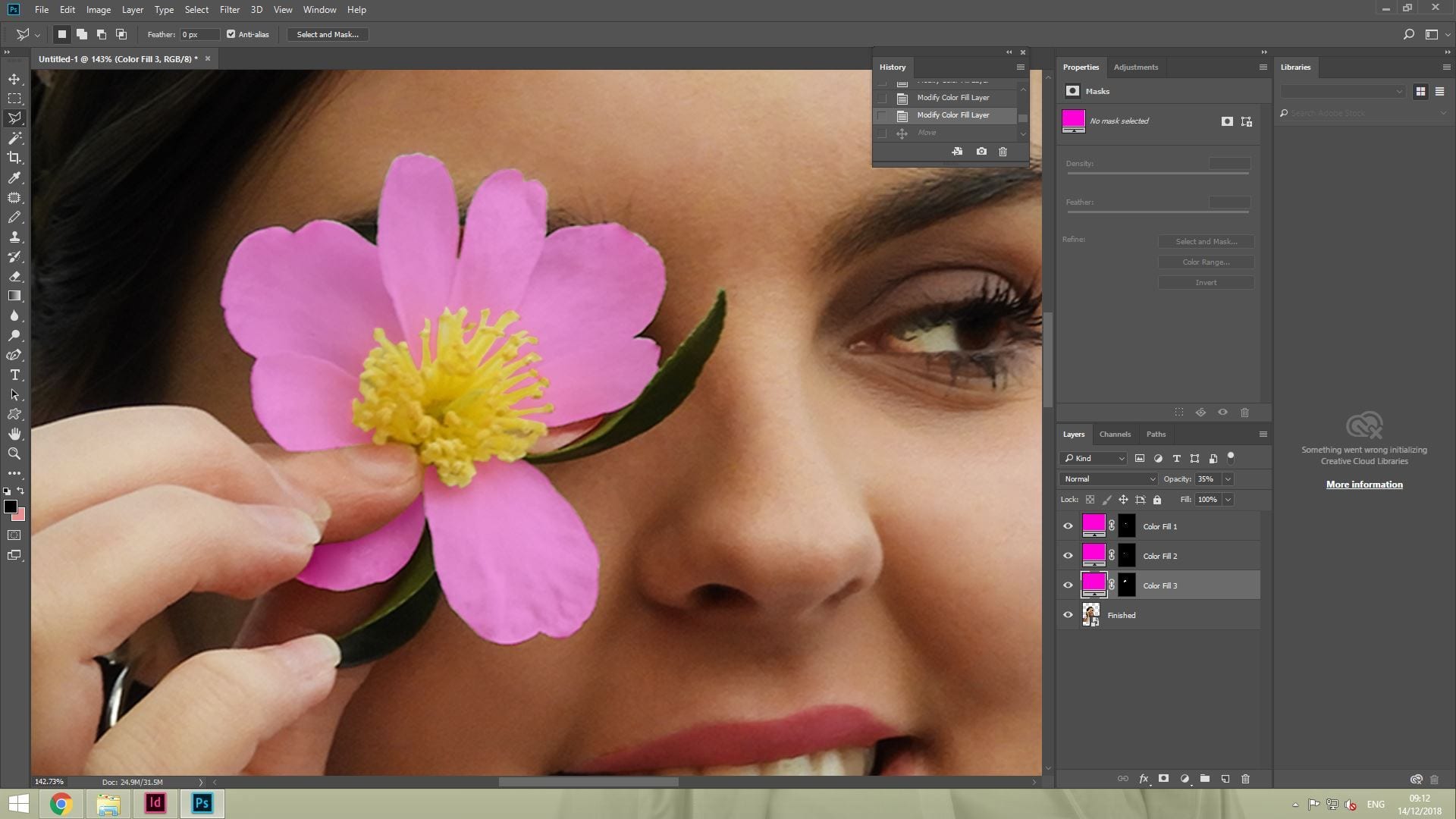
First, I cut out the flower using the polygonal tool to create an outline. I then selected solid colour and changed the blending options to make it more transparent. By doing this, it made the image ‘pop’ with colour and create a lively vibe. I did this as it was plain and white which didn’t suit my genre.

Then, I cut the flower out using the polygonal tool to place around the star. This would portray their star image to be cute and friendly. I changed this in the end as I didn’t like the look of it as it blended with her shirt which is also white.

Finally, I lightened her skin colour as that is a main factor in the style of Kpop. They believe porcelain skin shows them to be young and trendy. I did this by using the dodge tool and making the size big enough to cover the image. This makes the brightening even and not dotty.
A New Improved Contents Page

This is my final draft of my contents page. I changed this draft a lot as I didn’t like the other draft I had made. I removed the inserts and only put one image of a star using the correct mise-en-scene to cover the page which I put behind a quote. As there was a big gap at the top, I filled it with an editors comment to introduce what is in the magazine. I also changed the table of contents as I believe this is more appealing.
Draft 2 – The Contents Page

This is my first draft of my music magazine. I like the use of the text boxes I used and the hearts I put on the big image. I also like the range of colours I used as it makes it more bright. I believe I can make this better as it looks quite plain and won’t catch people’s attention. A contents page should include a title, headline grabbers, page numbers and images which intrigue an audience.
Peer Feedback
I believe the contents page works well and in tandem with the front cover as the general colours used are consistent as well as the fonts. These colours and fonts also are bright and colourful which matches the genre of Kpop, giving the magazine a fun feel to it. The stars on the contents page add onto this fun feeling with their bright flower crowns and happy facial expressions. Conventional features of this contents page are the page numbers, insets, the title of the page and fun symbols.
To improve for a second draft, cover lines could be added to tempt the audience to read stories inside the magazine and maybe some information on the insets relating to these cover lines. Additionally the white writing on the pink background is rather difficult to read so could be bolder/ bigger or in a different colour.
Targets for development
- Make the flower lady the main photo and give it more colour to pop
- White on pink writing is a little unclear, make it a bit darker
- Page numbers
- Make more of the hand drawn doodles
- Use the logo masthead as a plug at the bottom
Second Shoot Contact Sheets


I found taking the photos difficult as the lighting was dull. I tried to combat this with turning the flash on however it also wasn’t right for my genre. The mise-en-scene of my models turned out to be successful as they looked cute and bubbly through the use of their flowery headbands and their light, pink makeup. By using those items, I believe it conveyed the Kpop genre very well. I tried to tell a narrative through the images of them having a fun, party vibe.
Risk Assessment

We need a risk assessment to ensure our safety. This sheet provides our location, people who we will be with at certain times and the risks. I will need to be careful during my shoot as I am not going to be in school the whole day.
Production Meeting Agenda for Second Photo Shoot
This is my production meeting agenda. It tells me who is bringing what to the photo shoot. I aim to have high key lighting to present my characters as lively and bubbly. The models will have similar clothing as kpop groups are always coordinated. The models will have light makeup as I will edit them in photo shop. I would like to bring a tripod for my photo shoot as it makes my images less blurry and more stable.