Second Shoot Contact Sheets

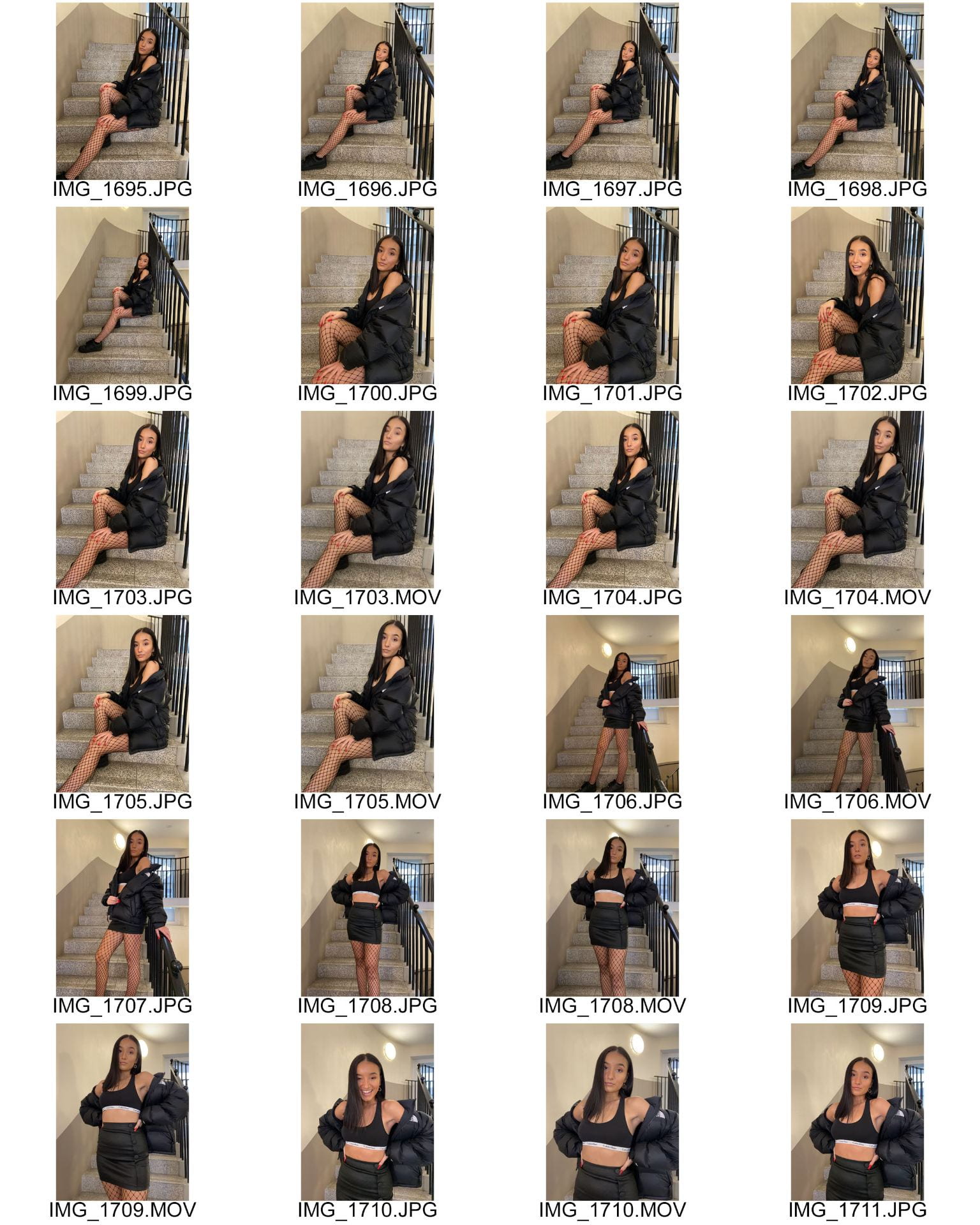
Below are the contact sheets for my second shoot…

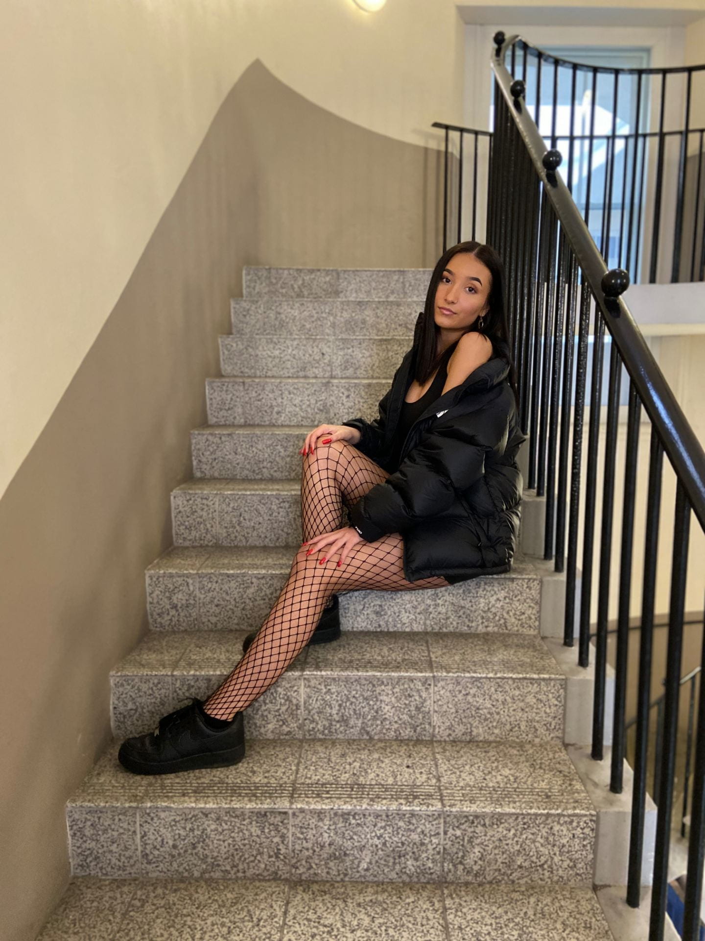
I feel that my shoot went well due to the fact I got clear photos with no blurry ones, I’ve included mise-en-scene as I have thought about the lighting, makeup, hair and clothing typically worn within my genre. I tested out a couple photos of my model sitting down on the stairs in a casual position, and I really liked them so I then decided to continue photographing in the same place but differing between the angles and distance of the camera.

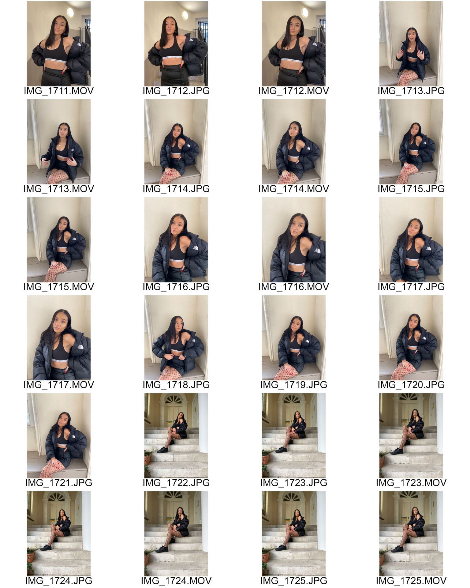
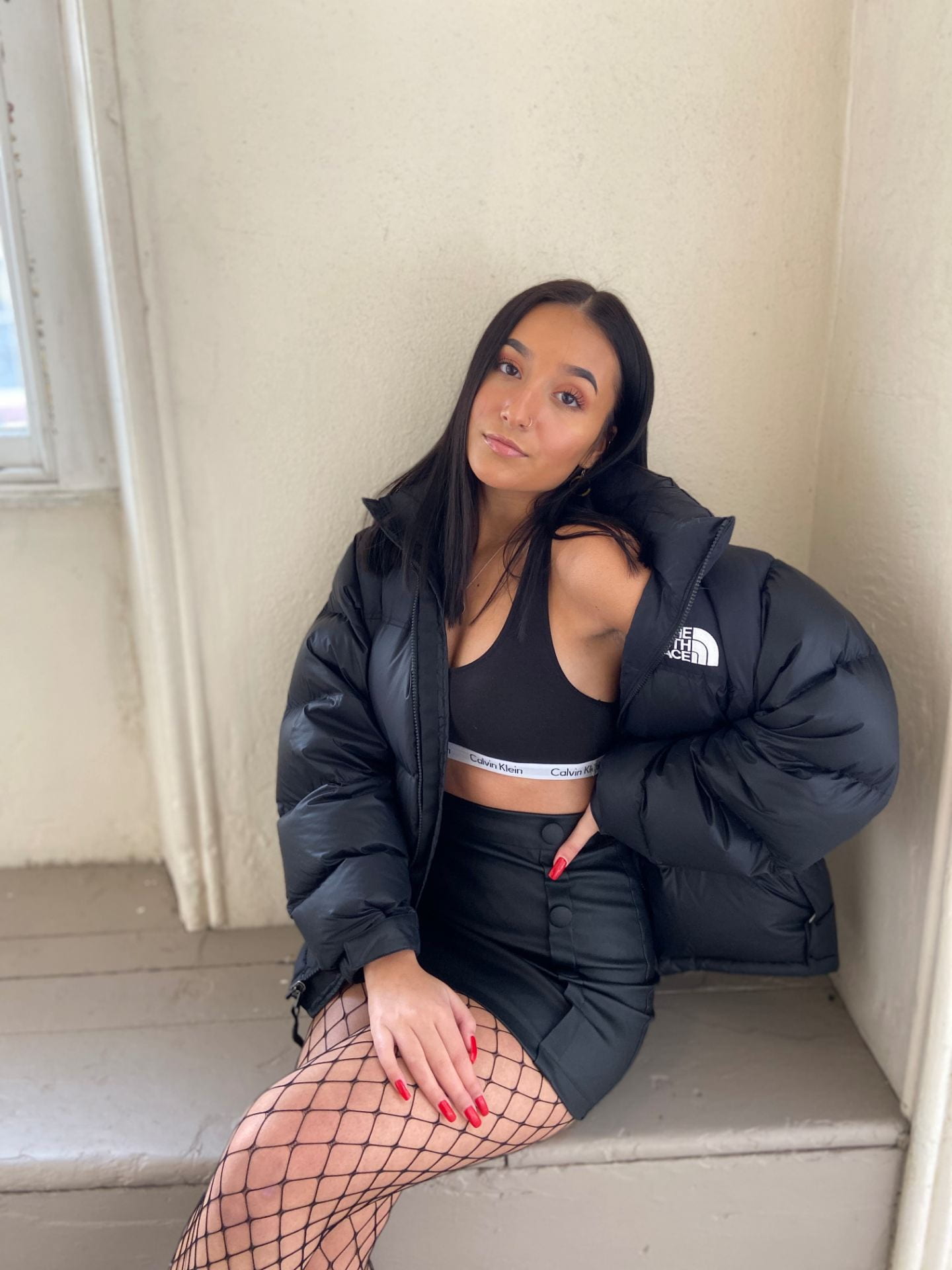
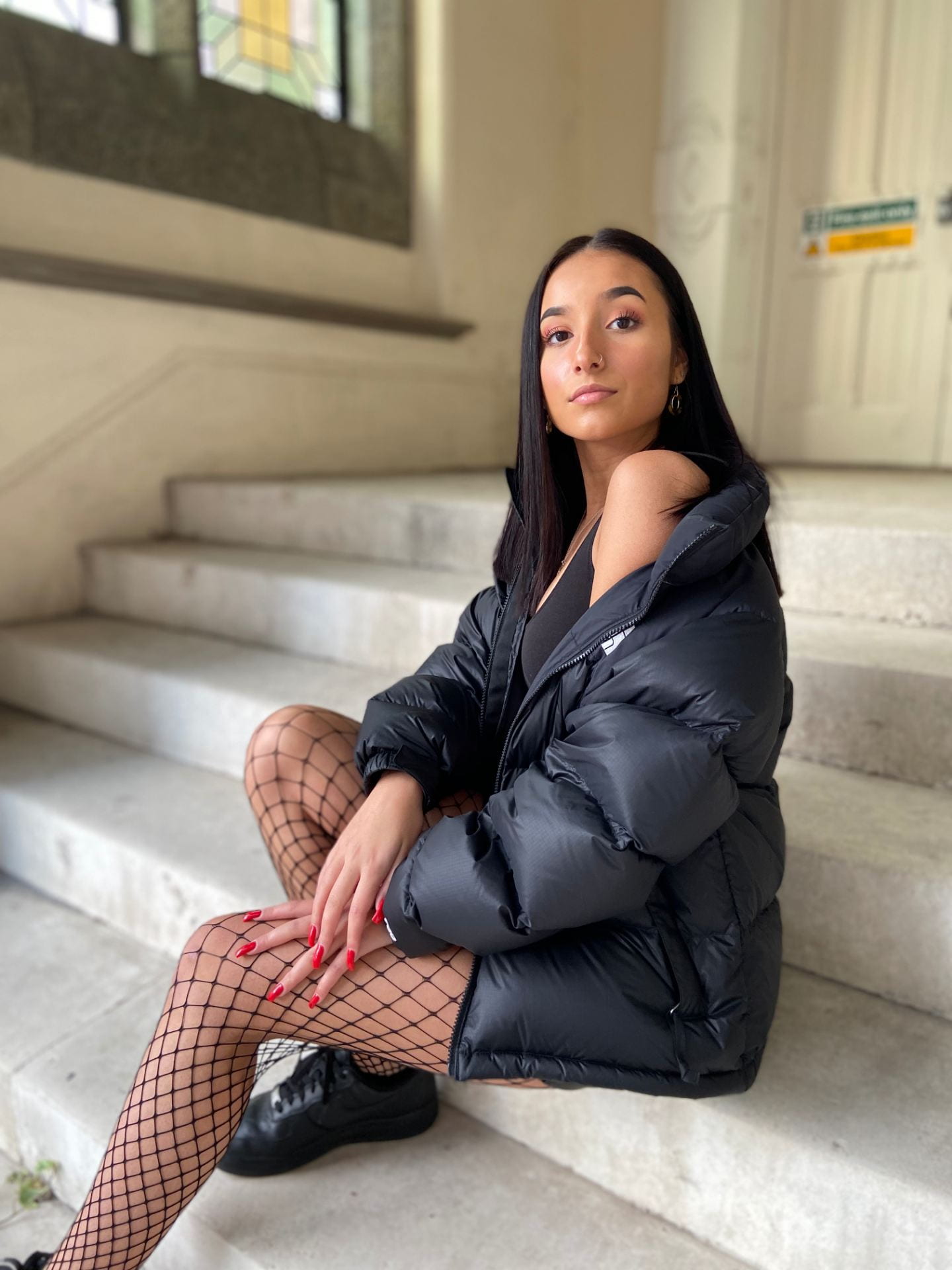
Below are three of my favourite images I took. I really like these specific images as I believe they all portray a rap/hip hop vibe, which is the style I’m aiming for. I prefer the first image I’ve chosen as you can see the whole model and all of her outfit, as in the other two photos you can’t see the full notion of the image. Overall I think these are the best images from my shoot.

Draft of The Double Page Spread

This is my first draft of my DPS

My magazine double page spread includes a bold and eye-catching heading, to entice the audience to read the article. I have added an image of the model on the right hand side of the double page spread, I then decided to text wrap the article to fit around the shape of the image, I’ve also separated the article into 3 columns. I have used a quote above the model giving my double page spread a more personal and intimate feel for the audience. The colour scheme is quite dark and it blends with the models outfit creating a dull DPS, I’m thinking of brightening it up with more red and white.


Mast Head Designs

Masthead Designs

These are some possible masthead designs for the front cover of my magazine. My favourite font is the third and fourth, I tired out a few different colours on the fonts to test which I liked best but I’ve decided that the typeface colour would vary depending on the colours and tones of the rest of my magazine. I like the third font as it is bold and easy to read, it’s slightly in your face which makes a statement, and that’s what I’m looking for within my magazine. I think it represents rap/hip hop as being bold and adventurous. I also like the fourth font as it is quite different yet I get rap vibes from it, even though it’s slightly unusual and unique with its style. If I was to use typeface three, I think adding a subtle design would make a big difference, for example adding drop shadow, stroke or texture etc.


Production Meeting Agenda for 1st Photo Shoot

This is my PMA for my first photo shoot. I have shown all the necessary information below which consists of the date of my shoot, where my shoot is taking place and the equipment needed to complete my shoot. I have also included the model’s name, the hair and makeup needed and the type of clothes she will be wearing. I have shown how I will direct my model to pose as the poses need to be typical of genre in order to work well. I have shown what props I need to use whilst shooting too.


Draft of Front Page

First Magazine Draft

Assessment

I am happy with my first draft as I have never done anything like this before, and I believe this is a successful first attempt at a front cover. Aspects I consider went well…

  • The size of my masthead is large and bold.
  • Cover lines font and size is clear and easy to read.
  • The vibrant yellow goes well against the dark background (although I don’t like  of the red tone).
  • The models pose and outfit portrays the effect I was aiming for.

Peer assessment

Feedback on what cloud I improve…

  • Change masthead typeface to a more legible style.
  • Enlarge the cover star image.
  • Replace background colour to complement other cover line colours.
  • Work on the photoshopping to get a cleaner cut line.

After looking over the feedback I was given by my peers, I’ve created a few targets for myself. Make my star image bigger; choose a different font for my masthead; edit magazine colours to compliment each other and finally build up my editing skills to get a clean cut image. When enlarging the star image, I think it would be ideal to crop it from the waist upwards to celebrate the face. Also when changing my colour scheme I think it’ll be best to stick with primary colours + black and white to strengthen the look of my front cover.

Star Image – theirs and mine

A star image is the appearance associated with a certain celebrity. It is important that a celebrity has a star image to portray themselves in a specific way, this also help to attract a particular audience type.

Below I have created a Prezi, it’s a Meta Narrative of Drake as he is a famous rap/hip hop artist. My Prezi includes content such as what style of music he produces (up-beat/fast/playful); how he performs (energetic/hyped); how he presents himself (fashionable/laid back); what kind of magazines follow him (GQ, billboard, Vibe); and how he uses social media (social interaction/entertainment/connects with fans).

After making the Prezi it helped me to create a mood board focusing on the rap and hip hop genre, to build my own star image for my music magazine. I have inserted images of what I would like my star image to look like for example, hair, makeup, jewellery, outfits and other accessories.

This mood board will help me to create a successful star image for my magazine to represent rap/hip hop. I will also have to think about Mise-en-scene when shooting my star image to accurately capture the sense of my genre through the image.

Communicating my Brand

My Pinterest Mood Board

Above is a screenshot of my pinterest mood board, to see the full board click on the ‘My Pinterest Mood Board’ link.

I created a mood board based on rap/hip hop to help me gather ideas for my music magazine. I included popular artists connected to the genre and the kind of outfits they wear within music videos and photoshoots.  I also added some fonts + a colour theme of what I imagine my magazine to appear like, I did this to make sure the colours blend well together before editing my cover with this palette choice. There’s a few rap and hip hop magazine covers in my mood board to inspire my own, it also contains some album art from the genre.

This research has allowed me to understand the style of rap and hip hop, therefore I believe I can create a successful music magazine with the information I have gathered through my mood board.

My Audience Profile

Below I have created an audience profile, which fits the type of audience that listens to rap/hip hop music. After creating this it helped me to make a dating profile for a male who would listen to my genre of music. My research found that the majority of people who listen to rap/hip hop are teens and young adults, 16-30. This may be down to the mature lyrics and fast beat, also most music videos related to rap and hip hop include people around the ages of 18-30 which may influence the listeners.

I used yougov as well as my own research to find out rap/hip hop artists such as Cardi B, A$AP Rocky, Drake and Kendrick Lamar. Yougov also showed me what other things their fans have liked and what they are interested in, also other artists they listen to related to rap and hip hop.

Within my dating profile I deliberately decided to add in an unconventional feature, the pomeranian. I though I would keep it up to date and with the times, by using a not so typical stereotype. The dog is meant to be a bold statement to rap/hip hop, showing that stereotyping is very out of date and the idea of having a more feminine/cute dog does not affect ones image of themselves or the genre of music they should listen to.

The Reception Theory by Stuart Hall will help me to think about the uses and gratifications, when audiences decode text in one of these ways:

  • Dominant or Preferred Reading
  • Oppositional Reading
  • Negotiated Reading

I will keep this theory in mind when creating my music magazine so that I can relate my media to the audience and achieve the content they wish to consume.


Branding Ideas + Mission Statement

My Music Magazine name and about it…

I am going to call my music magazine ‘DAZE.’ I decided this name would be good as it is short and sharp, also I would like for my audience to be dazed by my magazine content and the genre of music within it, therefore I though this would be a fitting name.

I have chosen the genre Rap/Hip Hop.

I listen to rap and hip hop often so I thought it would be a good music genre for me to focus on in my magazine. I enjoy listening to rap/hip hop as I like the fast beat and base of the music with the fast rhyming lyrics that blend well with the up-beat tones. I think presenting a model and photoshoot in the style of this genre won’t be difficult as I believe I’ve got enough knowledge on rap/hip hop to convey it through an image.

Word Cloud…

Here is a word cloud I have made full of words that I believe connect to the rap and hip hop genre. For example I used words like energetic, fast, bold, expressive and unique as they all link to the music genre.

Mission Statement…

DAZE. is the biggest rap/hip hop magazine in the world, it’s filled to the brim with the latest up-coming rap/hip hop artist; news on celebrities; information about celebrity lifestyle; and the hottest rap/hip hop gossip. DAZE. is always packed with the best info on rap/hip hop right now, they also have the best images of celebrities on their covers, which makes me buy it every month. This magazine will bring the community together with its up to date trends and features, drawing in the audience and making them want more. You can’t miss this magazine with its bright text and bold images! It’s made only for the best of audiences, it exclusively contains rap/hip hop royalty. If you’re featured in DAZE. you should be proud, you mean something.

A Front Cover Analysed

Below is a MOJO music magazine cover that I have analysed, I looked into the audience demographics/psychographics, mission statement and how they’ve made it an appealing front cover by using…

  • Images
  • Language
  • Font
  • Colour pallet

This magazine has a very confident aura, considering themselves the best magazine with only the best content. I have learnt that all elements are important when creating a magazine cover to entice the audience, even the small details like font, colour pallet and plugs. For example, if you have a magazine with a dull grey colour pallet not as many people would buy it, yet if colours where bold and vibrant people would be attracted to they eye catching features.

Skip to toolbar