October
8
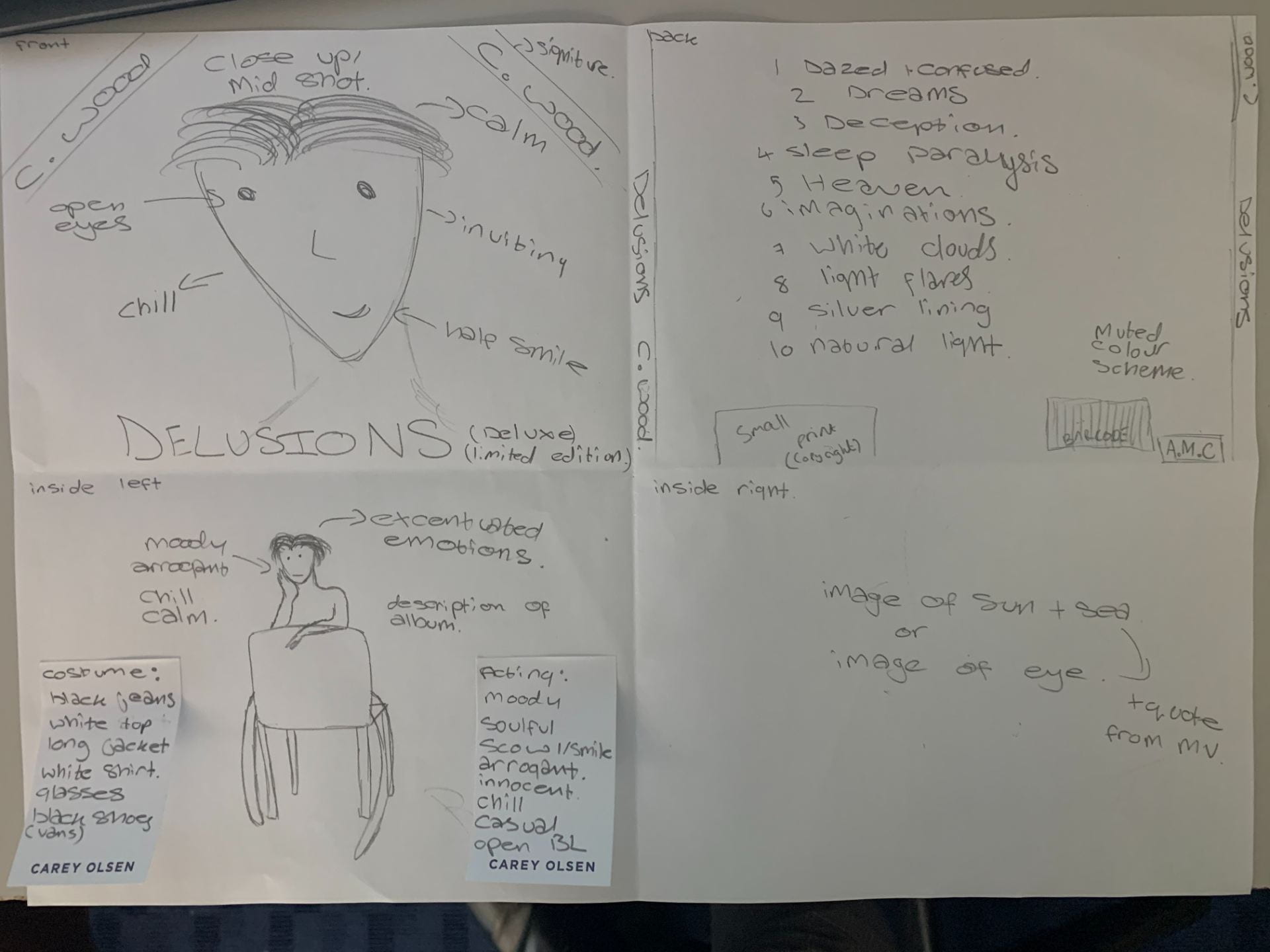
Hand drawn mock up
Reflection
The conventions seen in our digipak will be similar but unique from other albums like the artist we have chosen, the designs of this digipak will help to encode the star image to the audience along with the meta narrative of the performer. Some aspects of what is included in our digipak include:
- a typewriter font and a more handwritten effect font to give it personalisation
- the colours of this album will be muted and soft to reflect the star image
- our design will include a close up shot and long shot with a chair for a simple star image
- use of graphics will further show his simple star image and soulfulness to the audience
- framing of the artist will show his soulful star image and casual attitudes
- close up images and long shots will imply simplicity and connection
- font colours will be either black or white to keep it simple and straight forward
- we will include a company name that we have created and a small print
- Some variety of shots, full body, mid shots, as well as shots that aren’t looking straight into the camera
- More tranquil, give a reflective feel the didipack maybe have model look downwards
Aim
From designing our digipak mock up we have decided that our aim will be to portray a calm, muted and soulful star image to the target audience, it will really highlight the connection the artist has to the audience as a young teenage artist. Our shots will be simple but effective to reflect the music the artist creates, everything in the digipak will be straight forward and simple to show the star image of the artist to be casual.