February
3


February
3
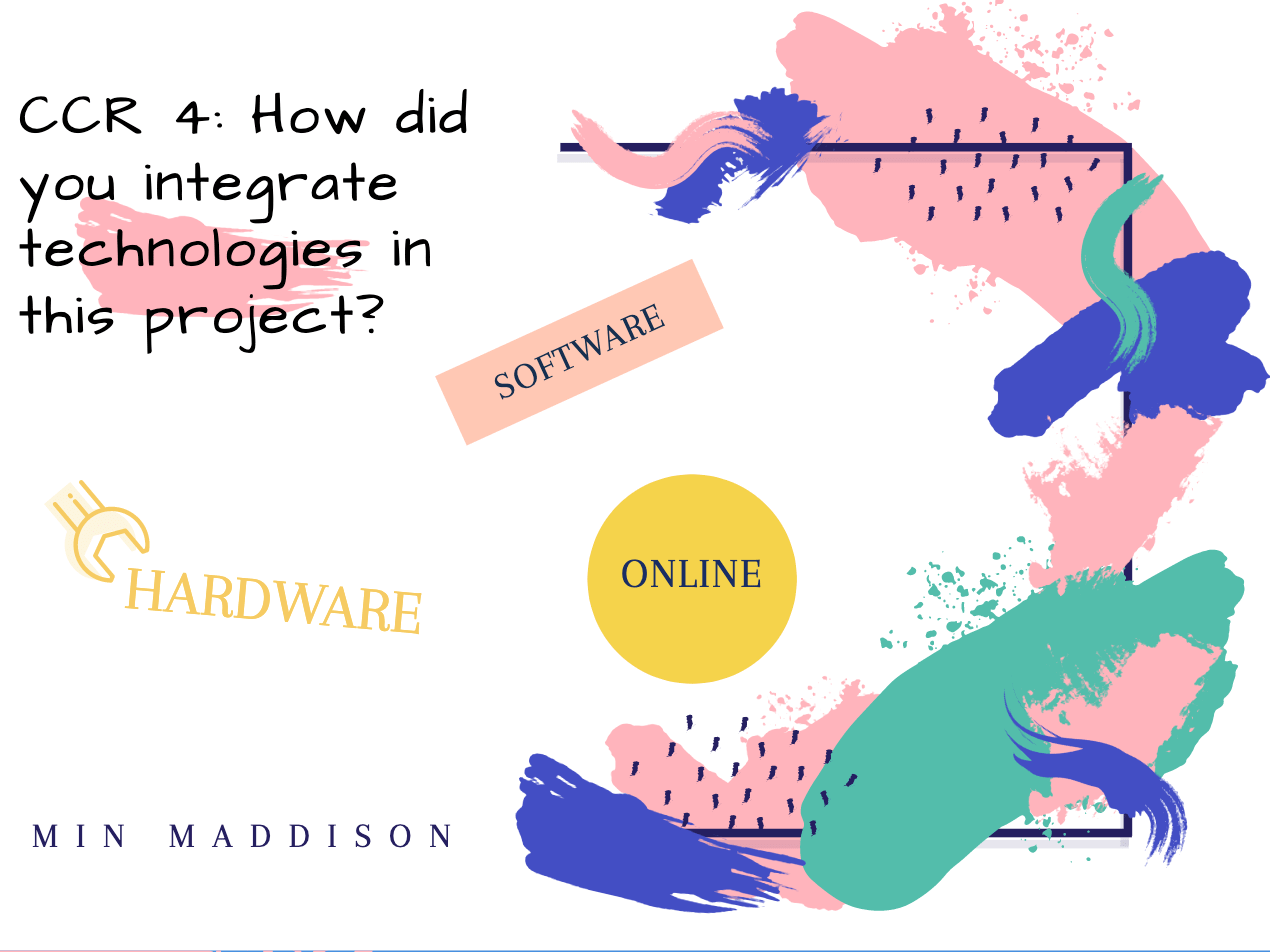
Question 3: So… How did your production skills develop throughout this project?
My Letter
This is my letter to all future A level media students that outlines the different skills in the course and how they will have effects for jobs and interests, this letter is then illustrated with my opinions and experiences to give the students a wider view on the course and the project of designing a magazine.
February
3
Question 2: So… How does your product engage with audiences and how would it bedistributed as a real media text?
February
3
Question 1: So… How does your product use or challenge conventionsand how does it represent social groups or issues?

January
16
So… How is it going?
What skills have I learned?
From designing my own magazine including a front cover a contents page and a double-page spread I have learned a wide range of skills and knowledge about what makes media effective for different audiences and readers. Every aspect that goes into a design on a page has an impact on how that page is presented to an audience, the colours, fonts, and style of the page can alter people’s opinions. From doing photoshoots I have been able to understand the vitality of mise en scene in media and how it uses synergy to join with camera angles and shots to create the perfectly produced image.
From the cover page, I have learned that star image and fonts have power over audiences as the way models are posed and placed signifies something to the audience, maybe it is an emotion of aura. The fonts hold effect as they can change the way audiences read the words on the page and can also cause certain reactions.
Furthermore, from designing a double-page spread I have gained knowledge on how to layout an effective and powerful article to make it appear to the audience in a specific light. From being taught how articles gain their effect and attention from design I created my pages so that they immediately looked exciting to readers, therefore, being successful in the media.
Finally, from creating a content page I have realized how important the layout of contents pages are and where they are located in the magazine. They are the pages that tell readers what is coming up in the magazine so if they are not effective the reader is not going to want to continue reading on, the captions and names of the articles have to be bold and bright to grab readers’ attention and draw them into wanting the read that article.
What went well?
From this magazine, I have learned about many aspects and effectiveness needed to create a perfect cover, double-page spread, and contents page. Whilst each page has it’s own uniqueness they all come together as they are the same genre and have the same aim, the layout of the pages change depending on the page so that the magazine looks exciting and inviting.
- The colour schemes are effective for each page
- The fonts are not too overwhelming
- The star image relates to K pop from the mise en scene
- The genre of K pop is radiated through each page
- The format of the images in the pages are powerful
- The magazine does pull you in to read the contents
Even better if?
- I planned my pages in advance
- I did not get as stressed with designing
- I experimented with effects in both photoshop and InDesign
January
16
Design Skills 2
Design skills
From completing my double page spread and contents page I have learned more from both InDesign and photoshop, they have given me the effects and achievements I aimed for when creating all three pages for my magazine. I now have a larger range of knowledge when it comes to design skills and production techniques when doing the photoshoots and planning for my design of the pages.
What have I learned?
Whilst doing these pages for my magazine I mostly used InDesign as the design of the pages took place there and only the editing of the double-page spread photo and background for the contents page was done in photoshop.
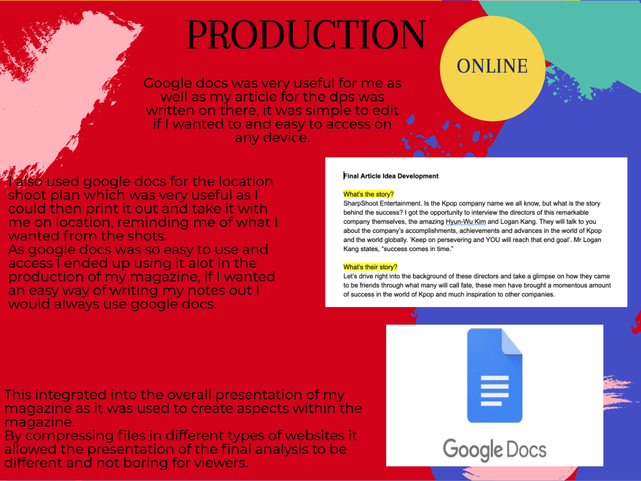
For the double-page spread, I have learned about the affective aspects of an article that make it so effective, including the writing style and layout. Many articles have a drop capital which I have included in mine, the photos in articles are usually placed on the right side of the page as that is what readers first see when they move onto that page, it allows the article to pull the reader into reading it from looking at the photo. However, as my photo is a landscape image I decided that the perfect place for it to be would be in the centre of the two pages with both models on either side of the page, this layout for my double page spread is very effective as it draws readers in. I have also learned that articles do not need to fit onto one or two pages and can go onto the next page which is what I have done as my article was too long to fit onto the double-page spread.
For my contents page, I have learned that everything that goes into a content page has an effect on what the reader may think of the magazine as it is normally the second or third page into the magazine. Similar to other magazines I have mirrored the colours of blue and purple from the cover page in my contents page to create a strong link to the cover, the KSTORM magazine name is also located in the top right-hand corner of the contents page to remind audiences that they are reading. My first draft of the contents page was not very exciting so for my seconds draft I changed the numbers and fonts along with the image to bring more fun to the page, making sure that it shouted out to teenage girls which is my specific demographic.
I know how vital it is for content page article names to be catchy and inviting, short and sharp so that audiences feel excited to read them. People tend to like numbers in captions as it shows how the article is straight forward, language technique is important in captions as they can help make them flow and have colour in the words.
What went well?
In my opinion, I think that the design of the contents page has been more successful than the double-page spread as the colour is more dramatic and looks much more inviting. The article captions are effective and each stands out to readers which is what I aimed for, the image of KDREAM is bold and powerful, it holds sophistication and excitement for readers inviting them to continue reading the magazine.
However, I do not think that I was originally very pleased with my double page spread as there was too much going on, I did manage to resolve that issue as removed some of the article and focused on making the words and images look exciting for readers. I really like my article for the double-page spread and think that it truly calls out to young girls and is very interesting by focusing on the world behind K pop, I am happy with how I have placed the SharpShoot logo within the double-page spread as it clearly shows who the article is about. I changed the colours of the background colour of the article from completely black to red and black as it relates to the colours of SharpShoot, the pages are powerful and strong and have resulted in success.
Even better if?
I think that these pages in my magazine could have gone better if I had pre-designed ideas or thought of them before going into InDesign and creating something where I did not completely know what I was going to do or how it was going to turn out. My article for the double-page spread should have been shorter as I would have liked to have it on both pages and not going onto the next page, I would have preferred to have an image that fit onto one side of the page in the article so I could have played with the design more to make it more effective but the image I have does look effective in the centre of the page surrounded by the article.
My content page could be better if I perhaps had some quotes from articles and links to social media but I did not have enough space on the contents page for that, but overall I am happy with my content page and think that is it successful for my magazine.
Impact
All the aspects that go into magazine pages indicate what genre it is from the star image to the narrative of the magazine and each article.
Aspects & impact
Mise en scene- Mise en scene is very important to portray the genre and magazine to the reader, how the model looks and is dressed will cause a specific reaction from the reader. Mise en scene includes aspects such as costume, makeup, setting, and hair, this helps to correctly convey a star image in the magazine.
Star image- Star image is vital to present an idea and genre, it is done through mise en scene and camera work.
Images- The layout and design of images will help to present ideas and emits different emotions from audiences depending on angles lighting and the models’ facial expression and mise en scene.
Camera angles- Camera angles help provide emotion to an image, through the angle, lighting, shutter speed of the camera and shot style lets ideas and narratives to be presented to audiences.
Page layouts- Page layouts invite readers to analyze the page and it’s contents if the page does not look appealing readers are much less likely to be interested in the article.
Colour scheme- The colours within a magazine adds to the genre and can portray an emotion as each colour symbolizes different emotions, for example, red is associated with love and passion whilst black relates to death and depression. Colours also help to portray the star image as the colour in the costume can tell the audience about the image and what it relates too.
Fonts- Fonts in magazines must be legible for all audiences and have to relate some way to the genre and magazine as a whole, too many changes in the font can be overwhelming for readers so it is best to stick to a few that occur in the pages.
Sizing- The sizes of images and fonts create differences in urgency and boldness within the pages of the magazine, this can help present the narrative of the images and magazine to readers.
Captions- Captions within the contents have to be powerful and bold so audiences are intrigued by reading the article simply from its name, readers like short sharp captions that often include numbers as they easy to read.
Genre- The genre of the magazine must be conveyed through the star image, mise en scene, and page design. It is important that the genre is shown through the pages as it reminds the reader what they are reading.
Narrative- The narrative of a magazine is a story that is presented by every idea and image, every story within the magazine must be interesting and speak out to the target audience.
Emotions- Emotions are mainly spoken through image and colour, if certain emotions are presented from the magazine the target readers will often radiate mirroring emotions and feel attracted to the magazine.
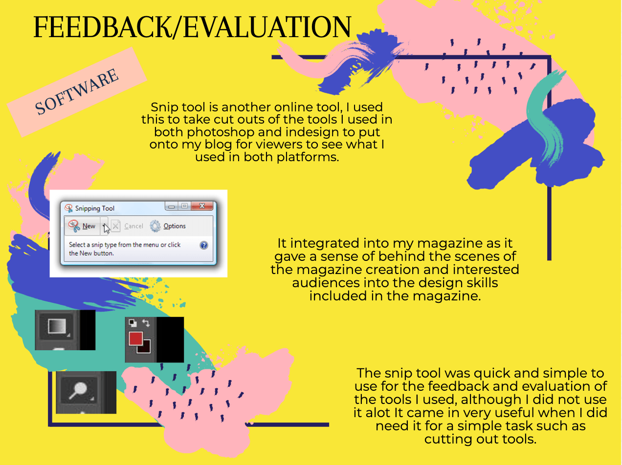
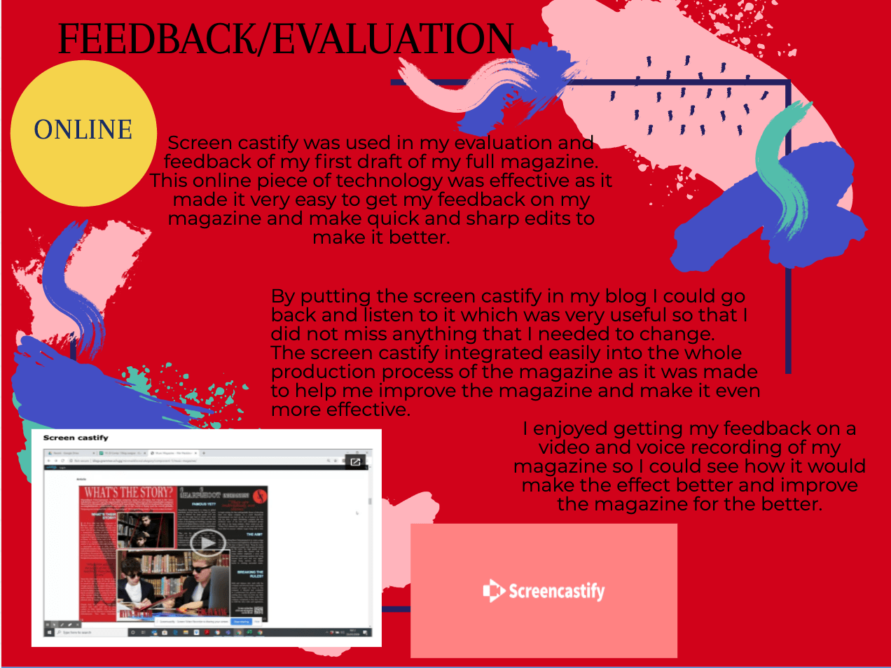
Screenshots
The gradient tool from Photoshop has helped me to create effective backgrounds for my magazine, giving colour and pop to the pages making them look more inviting. I have kept with the simple designs of the gradient tool but have experimented with the shapes and different length of gradients to give effects.

The colour changing tool form Photoshop has helped me pick the colours for this gradient allowing me a wide range of colours to speak to the audience and emit specific emotions.

The stoke tool from InDesign has enabled me to thicken the words on the pages of my magazines so that they stand out more and can have a border around them, giving a sense of boldness and power in my magazine.
Finally, the shadow tool from InDesign has allowed me to put drop shadows on words and images to make them appear 3D in the magazine, they are standing out to the audience as the words and images break that 4th wall. The effect helps the words to jump out at the target audience making them more intrigued and excited to read the magazine.

December
12
Design Skills 1
Design Skills
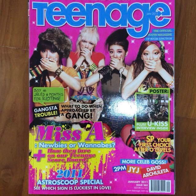
I have gained many skills from designing my front cover page in both Adobe InDesign and photoshop. With each aspect of the cover magazine, I have encoded meanings into the colour scheme, fonts and words on the cover page to draw my specific demographic into reading the KSTORM magazine.
What have I learned?
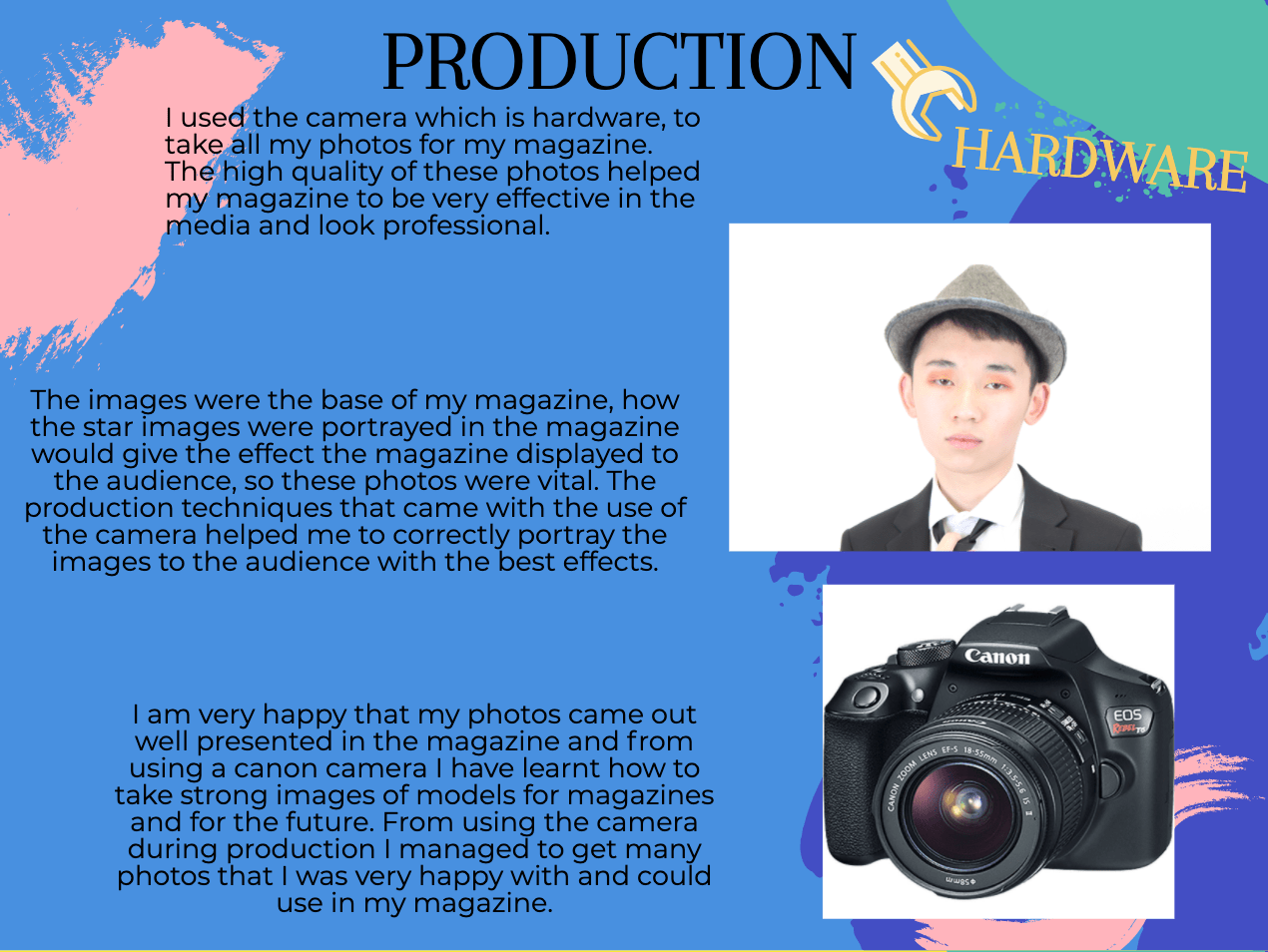
For taking my photos I have learned that to have lights in the photo room gives a brighter look to the photos and helps the camera lens to focus, the flash on the camera gives a very high-quality photo of the model or object as it zooms in on all the smaller aspects of that thing. Without the flash from the camera, the images result in having softer looks that are much less harsh than the ones with the use of flash.
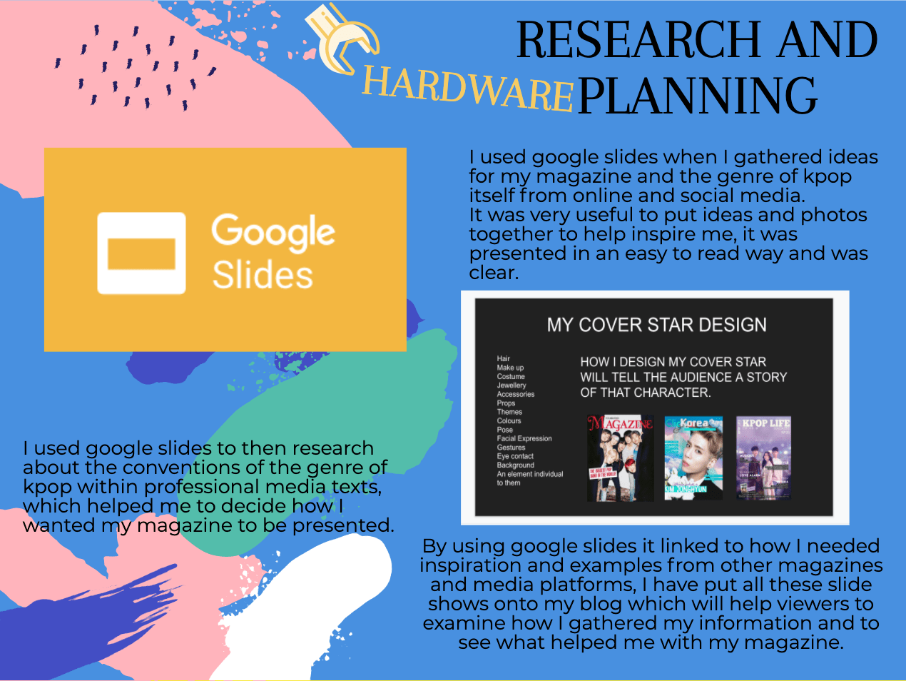
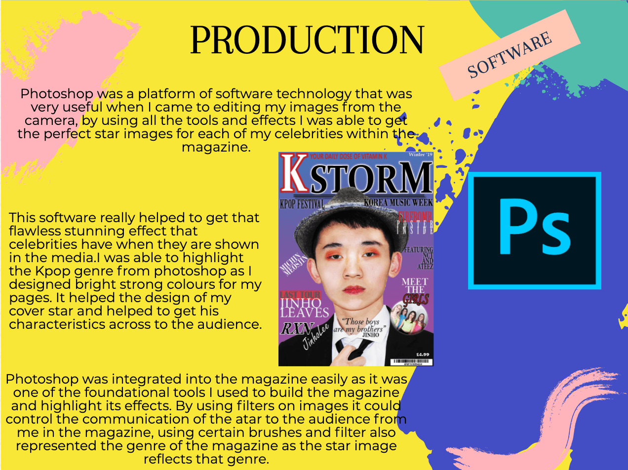
From photoshop I have learned a range of different techniques on how to make an image look better and sharper, I know how to edit and photoshop a model to make them look even more media-worthy for the public to see. For the editing of my cover star, I used the burn tool to darken some areas of the face to help define the jaw or neck so the sharpened areas of the face stood out more. I then used the dodge tool to lighten up any areas that looked to dark are portrayed the wrong message of that star to the audience, and give a lighter skin tone to make the model appear more Korean. One of the tools I used a lot was the spot healing brush to remove any spots from the model to make them look even more perfect for the front cover as idols are in the media. I can cut images out of their backgrounds by using the quick selection tool, to have them as single images to then place onto another background of my choice which I did for the cover that ended up being very effective and standing out, I can make these backgrounds in photoshop so that I have the correct colour scheme for the photos so that it can encode a message to the audience. This created a conventional neon aesthetic to the cover that Kpop normally conveys to the audience to make it look more exciting and inviting.
In Adobe InDesign, I used many types of fonts and colours to create effective titles and cover lines on the front page to interest audiences. I have learned how to make fonts and techniques in InDesign look as effective as possible, I also put in a plug of KDREAM in the corner of the cover and used the shaping in In Design change the shape of the photo to a circle so that it stood out more and looked more interesting as Kpop is very exciting and different from other genres. On this plug, I put an outer glow to further highlight it to audiences, I then snip tooled in a bar code for the magazine by creating one online InDesign has kept it looking clear and sharp. I have learned that less is more and not everything needs to stand as much as other aspects of the magazine.
In the future, I intend to use these techniques from both Photoshop and In Design for other projects to make images look better and cleaner. I think I have done well in using the online tools to help make my images better and more professional, I will improve my skills in the future to result in better-looking photos for my media.
What went well?
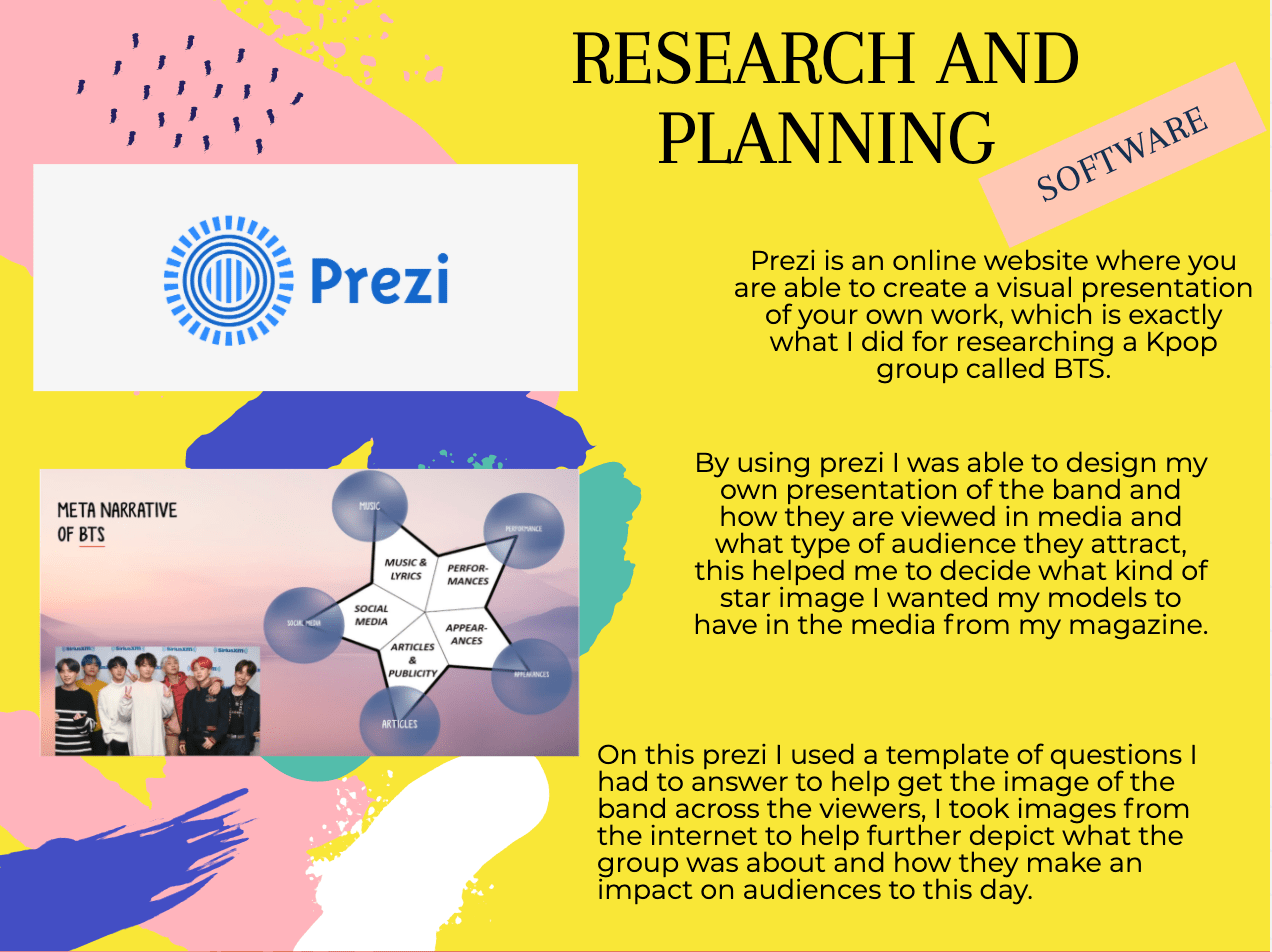
The photos I have taken so far have all been very successful and all convey a narrative and story to the audience, the angles and distances of the camera each give a certain amount of intensity to the models and narrative. For the single male model photos of Jinho, many of them were close up as I wanted him to be conveyed as slightly arrogant and intense to the audience so that the specific demographic, teen girls felt he was looking right at them. The group photos of the girl group KDREAM were mostly mid shots as I had to get the whole group into the shot, some were close up but I liked the ones with the front angle and mid-shot lens. This made the group appear very exciting to audiences and convey the narrative of something new and enticing, lastly, the two director shots were also mid shots and close-ups to show how important they are as directors and their significance in the kpop industry and to many of the idols and groups themselves. There were low angles within the shots to convey the dominance and power of these two men, but also some front angle shots to soften the narrative of them as I wanted them to be viewed as kind and mature to the audience.
In Photoshop, I first struggled with the many effects that were usable to my images but I quickly understood how everything worked and ended up professionally editing many photos for my magazine which were successful. I edited a lot on the cover star because it was such a close-up image it had to be perfect for the front page to interest the target audience, the plug of KDREAM did not need too much editing as the image was not as close up as the cover star image and due to the image is a small plug in the magazine. I intend to use more of KDREAM in the double-page spread of the directors to help tell the story to the audience, the images each tell effective stories themselves with the help of photoshop to help emphasize those stories to the readers and audience.
I was very successful In InDesign as I kept reinforcing the narrative of the magazine in all the fonts and colours. I kept the colour scheme simple in the cover so that there is a larger focus on the pugs and plugs and main cover star, the name of the magazine KSTORM is very effective as it is not too busy but stands out enough to be clear and noticed by audiences. The K of the KSTORM is slightly different from the rest of the name as I wanted it to stand out further so that is is the letter that sticks in whoever’s mind looks at the magazine, I decided to colour it white with some bright red strike to entice audiences in as red is a vibrant colour. The whole KSTORM has an outer glow that effectively stands out against the transitioning colours in the background that I made in Photoshop, giving fun and sophisticated looks to the magazine. I used a limited number of fonts on the cover of the magazine as it keeps the magazine simple for readers to look at and it is not overwhelming either. The magazine cover is busy but not overwhelming, I needed that balance to successfully create a magazine cover with the narrative that calls to young teen girls.
Even better if?
I need to work quickly when designing and editing my material for my content as the stories and narratives need to be clear in the image, I then need to experiment with more techniques on photoshop and InDesign to be able to perhaps result in a more effective piece.
Encoding in the cover
In every aspect of the magazine, I encoded a message into that specific aspect to help the audience of teen girls when reading this magazine. I wanted my magazine to be seen as professional and mature but also have the fun exciting touch that kpop has, It needed to be straight forward so that the audience gets what the want from the magazine images and cover.
In the name of the magazine KSTORM I wanted the excitement to be there immediately in the magazine so the letters are all in capitals to make it sound urgent and important, the storm in the name reflects on how the magazine is taking the world by storm and is very dangerous as you can become addicted to kpop fast, you must be aware of it. The danger of the KSTORM is what interests young girls as they want to be free and live on the edge as young teenagers reading the magazine. The red in the letter K gives more urgency and energy that the magazine wants to display, the font is straight forward and bold and very readable to anyone.
The fonts in the cover each portray different meanings to whatever story or event they are connected with, the colours of white black and red are all very contrasting showing how each story within the magazine is different and gives the audience different information about the world of kpop. These colours further stand out on the background of purple into blue giving it a bigger and brighter pop about the cover, the colours of the words and background contrast so nicely that they actually fit very well together to create a very impressive front cover.
This magazine needed to show the energy around kpop and what the genre of music is truly like, the sophistication and maturity in the magazine is displayed by the fonts and cover star whilst the danger of the addiction to kpop is seen through the colours. This magazine is a powerful portrayal of how compelling kpop is as a genre of music and how it really can take the world by storm.
Screenshots of tools
Photoshop
Quick selection tool to cut out the models and parts of the image i want and do not want.

Spot healing brush tool so that I could remove any blemishes from the models to give a cleaner image.

And finally, the dodge tool to lighten up areas in an image to make it look brighter.

InDesign
The text box tool to be able to add text and words to the magazine, and edit the words within the box.

The fx tool to add effects like outer glow and outer shadow to the words.

Finally the tool that I used to change the height of the words to make them look more effective in the magazine.

November
18
So… I am ready to photograph my star.
Mission statement: The magazine K STORM aims to express and convey the unique genre of K-pop and open audiences’ eyes to a world of the unknown in a positive manner. It strives to present new and exciting themes within K-pop and constantly produce high-quality media for a wide range of demographics.
Brand values
My brand values include the quality of the images and the content within the magazine as it has to call out to the audience and be as effective as it can be, my magazine will need to have the correct themes and colours to reach the correct demographic that my magazine is designed for therefore being conventional and relating to what the audience is used too. To reflect the theme and genre of k-pop in the magazine the mise en scene and colour palette will be vital to display the Korean style of music, my magazine will be high quality in both images and articles to grab audience attention and become popular in the market.
My magazine will need to have the visual effects and boldness that Korean media such as music videos is so well known for globally, and feature the articles that are so important in this type of media such as dating and mental health and what it’s like to be part of the k-pop industry and how truly intense it can be for rising stars. To make the brand value better and stronger I will add aspects such as quizzes and games in the magazine so that the audience has the chance to interact with the magazine, some fashion ideas included in the magazine will interest people more into the Korean style and new cultures and lifestyles.
Communicating ideas
I have learned many things from the camera and mise en scene from the past weeks of working on my music magazine, to communicate these ideas I will use specific colours and patterns in the mise en scene and use certain camera angles to portray a narrative and show different emotions in the cover stars. Combined together the mise en scene and camera angles are very effective for media and it is vital to have the aspects punctual and clean so that the right message is conveyed to the audience, my magazine will display the themes of young wild and free with a touch maturity and professionalism so that a wider audience gains interest in it through the communicated ideas.
Camera
By learning how to professionally use a camera to achieve high-quality images and knowing about the different camera angles as well as the lighting I will be able to get high-quality photos for my magazine so that it looks professional and well thought out. All the certain angles used in a shot display different feelings to the audience, whilst an extreme close up shot is intense and emits powerful feelings a mid-shot will soften that intensity and make the image look more inviting. The angle of the shot also matter as well as they give the cover star status in the narrative, In my own magazine photoshoot, I will use a wide range of camera angles and positions that give the audience different auras so that I can pick my favourite one that creates the right vibe for the magazine cover.
Mise en scene
The mise en scene is a large part of K-pop and is very vital in the media to portray the groups and idols in certain lights, the costume, lighting, acting, makeup and setting are all as equally important to show the audience what kind of celebrity they are. My stars are going to be displayed to the media in juxtaposing ways whether they are on the front cover or the contents page, this will give a broader shape to the magazine and interest people more in the world of k-pop. I want the difference of the unique genre to be viewed as positive in the magazine as audiences sometimes fear new things, but as my magazine will be conventional it should have that aspect of familiarity to reach out to audiences and demographics. In Korea, the makeup and hair and fashion are very different from the western world so I want to clearly display that difference through the mise en scene so my magazine really stands out in the market, every single facial expression and accessory onset will display a chosen narrative to an audience.
Star image and decoding
In all magazines including mine, the star image is vital to reflect the magazine genre and vibe it wants to display to the audience, the star image is how the cover star is portrayed through mise en scene and setting as slight differences will result in the portrayal of that star to be wrong or misleading to what the producer is actually trying to convey. These stars will need to have set characteristics to show to the audience, aspects such as being ordinary or extraordinary will need to be shown to the audience so that they recognise that this person is a celebrity, the stars will need to be shown as absent or present in the audiences lives with shows and tours that allow audiences to interact with the stars. Each star image is different whether it is a band or group or as individuals, every point of mise en scene is vital for the correct narrative of the magazine.
The audience has to be able to decode the articles and images in the magazine, so my magazine will need thee right use of language that reaches out to my specific psychographics in the audience. As a producer whatever I encode has to be able to bee decoded by the audience so that it interests them, decoding is seen in aspects such as colours, fronts, images and writing. If the target audience cannot decode the magazine contents then the product will not b very successful in the media so that is why it is very important to know your client.
October
21
So… I’m ready to make some media!
Introduction
When I come to make my own music magazine I will need to focus on the mise en scene, CLAMPS in the magazine cover and the AIDA, along with this the colour pallet and target audience will need to be considered to make this piece of media successful. The type of layout I decide on will be vital in this process as well as the font types as they will have to relate to the genre of magazine cover I create, the mise en scene includes aspects such as costume, lighting, and makeup. What I decide to do considering my models for the magazine cover will vary depending on the genre as there could be strong makeup or lighting or it could be minimalistic, the mise en scene for every piece of media is very important as it displays the theme to a certain demographic.
Camera Angles
The camera angles should also be taken into serious consideration as different camera angles can display juxtaposing emotions and reinforce certain attitudes the cover star has or what the magazine cover shows the audience. I need to be able to think in the mind of a professional producer and decide which angles will be the most effective for the genre of the magazine I am designing, whilst close up angles will give a sense of intimidation and midshot angle will be less intense. As a producer, I will have to decide on an effective camera angles so that my magazine cover can be as successful as it can be in the industry.
Mise En Scene
The mise en scene in my magazine cover will also be vital as I will need to have every aspect of this faultless to really accentuate my genre of music in the cover, through the uses of such aspects like costume, acting, and setting I will be able to convey the moods in the magazine and pass that onto the audience. The position of the cover star will be vital to this cover as well as the posture and angle they take on will add mood to the cover and present certain themes and ideas, their costume will tell a story about this cover star on my magazine front and show what genre they come from.
The lighting whether it be dark or light will express to the certain demographic how they should react to the cover, along with this the makeup and hair on the cover star will further portray a narrative in the cover, the hairs colour and style will show people what genre they come from and the makeup will reinforce how dramatic and loud the certain genre of music is, the makeup whether it be soft or bold to each show contrasting moods will affect the reaction from the audience. In addition, the props will be important to show the themes within the cover as each of them that is used will need to have a purpose on set, they will need to add to the narrative. Lastly, the setting will be major as it will show the audience where the scene is set giving the cover a full narrative and story, I will decide on whether I would prefer a background of scenery or a background of colours both solid colours or multiple colours.
Layout And Typography
The layout of the magazine is once again very important to catch the audiences attention as too much information on the front cover can overwhelm a person but too little can lead to them being uninterested, I will need to have the perfect balance of both negative and positive space on the magazine cover. Along with this information, I also know that I would like my cover to be conventional which means both different yet the same, I want my cover to be familiar to the audience and grab their attention as something new and exciting therefor inviting them in to purchase the magazine. Each caption, plug, and sections of information will have to be in their right position on my cover and the right sizes of importance to help grab and hold audience attention.
The typography of my magazine cover will have to be legible along with being bold and sharp to gain audience attraction, for the best results I will use minimal fonts but edit those fonts to make them appear more inviting and exciting to my demographic and psychographic to then get the best results from my magazine cover.
AIDA And B&K
The AIDA that is vital to be included in a magazine cover will need to be focused on as that is what makes people purchase a piece of media. I will first need to gain my audience’s attention through the magazine layout, they will be interested in the plugs and pugs of information I will have located on my cover. Hopefully, this audience will gain a desire to find out more about what is it the magazine and purchase a copy therefor making this successful media, however, they will need to know how to buy a copy of the magazine so I will need to put prices on the covers along with bar codes. B and K includes ideas, news, gossip, and fashion these points will help me to be more accurate with the genre of the magazine I am designing as it will give me more information on what is included in that certain genre of music.
Focusing forward
Focusing forward to designing this magazine cover I will take into account all I have learned in the past weeks to create a successful piece of media for a selected demographic, through the connected use of camera angles, mise en scene, and cover layout I will create a mood for the magazine cover and let it tell a story and have a narrative within it to make it exciting the audience and make them want to buy it. The information that I have learned in my media lessons will really help me design a magazine cover to the best quality I am capable of and interest audiences and the selected psychographic.
September
27
So… How can an image communicate meaning?
Introduction
In the media the use of camera aspects and mise en scene are used to convey a narrative and are used to represent individuals, groups of the public, events and many places. Every single part of a scene represents something and tells the audience a story, and therefore expresses emotions.
Within mise en scene there are six categories:
costume, lighting, acting/proxemics, make up/hair, props, and setting. This spells clamps that can be used to help remember the sections of mise en scene and to make sure you take into account each sector to help result in a powerful photo or piece of media.
Mise En Scene
All these parts can tell a character’s story or express a certain feeling to the audience, the setting of a photo would tell us of the person or object in that specific shot. All of the categories are interlinked to each other much like the media ecosystem, these parts are all as equally as important as the other and really help to put an image together to make it effective. Mise en scene can be clearly expressed in the tv series Downton Abbey, where the two classes of characters upper class and lower class are differentiated through the use of mise en scene. Whereas the upper-class characters wear suits and expensive dresses to state their importance, the lower class servants wear simple clothes with dark colours to show they have no power or significance juxtaposing the rich. The setting in Downton Abbey is in a mansion which displays the money the rich have and what they can afford, within the house the colours further convey the money and power. A red carpet flowing down the stairs represents royalty and shows the audience that these characters have importance, the many paintings presented in this mansion show that the money the upper class have has been passed down, it is old money.
The Camera
For the camera uses, framing and movement are very important to help further express the feeling the mise en scene is trying to portray. along with these two ways of analyzing the distance, angles and aperture are vital. Depending on angles a person in a photo can be viewed in juxtaposing ways, but as with mise en scene, how the audience views the person also relies on the distance and framing. The importance of camera framings in scenes is vital to produce a successful piece of work to show to a specific audience, in movies all the shots taken are analyzed so that they have a response that the producers wish for. In chicken run the shots taken display a powerful feeling to the audience there are long shots and close-ups, in one scene there is a point of view shot when a character is calculating the chickens. By using this type of shot it creates a sense of suspense as we see the chickens from that character’s point of view, it is ominous and we get to experience the chickens’ fear. Along with these camera angles the distances and focus on certain objects also add to the narrative, how the photo is set out is very important in media production.
Focusing forward
By knowing about mise en scene and the camera I will use my knowledge to professionally layout designs on what reaction I want from the audience. I know which angles and distances to use to get the most successful response, I now find it easier to be able to tell a story from a photo and have it convey a powerful narrative. I am looking forward to designing my own proper work with a better more experienced mind in the area of how to create effective media for certain demographics.