December
14


December
4
Critical Reflection Prep
Preparation table for essay
• How do your products represent social groups or issues?
• How do the elements of your production work together to create a sense of ‘branding’?
• How do your products engage with the audience?
• How did your research inform your products and the way they use or challenge conventions?

Click to see template
Critical Reflection Mindmaps
November
11
Social Media page Draft 1 self assessment
Feedback from teacher screencastify
Feedback
Nice image of badge for profile photo, delusions hashtag is powerful. Who the artist is following is good because they are similar, the link to music video does not work but overall profile is good. Driving the release date for the album, cross media convergence with snapchat pushing delusions. Continue to push the image to the audience, merch involves audience, make the link work to website.
Cross media convergence with capital FM, link in Roman Kemp to post, pushing the instagram live and charity for support. Getting the audience to interact with the artist so that it hopefully goes viral, giving the fans close ups to the photo shoot. Push the editing for the music video, thanks to editing team, finally the launch of the album make a link to where audience can purchase the album. Perhaps add a link to Spotify and Apple music, overall effective with synergy and cross media convergence all pushing the promotion of the album to the audience.
Targets:
- enable link to the music video
- link to the merch website
- link in Roman Kemp to the radio post
- push the editing for the music video
- add a link to Spotify
Improvements
Self reflection
I think that the overall presentation of our social media page is very effective towards a target audience as it really forwards the ideas of the star image, and pushes the important information. Throughout the posts uploaded onto the instagram page there is a constant reminder of the album release date and presence of the artist to the audience, I think that the layout and structure of posts is very effective to correctly promote the release of the new album “Delusions” to the audience, the elements of cross media convergence and synergy add to the strength of promotion on the artists account. The branding in the social media page is powerful as the link to merch and giveaways further gives presentation of the star image, and in a result makes the posts more powerful towards a specific audience.
In our second draft there is a stronger sense of branding and point of sale as we added a link to spotify and other streaming sites so that all audiences can listen to the new album, we constantly involve the audience with audience interaction through snapchat and giveaways. This effect makes the artist seem closer to them personally helping to sell the album, making the artist seem more ordinary and simple increases the number of audience members interested in his music and posts on social media.
November
11
Timeline and Marketing ideas

November
10
Audience interaction with a social media page – an analysis
November
10
Social Media Page Terminology

November
2
Digipak Draft 3
Digipak draft 3
Front

Inside Left

Inside Right
Back
draft-23-blog-D click this link to see HD images of Digipak
Changes we made:
- changed the artists name
- changed the chosen fonts for the digipak
- edited the layout of the inside left
- placed the song names in the center of the back cover
Digipak in CD case

Audience Tally
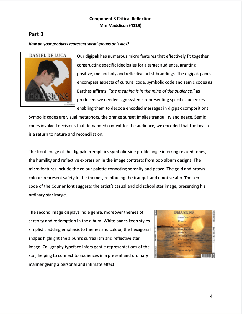
We asked some peers what they thought the genre of the album was and what message it conveyed to an audience, below is a sum of the opinions we received. The results show that most of the peers guessed that the digipak was an R&B pop genre which is shown through the choice of colour and design of the overall digipak.

November
2
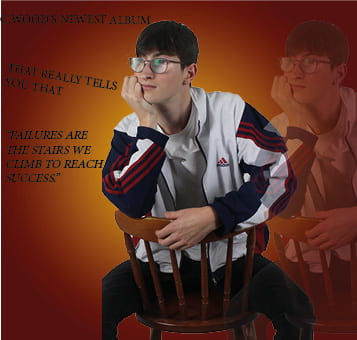
Digipack Draft 2
Digipack panes x 4
Here is our new draft of the digipak, I think that we made many significant changes to the design and structure of the digipak. There is a wider ranger of colours that all connote the sense of calm and serene moods of the artist as he looks wistful in all the images. The included images of the sun further emphasise the gentle tones of the digipak helping to effectively advertise the artists star image.
Front
Inside Left
Inside Right
Back

Feedback from teacher – screencastify
Feedback
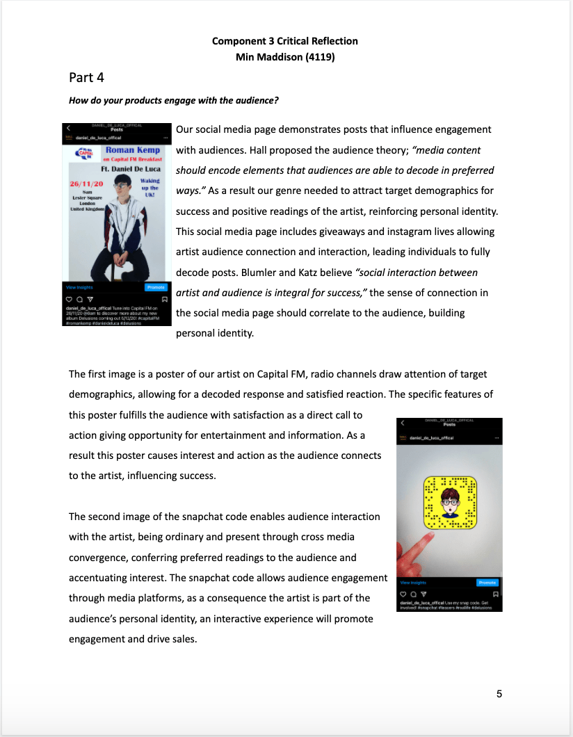
More clearly picking up the theme of the music video, and clearer as a cross media marketing strategy. The photos are effective, profile shot on front cover. Separate the artist from the shadow make him more clear and recolour the images if we want, push the colours a little more for vibrance. Inside right is effective, the sun mirrors the shape of the CD, back cover fonts need to be clear for the buyer and the horizon needs to be straight. Change the colour of the font, add stroke, drop shadow or glow, maybe change the name of the artist so that the audience knows the artists full name.
The delusions font is effective, means someone believes something is not real as it is an insult to someone, maybe change the name of the artist and album name. Chosen fonts are not different enough and do not stand out, perhaps seriff and son-seriff fonts, do not need artists name twice on front cover. Move the quote on inside left page, image is not cropped very effectively perhaps change the image so that it is more effective. Main points are to look at album name and artist name and choose different fonts, make the digipak exciting.
Targets for improvement:
- add stronger colours for vibrance
- change the fonts and make them stand out more
- think of changing the album name
- think of changing the artist name
- pick a different image for the inside left
October
16
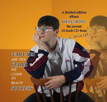
Digipack Draft 1
2 panes front and back
Assessed in relation to the assessed PSW examples
Here is the first draft of our digipak, I think that the colour scheme works well to present the mood and star image to the audience, although I think that this draft was rushed and not properly thought out so that it could be as effective as we could make it.
Front

Inside Left
Inside Right

Back
Target Points:
- too many similar colours
- middle left- the image needs to be cropped to see the face and emotion clearly
- the front cover needs to pop our more and have a less boring tone
- feather the image on the front cover
- make the small print more visible
- add the logos
- make it more exciting
- change the colour scheme
- give the digipak more pop
October
14
Contact Sheet/ Graphics /illustrations Drafts Ideas
Contact Sheets
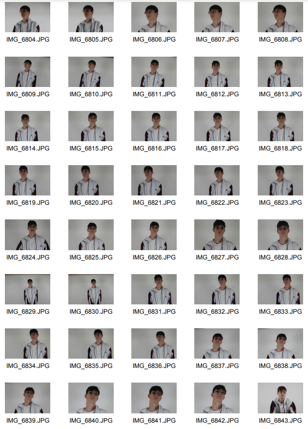
Please click to see full contact sheets
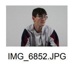
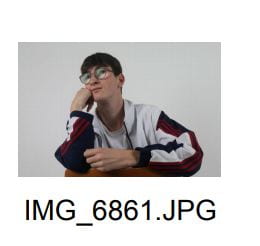
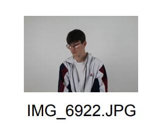
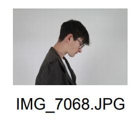
Favourite shots
These are some of my favourite shots as they show the soulfulness of the model and the correct effect we want to show to the audience.


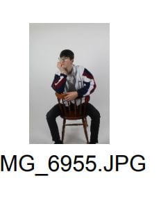
Evaluation
From doing this photoshoot for our digipak we achieved to get the preferred star image for the target audience, the soulfulness and sense of calm in the shots is clear by the models facial expression and body language. The simplicity of the costume and shot angles matches the artists star image of a teenage boy to fit with his audience, the chair and stool we used work well to help extenuate the feeling of calmness and the chill vibe of the artist. The chair allowed more freedom for the model to express his moods to then connect to the audience, from getting 481 shots from this shoot we effectively achieved the significance of the star image in the digipak.