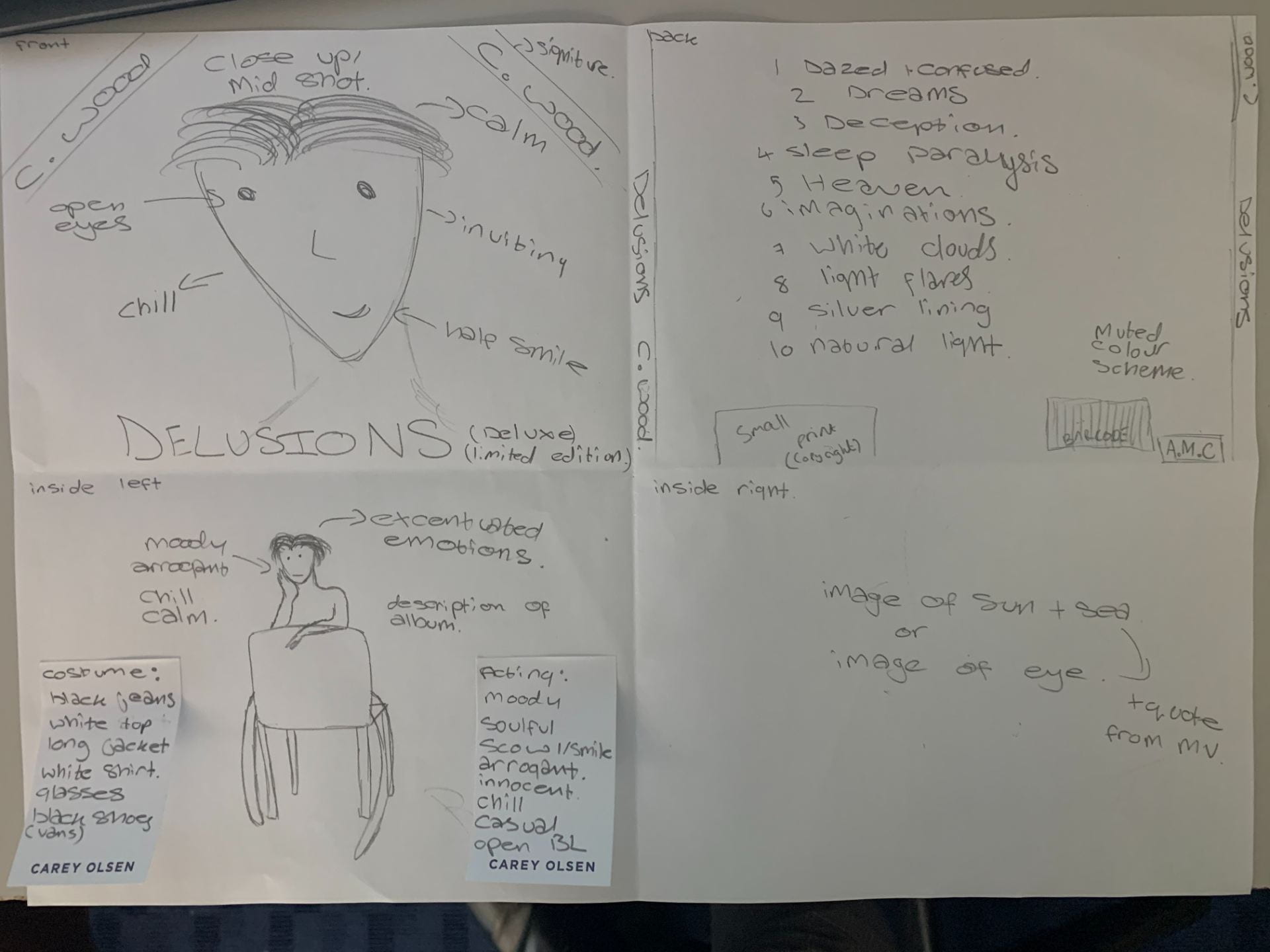
Digipack panes x 4
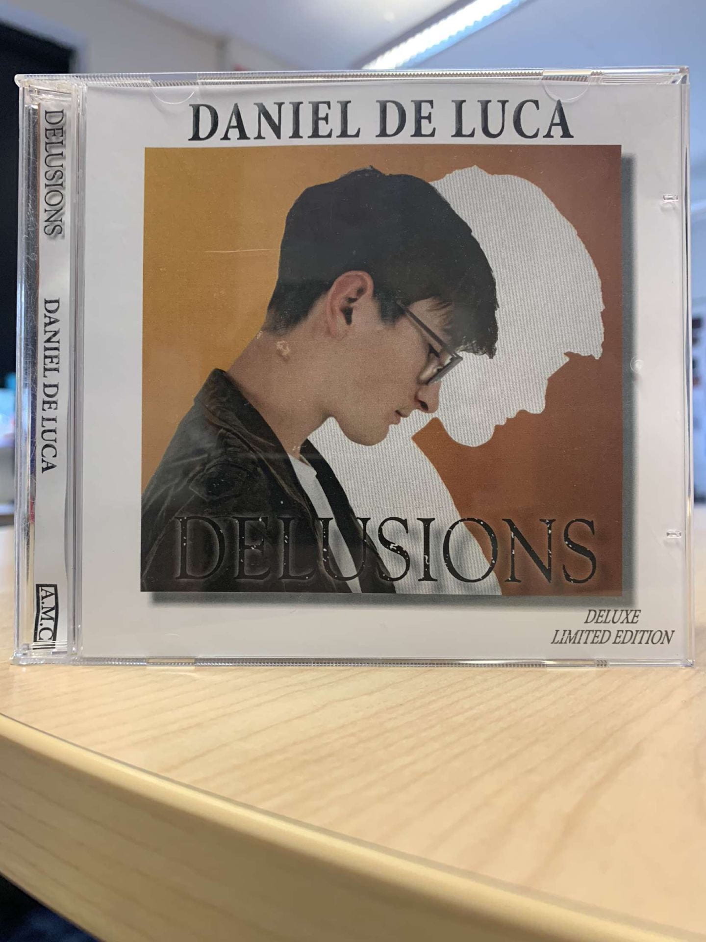
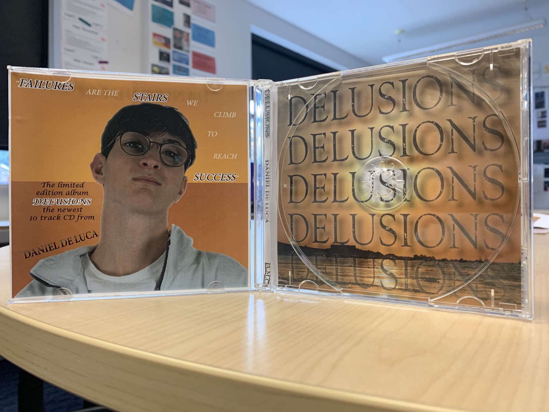
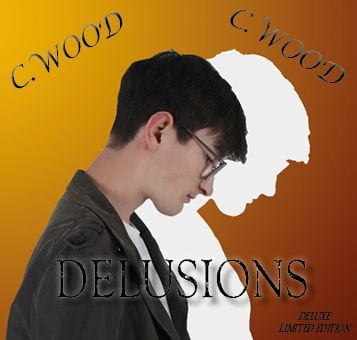
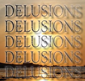
Here is our new draft of the digipak, I think that we made many significant changes to the design and structure of the digipak. There is a wider ranger of colours that all connote the sense of calm and serene moods of the artist as he looks wistful in all the images. The included images of the sun further emphasise the gentle tones of the digipak helping to effectively advertise the artists star image.
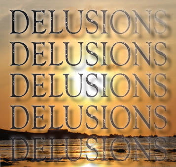
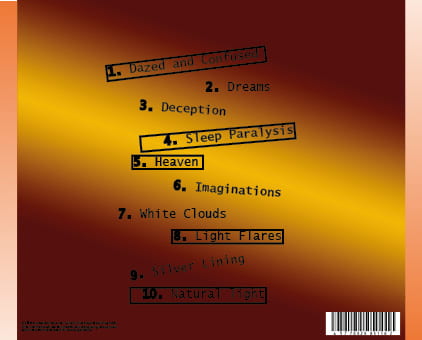
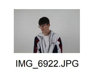
Front
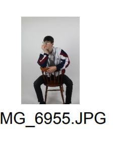
Inside Left
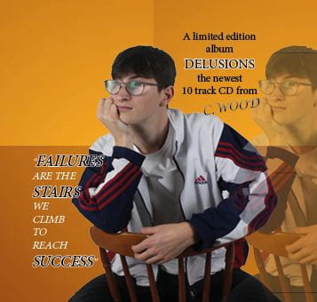
Inside Right
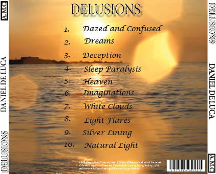
Back

Feedback from teacher – screencastify
Feedback
More clearly picking up the theme of the music video, and clearer as a cross media marketing strategy. The photos are effective, profile shot on front cover. Separate the artist from the shadow make him more clear and recolour the images if we want, push the colours a little more for vibrance. Inside right is effective, the sun mirrors the shape of the CD, back cover fonts need to be clear for the buyer and the horizon needs to be straight. Change the colour of the font, add stroke, drop shadow or glow, maybe change the name of the artist so that the audience knows the artists full name.
The delusions font is effective, means someone believes something is not real as it is an insult to someone, maybe change the name of the artist and album name. Chosen fonts are not different enough and do not stand out, perhaps seriff and son-seriff fonts, do not need artists name twice on front cover. Move the quote on inside left page, image is not cropped very effectively perhaps change the image so that it is more effective. Main points are to look at album name and artist name and choose different fonts, make the digipak exciting.
Targets for improvement:
- add stronger colours for vibrance
- change the fonts and make them stand out more
- think of changing the album name
- think of changing the artist name
- pick a different image for the inside left