Below are example of Indie Music tour posters and the Indie tour poster conventions I have discovered:
AUDIENCE: The audience for Indie music is baby boomers. (50’s plus)
LANGUAGE USED: The language used on the posters is very clear and easy to understand. There isn’t any foul language or slang.
LAYOUT: The layouts are very simple and not too cluttered. The star cover photo is positioned in the centre of the poster with the dates and places they visit at the bottom. The main cover lines are very large and are either above or below the cover photo.
FONTS: The fonts of the main cover lines are quite unique and represent the individual group or artist. (some are very quirky like the ‘Arctic Monkeys’) The dates and other information about the music is in a smaller font that is clear and easy to read. (The majority are in a sans serif typeface.)
COLOUR: The majority of posters have a black/dark background with not much colour. If colour is used, it is either hint of brown or it is quite washed out and dull. (for example, even though the Mumford and Sons poster is much more colourful than the other posters, it still isn’t neon or too colourful.)
PHOTOS: The photos used on the posters are a mixture of styles. Most are a mid shot of the artists however some have aerial views of the actual tour or none at all. Quite a few of the images are also not face on to the artists.
From looking at the conventions of Indie tour posters, I have realized the type of components I will need to include when creating my own to catch my audiences attention and interest them. This will hopefully desire them which will lead them to taking action to buying my magazine. However I will need to make sure that my poster is still unique so that is is different and interesting.
After looking at the conventions of an Indie music tour poster, I then created my own. Below is my final design using my favourite image taken on our photo shoot.
Looking at my poster, it has many conventional features such as the colour scheme, fonts and cover image. However there are also feature that are less conventional. For example, the layout is a little different compared to some of the others. The image is to the side with the text down the side. This doesn’t quite follow the ‘normal’ for an Indie tour poster as most of the time posters are split into 3 horizontal sections with the information at the bottom. Using components that are not so typically conventional allows my poster to be unique and interest the audience so they would hopefully then buy a ticket. If it was identical to another, then it would not stand out or draw attention of the audience.
As well as being conventional and unique, I have also added extra details in to draw in attention. For example in the photo used, her eyes are targeted towards the information down the side. This also draws the eyes of the audience to that part, making them read the information. The information is also sectioned by simple white lines to add an extra detail. This helps organise the information, making it easier to read. Due to the lack of text, this also helps to intrigue people into reading what is there which will hopefully desire them into taking action into buying a ticket.
There are features that I like and dislike about my poster. I really like the layout. It is simple and easy to read. It is structured well and isn’t too complicated or cluttered. However I am not the biggest fan of the title as although it fits the Indie genre, I think that it may be too simple compared to others. I am also not the biggest fan of the background. Next time I may find a texture or photo to use instead.
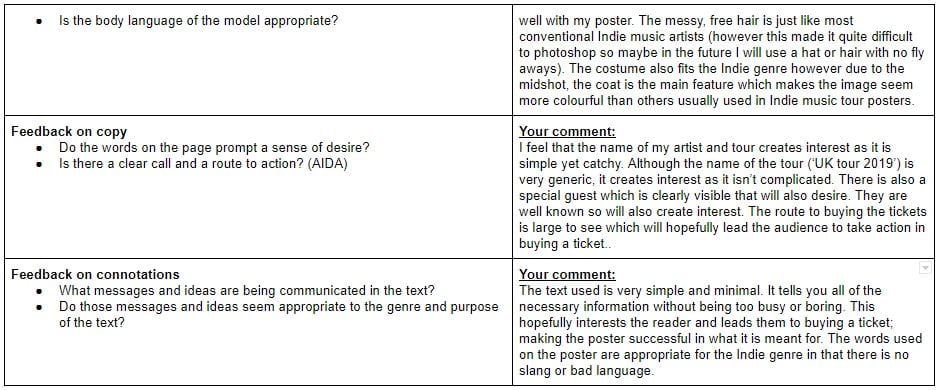
Below is a review of my poster including what has been included and why, whether it is conventional or not and the features that could have gone better.


