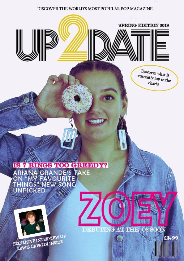
Below is my first draft of the front cover of my pop music magazine.
Please click on the image to see it clearer.
There are different elements which I enjoy and others that I believe could be improved in my next draft.
Some features that I think are successful are:
- The main cover line font: this is as it is clear and easy to read but still fun at the same time. For my second draft, I may increase the stroke to make it even more bold.
- The plug: it is simple yet grabs the attention of the audience. It is top center and in a simplistic serif font which enables easy reading.
- The masthead: it is very clear to read and has the issue date fitted neatly above. In my next draft, I may make it slightly bigger so that it can fit the entire width of my magazine.
Some of the features I believe are less successful are:
- The main cover star: Although the actual photo is fun, I feel as though the image is slightly too boring and ‘normal’. In my next draft, I will try editing the image more. I could possibly try making it black and white with pops of colour.
- The insert: I feel as though it isn’t placed right. It is adding unnecessary clutter to my magazine. For my next draft, I may not have an insert as not all magazines include them (such as Billboard).
- The pug: this is too simple and doesn’t create interest. I will make this more interesting by adding more to it and possibly make the actual text inside more catchy.
The advise that I have received from my peers includes:
- Make the main cover star larger: I will definitely do this and possibly overlap it slightly over the masthead.
- Add another colour (possibly pink) to masthead to make it even more interesting: I will do this by adding pink to the number two. I will create this by adding a second two slightly in front or behind the yellow two.
- Make the cover line less complicated: I will take out unnecessary words so that it is as short as possible but still getting the message across to the audience. Long pieces of text can bore readers so hopefully a short cover line will create interest. I may also add a second cover line so that one on its own doesn’t seem odd.