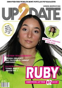
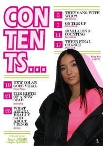
Below is the complete set of drafts of my front cover, contents page and double page spread.
I then received feedback on the magazine:
From the feedback given I can tell that what is successful is:
- The masthead name and font
- The details such as the lines (also that they are repeated throughout my pages)
- The contents page title and page numbers and headings
- Social media links
- The colours in the image on the double page spread pop out from the black and white.
The parts that can be improved include:
- Spacing of text: the mast head can be raised up as it starts quite low, the headlines can be lowered to make reading them easier, make the drop capital word on one line and bring the stand first lines of text closer together.
- The pug can be improved on. I need to more is up slightly and possible add colour to the caption with it. I could possible use the two rings (like on the LHS) around the image which needs to be changed as both artists are wearing the same colour on the front. (maybe use a photo from my phone)
- I could make the cover image pop even more by brightening it up in photoshop.
- Possibly make Ruby even bigger on the contents page.
- Make sure the page numbers used in the bottom corner are the same (one has a dot after it and the other does not.
- I could add the social media icons.
- I could use the doughnut and use it for the O’s in the title to add even more fun.
- Make sure the green on the double page spread matches the one used throughout.
- I could mirror the triangle with the quote in on the top left corner.
- Make less space at the top of the contents page either by raising everything up or adding a banner of some sort.


