Below is the first draft of our digipak. If you click on the digipak, you can open it as a pdf.
Overall we are really happy with the way in which this draft has turned out.
CAMERA AND PHOTOSHOP
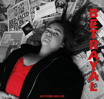
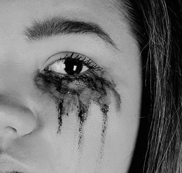
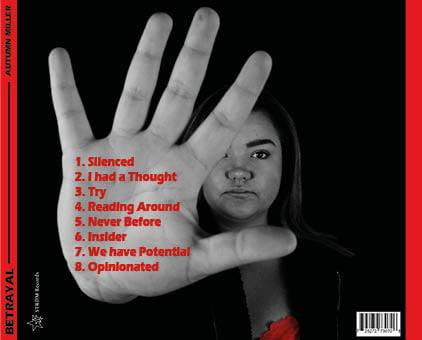
I think we have been very successful in the use of camera and photoshop. The photos which we have used works extremely well. The images are very powerful and help to connote the importance of strength and power, helping to express our message of self identity and the negative impact the media has on us. We have used angles such as an aerial shot of our model to help portray the idea that our star is being over powered by the media, an extreme close up of the eye with ruined make up to emphasis the sadness and hatred that is being created and a close up of the hand in the foreground to show the strength we can have in stopping the actions being taken by the media.
We used photoshop to benefit our images and help them present our message further. We adjusted them by altering the contrast and saturation to sharpen the images and make the difference between the lights and dark even more significant. We also colour corrected our images by turning them black and white and pulling out the reds. We did all this to enforce the idea of power and create a stronger impact. We decided to use the theme of the black and white with the pop of red as it enables the red to stand out and suggest the idea of strength and resilliance. The colour red also suggests the idea of hatred against the media.
MISE EN SCENE
We have thought very carefully about the mise en scene which we used. We used the costumes of a red top and an oversized jacket. The red top follows the theme of red which we are using and connotes the idea of strength and dislike towards the media. The oversized jacket was chosen to suggest that she is trying to hide away and get some privacy. The colour of the jacket (black) could also suggest that she is being engulfed by sadness which the media is creating.
The use of the make up, especially in the second page, was chosen to show the impact which being in the spotlight creates. Along with the extreme close up, it really reinforces the depression which can be created from this lifestyle.
The positioning of our model is also important. We decided to get her to lay down on the front cover. This enabled us to use an aerial shot of her showing her as being intimidated. This reflects the emotion which the modern world is creating. The use of her putting her hand up on the back side is also powerful as it is a significant position which shows the courage and fortitude our artist is trying to show. This shows her as being very influential which builds on her star image.
The use of the media pages as a background works really well. We even created our own media posts with our artist featured to relate it to her even more. The idea of using lots of different types of media (newspaper articles, adverts, magazine pages, news post and social media posts) enables the message to be about media as a whole; not just one type. This enables the message to be able to relate to everyone, creating even more of an impact.
DTP
The use of desktop publishing was really useful in helping build our digipak. It enabled us to be able to select the colour red and be able to make it stand out. We were then able to add other features of red (such as the font colour) to be able to show continuity and emphasize the importance the red creates; showing resilience and passion. To improve our digipak further, we are going to take the reds and alter them so that they are all exactly the same. This will enable an even better continuity, enabling a better flow throughout.
We used the same sans serif font throughout the digipak. It is bold and helps to create impact. On the front, we positioned it to the right which follows the eyeline of the star. This then helps the audience to be drawn to the title. On the back, we placed the song titles on the hand as that is the point of focus. All of the font is red to enable it to follow the theme and stand out against the black and white. On the margins, we made them red with a black font to create power and impact. To improve our digipak, we are going to explore different fonts and possibly have more than one. For example, possibly having the album title and the artist name different.


