This is an artist who is very similar to ours and this post is all about the conventions that are on his social media page.
This is an artist who is very similar to ours and this post is all about the conventions that are on his social media page.
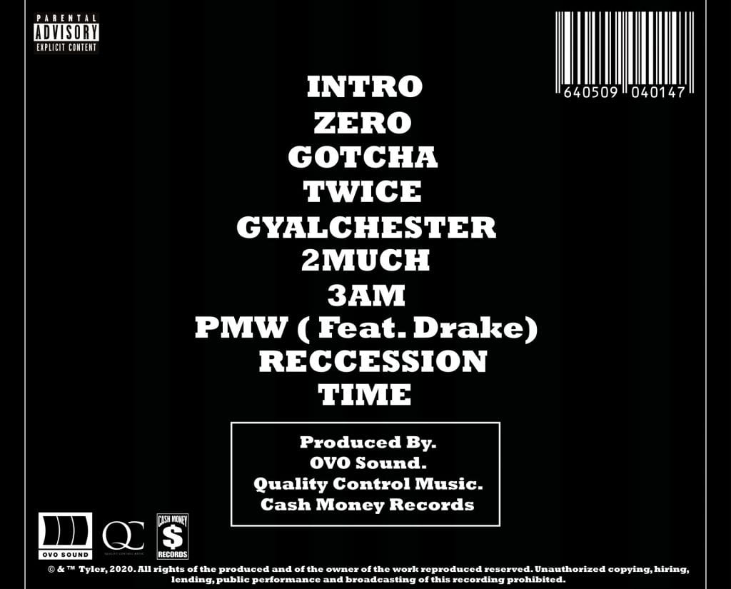
Digipak Conventions Analysis:
Targets for improvement:
This is a storyboard for our narrative shoot, it shows the basic scenes we want to record and in the order they should be. The sheet also has ‘directors notes’, these notes give details on what is going to happen in the scene and some of the shots we want to use.
My Shoot 2 Reflection:
In our second shoot we shot the narrative part of our video and we shot the scenes for the performance where our star was wearing gloves, had money and had a bat.

A difficulty we encountered in filming the narrative was when we were near the edge, where we filmed there was a small drop (around 1 meter) on the left side of the screenshot above. The drop itself wasn’t the problem as there was railings up but the problem was that there was modern cars on the road where the drop is. Which obviously we couldn’t show in our video as it wouldn’t set our class gangster theme if we had a Fiat 500 in the background. Other than this I feel the shoot did well and we didn’t encounter any other problems and overall is was very happy with how the narrative shoot turned out.

We also filmed a bit more for our performance in the black room at school, when we filmed with the bat we had to be supervised in the studio which did make me feel a bit rushed for time although I’m still happy with the shots we got and think they came out well. Using the props, in my opinion, went very well. We got a nice variation of shots with the bat and the fake money. In this shoot we also got some shots of our star with gloves on and some shots of him putting on the shots, these were my favourite shots from our shoot as I feel like they really give that anarchic gangster message that we needed to incorporate into our music video.

We used curves to have complete control over our contrast, the curves can be manipulated into giving you complete customization over your contrast. You can use the white curve or any of the three RGB curves but we only used the white contrast curve as we did ours entirely in black and white. The curves give much more control over the contrast slider we originally used. The control of colour is very important to our work, as it plays a big part in giving across our gangster/anti-authority message.
These are adjustment layers, they can be used to apply effects to multiple cuts at once. How they work is that you apply the affect to the adjustment layer instead of the clip, then you can put the layer on your timeline and stretch it as far as you’d like to. Therefore the effects will apply to every clip that they’re stretched to. This plays a part with the contrast curve that I previously talked about, as we could use the curve on the adjustment layer to find the perfect contrast we wanted then apply it to the entire video at once. This saved us many hours of work and was definitely the biggest timesaver throughout this entire project.
Our first draft of the front and back of our digipak:
Changes to make:
Our Social Media page:
Our second draft of our digipak:


I really like our new design for the front cover is a massive improvement to our front cover on the first design.
Improvements to be made: