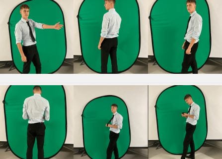
We did not create a contact sheet for our images we took, this is because we only took a few photos in different positions. We also took all of our images on an iphone. I did not matter on how the photos look, it was just imporant we got the variety of images so we had enough to work with.
Author: seannahainsworth
Photoshoot / Design Production Meeting and Risk Assessment
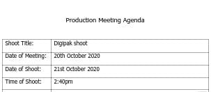
Production Meeting Agenda
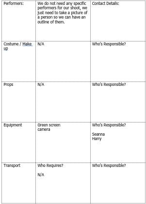
This is our PMA for our shoot which we did for our digipak. Our aims for the shoot is to get a picture of Harry in a position where we can cut him out and then make him black, looking like a silhouette. We do not need anything for the shoot other than a green screen and a camera. There no attention to detail within the model as we wanted to make it as minimal as possible, however it is important we get him in the right position where we can see the different parts of his body and they do not all blend into one.
Risk Assessment
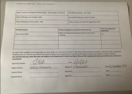
We were not going outside of school or in the studio for our shoot, we went into the lecture theatre with the green screen as there was a large open space and enough room for us to do what we want. We still assessed any risk which were possible when doing our shoot and completed the risk assessment sheet.
Hand-drawn Mock Up
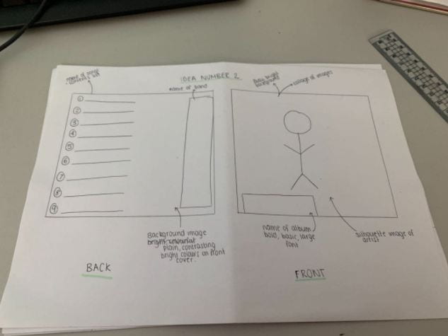
On these designs, it says what our colour pallet is and where our images and text will be placed. We have also annotated the designs with the conventional technical elements such as:
- Barcode
- Title
- Image
- Artist
- Song title
It is also important for our artists’ star image to be unique and different to other artists of the genre to keep the audience and engaged with the album cover and it will relate to their preferred reading. We need to include a repertoire of elements in order to engage with our target audience. Our digipak needs to be conventional but in order to make it even more unique we need to challenge the conventions which will allow it to stand out.
We want to make our digipak bright and colourful, this is conventional for our genre and will make it stand out from the rest of our competition. We will include colours such as green, blue, purple & pink as not only do they work well together but they are also bright. It is important we choose the right colours otherwise our digipak will not look conventional.
Branding Moodboard
To prepare for our digipak we created a mood board. We added images and ideas that connotes the pop genre, this will give us inspiration on what we should use for our digipak. Our brand image will be developed by the ideas we have researched and a repertoire of elements will be involved in order to make the digipak conventional.
Digipak Conventions Analysis
This is the first time which I have annotated and analysed the different conventions within a digipak. I used Clean Bandit’s album ‘What is love?’ as they are a similar artists to Rudimental. This allowed me to pick out different things within the images that conveyed different meanings in what the artist wanted to portray. Now that I know what is needs to be include within a digipak such as barcode, copyright information and information of the contents of the album- I will be able to use my knowledge of the different conventions and include them when creating mine. The album cover is quirky and playful which infers that the artists are off beat.
Our Mission Statement – The Package Brand
We created a presentation of things we want to include and take into consideration when creating our digipak. We analysed our audience, created a mission statement, researched our different competition, our call to action and established the unique selling point. We need to be able to know as much information about our audience as we need to make it relatable and need to promote our brand with the use of integrated advertising.
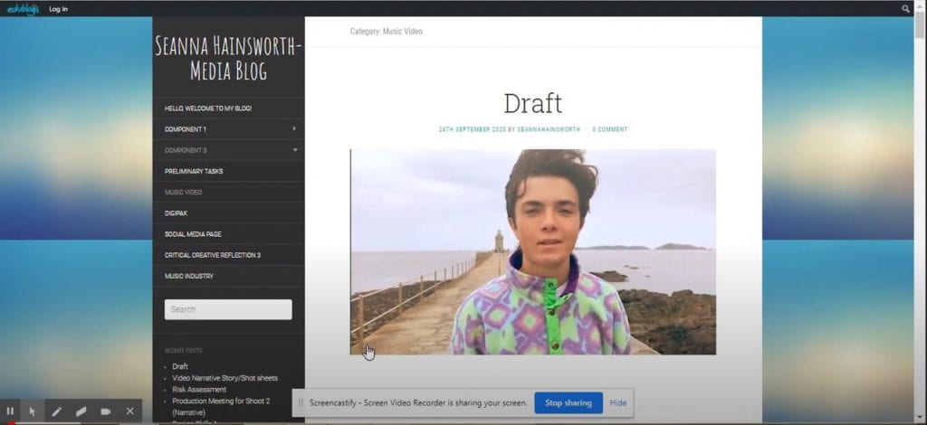
Music Video Draft 4
Music Video Draft 3
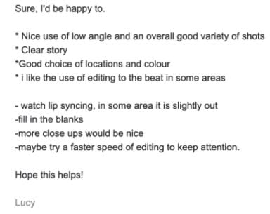
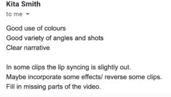
Teacher Feedback- Screen Castify
- Add transitions to make the clips look less static
- scale & position clips.
- Shots are too long so need to make them shorter
- fill in gaps
- focus on clips of Noah at the lighthouse and on the steps but need to make him bigger
- edit to the beat to create more energy
- correct the clips of Laura and make clips more stylized.
- get rid of studio shots
- narrative (pace of edit)
- close ups- sense on intimacy
- create more chaotic
The reason we are missing footage is due to us not having enough time to edit. We had problems at the beginning which we have slowly overcome however it has resulted in us being further behind then we need to be.
Design Skills 2
We learnt many new ways to improve our music video with some new techniques and tools and fix mistakes when we searched around premier pro.
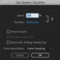
For example, we have discovered how to reverse clips to help include flashbacks in our music video:
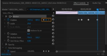
We have also learnt how to position our models off centre of the screen or centre, so we can move our models wherever we think suits the clip and part of the song, this tool came in handy because we ended up filming almost everything on our iPhones so the scale was a bit off:
These help to communicate the star image, we have included and used these tools and design skills because they bring out the best possible version of our star and our genre, pop. The flashbacks help the conveyance of the narrative in terms of memories over their summer holidays
