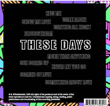
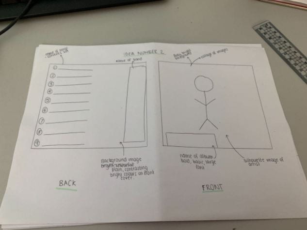
Front Pane:

Middle Panes:


Back Pane:

*Need to add flipsnack*
Front Pane:
Middle Panes:
Back Pane:


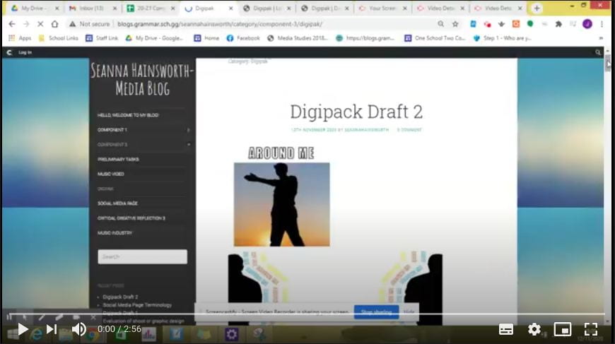
Our teacher created a screen castify, giving us feedback on our draft 2 of the digipak.
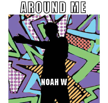
-Front pane – make the cut out bigger
-Perhaps make Noah W a bit smaller
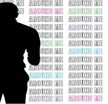
-Left hand silhouette has a stumpy arm
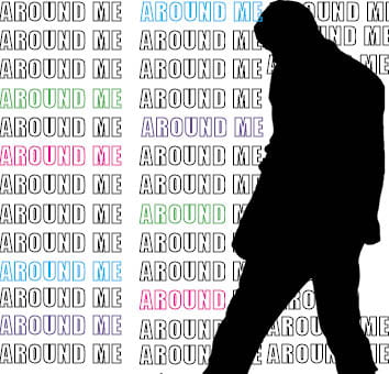
-The back is good….perhaps have some odd letters in colour to break up the white
-Some odd coloured letters in the album title?
-Would a white silhouette on the back work to contrast with the front? Or make the right hand inner pane a white silhouette on a black background i.e. transpose the colours?
-Is the album called These Days or Around me…if so the featured main track ought to have the main title on the back?
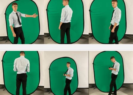
We took several images for our digipak, all of them were simple bur effective and we have the resources to now create silhouette in many positions. We didn’t need to focus much on what the star image was wearing, we also didn’t need to be anywhere in particular for our shoot. We took pictures on a green screen background in the lecture theatre of the school, because it was an open space and there was somewhere we could place the green screen background.
What went well?
Even better if?
While creating our Digipack, we will photoshop to cut out the model and turn them into a black silhouette. So we will use the cutting out tool and then copy and paste the cut out model onto our digipack which will be on indesign.

We also took inspiration from a graffiti wall for the background of our digipak. We will create our own graphics for the background as we do not intend for it to be a real life image, we want it to be illustrations.

We did not create a contact sheet for our images we took, this is because we only took a few photos in different positions. We also took all of our images on an iphone. I did not matter on how the photos look, it was just imporant we got the variety of images so we had enough to work with.
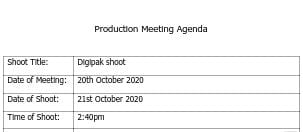
Production Meeting Agenda
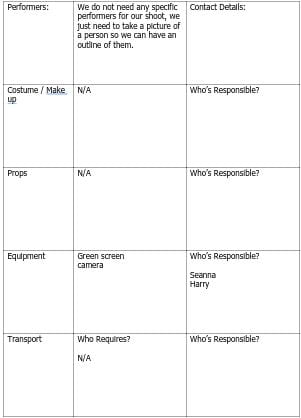
This is our PMA for our shoot which we did for our digipak. Our aims for the shoot is to get a picture of Harry in a position where we can cut him out and then make him black, looking like a silhouette. We do not need anything for the shoot other than a green screen and a camera. There no attention to detail within the model as we wanted to make it as minimal as possible, however it is important we get him in the right position where we can see the different parts of his body and they do not all blend into one.
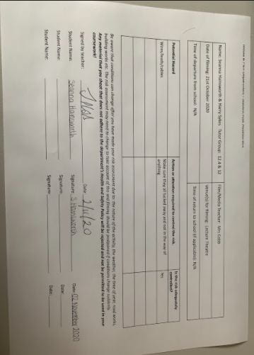
Risk Assessment
We were not going outside of school or in the studio for our shoot, we went into the lecture theatre with the green screen as there was a large open space and enough room for us to do what we want. We still assessed any risk which were possible when doing our shoot and completed the risk assessment sheet.
On these designs, it says what our colour pallet is and where our images and text will be placed. We have also annotated the designs with the conventional technical elements such as:
It is also important for our artists’ star image to be unique and different to other artists of the genre to keep the audience and engaged with the album cover and it will relate to their preferred reading. We need to include a repertoire of elements in order to engage with our target audience. Our digipak needs to be conventional but in order to make it even more unique we need to challenge the conventions which will allow it to stand out.
We want to make our digipak bright and colourful, this is conventional for our genre and will make it stand out from the rest of our competition. We will include colours such as green, blue, purple & pink as not only do they work well together but they are also bright. It is important we choose the right colours otherwise our digipak will not look conventional.

To prepare for our digipak we created a mood board. We added images and ideas that connotes the pop genre, this will give us inspiration on what we should use for our digipak. Our brand image will be developed by the ideas we have researched and a repertoire of elements will be involved in order to make the digipak conventional.