From looking at existing music magazines’ contents pages I’ve found some typical conventions that most contents pages have. These include:
- large ‘contents’ titles
- lists of catchy feature headlines with their corresponding page numbers (in page order)
- a quick description for each feature
- one main large image and usually a few more smaller ones
- only 2 colours other than black and white
- separate ‘regulars’ and ‘features’ sections
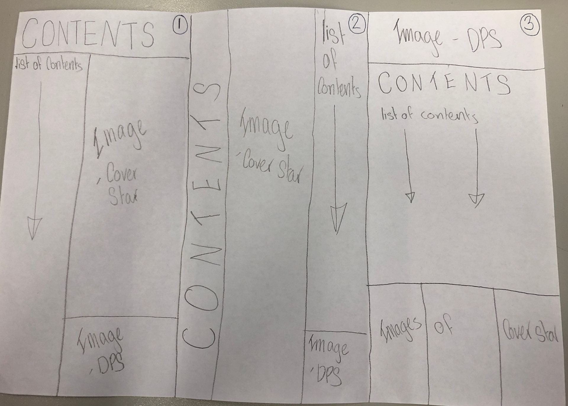
Keeping these conventions in mind I sketched three possible layouts for my contents page:
I also composed a list of possible headlines to use in my list of contents, including:
- MONTHLY BREAKTHROUGH
- THIS IS TOP 40
- WHAT’S RIGHT AT READING
- ON THE EDGE
- YOUR NEW FAVOURITE
In making these headlines I made sure to use some key words used in a lot of magazines to entice and draw in the reader. Using words like ‘you/your’ make the reader feel personally targeted by the content and also using words like ‘breakthrough’ and ‘exclusive’ entice the reader into turning the page to find out more. Other vocabulary like superlatives and alliteration can also be used to make a catchy name for a feature.
The purpose of a contents page is firstly, to give the reader a taste of what is going to be in the issue, but secondly it is to intrigue the reader so that they continue to read the rest of the magazine. This is why short descriptions of each article and grabbing headlines are two main conventions of a good contents page.