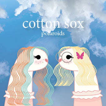
For our second draft we’ve added our design elements to the inside covers and added the typical conventions of a digipak such as copyright information and a record label.
Below is a Screencastify of our teacher giving us feedback:
Targets for improvement:
- Change the typeface to a sans serif font and try to make it pop out from the background more.
- Add more illustrations to tie in the butterfly on the inside cover
- Remove the logo from the socks
- Colour correct the polaroid images on the back cover