Contacts sheets
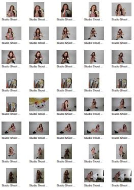
Below are the contact sheets for our digipak shoot; we chose to use a variety of poses and shots in two different outfits/mise-en-scene to decide which we think fit better with our overall idea. In retrospect, we both agree that from being able to compare all of the images together on the contact sheet the first mise-en-scene choice is much better and more fitting with our star image.
Making these contact sheets were helpful because it allows us to look at all of the images at the same time so we can compare them and see which ones we would like to pick out to use for our digipak.
Click on the image to view our full contact sheets:
Photoshoot PMA
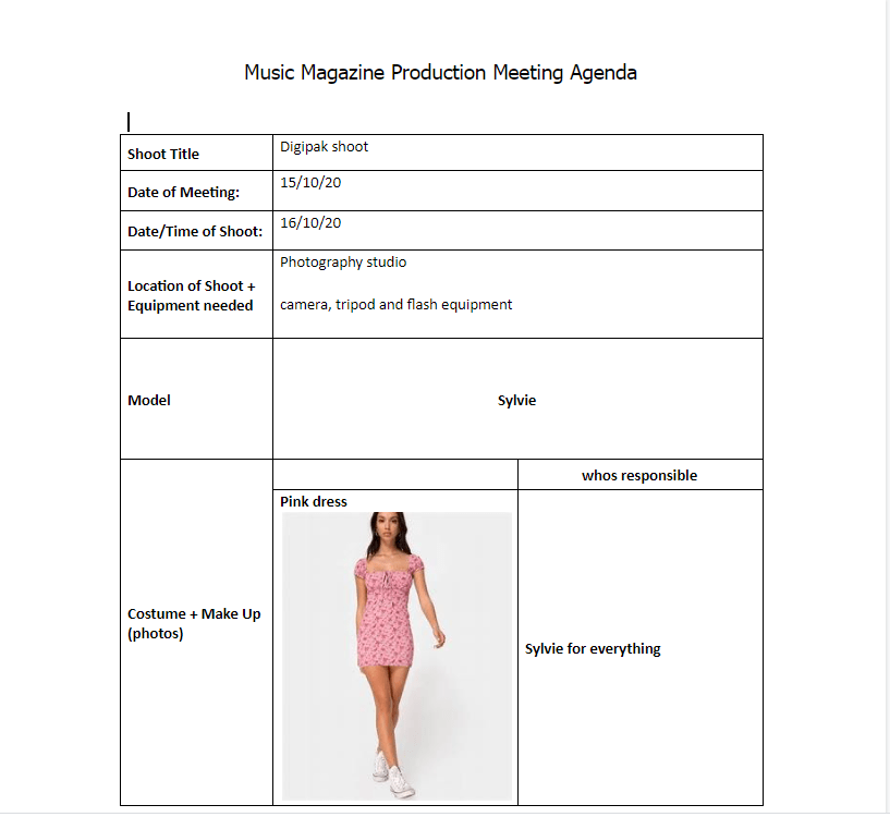
Prior to our photoshoot for our digipak images we have drawn up a production meeting agenda and also a risk assessment to ensure our shoot runs smoothly; this is important because we only have a limited amount of time in the photography studio so we have to make the most of our time in there. Writing up this meeting agenda also makes sure that we both agree on the mise-en-scene of the model and who’s providing it so there aren’t any surprises or mistakes on the day.
Usually before a shoot we would also make a risk assessment document but since we are shooting in the school studios there aren’t any real risks to account for.
Please click the image below to view the whole document:
Hand drawn Mock-up
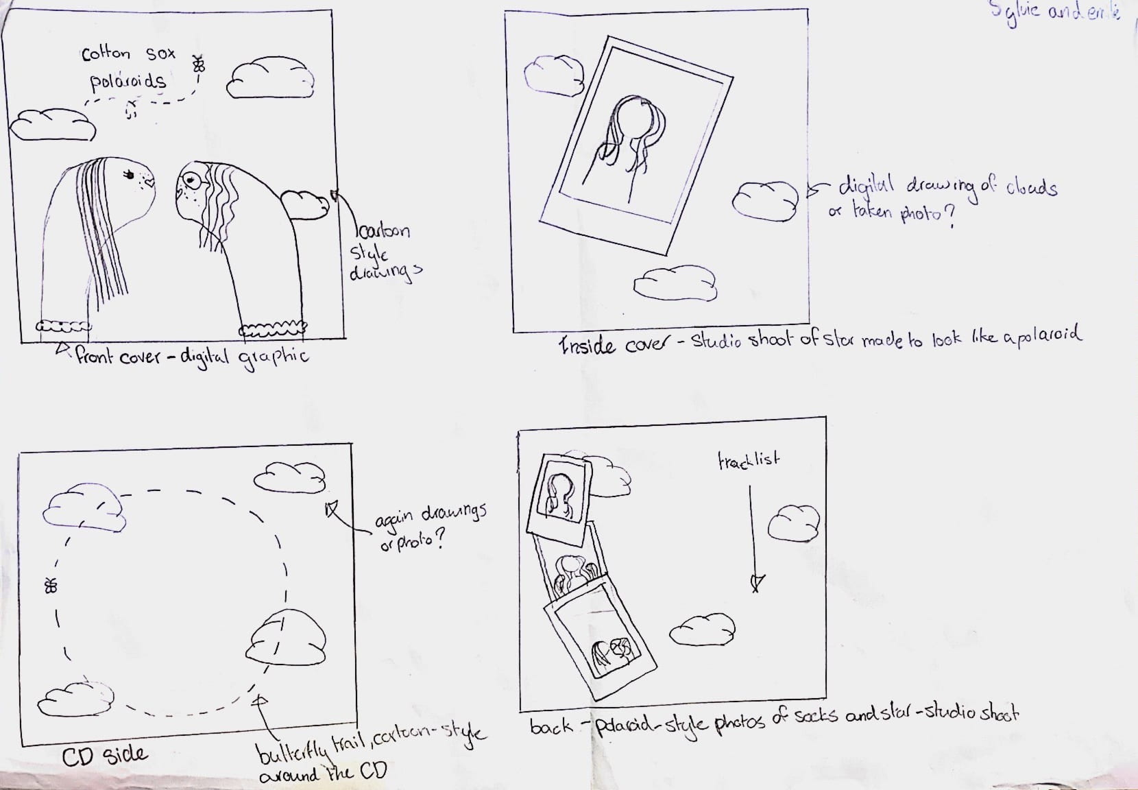
We’ve drawn this rough mock up of our digipak in order to discuss and agree upon the specific design elements and also to be able to visualize what the finished product will look like. Our final decision for our digipak is to follow the conventions of many indie album covers and use a graphic as our front cover. This fits in well with the aesthetic of our star and also the genre itself by being quite quirky, colourful and surreal. Our star will be featured in some parts of the digipak in the form of photo-booth- like polaroid pictures to ensure that the star is still present in the album if not on the front cover. For the star images we will plan a studio shoot and for the sky background we will also have to take some pictures; the rest will be digitally illustrated to give the cartoon-like, playful theme we’re looking for.
Branding Moodboard
After looking at some conventional indie-pop digipaks we can now start to collect ideas for the design of our own. To do so we must take into account mise-en-scene, colour schemes, previous similar digipaks and any graphics or typefaces we would like to include. We also needed to make sure our ideas fit in wit the star image we created for our music video so we added a few similar ideas to keep our star’s metanarrative and brand cohesive.To collect all of these ideas I’ve made a moodboard on Padlet with ideas for each component of the digipak which we can then use to create a first draft:
Digipak Conventions Analysis
In order to begin designing our digipak we must first look at others made in the same genre to be able to see what the typical features and conventions usually are. In the case of our performer this was indie-pop so I chose to analyse the album ‘Kid Krow’ by Conan Grey, a young indie artist, to see what we need to include in our digipak and how the genre is connoted through the design of the album.
Our Mission Statement- The Package Brand
Please view this slideshow showing how we created a package brand for our star:
Draft 4 (Final Draft)
For our final draft we have made a few small adjustments to our video in-line with the feedback we have been given. Some changes we have made include adding a fade out at the end of the video as this was one of the peer critiques we got, this made our video have a much more definitive ending as the music fades out as well. We also had to change the artist’s name on the title card to a fictional one as we cannot use the original artist’s name. Finally, we removed the tear animation shown to us by the animators at Specsavers because we didn’t have time to add anymore so the single tear looked disjunctive to the rest of the video.
Please view our final draft below:
Draft 3
For our draft 3 we have taken into account tips from our teacher as well as our peers to see what needs to be changed for our final draft. We had our peers comment on our videos because we have all been doing the same project so they may have some ideas that we had not thought of from going through the same process.
Some things we have changed since draft 2 include adding some push-in effects to make the footage seem less static, we’ve also put the same effects on all of the shots with the sock puppets to add a continuous theme. Another addition is the title card at the start because we felt this introduced the video well and created a less sudden start.
For our final draft we will now take onboard the peer feedback we received below:

Teacher Feedback
We have received some feedback from our teacher on our second draft of our music video in order to get an experienced opinion on how it looks and what we need to change in our next draft:
Feedback from draft 2:
- Good close ups and shot variety
- Good soft filters used to connote the romantic scenes
- Montage of skirts works
Targets for improvement:
- Seems static- add more camera movement or quicker cuts to seem less repetitive
- Unresolved narrative
- More sock puppet shots
- Maybe add some captions to puppets
Specsavers Feedback
We had the great opportunity of getting feedback on our current music video drafts from film makers/animators Lenny and Elliott from Specsavers. They were a great help to us as they were able to show us some new ways of using the Premiere Pro software as well as giving us creative ideas and direction as to where to take our video from there.
Feedback and ideas:
- Keep our Premiere workspace organised eg. separating all of our footage into separate bins of when they were shot and what they are.
- give each segment of the video a different layer (narrative and performance) so that we can make changes to one without affecting the other and we can also select a whole segment much more quickly and easily.
- Lenny showed us how to add animations in After Effects which is a great new idea which we will implement if it’s possible as it adds to the childish nature of our video.
- They also showed us how to perfect our colour filters to exactly how we wanted them using curves to change the highlight/shadow colours.
The video below is a tutorial on how we may be able to add some more animations to our video: