So… How did you integrate technologies (software, hardware and online) in this project?
In order to present my use of technologies in this project I’ve created an info-graphic with what technology I utilised in every section:

Loading…
So… How did your productions skills develop throughout this project?
This voicethread presents my advice to a future media student on what I’ve learnt in my first few months of studying media:
So… How does your product engage with audiences and how would it be distributed as a real media text?
To answer this question I’ve made a Screencastify explaining how my product will reach these aims:
So… How does your product use or challenge conventions and how does it represent social groups or issues?
To answer this question, I’ve produced an emaze presentation featuring how each component of my finished product uses/defies the conventions of its genre (a pop music magazine):

So… How’s is it going?
Since beginning this project I’ve learnt and developed loads of skills which I’ll be able to transfer into my everyday life and also into more media projects throughout the next two years. One skill in particular which will help in later media projects is learning the importance of folder management. Learning to be able to organise drafts, exports, PDFs and JPEGs is imperative to keeping all of my work in check because losing one of those files could be detrimental to my project because I would have to start it over again. It also helps to keep my computer drive organised and accessible so I can work on it efficiently.
Another skill I’ve developed through studying media is time management which is key to not running behind in my blog because there is so much content which needs to be prioritised correctly. For example, I’ve learnt to know what work needs to be done immediately and which blog posts can wait. Another instance when being time conscious is important is during a photo shoot, especially on location because you only have a set time slot with your model and setting to get the shots you need.
Overall, studying media is starting to help me develop and gain new skills which I’ll be able to use in later projects but that will also be helpful in everyday life too. In future, I hope to develop more computer skills like folder management and using Adobe which will help my projects run even more smoothly.
Design Skills 2
Now that I’ve almost finished my magazine I’ve improved my design skills since my last post, this is due to needing to learn more in InDesign and PhotoShop to correct the last few errors in my magazine draft.
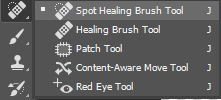
One tool which I’ve recently used a lot is the spot healing brush tool in PhotoShop which is really helpful for removing any spots or uneven patches on the model’s face by editing the vector graphics of the image. Making my model’s face more even and smooth helps to create the star image I’m aiming for because it gives the audience the impression that she is flawless, creating interest towards her and further giving her a celebrity quality of perfection. Although morally this level of perfection is sometimes not accepted, I feel that this editing is needed in order to create an image which readers will aspire to and find attractive.
 Another skill which I’ve learnt is using shapes and lines to create impact in InDesign. I felt that my contents page was a bit bland and received feedback to put my model into a shape, to do this I used the ellipse frame tool and found that it added a new convention to the page and made it a lot more interesting. Adding more elements like this also made my contents page show the fun and exciting element of my brand’s mission statement which was starting to get lost before this edit.
Design Skills 1
From doing my studio shoot I’ve learnt that a lot of things need to be taken into consideration for a shoot to be successful. These are mostly down to production and catering to the audience; for example MES is essential for a successful cover image because without interesting/relevant clothes and makeup their will be no interest from the audience. The aspects of AIDA (Attention, Interest, Desire, Action) also need to be taken into consideration because these are the components that a good front cover needs.
From editing my front cover model I’ve learnt new photo skills on both InDesign and PhotoShop, mostly ways to really enhance my images to make them more bright and exciting. I also used the editing software to perfect things that couldn’t be changed in real life.
One tool I found really useful was the ‘curves’ tool in PhotoShop which can be used to change the lighting of an image.
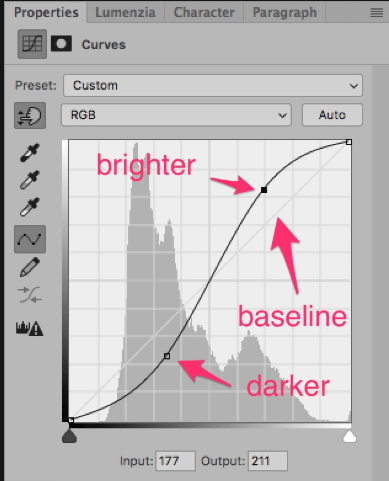
I used curves to brighten up the image whilst also adding depth to other areas, this is why curves was better to use than changing the exposure because you can lighten an image without it starting to look faded. Curves is a good tool to make it appear as if the perfect lighting was used when the picture was taken, making my star look as good as they can.
A tool in both InDesign and PhotoShop that I’ve used a lot is the ‘eyedropper’. This picks up a colour from your image and lets you use it in other areas.
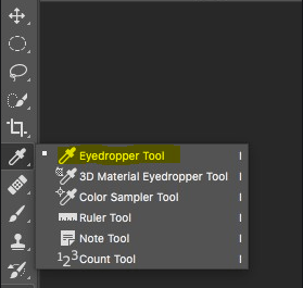
I found this helpful to find the perfect typeface colours for my masthead and cover-lines by picking out colours from my star’s top or jacket and making them brighter; this made my front page look more put together and professional because the cover star matched the front page really well and there were not too many different colours used.
So, I am ready to photograph my star
To photograph my cover star I need to make sure I have a good idea of my magazine’s mission statement and its’ brand ideals, this is so I can make sure my model is styled in a way that fits my magazine. My mission statement uses statements like ‘cutting edge’ and bringing ‘the fun back into music’ which means that I have to make sure my model looks young and trendsetting; I also need her to look happy and bubbly to fit in with the fun-loving aspect of my mission statement. I’ve also been suggested to play music from my genre on the shoot to create the right environment for the photo shoot, it also demonstrates to my model what I’m trying to achieve.
In order to display this through the photos mise-en-scene is really important. For example, I’m dressing my model in a costume which a trendy young person would wear including bright colours in order to connote the ‘fun’ element. To further display this I want to direct my model in poses which show movement and energy (eg. something standing up) so she doesn’t look bored. The use of props like holding a microphone can also show more clearly that it is a music magazine, props also help to create a narrative which helps a photo communicate meaning. Another way in which meaning can be communicated is through the camera and how it is placed. For example, I can use the proxemics of the camera in relation to my model to highlight specific things like using a close-up to show the model’s emotion through their facial expression. I can also use different angles to produce the same effect; a canted angle would make the image seem less static and more fluid whereas a low angle of the model would make them seem strong and confident. I’ll use all of these ideas to communicate my magazine’s brand through its’ cover star.
So… I’m Ready to Make Some Media
In the past few weeks I have learnt multiple components that help towards making a successful piece of media, all of which will help me in choosing how I design my own music magazine.
Here are all the different components I need to be aware of:
CAMERA – Camera angles can communicate a lot about a photo, including the overall mood or story trying to be conveyed. The camera’s distance can also bring attention to certain parts of the photo, mostly if you want the audience to focus on either the subject or the setting.
MISE-EN-SCENE – MES is used to add deeper detail so that the audience can deduce ideas about the photo/video without further context, for example, wearing shabby clothes could show a subject is poor. This is a very important component because it’s the audience’s first impression of your story/character.
LAYOUT AND TYPOGRAPHY – Magazine covers are often laid out with all of the text wrapped to the subject or a side of the page, this allows the cover star to not be covered up by text so the page looks smart and not cluttered. Typeface is also important, more often than not all of the text is in capitals which creates a sense of urgency and calls the reader to attention. Typography can be used for AIDA: Attention, Interest, Desire and Action. This means that by how your message is phrased (usually using imperatives) it can draw the reader in and implore them to take action.
USES AND GRATIFICATION – This theory by Blumler and Katz is about the four reasons for media: information, personal identity, social interaction and media. This means that I must be mindful of all of these reasons when producing my magazine.
So… How can an image communicate meaning?
Throughout the past few lessons and posts we have been learning how to convey meaning and present messages to the viewer through the media we produce. This has been done mainly through two mediums:
Camera Framing
How the camera is used for an image can say a lot about it, for example:
Long shot- gives more peripheral detail, often placing the subject in their surroundings/location.
Close-up- directs audience’s attention to the only thing/person in frame, enabling them to convey the mood of the image more easily.
High angle- makes subject seem small and inferior
Low angle- subject can appear bigger and stronger, as if they were towering over the camera
Example of long shot angle:

Mise-en-scene
All components of mise-en-scene contribute to communicating meaning through an image, these components are:
Makeup/hair/clothing- all of these factors can convey the model’s social class and interests, but also the time period in which it is set in.
Lighting- can create the mood, for example a low-lit and shadowy scene connotes feelings of sadness or fear whereas a warm and well-lit scene implies a happier scene.
Props/setting- as in costume, where a piece is set can illustrate the time period it is set in and the class of the characters. Props can be used to give the audience more information about the characters and what they do, for example, a musician may hold a microphone in a poster to show they are a singer.
Acting/proxemics- where actors are in comparison to one another says a lot about their relationship. This could mean when a character is facing away from the other they are angry, or if they are close together then they may be friends.
Focus forward
Using these two techniques are essential to the production of my own music magazine. This is because the cover must be able to display the magazine’s genre and features immediately to the reader, without this they will not feel enticed to pick it up and read it.
12