A New Improved DPS
First Draft

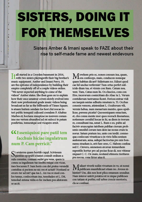
New Draft

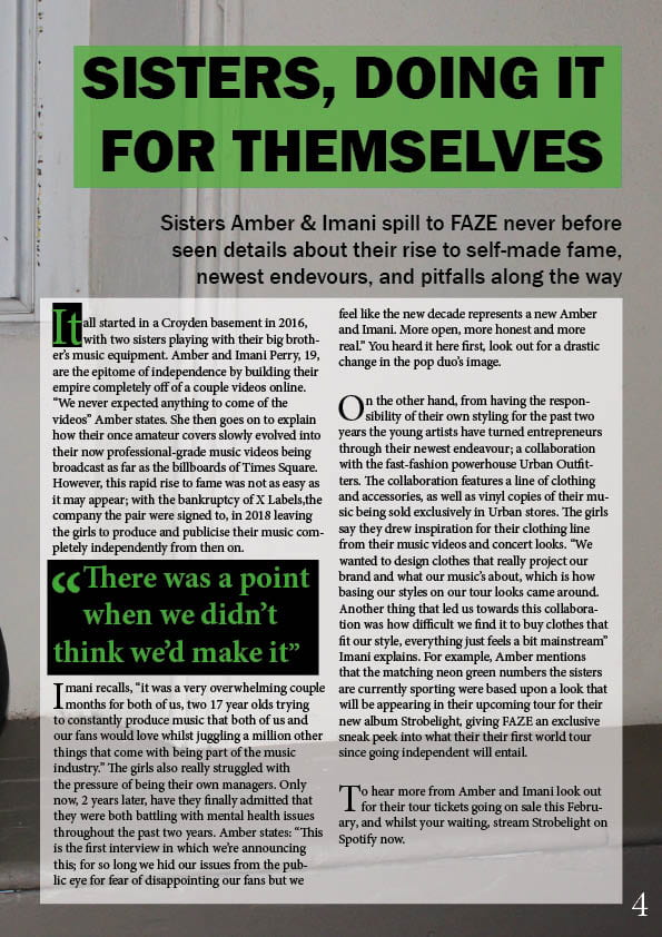
A lot of the changes I’ve made since making my first draft are to do with the colours in my DPS; firstly I’ve made the green of the pull quote and the title a lot more vibrant and neon, I’ve also put black boxes around some of my text to make the green pop even more. Doing this also brings more attention to the pull quote which is usually the first part of the article the reader sees because their eye is drawn to the larger writing. This should entice the reader to read the whole article by being interested in the context of the quote.
Another change I’ve made is adding a bit more drama and intrigue to my stand-first, which was a bit bland before-hand.
Feedback and Reflection on Draft DPS
After finishing my first draft of my double page spread I had a couple of peers and my teacher give me some feedback on the design and layout. This was useful because it gave me an outsider view of what needs tweaking and improving.
The main pieces of feedback were:
- add more drama/conflict to the stand-first to make it more grabbing to the reader
- stronger colours with more contrast
- add more impact to the drop capital (suggestion: add a black box to contrast the green)
From this feedback I know what my targets for development will be, mostly making it more attention grabbing and impactful for the reader. Some specific things I’ll look at are the colouring, especially for my pull quote and drop capital, and also the wording of my stand-first.
Draft of The Double Page Spread
My First Draft
After making my first mock-up of my double page spread I had some people give me some feedback on what still needs to be worked on before adding the article.
Targets for improvement:
- Brighter green used in the title to match the neon of the stars’ clothes
- add page numbers
- make the stand-first more exciting and dramatic
- add a by-line
- improve the pull quote and drop capital’s styling
2nd Shoot Contact Sheets
Contact sheets
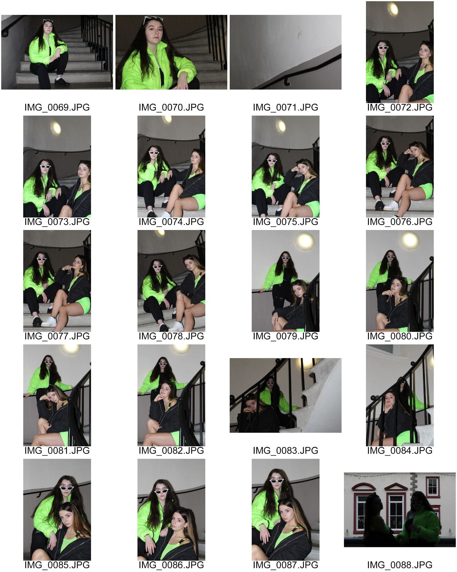
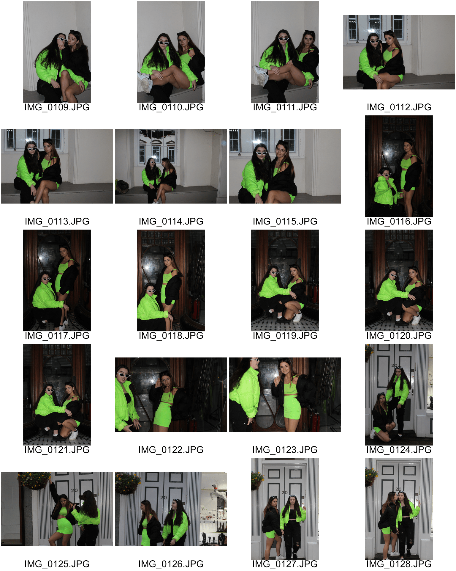


From this selection of photos I chose a few which could feature in my magazine:


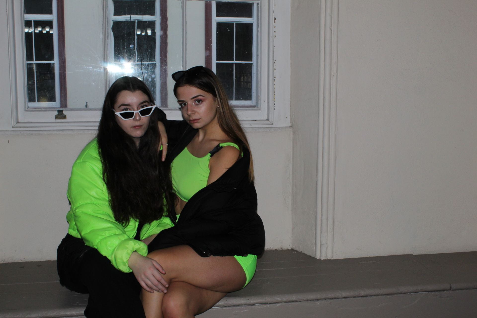
Unfortunately, since it was heavily raining on the shoot day I was unable to use my original location to shoot at, even so, I did get the types of photos I hoped to. Using two models was also really helpful instead of just working with one, as originally planned, because I could get a lot more varied angles and dynamics in my photos.
One thing I would change next time is before beginning to take photos, think of the layout of my page because I only had a few to choose from since I hadn’t thought about where in the image I’d have to leave room for text and the centre-fold.
A New Improved Feature Article
Since writing my first draft I’ve made quite a few changes to my article. Firstly, after reading it through aloud I realised that it didn’t read as well as I would like it to so I made a couple changes to the punctuation and wording to correct that.
My second issue came from my teacher’s feedback which was that it seemed too autobiographical and needed a bit more drama and exclusivity. To change this I added in a story exclusive to the magazine wherein my stars admit to suffering with mental health issues after the fall of their label, promising to have a new image for this decade. This adds a bit of drama and shock for fans who didn’t know this information about the stars’ personal lives.
Click here to view my new improved article, with all my edits highlighted in red to make it clear what’s been changed.
Draft Feature Article
Click here to read through the first draft of my article
Voice memo
In order to make sure my magazine reads well and flows I recorded myself reading it aloud for errors:
From doing this, I noticed a couple of places where the article does not read as smoothly as I would like. This means that I can make improvements to my next draft which wouldn’t have been obvious from just reading it in my head.
Teacher Comments and targets
- seems very autobiographical
- more gossip/exclusives needed
- add a sense of conflict, gives the article some drama so the reader is interested in reading on
Article Idea Development
Who am I writing for?
My target audience are young adults interested in the most current and upcoming music, as well as being well-versed in current affairs and public issues such as the fight for gender equality and the awareness of mental health. This is why my article is about two new, young, female artists. This will interest my audience because it includes promises of brand-new releases and tours, as well as some more in-depth information on the artists themselves, with a feminist theme of independence throughout the story.
Article Development
Click here to view my article development document in full
Language Analysis
In order to write my own article, I need to analyse an existing magazine article which I’ve chosen as ‘Billboard, (June 15),Dance Power Players ‘.
This article is structured as a biography to introduce a new band, with the reporter narrating the interview in third person and present tense. This makes it seem as if the reader is the reporter, placing them inside the story and making them continue to read.It only becomes apparent that the journalist is present after most of the story when they begin asking the artists questions. There is a clear introduction which is written aligned with the title of the article, giving the audience a taster of what and who the article is about. However, there isn’t a clear-cut conclusion which makes this particular article seem a bit less structured.
The scene for the article is set immediately, with the first sentence for the piece describing the location. The location itself is described positively as a “sunny Memorial Day afternoon on a patio” which connotes the feeling that this interview is casual and relatively informal because it’s taking place outdoors rather than in a studio or conference room. As for the musicians, the journalist introduces them each separately with an impressive fact about each of them. For example, Martin Garrix is named as achieving “viral stardom” and Steve Angello’s ex-band is referred to as a “supergroup”; these introductions give these artists a sense of importance and impressiveness to the reader.
The overall style of writing of the article involves long sentences made up of multiple lists of imagery and hyperboles, for example ” nothing less than a redefinition of success in EDM, emphasizing original music and brand-name, pop-style superstardom”. This style fits the dance music genre because the genre itself is very energetic which does come through in the article through the vocabulary mentioned above. In relation to quotes from the artists, there aren’t many but towards the end of the article there are a couple from Scooter Braun which centre around the new artists he’s managing. These quotes are utilised to promote the artists in question’s new endeavours, naming one “a legend” and the other a “rising star”. This means that through reading this piece the reader becomes invested and interested in these artists’ future careers and music because their manager is so complimentary to them, showing the confidence he has in their success. This also shows that the writer enjoys the artists’ music, showing this article is written by the fans for the fans.
Overall, the journalist represents these artists as the ‘next big thing’ and people to look out for in the future by the way they are described. They are also shown as one unit by wearing the same “all-black” ensemble and being described as sharing a vape as they sit together. Both of these points give the reader the impression that these artists are down to earth by the way they speak and the relaxed/informal environment the article is set in.
PMA For 2nd Photo Shoot and Risk Assessment
Before going on my location shoot I need to organise what I want to achieve from it in terms of setting, lighting and the styling of my models. Click here to view my PMA document for the shoot.
Another important thing that needs to be done before going on location is an assessment of potential risks, this is done in order to keep both the models and photographers safe during the shoot. Click here to view my risk assessment for the day.
Design Skills 1
From doing my studio shoot I’ve learnt that a lot of things need to be taken into consideration for a shoot to be successful. These are mostly down to production and catering to the audience; for example MES is essential for a successful cover image because without interesting/relevant clothes and makeup their will be no interest from the audience. The aspects of AIDA (Attention, Interest, Desire, Action) also need to be taken into consideration because these are the components that a good front cover needs.
From editing my front cover model I’ve learnt new photo skills on both InDesign and PhotoShop, mostly ways to really enhance my images to make them more bright and exciting. I also used the editing software to perfect things that couldn’t be changed in real life.
One tool I found really useful was the ‘curves’ tool in PhotoShop which can be used to change the lighting of an image.
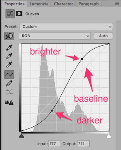
I used curves to brighten up the image whilst also adding depth to other areas, this is why curves was better to use than changing the exposure because you can lighten an image without it starting to look faded. Curves is a good tool to make it appear as if the perfect lighting was used when the picture was taken, making my star look as good as they can.
A tool in both InDesign and PhotoShop that I’ve used a lot is the ‘eyedropper’. This picks up a colour from your image and lets you use it in other areas.
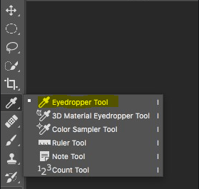
I found this helpful to find the perfect typeface colours for my masthead and cover-lines by picking out colours from my star’s top or jacket and making them brighter; this made my front page look more put together and professional because the cover star matched the front page really well and there were not too many different colours used.