A New Improved Front Page
Original Draft
Draft 2

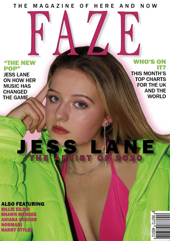
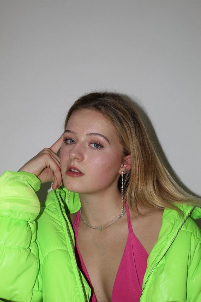
In response to the targets from my first draft I’ve moved my cover line downwards to show my model’s face and also changed the colouring of the typeface to make it pop more. I’ve also retouched my cover image to make her look more vibrant and healthy, this also makes the cover a bit more exciting. Some changes I made were re-colouring her eyes and hair to give them more impact; I also saturated the whole image to get the brightest colours I could out of the image. Another piece of criticism I responded to was changing my masthead colour however this could still be deliberated depending on the feedback I get on this draft.
Draft of Front Page
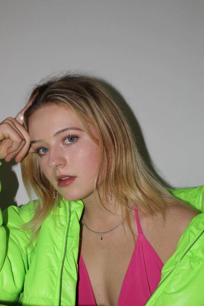
My First Draft
Peer Assessment
“I really like the writing as it’s catchy and exciting. Have you tried adding a pink background and having white writing it may make your front cover look more colourful (just a suggestion) maybe move the Jess lane in huge writing a little more down so you can see her whole face? I’m happy with the amount of writing you have done as it’s not too much but it’s enough. “
Targets:
- try a different coloured masthead
- move the cover line downwards
- retouch the model’s colouring
- add a sense of urgency
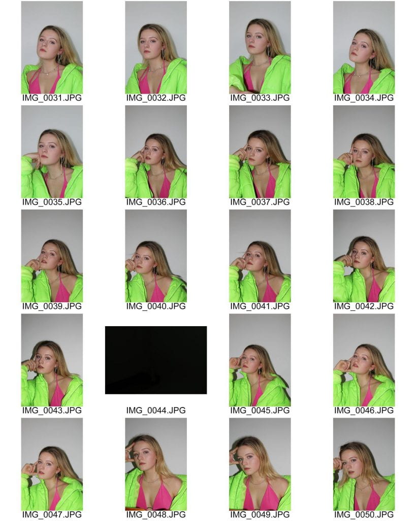
First Shoot Contact Sheets
Contact Sheets
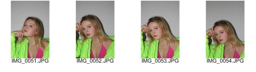
My Favourite Images

I’ve short-listed all of my favourite photos to a list of four but I think the last photo will be the last one because it fits what I set out to get the most.
Overall I achieved most of my aims from my PMA but I had some trouble with the lighting equipment being compatible with my camera so I didn’t have enough time to experiment with any other poses. This is something that I would like to do in my next shoot when I have more time and I am more prepared with the equipment. Apart from this mistake I’m happy with the images that I did get because they’re all in focus and good to use for my cover because I wanted a close-up for it, however in my next shoot I’d like to use a different camera which is compatible to I can experiment with lighting more. Another thing I’d like to do is change up the distances and angles I shoot from to get more variety throughout my images.
So, I am ready to photograph my star
To photograph my cover star I need to make sure I have a good idea of my magazine’s mission statement and its’ brand ideals, this is so I can make sure my model is styled in a way that fits my magazine. My mission statement uses statements like ‘cutting edge’ and bringing ‘the fun back into music’ which means that I have to make sure my model looks young and trendsetting; I also need her to look happy and bubbly to fit in with the fun-loving aspect of my mission statement. I’ve also been suggested to play music from my genre on the shoot to create the right environment for the photo shoot, it also demonstrates to my model what I’m trying to achieve.
In order to display this through the photos mise-en-scene is really important. For example, I’m dressing my model in a costume which a trendy young person would wear including bright colours in order to connote the ‘fun’ element. To further display this I want to direct my model in poses which show movement and energy (eg. something standing up) so she doesn’t look bored. The use of props like holding a microphone can also show more clearly that it is a music magazine, props also help to create a narrative which helps a photo communicate meaning. Another way in which meaning can be communicated is through the camera and how it is placed. For example, I can use the proxemics of the camera in relation to my model to highlight specific things like using a close-up to show the model’s emotion through their facial expression. I can also use different angles to produce the same effect; a canted angle would make the image seem less static and more fluid whereas a low angle of the model would make them seem strong and confident. I’ll use all of these ideas to communicate my magazine’s brand through its’ cover star.
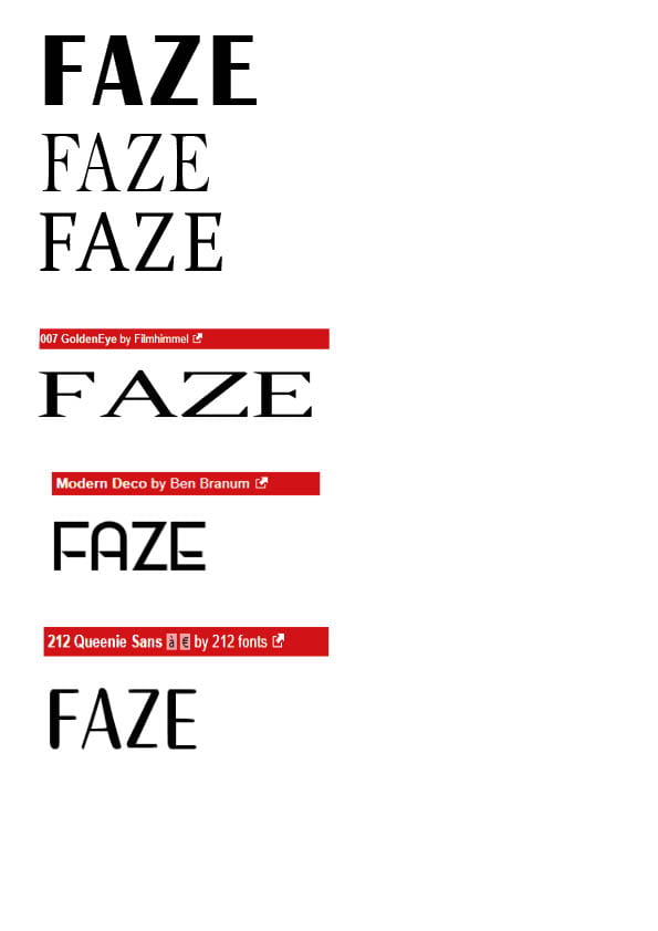
Masthead Designs
The masthead of a magazine is really important because it’s the first text that’s read, this means that in order for a magazine to be successful it needs to have a impactful masthead. However, it needs to also fit the magazine’s brand and genre. In order to do this I’ve made multiple mock-ups of my masthead to see what kind of typeface would fit my magazine the best.
I’ve concluded that I want a typeface with very sleek look and so I thought a serif font would be best because it adds a touch of elegant formality to an otherwise more informal genre. Because of this I decided that the second typeface on the list would be best because it’s reminiscent of ‘ELLE’ which is also seen as a elegant and stylish magazine however I experimented with different styles to make sure I’ve seen all my options.
Masthead drafts
Click here
Production Meeting Agenda for 1st Photo Shoot
Meeting Minutes
In order for my initial photo shoot to run smoothly I had to compose an agenda of my exact plans for the shoot. This helps to ensure the shoot is successful and produces the photos I need for my magazine cover.
Click here to view my PMA which includes all my plans for my initial cover shoot including my costume choices and direction for my model.
My aims for shoot one:
-put my initial ideas into practice to see if they work
-convey my brand through the model
-adapt my ideas to the set I’m working on to see which ideas work best
These are the goals which I hope to achieve in my first shoot, even though some ideas may have to be compromised because they may work better theoretically rather than practically.
So, what am I up against?
Competition Voicethread
Unlike in past years, the competition for a published magazine now spans onto other media platforms, especially online music magazines. These magazines are the biggest competition for me because they can embed videos and audio into their articles so the reader can hear the music the article is talking about. However, by looking through published pop magazines I found commonalities that I can adapt to my magazine in order to keep up with the competition. Some similarities throughout all the magazines I looked at were the featuring of bright colours in their design (mostly pink) and also interviews with young, new pop stars. Another feature used was the singles chart for the week which I think is a good idea because pop music is such a changing genre that it’s important to show what it consists of at the time of publishing.
I can beat this competition by using attention-grabbing colours and a clean, modern design because this fits in with my audience demographic of late teens and millenials and bright colours will make my magazine stand out. In terms of content, I plan to have an interview with my cover star and also features in the contents such as the top charts for the week in order to make sure my magazine is as up-to-date as it can be. As a way to combat the issue of not having online interaction I can add in opportunities for a website in my articles.
Star Image- Theirs and Mine
Prezi Presentation of a Music Artist
In order to create my own cover star I needed to familiarise myself with an existing star who fits my magazine style. I chose Billie Eilish for this because she is a very current and innovative pop artist with the same style in which I would like to produce my magazine and cover star.
This exercise helped me understand how an artist’s entire meta narrative shapes how they are represented, and thus how the magazines they feature on are represented. For example, Eilish is constantly in bright, neon colours which presents her as youthful and outgoing, and so advertising the covers she appears on as such.
Creating My Cover Star
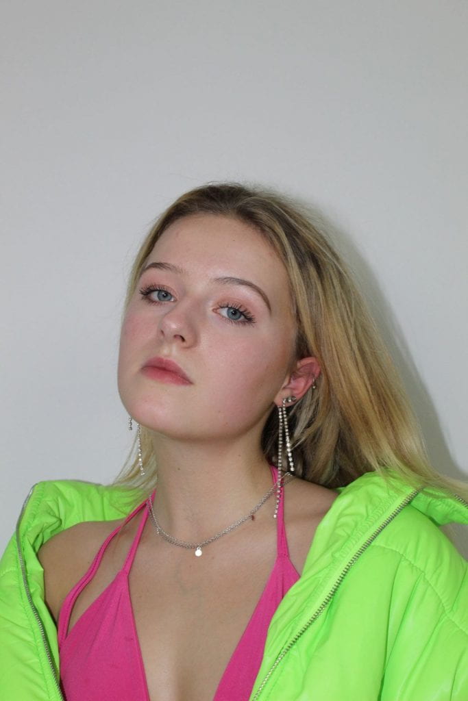
I drew inspiration from my existing cover star of Eilish when choosing costume by picking a neon streetwear style, I chose this style because it connotes views of being current and contemporary whilst also drawing attention to the star. I also chose the prop of a microphone to more clearly display that my star is a musician. For hair and makeup I decided to use very sleek and straight hair because this makes it far easier to cut out in photoshop without making the background look unnatural, for makeup I would like to use a very minimal and natural look to represent the youthful attitude of the pop genre and of my magazine.
I also considered poses to use for my cover, I really like the idea of recreating something similar to the picture in the slideshow of Rihanna blowing a bubble because I thought this would present my motives of making my magazine youthful and fun; my only concern is that this will hide my star’s face. Alternatively, my other ideas were to use very relaxed positions or place my model on a chair to further show the nonchalant attitude of a music celebrity. A dismissive attitude also has connotations with being “cool”, an idea I would definitely like to display my star as.
Communicating my Brand
Here is a pinterest board of pictures and existing magazine covers that I plan to draw inspiration from for my own pop magazine. Its also useful because it also includes ideas for photo shoots I might do and potential colour schemes. This helps the design process by giving me a starting step as to what I want my finished product to look like.
Pinterest Board
My Audience Profile
In order to hone in on exactly what my audience demographic is I’ve made up my ideal audience member. I’ve created a dating profile of them to display their personal information and the likes and dislikes I plan to cater to.
My Audience Member’s Dating Profile
The Reception Theory
Stuart Hall theorised that meaning for the audience is made when the ideologies of the media and them coincide. These ideologies are called encodes (producers of media) and decodes (consumers of media) and can be displayed as a Venn diagram, with the overlap representing meaning.
He also stated that there are 3 kinds of ‘reading’ from an audience:
- preferred
- negotiated
- oppositional
The wanted reading is ‘preferred’, this means that the reader agrees and relates to the values displayed in the media. I plan to gain this reception by relating my media content to my demographic’s interests.