Critical Reflection Essay
Sylvie Rouget
A promotion package for the release of an album, to include:
- a music video (major task)
- a social media page (minor task)
- a digipak (minor task)
- How do the elements of your production work together to create a sense of ‘branding’?
- How did your research inform your products and the way they use or challenge conventions?
- How do your products represent social groups or issues?
- How do your products engage with the audience?
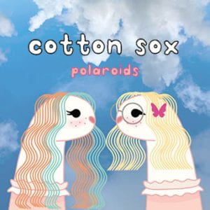
Front of the finished digipak
Stuart Hall’s reception theory shows us how our brand needs to have a cohesive message across all products which can be used to encode specific messages (ideologies) for the audience to decode in order to achieve a preferred reading of the text. It is important for our brand’s messages of youth, playfulness and creativity to come across effectively so that the audience will receive the right message and buy into the brand and it’s products.
Our products worked together to create a sense of branding by all having the same repeating visual motifs throughout. These motifs include the bubble-writing typeface, the sock puppets and also the imagery of a summery, soft-hued sky. All of these motifs are

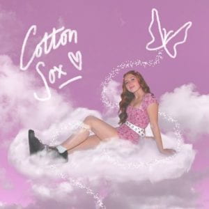
Tour promotion on social media page
represented in each of our products; for example, the sock puppets used in the music video were digitally recreated for the digipak and the design features of the digipak were carried through to promotional posts on our social media. These repeating components encode our products’ brand as child-like from the sock puppets but also with an unusual, magical element from the use of the different coloured clouds/sky.
The similar design features of each of our products create a cohesive brand by giving it a recognizable colour palette and style which becomes synonymous with the star’s brand. This helps our products become more of a lifestyle and brand that the audience may find engaging rather than just a set of separate pieces; allowing a certain demographic to identify with it as their preferred reading material. The demographic our brand aims at is

Screenshot from narrative element of the music video
alternative teenage girls to young adults which our brand appeals to through the use of the soft ‘girly’ colours,also notably the unusual metaphor of the sock puppets which is not a prop conventionally used to represent an artist, showing the slightly alternative and quirky route our brand takes.
According to Nick Lacey, a piece of media has a ‘repertoire of elements’, these elements are what makes our product conventional to its’ indie-pop genre through the use of sound, costume, setting, theme and camera/editing amongst other components. Richard Altman suggests that these main components define a blueprint for the product, in our case a music video, and can be either followed to adhere to our indie-pop genre or be challenged to evolve the genre to something more. We chose to do both by keeping some typical conventions we’d noticed in professional videos in order to make sure that it is still clearly in our chosen genre; however we also subverted some conventions so as to bring something new and evolve the genre.

Screenshot of performance piece of the music video
One example of our research reflecting our production is through analysing the music video ‘Mariposa’ by Peach Tree Rascals, a music video of the same indie-pop genre of our music video. This analysis shows that a convention for a video of this genre is being outdoors/in a summery setting. We mirrored this in our music video by the majority of our shots being outside in a rural setting using a naturalistic high key colour palette. This is a convention in the indie genre because it connotes the laid-back, playful and fresh feel of the music.
A second example of how our research influenced our final product was through looking at other more indie/alternative female artists to see how their music videos are designed and

Screenshot from performance element of the music video
shot. One very prevalent alternative artist is Billie Eilish, whose music videos are conventionally very surreal and usually have darker themes and clashing colours. We challenged this convention by keeping the playful surrealism of the genre whilst flipping the dark themes to the opposite and having our video be very soft toned and light-hearted to appeal to a more optimistic and playful audience. Our narrative can also be seen to challenge a typical music video’s conventions as the romance is between two female characters rather than a male.
Richard Dyer’s theory of the star image is an observation which influenced us in how we needed to utilise our products to present our star’s metanarrative. Our star’s image also needs to present a certain amount of relatability so the audience can identify with them through our products, this is why the design of, for example, our digipak, must coincide with our demographic community’s style and interests. We achieved this by Barthes’ idea of cultural, semic and symbolic codes portraying an alternative teen icon with themes of romance, surrealness and naivety.

Typeface used for front of digipak
One example of how our product reflects an entire social group is through the typeface we have used. The use of bubble writing and lower case lettering encodes a naive and playful nature to our product which represents the personality of our young and fun-loving audience. The handwritten sense of the typeface also implies that there is a personal touch to the digipak, allowing the star to feel more relatable and connected to their audience community by showing a sense of personality and a human authenticity connoting the album’s informal feel.
Secondly, the repeated use of the semic code of colours such as soft pink connote feelings of romance and femininity,
Inside leaf of digipak
this matches the image of our star and the community we are trying to portray. The symbolism of the clouds also can act as a cultural code for a dream-like, angelic image which supports the surreal feeling which we are intending to connote in order to adhere to our off the wall and quirky audience.
Creating a social media page for our star helps our audience engage with our products through implementing the audience theory, AIDA: attention, interest, desire and a call to action. This theory led us to create posts with lots of teasers in order to intrigue our audience. Utilising imperative verbs as a call to action in our comments/captions of product promotion can also be used to stir a sense of urgency to interact; therefore allowing our products to engage more heavily with our audience.

Caption of social media post
Synergy is one example of a marketing technique we used on our social media page to engage with the audience. We did this by creating a sponsorship with Beats headphones which begins to create an identity around our star of a fidelity to music that the audience can recreate by buying the same products as being advertised. This coincides with Blumler and Katz’s Uses and Gratification theory in that the audience can create a personal identity that shows their interest in the star through copying and buying into what we advertise on the social media page.
Secondly, another post on our social media page which allows our audience to engage and interact with our artist is

Competition post on social media page
the “competition” we set up. This post was a call to action for the audience to share the post to win a prop used in the star’s music video, an example of using cross media convergence as a marketing element. By doing so we are utilising Blumler and Katz theory by giving the audience a platform for social interaction and thus advertising our star by the internet’s word of mouth. This competition would also help to form the audience’s personal identity around the star because they would feel connected to them through owning the same prop that the star used and maybe even making their own videos with it. This creates a sense of community around the star and allows the audience to interact and therefore engage with the product.
Critical Reflection Prep
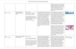
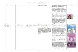
To prepare to write my critical reflection essay I put all of my ideas for each section into a planning document which made sure my essay would be structured correctly. I used this plan to construct each section of my essay which could then be put together to make the final piece. This preparation made it easy for me to make sure I was answering the questions, using theory and also using examples of my own work.
Please click on the JPEGs below to view the full planning document:

Design Skills 2
After working in Premiere Pro for longer now I have become aware of many more functions the program has which have helped me to add some more meaning to the narrative of the video through the camera and effects. Meaning can be made through camera by what an effect can represent, for example, different colours/filters can each create a different mood or meaning.
 To elaborate on this, one tool I’ve found really helpful is the Lumetri colour application which we used to add a filter of colour over some shots using an adjustment layer. This tool allows you to add a wash of any colour you like by adjusting the colour wheels to find the exact colour you want. This was perfect for the shots of the sock puppets as we wanted them to have a dream-like feel and wanted the audience to perceive them as flashes of the star’s past relationship. Giving the sock puppets shots a pink hue with Lumetri colour connoted the idea of the relationship being looked at ‘through rose coloured glasses’; insinuating how perfect it seemed.
Another tool which we will use to add meaning is the zoom tool in Premiere Pro to create a gradual push in effect to some of our shots. This will help us to create meaning by allowing us to draw attention to parts of certain shots, for example, the polaroid camera on the line of the lyrics which mentions it. The push in effect can also be used in the shots of the star lying on the ground; a gradual zoom on this will make the shot feel more surreal and entrancing which will draw the viewer in. This will also help connote the dream-like themes of the video.
Design Skills 1
Premiere Pro is a new program to me and so I’ve found many different features in it which I can use to make my music video look more professional and to help convey my star image better.
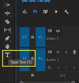 One tool I’ve used in Premiere is the text tool. This tool is how we’re planning on adding a title card to the beginning of the video to introduce the song. The text tool was helpful because it allowed us to choose what font and colour we wanted our text in; it can also be used to add a drop shadow or adjust the spacing of the letters which meant we could get the exact font we envisioned. This will contribute to a more cohesive music video because our song title card will match our mise-en-scene and we have also learnt how to place it in keyframes so that it appears on screen to the beat of the song.
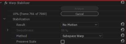 A second tool I’ve learnt to use in Premiere is the warp stabilizer which has been really helpful to correct footage which we want to use but is not completely stable. This tool helps to focus the shot onto a certain point and from that stabilizes the video around it which was useful when we had a shot that we needed to use turn out a little shaky. This tool helped to make the video look well shot throughout and get rid of some minor filming errors without having to reshoot.