Digipak Draft 3
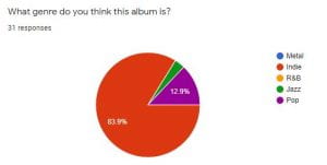
To make sure that the third draft of our digipak could be our final draft we sent out a poll to our peers asking them to choose which genre they would think our digipak represents. The majority of the responses selected the correct genre, which was indie, however a small amount chose pop which is still useful to know since we would class the genre as indie-pop more specifically.
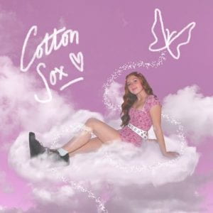
These are the final images for the final draft, please click on the images to view the full PDF:
Inside leaf of digipak

Digipak draft 2
For our second draft we’ve added our design elements to the inside covers and added the typical conventions of a digipak such as copyright information and a record label.

Below is a Screencastify of our teacher giving us feedback:
Targets for improvement:
- Change the typeface to a sans serif font and try to make it pop out from the background more.
- Add more illustrations to tie in the butterfly on the inside cover
- Remove the logo from the socks
- Colour correct the polaroid images on the back cover
Digipak Draft 1
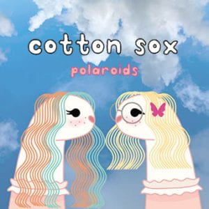
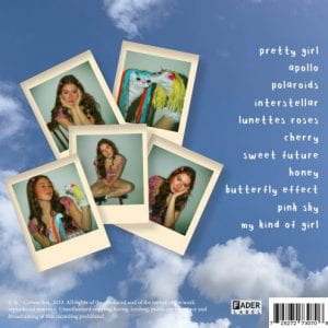
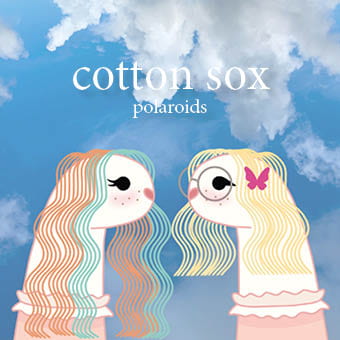
Please click on the image below to view the first full draft of our digipak. We have created our overall foundations of our digipak however we still need to add in crucial information such as the copywright and record label. Our inner panes also need the design elements added as at the moment this draft just shows their backgrounds whereas the designs of the outer panes are almost finished. We chose to use a digital drawing for our cover because it fits in well with the conventions of an indie genre digipak and also relates to the playful and youthful aspects of our artist. For the back cover we chose to use polaroid images to reflect the album’s title and also a lyric in our music video. One other component that is yet to be added is our typefaces as we have made them ourselves and have yet to upload them into indesign.
Evaluation of Shoot
Overall, our digipak shoot ran smoothly and we were able to get all of the shots that we envisioned in the drawn mock up and some other ideas we had too. We also shot with two different types of mise-en-scene because we were unsure of which one we preferred and fortunately we had enough time to do this. Another goal we intended to achieve from this shoot was to take some ‘behind the scenes’ images that we may use on our artists website to advertise the upcoming release of the album.
After looking at the contact sheets we were pleased that we completed everything we wanted to in the shoot and were able to choose which mise-en-scene we wanted for the final digipak. From reviewing the images we saw that we got the right poses we wanted to imply a casual/photo booth-esque feel to the back cover. One thing that needs to be changed is the lighting to look more like a disposable or polaroid camera has taken the pictures however this can easily be changed in PhotoShop later on.
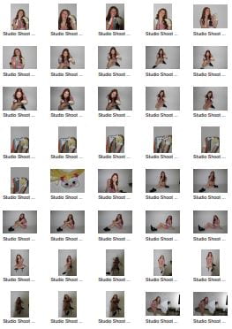
Contacts sheets
Below are the contact sheets for our digipak shoot; we chose to use a variety of poses and shots in two different outfits/mise-en-scene to decide which we think fit better with our overall idea. In retrospect, we both agree that from being able to compare all of the images together on the contact sheet the first mise-en-scene choice is much better and more fitting with our star image.
Making these contact sheets were helpful because it allows us to look at all of the images at the same time so we can compare them and see which ones we would like to pick out to use for our digipak.
Click on the image to view our full contact sheets:
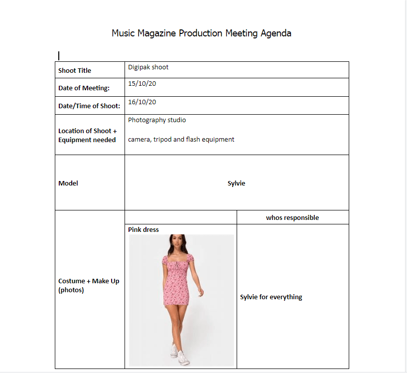
Photoshoot PMA
Prior to our photoshoot for our digipak images we have drawn up a production meeting agenda and also a risk assessment to ensure our shoot runs smoothly; this is important because we only have a limited amount of time in the photography studio so we have to make the most of our time in there. Writing up this meeting agenda also makes sure that we both agree on the mise-en-scene of the model and who’s providing it so there aren’t any surprises or mistakes on the day.
Usually before a shoot we would also make a risk assessment document but since we are shooting in the school studios there aren’t any real risks to account for.
Please click the image below to view the whole document:
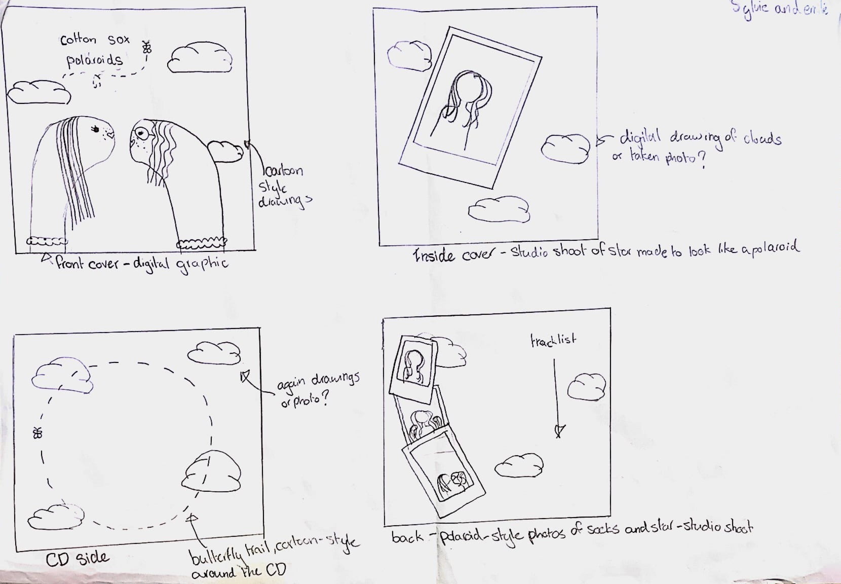
Hand drawn Mock-up
We’ve drawn this rough mock up of our digipak in order to discuss and agree upon the specific design elements and also to be able to visualize what the finished product will look like. Our final decision for our digipak is to follow the conventions of many indie album covers and use a graphic as our front cover. This fits in well with the aesthetic of our star and also the genre itself by being quite quirky, colourful and surreal. Our star will be featured in some parts of the digipak in the form of photo-booth- like polaroid pictures to ensure that the star is still present in the album if not on the front cover. For the star images we will plan a studio shoot and for the sky background we will also have to take some pictures; the rest will be digitally illustrated to give the cartoon-like, playful theme we’re looking for.
Branding Moodboard
After looking at some conventional indie-pop digipaks we can now start to collect ideas for the design of our own. To do so we must take into account mise-en-scene, colour schemes, previous similar digipaks and any graphics or typefaces we would like to include. We also needed to make sure our ideas fit in wit the star image we created for our music video so we added a few similar ideas to keep our star’s metanarrative and brand cohesive.To collect all of these ideas I’ve made a moodboard on Padlet with ideas for each component of the digipak which we can then use to create a first draft:
Digipak Conventions Analysis
In order to begin designing our digipak we must first look at others made in the same genre to be able to see what the typical features and conventions usually are. In the case of our performer this was indie-pop so I chose to analyse the album ‘Kid Krow’ by Conan Grey, a young indie artist, to see what we need to include in our digipak and how the genre is connoted through the design of the album.
Our Mission Statement- The Package Brand
Please view this slideshow showing how we created a package brand for our star: