After being introduced to Indesign we had to create a replica, as close to the original as possible, of the front page of a magazine, including the conventional features of a magazine front cover such as a masthead, cover lines, a pug and a main cover star.
Below is both, my final draft and the original.
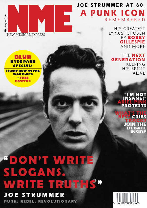
My final draft. Please click on the image to see a PDF
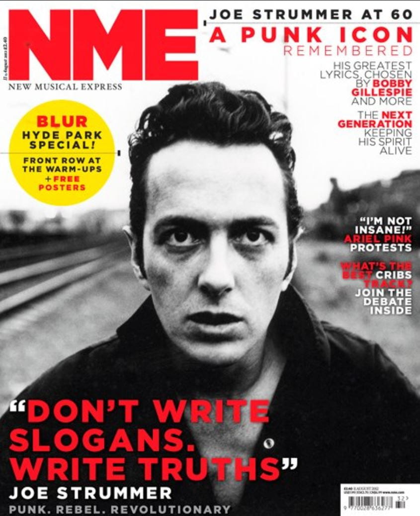
The original magazine cover
This task has successfully introduced me to Indesign and how to use its features such as adding text, changing the stroke of the text, adding shapes and filling a frame proportionally with an image. I have also been able to consolidate my knowledge of the conventions of a magazine cover which will be essential when producing my own. Here, I have listed some of the strengths and weaknesses of my mock-up front page:
Strengths:
- I found it easy to navigate placing an image to fill the frames.
- I was able to change the spacing in between the lettering to more accurately reflect the original’s font.
- The layout of the quote at the bottom left of the front cover, matches the positioning in the original.
Weaknesses:
- In places, such as the pug, the text is bolder than the original.
- The alignment of the cover lines on the right of my magazine cover is not right. They are not in line with each other.
- I struggled to find the correct fonts to match the original.
Here are some YouTube tutorials I found that will help me in the future to use Indesign more effectively.
These tutorials will help me when it comes to using Indesign in the future for my tour poster and magazine. Using these videos I will be able to navigate around text in Indesign more easily as this was what I struggled with the most during this task.