Category: Component 1
Question 3: So… How did your production skills develop throughout this project?
Question 2: So… How does your product engage with audiences and how would it be distributed as a real media text?
Question 1: So… How does your product use or challenge conventions and how does it represent social groups or issues?

Adverts
Here are two adverts that I think would work really well in my magazine. They are both in high resolution, simplistic and I think they would suit my target audience perfectly.


The perfume advert: I think this is perfect for my target audience as they are young, middle class women who could afford to spend a little extra on beauty products. My demographic are into taking care of themselves, especially their appearance, fashion and shopping. So having a luxury perfume advert is perfect. Jennifer Lawrence is also a very recognisable actor in the age bracket of my demographic so she will draw the attention of my readers.
The awards advert: This is well suited to my target audience as these awards are given to the fresh faces of country. These awards are the BRITS of country music so this is a big event in the calendar of my target audience of young, female country fans. My demographic are also homebodies, so having an advert for the awards on TV is perfect for them. The main artists on the ad are very well known and particularly Carrie Underwood is the perfect representation of young, fresh country music, which is the focus for my magazine.
A New Improved Complete Magazine Draft
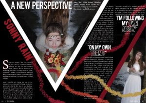
What have I changed?
- I have added another colour throughout my magazine, adding the red to all pages.
- I also changed the background on my front cover so it is a gradient and not boxes. As well as this I added a drop shadow on my main cover model.
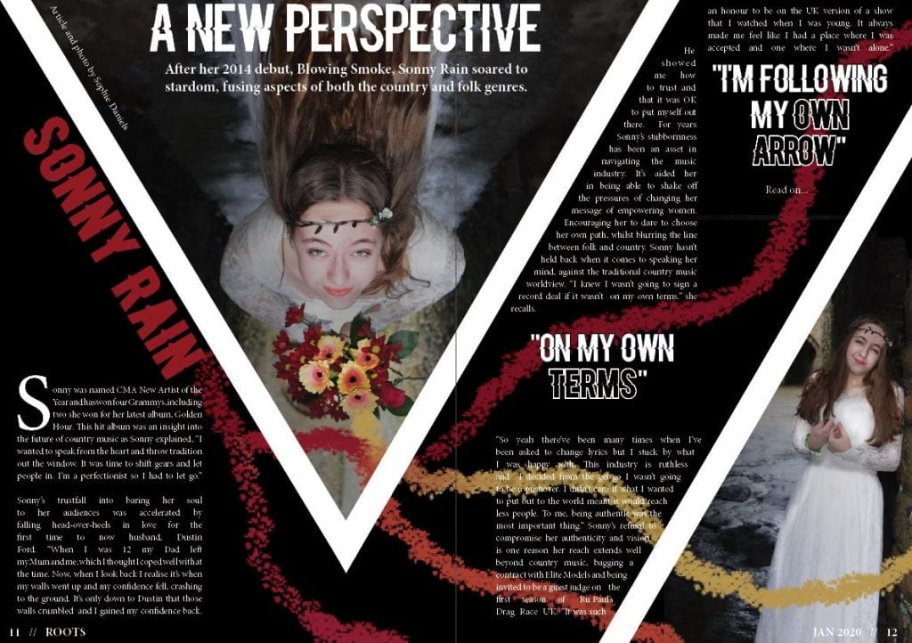
- I have moved the headline and standfirst on my DPS so it doesn’t get lost in the fold of the spread.
- I also added some small details eg. making the exclusive box on the front cover black, adding an arrow to the end of my DPS to instruct readers to read on and moving Sonny Rain’s name into the blank space to fill it on the contents page.
My teacher gave me some feedback:
- On the contents page, add cover lines under the two headlines without and get rid of the with under most headlines as it’s repetitive.
- Increase the line space on the quotes on the DPS.
- Add text under the last quote on the DPS.
- The standfirst could be bolder.
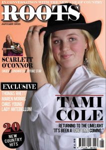
Complete Magazine Draft
Here is my first complete magazine draft:
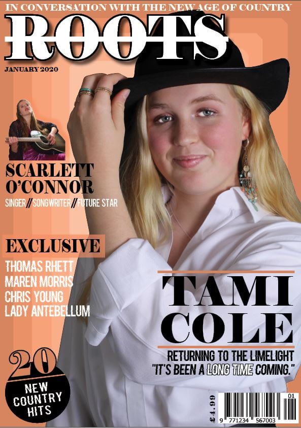

Please click to view PDF.
My teacher has provided me with some very helpful feedback. Here are her comments:
A summary of my teachers’ comments:
- Good coherency throughout.
- Like the fonts on the front cover.
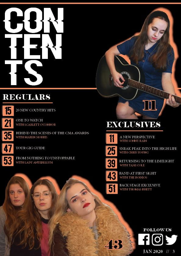
- Introduce another colour to the front page eg. on the pug.
- Add this extra colour to the contents page – alternate colour boxes for the page numbers.
- Add the artists names to their images on the contents page.
- Headlines on the contents page to be bigger and bolder.
- Like the social media icons.
- Move the headline on the DPS over to the left and move the byline to the other side of the triangle.
- Check the line spacing.
- The line for the second image could be in one of the colours from the flowers.
- Add an arrow to the read on at the end of the article.
So… How is it going?
Throughout this process I have adopted many new transferable skills:
- Organisation – The blog league has helped me to keep organised and I have been able to keep up to date with it.
- Communication – I have been able to communicate my ideas to my audience through my writing for my article, and even through the photos I’ve taken and used.
- Reflection – From the feedback of my peers and teacher, I have been able to reflect on it and improve my magazine. Using feedback to better my work is going to be really helpful in other projects and aspects of my life.
- Design software skills – I have learnt how to use photoshop and Indesign efficiently. The skills I have learnt whilst using these apps will be very helpful in the future when creating any digital media.
So far, I am pleased with my progress on my magazine. Here’s a few things that I think have gone well so far:
- The coherency of colours and fonts throughout my magazine.
- The images appear to be reflective of my chosen genre; country.
- My article on my DPS.
My magazine still has lots of improvements to be made. It would be even better if…
- My line spacing on my DPS was better and consistent.
- I introduce a new colour to my magazine to make it more exciting.
- The headline on my DPS was not centre of the triangle as part of it will be hidden by the fold.
Design Skills 2
Throughout this process of creating and designing my magazine I have become more confident using Photoshop and Indesign.
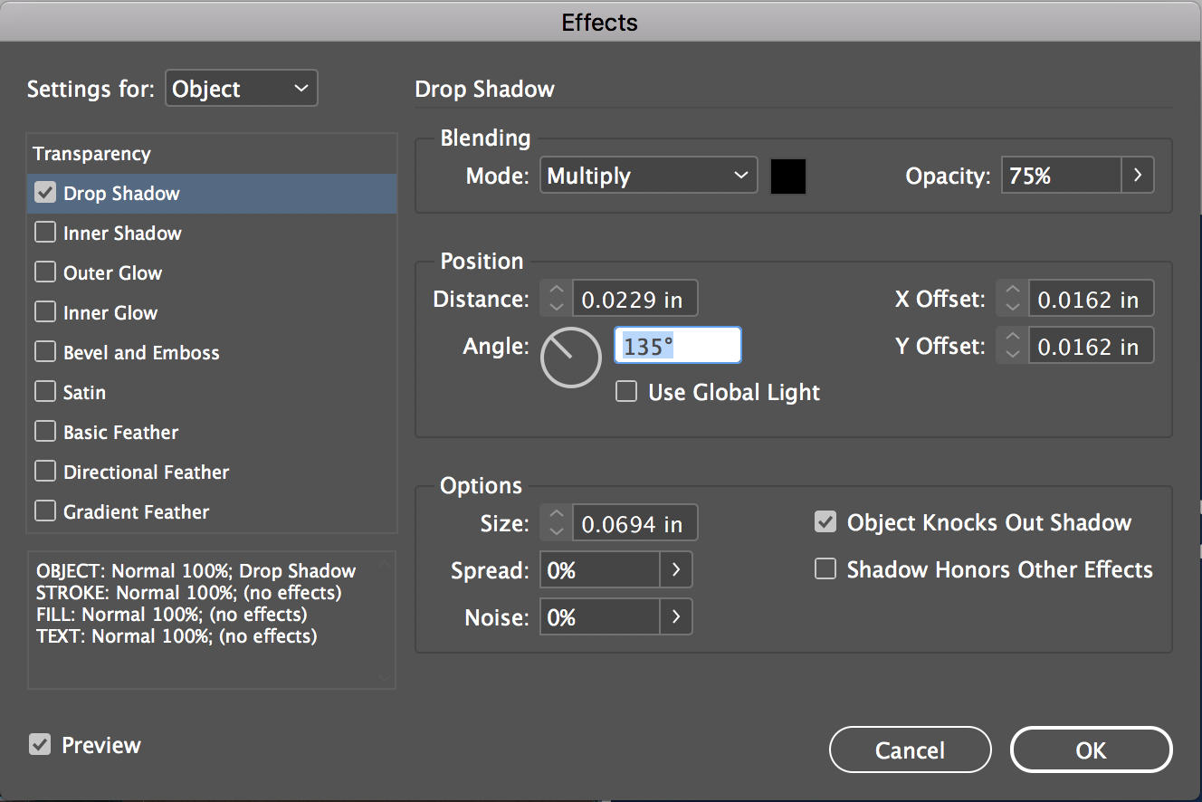
One tool that I have found really useful during this process, particularly when constructing my contents page, is the drop shadow tool. This has been very helpful to make the artists look like they are coming out of the page, making them appear closer to the readers. This effect added to the fact the artists were untouchable stars, adding to the extraordinary side of a star from Richard Dyer’s Paradox of the Star theory.
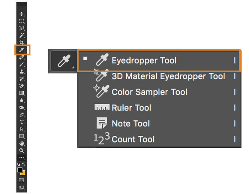
In Photoshop, the eyedropper tool was very helpful to match colour schemes. It was particularly useful when creating the paint lines on my DPS. I was able to match the colours to those in the flowers which enabled the magazine to look coherent. Being able to match these colours and choose colour schemes has helped me to convey my genre in the most clear way possible. For example the colours associated with country music are oranges, reds, yellows and black which I have tried to include in my magazine.
Overall, I think these design techniques that I have been experimenting with and using have been very beneficial in the process of creating my magazine. These tools are helping me to construct a magazine with small details that help to convey my narrative and genre.
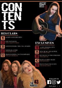
A New Improved Contents Page
Please click to view PDF.
I had a conversation with one of my peers. Here is the recording of her feedback on my second draft of the contents page.
Some of her feedback included:
- It is coherent with your front cover and the rest of the magazine.
- It could use another colour being added to add a bit of excitement.
- You can clearly tell it’s from the country genre.