Here you are able to see the stages of the illustrations that I have done to complete the catfish side of the digipak. To begin my drawings I simply drew out two catfish wrapping around each other using a simple black pen. I then added in some shading to the catfish and details of the fins and main body.
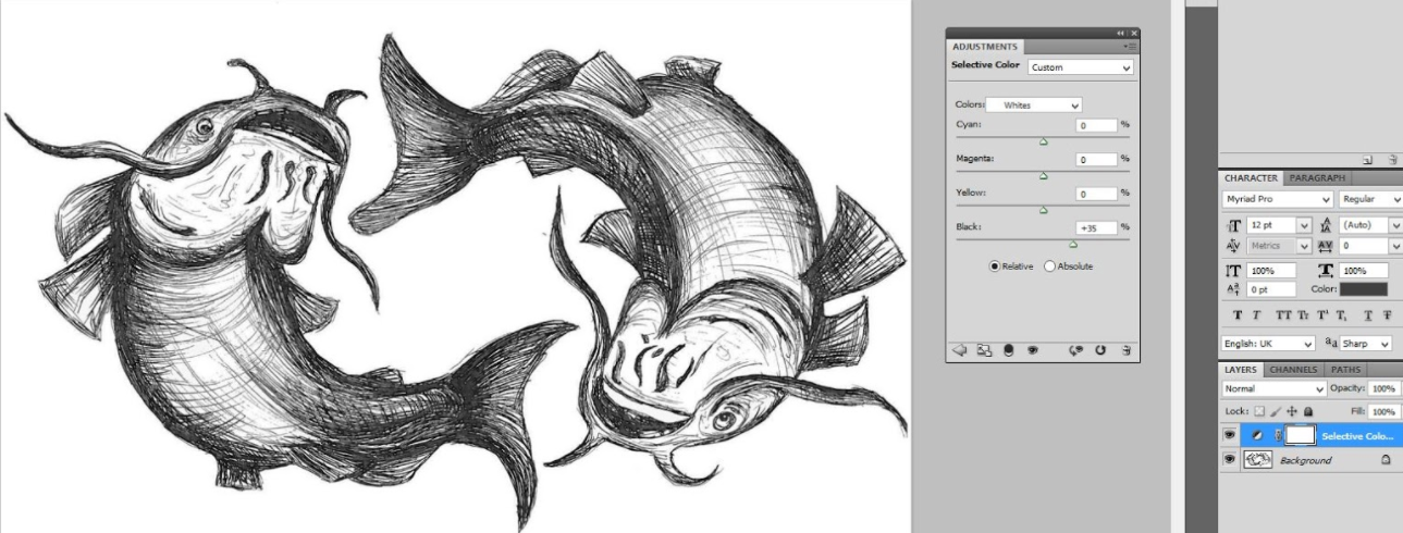
As you are able to see below I have scanned the drawing into the computer and put the sketch into photoshop ready to edit. To begin this edit I increased the colour balance allowing the lighter lines of the shading to become more prominent and obvious. To do this added a mask on photoshop and chose, selective colour, allowing me to select the blacks, neutrals and whites specifically to enhance and help the image to really stand out.
“Colour change”
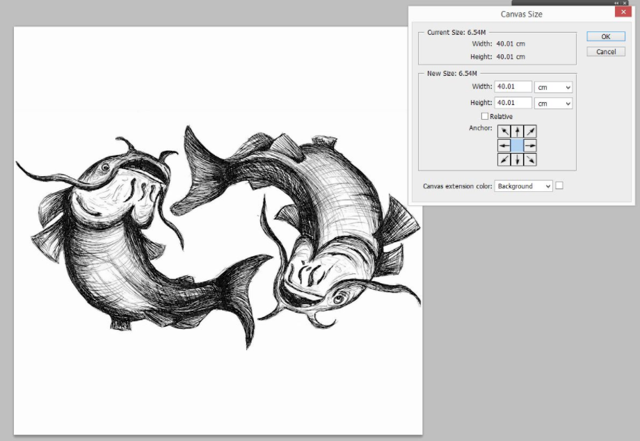
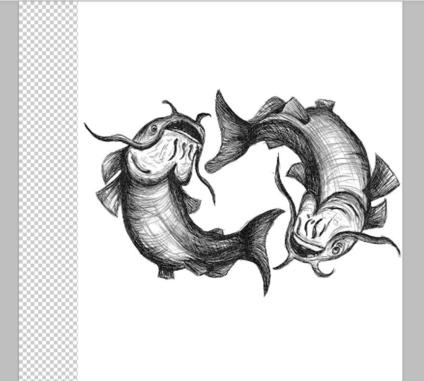
After completing and changing the strengths of colours of the illustration I wanted to make the drawing square so that it would be able to fit into a actual digipak cover. To complete this I changed the ‘canvas size’ of the image to 41×41 where as before it was 42×51.53. By doing this is shrunk the image and it became a square. However; I realised the drawing was far too rectangular and wide to fit around a CD, so I took a step backward and created another layer of the image, (shown below, titled ‘image being squashed’) to squash the image down and make it become a lot taller than wide.
“Image resizing, rectangle into square, 40×40”
“image being squashed”
Here is the editing process of making the image taller rather than wide, so that it will fit around the CD nicely as explained above.
After ‘squashing’ the illustration I went along and changed the image size back to 40×40 so that none of the drawing would be cut off.
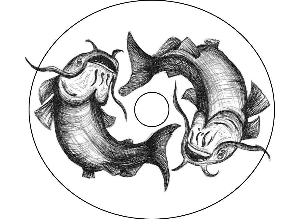
Above I then added in the shape of a Cd to show the idea of how the drawing would fit behind on the digipak. I am really happy with the overall out come of this illustration even though it is just a draft of our final piece. It really gives us the idea on what our final product will look like.