Here is Draft 2 of our Digipak and Advert, you are able to see that they are both quite similar but this was done deliberately. So that the audience and potential buyer would be able to recognise the album once released from the advertisement.
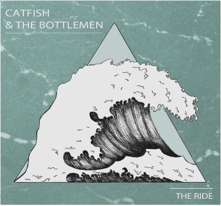
Front Cover:
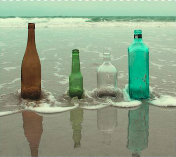
Inside Left:
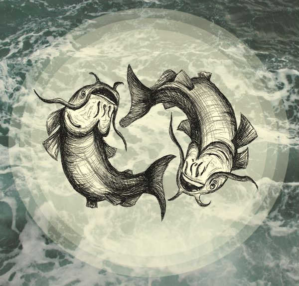
Inside Right:
Back Cover and Spine:

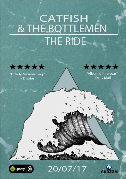
Advert:
We have now completed draft 2 of the digipak and advert, so I am going to ask my peers where to improve and make them better. Now that I have exported the advert and front cover of the digipak, the colours do not match so, in the next draft I am going to make sure the colours are correct.
What has changed from Draft 1:
Front cover: Made sure the text and wave are in the same colour and changed the background to the sea to fit the inside right cover.
Inside left cover: Made the silhouette to the bottles on the beach.
Inside right cover: Completely changed from squares to circles and scrapped the writing,’The Ride’.
Back cover: I have added in a extra hook where feedback said there was a patch of empty space.
Advert: -aligned the main titles into the middle of the advert rather than the left side.
-Moved the icons of the companies to the bottom of the advert, equally spaced.
– Added in another 5 star rating to make the advert more equal and symmetrical.
Overall I am so much happier with the look of the digipak and advert because they all link together through colours and the theme of water and sea.