My Tour Poster


Seen above are a range of rap tour posters, as you can see they all share some of the same conventions, for example a large majority sharing the same color scheme of black and white. They also have an intimidating block font as well to represent the artists attitude, and they also show the artists them self. For a poster you have to look at AIDA, this stands for Attention, Interest, Desire, Action, these are all the essential factors in a poster, Attention means the poster must grab the attention of people. Interest also applies to the design of the poster, it has be interesting enough for people to want to go and see it. Desire is how appealing the poster is. Action applies to where the tickets are being sold etc.

Seen below is my reflection of my poster.


My Magazine Front Cover Swede

Please click on the image to see the clearer PDF


The two pieces shown above are the original magazine cover, then my mock up of the same magazine cover. As I couldn’t find the original image I had to find my own image to use, which meant changing the colors of the original text, and moving some of it around, for example the Arctic Monkeys cover line had to be moved so it didn’t obstruct a band members face. This task has helped me learn the basics of InDesign, as now I have a basic understanding of how I can create a piece of media, this will greatly benefit me when I am creating my tour poster.The task has also helped me reinforce my understanding of magazine layouts, like mastheads, cover lines etc.Below this you can see the strength and weaknesses of my mock up and its design process

Strengths

  • The general placement of everything was sound, only 1 of the text boxes had to be moved at the end
  • I think I did the main cover line quite well, all of the angles used are consistent and look good
  • I created the posters found in the bottom right well, using several layers for them.

Weaknesses

  • The Main cover photo is slightly lower in resolution, if I spent more time finding an image, I could have found a much more high quality one
  • The Fonts are different compared to the original, as the original fonts are much more thicker and bolder
  • Placement of the fonts could have been slightly tweaked, for example, on the plug at the top, the S is slightly cut off, this could have been easily fixed.

I have found some YouTube videos that I will watch prior to making the tour poster next week.


The Camera Talks

In this task, we went around the school and photographed what we thought could potentially create a narrative. Then after taking them all I created the mood board above and added the denotation (what it is), the connotation (what you could derive from it) and what technical term was used with the camera. As you can see it was very successful, getting a varied range of shots, as-well as different emotions, ideas coming from the pictures.

This will be very useful when creating my music magazine as I will have to create a narrative for the front cover, using things such as props and setting, and I would also have to factor in the type of shot being used and what angle the shot is from, for example higher angles can create the feeling of weakness, while lower angles can create the feeling of power.

Technical Camera Terms


The contact sheet below demonstrates different angles and compositions used with a DSLR, previous to this photo we learnt about how to utilise an aperture(F-stop) and shutter speed to its best ability. Apertures affect the depth of field (what the camera is focused on), for example if you were taking a long shot and wanted everything to be in focus with would use F22 but if you wanted to have a strong depth of field you would use F2.8. On the other hand shutter speed can be used to stop action or create a sense of movement in a photo, for example if you were taking a picture of a sport car you would set it to a very high shutter speed if you wanted it to be sharp and in focus, although if you wanted to create a sense of movement you would have to set it to a slow shutter speed to it blurs slightly.If we had set all these correctly the photo would be exposed well and would look good. All the images below used angle and framing to create a narrative for the audience. This will impact when I come to take photos for my magazine as I will know how to create a narrative just from a photograph, without words being used.


My image that uses mise-en-scene to communicate meaning.

Mood-board

For our mood-board, our group was given the genre of rap, for this task we had to find images that represented the most common conventions found in rap music. These included things like bling, oversized clothes, and a large amount of accessories. We then found connotations of the images to find attritbutes such as Intimidating and carefree. This would help us with the next part of the task.

Made with Padlet

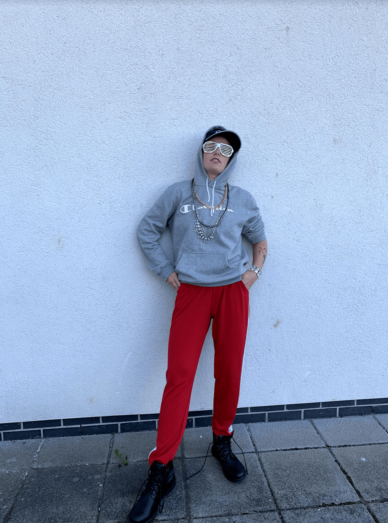
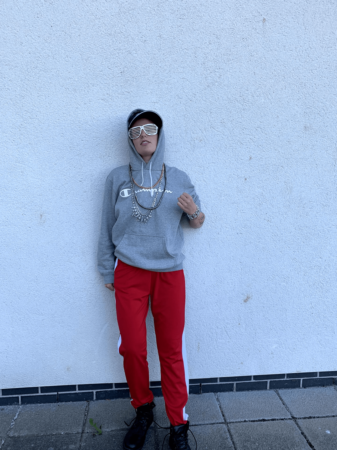
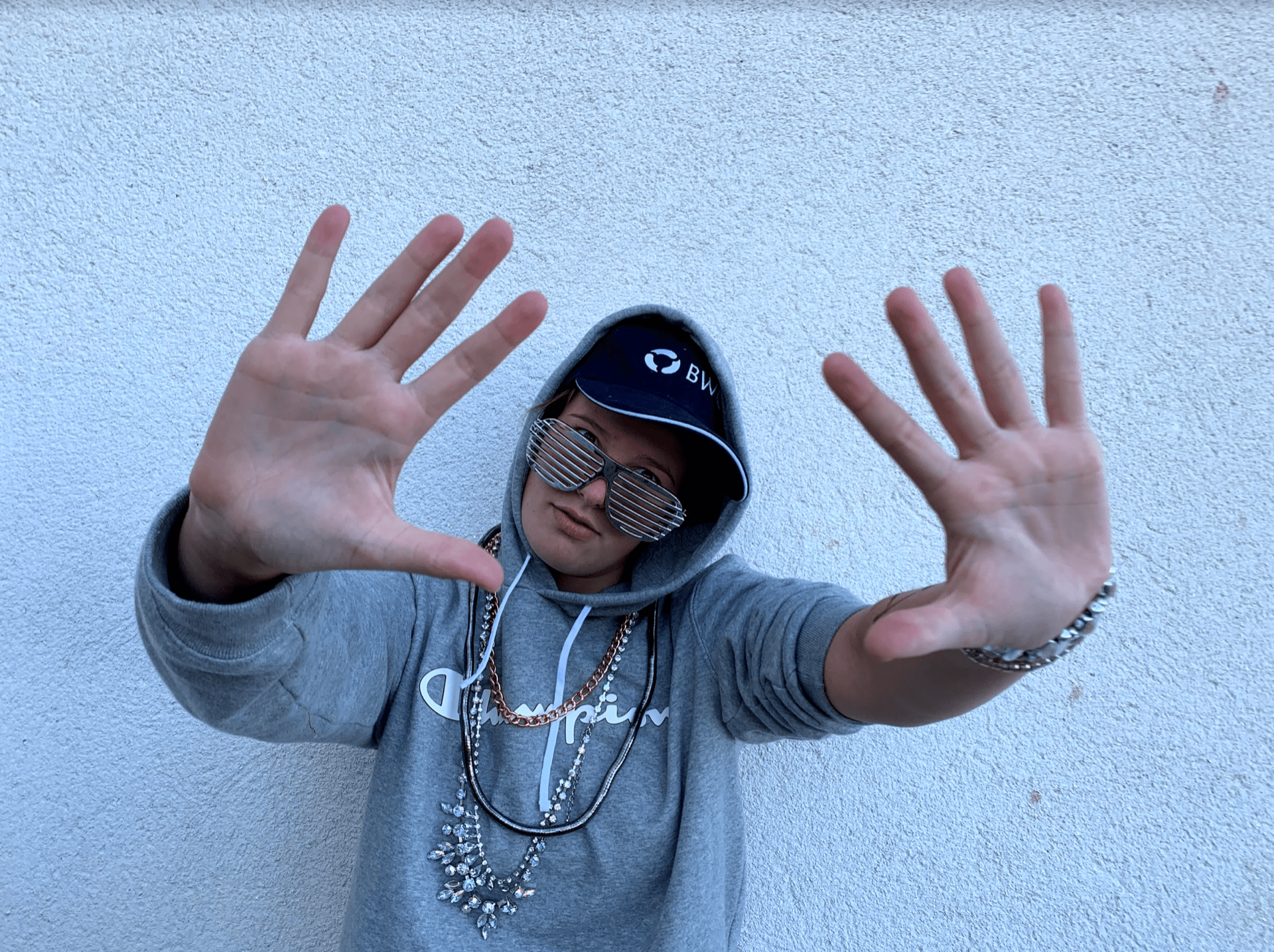
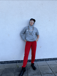
This mood-board helped us when we were creating our mise-en-scene as it would give us the idea for the C.L.A.M.P.S (Costume, Lighting,  Actor, Makeup, Props, Setting) we would use. We then dressed up in the appropriate clothing that would create the right mise-en-scene and create the image of what we decided was a rapper, we tried to give of the effect of intimidation and care-free feel.

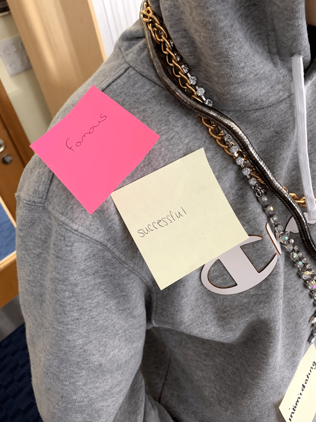
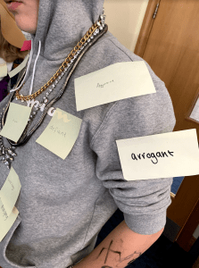
After dressing up our model, post-it notes were placed on the model to describe the mise-en-scene and how they compare to the music genre we were given, these were words like rebellious and wealthy.


This tasked has helped me as it will be able to be used when creating our magazine cover in the future, as I will need to research what works and what the audience would want to see for it to be appealing, it also will help in decision making for ours designs as we would have to choose what the most ideal CLAMPS would be for the front cover of the magazine.

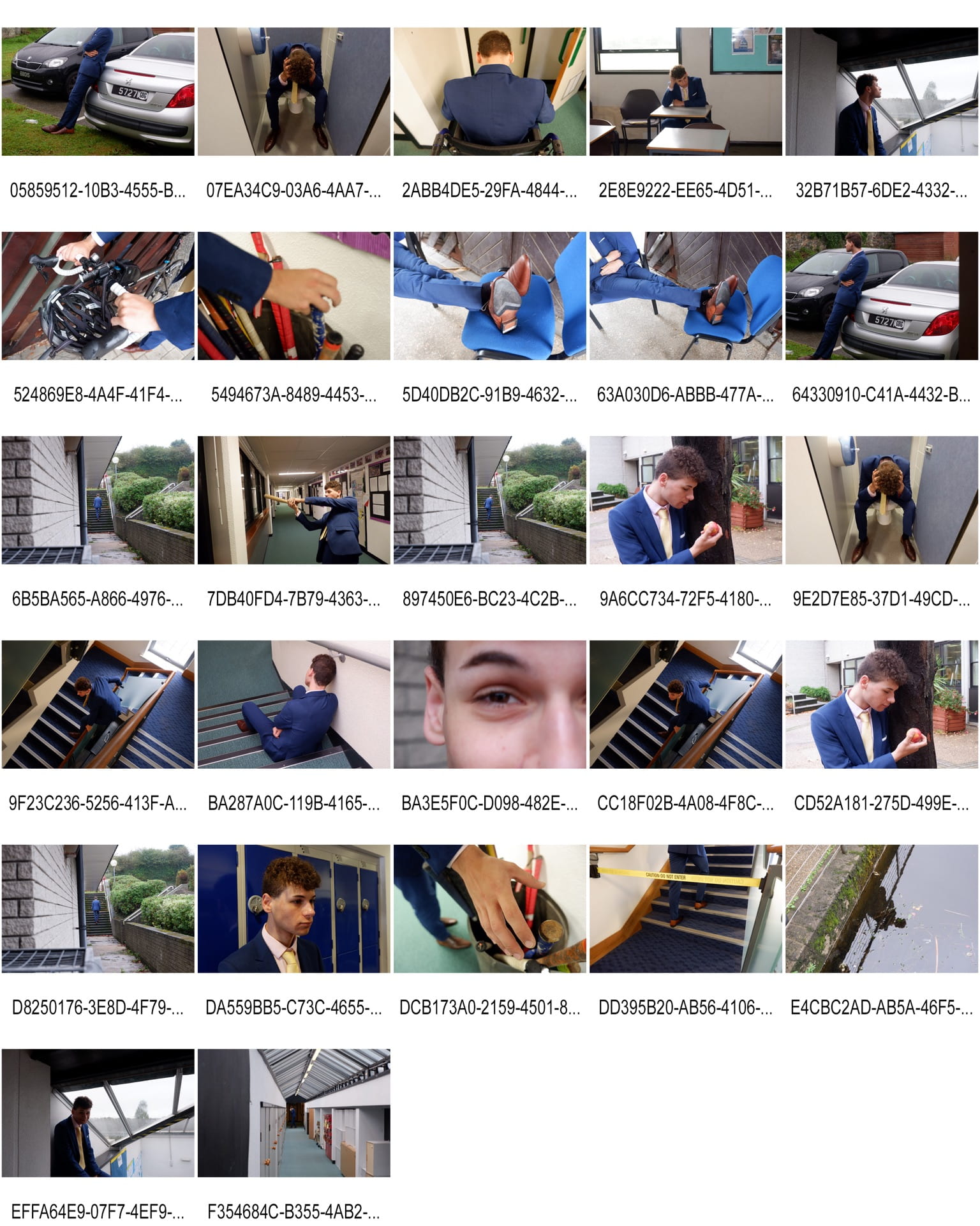
Here are the final photos below.


This whole process, the moodboarding, finding connotations and the photoshoot will all be able to be used when creating my own music magazine, as I will have to take several photoshoots, all with different feeling and attitudes deriving from them. This means I will have to think about every aspect of my magazine photos, and choose everything for a specific reason, in order to create the correct mise-en-scene for my magazine. The audience feedback has also assisted me as it has told me that we created the correct mise-en-scene, because the audience could find the correct denotations as-well as connotations from the model.

Print Media that Communicates Meaning.

This is the Tour Poster I have decided to analyse. Every feature on the poster has a purpose, every font, image and the placement of them. Mise-en-scene is a term used to describe things in the frame and how it is arranged. This is shown by things such as fonts, colours, images, body language and make-up, for example in the poster Gerry Cinnamon is smoking is a cigarette, this signifies rebellion and would appeal to his target audience. I will need to consider theses factors when making my own music magazine for my front cover.