My Tour Poster
To help my research, I began to research Rap Tour Posters. I now know that to make my poster successful I must consider the following elements of AIDA:
- Attention
- Interest
- Desire
- Action
Addressing these will help to make my tour poster successful and suit the target audience. It also must be unique so that it stands out, while fitting in the conventional style.
I have learnt that Rap Tour Posters often:
- have a Black Background
- contain imagery of the star
- imagery often in black and white
- have bold text
- contain splashes of colour (often red, blue or yellow)
- have a simple layout
After knowing these conventions, I began to deign my own poster. I chose to use a black and white theme, I then used red and yellow colours for the titles and information, against the black, this stands out, and makes it very eye catching. It also shows the information clearly to the viewer, this would encourage them to be interested in the event. It meets the comnventional designs of a rap tour poster with the black and white theme, and colour added. It also contains imagery of the cover star, and bold text, which all suits the theme. However I think that my poster is unique due to the layout I used and the fonts. I used a simple layout, as majority of the posters do, but used different angles to make it slightly more interesting.
My poster also addresses AIDA as it draws attention due to the bright colours and large imagery. It generates interest due to the lack of information about what the tour is, this makes people interested as they want to know more about the tour. It creates desire, as the audience want to be like the cover star and also not miss out on the event. Finally, it has information at the bottom for the stars website and where they can buy tickets, this makes it easy for the audience to take action on what they are seeing.
I think that the colour scheme and imagery both work well together, however I think that the white outline around the star really distracts from the poster, and to improve I could get rid of this line.
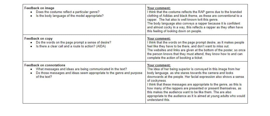
Here is my self assessment sheet for my poster:


