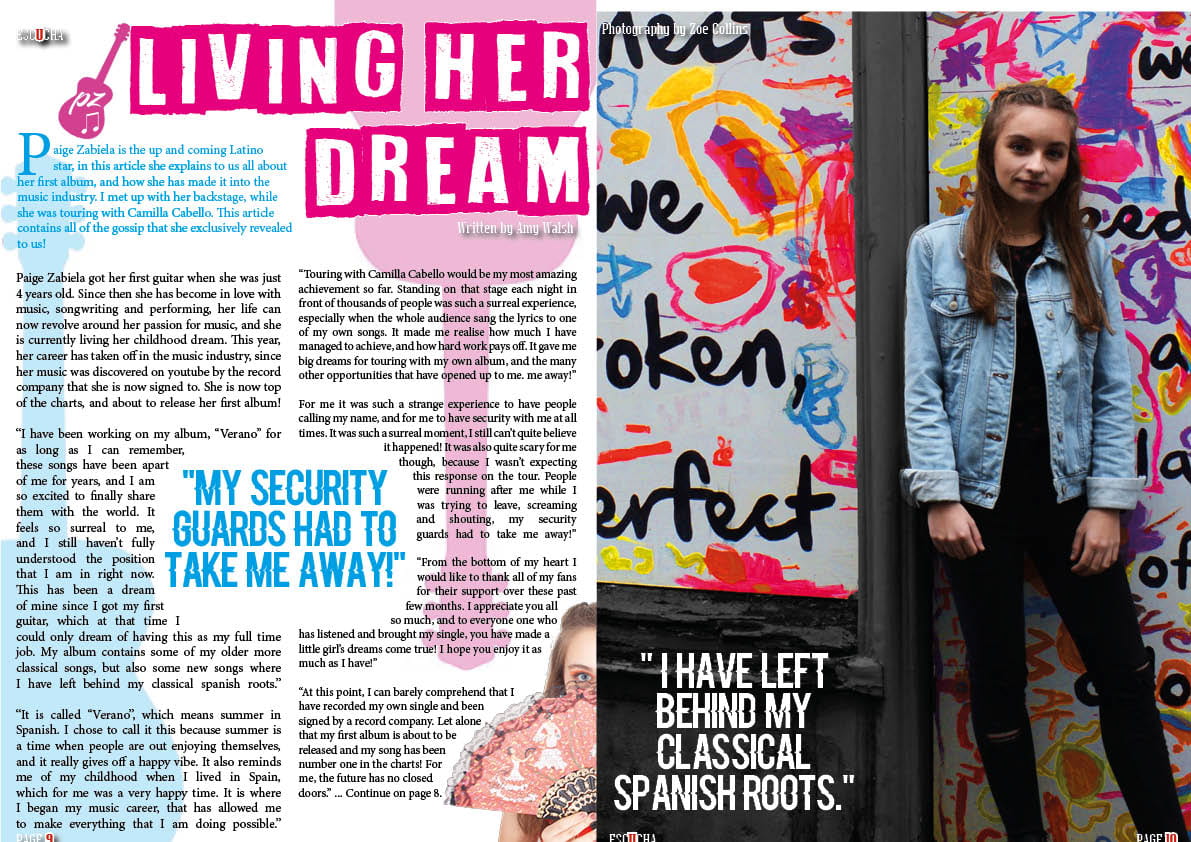
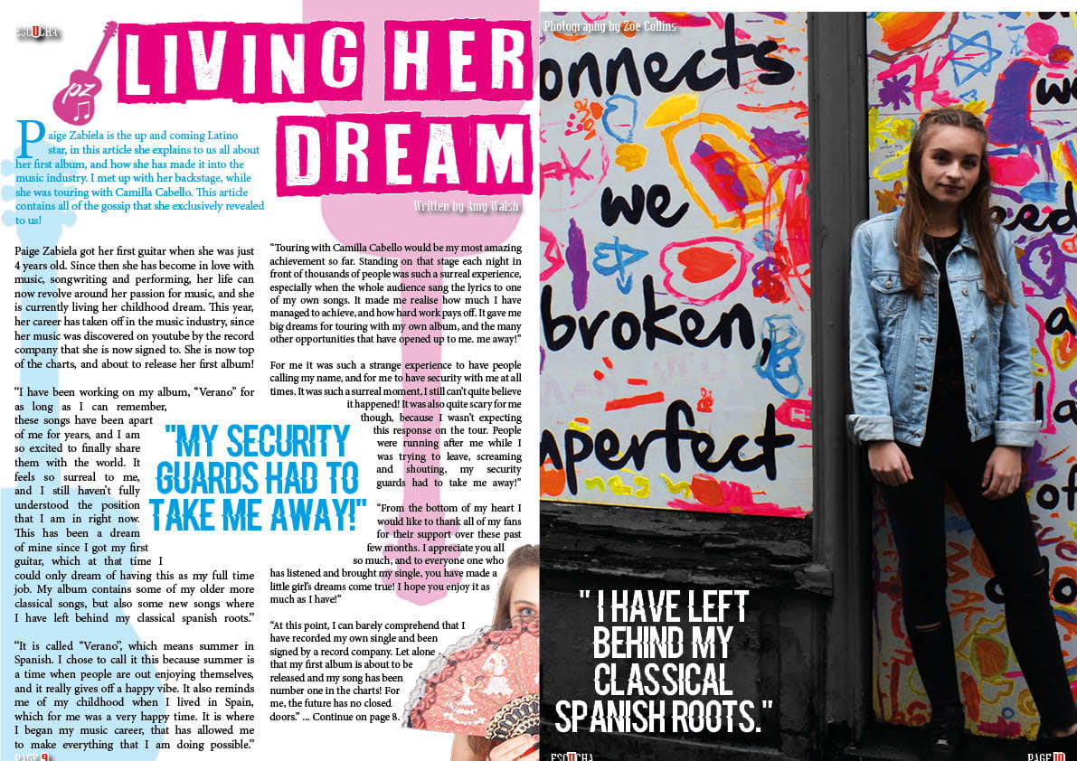
January 22

Adverts

I also needed to  contain 2 adverts in my magazine, that would be suitable for the genre of my magazine and appealing to my target audience. I chose these two adverts because I think that they would be suitable for my target audience, and also eye catching for them.

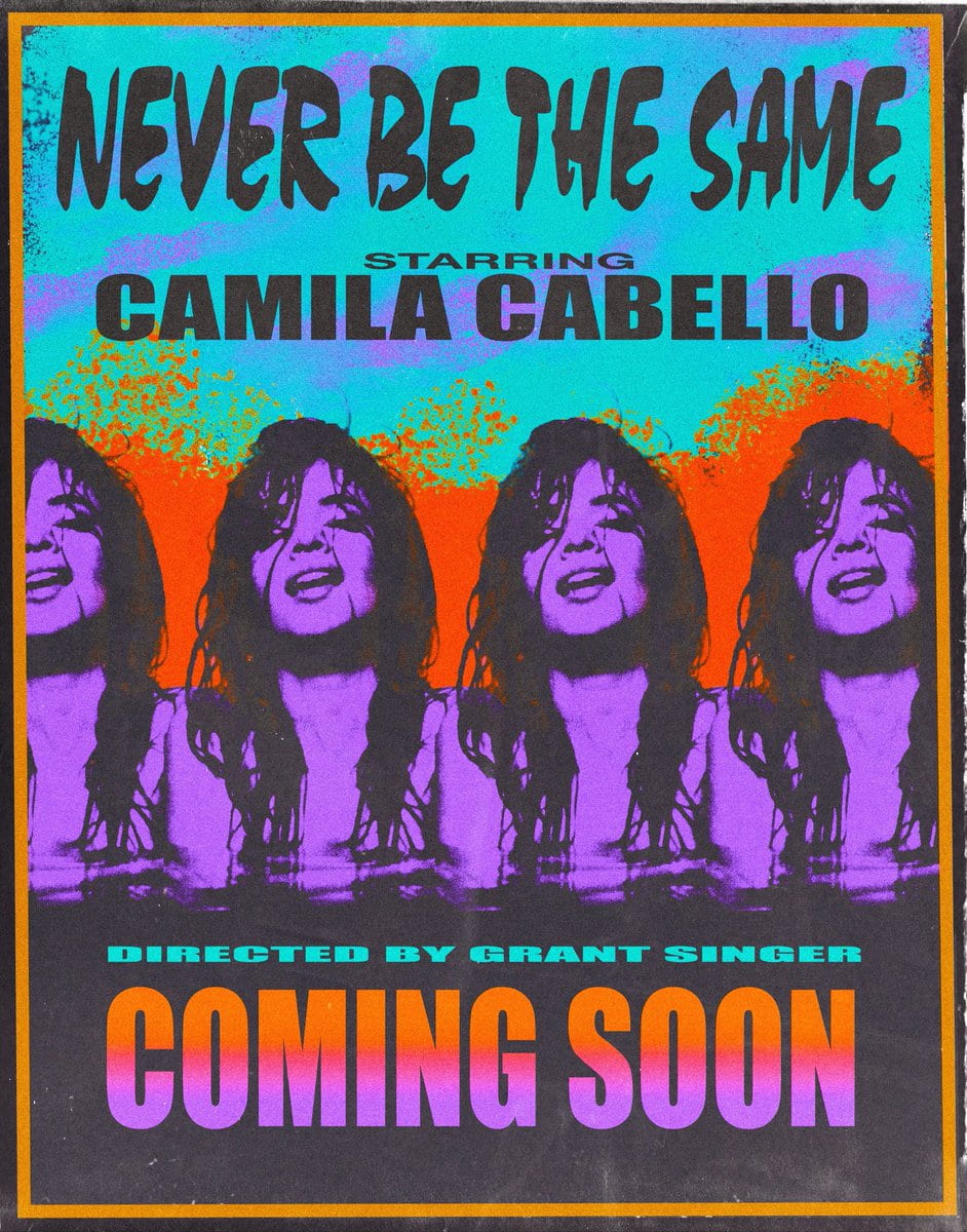
I think that the first advert would appeal to my target audience, as Camilla Cabello is a very famous figure in the Latino genre music. Her target audience is also very similar to mine,. Therefore I included the poster for her most recent tour. The colours are also very eye catching, and I think that they would attract the audiences attention.

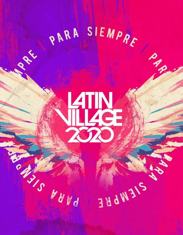
The second advert that I chose was for Latin Village Festival 2020, I chose this advert as it is a very big Latin music festival, I chose this magazine as I thought that it would capture my audience’s attention due to the bright colours a sit would attract their attention. It also doesn’t overload them with information, this will maker them intrigued and want to know more.

Overall, I think that both of these adverts will be suitable for my magazine, as they both are relevant and will attract the attention of my target audience, that enjoy Latin music, enjoy festivals and listening to the Latin music genre.

January 21

A New Improved Complete Magazine Draft

Here is the new draft of my full magazine. In this draft I have made lots of changes to the contents page, and some additional minor changes to the front cover and double page spread.

On the front cover I:

  • Changed the Pug, I made it into a star shape to continue my theme of stars, and also to make it stand out further.
  • I also changed the position of my secondary image, I moved it slightly further to the left so that it stands out more
  • Added more of the small stars to continue the theme
  • Changed the wording from largest to newest
  • Added more stroke on the white lines
  • Added additional artists at the bottom
  • Twisted my image to the right
  • Re-edited my main image, to adjust the cut out of the hair

From my first full draft of my magazine, I have changed my contents page a lot from the feedback that I was given. I have:

  • Changed the colour scheme, I have brought out more Latino colours continuing the red, orange and yellows.
  • I have changed some of the fonts to make it make it tie in further with the front cover
  • Added captions to my images to give context
  • Changes the lettering to make it stand out more
  • Added borders to the images
  • Added stroke to some of the text
  • Changed some of the positioning and placing
  • Changed the imagery of Paige to a more suitable image
  • Moved the star imagery so they are more directly noticeable

Double Page Spread changes:

  • I changed the drop capital from the stand-first to the actual beginning of the article
  • I changed the page numbers to the correct number to continue reading
  • I raised the page numbers slightly so that they were not cut off
  • I removed the additional photo, as I don’t think that it went that well and didn’t suit it
  • Changed the wrapping of the text of the quote

Overall I am really happy with my final draft of my magazine, I think that it reflects the Latino genre well, and is engaging for the reader. I also think that the bright colours, whilst reflecting he genre, also catch peoples attention and draws them towards it. I think that theme is continued and consistent and it all works well together.

January 17

A New and Improved Contents Page

After the feedback from my full magazine draft, I decided to change my Contents Page in particularly as I feel that there are different ways in which I can demonstrate my genre better and make it more interesting for the audience. Here is my new draft of my contents page.

I have changed the colour scheme mainly, this is because I think that the yellows and oranges show the Latin Genre better, and it also helps it to tie into the front cover more. I also changed the fonts, this helped it to tie in with the front cover further and also the double page spread. Overall I think that this draft is better, as it is more eye catching and the genre is more obvious. To further improve, I think that I can make the words News and Artists stand out more, this will be more interesting for the reader and stop it from blending in. Overall I am happy with this draft and the chnages that I have made, I think that it will benefit my magazine as a whole and it makes it look more unified.

January 15

Complete Magazine Draft

Here is the feedback from my teacher telling me the positives but also improvements that I can make to my draft of my full magazine. My main feedback given was:

  • Colour Scheme- bring out more Latin covers to tie in with the front cover and conventions of music genre.
  • Fonts- don’t use too many different fonts
  • Contents- make the contents page tie in more with front cover
  • Captions- add information/captions to photos
  • Capital Letters- use capitals on captions
January 15

A New Improved Contents Page

This is the second draft of my contents page, I have made a lot of changes and added lots of new things since my first draft. I have changed the following so far:

  • The spacing between the lines of text
  • I added in a pale yellow background
  • I added in small pink stars
  • I changed the alignment of the text so it matches and is consistent
  • I added captions for the imagery
  • I added additional photos into star shapes
  • I added in some pink lines as I did on the front cover to keep it consistent

Here is a voice recording of a conversation with a peer where she analysed and thought about my contents page and my front cover also.

The targets I have from her are:

  • Maybe add in something to the background to keep it interesting and busy and it will make the fonts stand out more.
  • Add captions or context into the photos
  • Add more capitals into your captions to keep it consistent and interesting
  • Link the imagery to the specific article
  • Give a border around the imagery to make it stand out
January 14

Draft of Content Page

Here is the first draft of my contents page. I chose the central image with the inflatable flamingo, and based my colour scheme around this image. So far I am happy with my contents page and think that it is going well.

So far I like:

  • The font used for contents and the page numbers
  • The central image
  • The colour scheme
  • The drop shadowing

I think that I can improve on/consider the following:

  • The fonts- use and where I have used them
  • The gaps- filling the gap between the two photos
  • Touches- adding in final touches such as shapes
  • Alignment- of the numbers and text
  • Captions- for the imagery
January 8

What is a Contents Page?

A contents page is an informative page that highlights what features and what is included in the magazine. It acts as a source for referencing and understanding the way to locate articles in a magazine as it reduces any confusion. It ensures that the reader knows where to look for their favourite articles. A few conventions of a contents page are that it often contains imagery of the stars that feature, and captions as to what the articles are about. It also breaks the barrier between the front cover of the magazine and the contents, this makes it more understandable for the reader and it is easier for them to navigate as it is not so overwhelming when opening. It must suit the genre of music and be layed out in the style of the magazine. Therefore it is usually situated at the very front of the magazine on the right hand side after an advert. However sometimes it is placed further back. It is usually one page however it can spread over two. Often the name of the magazine is also placed on the contents page somewhere. It is usually named: contents, what features or what’s inside.

December 19

A New Improved DPS

For my second Draft of my DPS I have made the following adjustments:

  • I made the main image bigger so that she was larger
  • I made the page numbers bigger
  • I added the guitar and also added a logo onto it
  • I justifyed the text and then wrapped it around the quote and image fully
  • I made the page numbers bigger
  • I removed all hyphens
  • I added photographer and writer credits
  • I added the logo in the top left corner
  • I moved the quotation up as the text fitted better around it

I think that this has improved my DPS as it has added a little bit more to it and made it more exciting. Next I think that I can make some more adjustments to it. For example making some of the fonts easier to read such as the credits. I also need to recheck my line spacing, as they are still not equal. I also want to make them image of Paige even bigger, as it will have more impact.

December 19

Feedback & Reflection on Draft DPS

I got some feedback from my teachers and peers on the things that I could change and need to improve on.

  • Space out columns of writing as too close
  • Get rid of hyphens
  • Change the blue font as it could be hard to read
  • Bigger page numbers
  • Justifying text could make it look neater
  • Check line spacing is equal
  • Maybe add a logo on the guitar to personalize
  • Zoom in the image in slightly to make her bigger

I have taken all of these suggestions into consideration and will make changes accordingly.