January 15

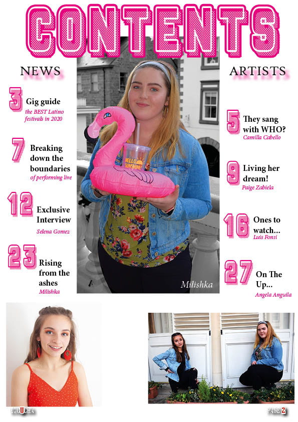
A New Improved Contents Page

This is the second draft of my contents page, I have made a lot of changes and added lots of new things since my first draft. I have changed the following so far:

  • The spacing between the lines of text
  • I added in a pale yellow background
  • I added in small pink stars
  • I changed the alignment of the text so it matches and is consistent
  • I added captions for the imagery
  • I added additional photos into star shapes
  • I added in some pink lines as I did on the front cover to keep it consistent

Here is a voice recording of a conversation with a peer where she analysed and thought about my contents page and my front cover also.

The targets I have from her are:

  • Maybe add in something to the background to keep it interesting and busy and it will make the fonts stand out more.
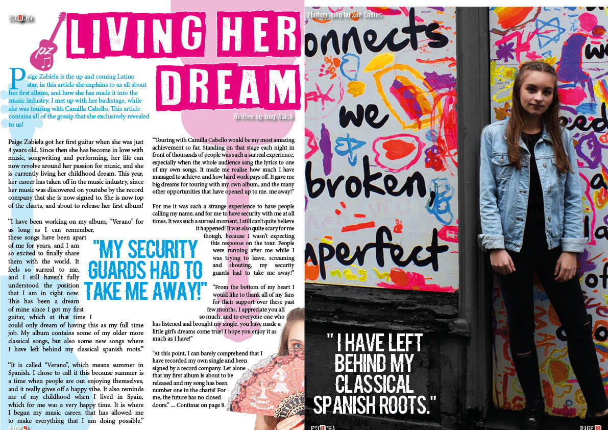
  • Add captions or context into the photos
  • Add more capitals into your captions to keep it consistent and interesting
  • Link the imagery to the specific article
  • Give a border around the imagery to make it stand out
January 14

Draft of Content Page

Here is the first draft of my contents page. I chose the central image with the inflatable flamingo, and based my colour scheme around this image. So far I am happy with my contents page and think that it is going well.

So far I like:

  • The font used for contents and the page numbers
  • The central image
  • The colour scheme
  • The drop shadowing

I think that I can improve on/consider the following:

  • The fonts- use and where I have used them
  • The gaps- filling the gap between the two photos
  • Touches- adding in final touches such as shapes
  • Alignment- of the numbers and text
  • Captions- for the imagery
January 8

What is a Contents Page?

A contents page is an informative page that highlights what features and what is included in the magazine. It acts as a source for referencing and understanding the way to locate articles in a magazine as it reduces any confusion. It ensures that the reader knows where to look for their favourite articles. A few conventions of a contents page are that it often contains imagery of the stars that feature, and captions as to what the articles are about. It also breaks the barrier between the front cover of the magazine and the contents, this makes it more understandable for the reader and it is easier for them to navigate as it is not so overwhelming when opening. It must suit the genre of music and be layed out in the style of the magazine. Therefore it is usually situated at the very front of the magazine on the right hand side after an advert. However sometimes it is placed further back. It is usually one page however it can spread over two. Often the name of the magazine is also placed on the contents page somewhere. It is usually named: contents, what features or what’s inside.

December 19

A New Improved DPS

For my second Draft of my DPS I have made the following adjustments:

  • I made the main image bigger so that she was larger
  • I made the page numbers bigger
  • I added the guitar and also added a logo onto it
  • I justifyed the text and then wrapped it around the quote and image fully
  • I made the page numbers bigger
  • I removed all hyphens
  • I added photographer and writer credits
  • I added the logo in the top left corner
  • I moved the quotation up as the text fitted better around it

I think that this has improved my DPS as it has added a little bit more to it and made it more exciting. Next I think that I can make some more adjustments to it. For example making some of the fonts easier to read such as the credits. I also need to recheck my line spacing, as they are still not equal. I also want to make them image of Paige even bigger, as it will have more impact.

December 19

Feedback & Reflection on Draft DPS

I got some feedback from my teachers and peers on the things that I could change and need to improve on.

  • Space out columns of writing as too close
  • Get rid of hyphens
  • Change the blue font as it could be hard to read
  • Bigger page numbers
  • Justifying text could make it look neater
  • Check line spacing is equal
  • Maybe add a logo on the guitar to personalize
  • Zoom in the image in slightly to make her bigger

I have taken all of these suggestions into consideration and will make changes accordingly.


December 18

Draft of The Double Page Spread

Here is a PDF of my Double Page Spread. So far I am very happy with the progress and design that I have made. To improve my double page spread, I think that there are some final touches that I can do to my image on the right hand side of the page, as some parts of the image need blending/removing. I think that the fonts that I have used work well, and are also legible. I also really like some of the small touches that I have added into my DPS such as the magazine name in the bottom left corner. I think that there are some things that I can change to make my double page spread even better such as, the positioning of text, the positioning of the drop capital. I also need to add in the Photographer and Editor credits.

December 18

Improving my front cover- Draft 3

After having thought carefully about my front cover, I decided to make some changes to improve my design. Firstly, I changed the image. I decided to change the image, as I did not think that my previous image was working the way that I wanted it to. I chose this image instead, as I think that the outfit that she was wearing was more current and made her look more styled than classical. I also chnaged my mast head, as I think that this makes it stand out more against the background. I also added a drop shadow on the picture.

December 18

Design Skills 1

I have learnt many new design skills and production techniques while making my front cover for my magazine.

Firstly I discovered how to add stroke or weight to text in InDesign. This is very beneficial as it can make text stand out from the page but also easier to read. I used this on my mast head and also some of my subheadings on my front cover.

Secondly the Clone Stamp/ Spot Healing Tool in Photoshop allows you to cover skin imperfections by repeating another section of the image ontop of the image to hide it and it blends in so that it is not obvious.

Another tool in InDesign was the fx tool, this allows you to add a number of different effects to an image that you have placed for example the bevel and emboss tool.

Finally the opacity tool in both Photoshop and InDesign became very useful. This allows you to change the opacity of any object e.g a photo or shape. I used this tool many times for example when creating the background for the 2nd draft of my front cover.

Overall I think that my design and production skills have significantly imporved when designing my front cover. I think that I have learnt a lot of new  skills and have been able to begin creating a front cover that will demonstrate my music genre and work well to draw the attention of the audience. I also think that my front cover is beginning to show the meaning that I am trying to convey. With the changes in my drafts I think that I am successfully beginning to convey my music genre, but also create a happy summer vibe through my work.

December 13

A New Improved Feature Article


This is my new draft of my article. I made a few changes in my article which are highlighted in red. I think that these changes will make my article more hooking for the reader as it is more interesting for them, and will provide them with ‘exclusive’ information and gossip. I also corrected spelling, punctuation and grammar mistakes that I had made.

My targets after this draft are to make sure that it is even more interesting and hooking for the reader. And to also make sure that I present it well on my double page spread.