Critical Reflection Essay
The idea at the heart of our campaign is “Be Yourself”, the artist wants the audience to be powerful and confident like her. She rejects the established norms, the political voice and the conventional me dia representations. As the producers, we wanted our brand to be cohesive and the elements to blend together to demonstrate the same powerful message.
After looking at the ideas of Hall, we encoded our text with our star identity and used elements of design to convey our message for the audience to decode. Our star is consistently represented as honest, loving and powerful. But also in many ways vulnerable, as she is not only exposing herself to the entire world, but making an attack on what people are used to and she is challenging the dominant hegemony of femininity.

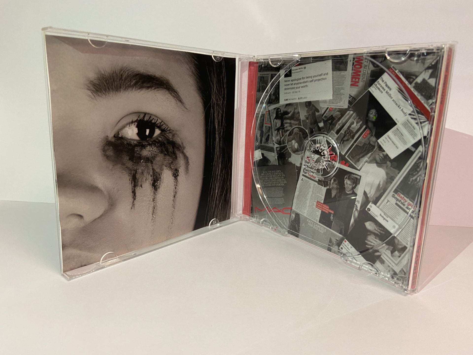
An example of consistency through our products to create a sense of branding was our use of makeup and also the eyes. We used the idea of make up, but also the removal of makeup across all of our products. This was to demonstrate that makeup is not the definition of beauty, and that the natural beauty is underneath when the person is “being themselves”. We also used the iconography of the eye, which formed a coherence across the brand. The eye represents truth, honesty and is known as the window to the soul, it infers ideas about the act of looking and seeing. This connotes to the audience that the star is saying the truth, and gives a much deeper meaning into the message. The use of eye contact on the digipak changes what the image is stating, the eye connects with the lens and extends outwards to the audience, which can lead to an immediate & intimate human connection and engagement with the star . The lack of eye contact by the models in the music video and social media page, implies a sense of regret, longing and melancholy in the facial expressions. This demonstrates that they are regretting their actions and are wishing that they had always felt the confidence that they do now, and had always presented themselves in this way.
 We researched professional Indie/Pop music videos and looked at examples by artists such as Taylor Swift and her music videos. We quickly understood that they were often studio based, with performance elements from the star, who has a glamorised star image. Conventionally they include life affirming narrative. We began by defining the conventions and generic expectations, stated by Altman. The audience had the elements that they expected at the beginning, with the natural settings and models being used to demonstrate the strong star image that they expected the star to be presented like as well. We then tore these expectations down and subverted them by demonstrating that these expectations are unrealistic. By having the models remove the makeup and hair, the star is trying to subvert the predictable pleasure to make the point that this shouldn’t be the expectation of women, and that they can just be themselves. We also built the star up to be what is expected from the audience, to satisfy their needs. We subverted the repertoire of elements, (Lacey), to demonstrate that the expectations placed on women are unattainable, they shouldn’t be forced to change themselves in order to conform. We contrasted this with the elements shown of the star at the end to show the difference of expectation vs reality.
The video begins conventionally; the glamourous and highly styled models ready to be filmed. We then broke the conventions and subverted expectations by having our artist remove the makeup! This was to demonstrate the star’s thoughts on beauty standards and unrealistic expectations, presenting the theme: ‘Be yourself!’ She is trying to encourage the audience to not feel the need to follow these expectations and allow them to express their own identity.
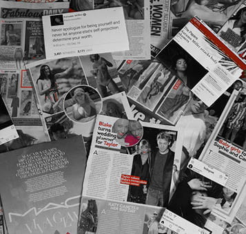
The star’s iconography is conventional, and what you would expect to see, and meets the predictable pleasure for the audience. We then broke these conventions and the blueprint by demonstrating that the star has been hurt by the media, she is not standing for the expectations anymore and wants change. She is making a social and cultural statement and therefore breaks the conventions and battles them, the high angle demonstrates that she feels powerless and alone and is reaching out for help. The ideology is torn down.
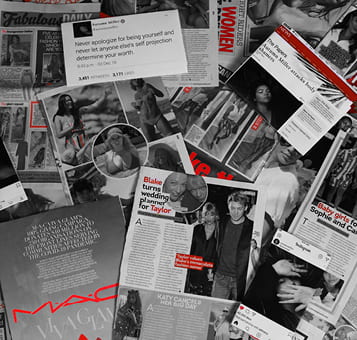
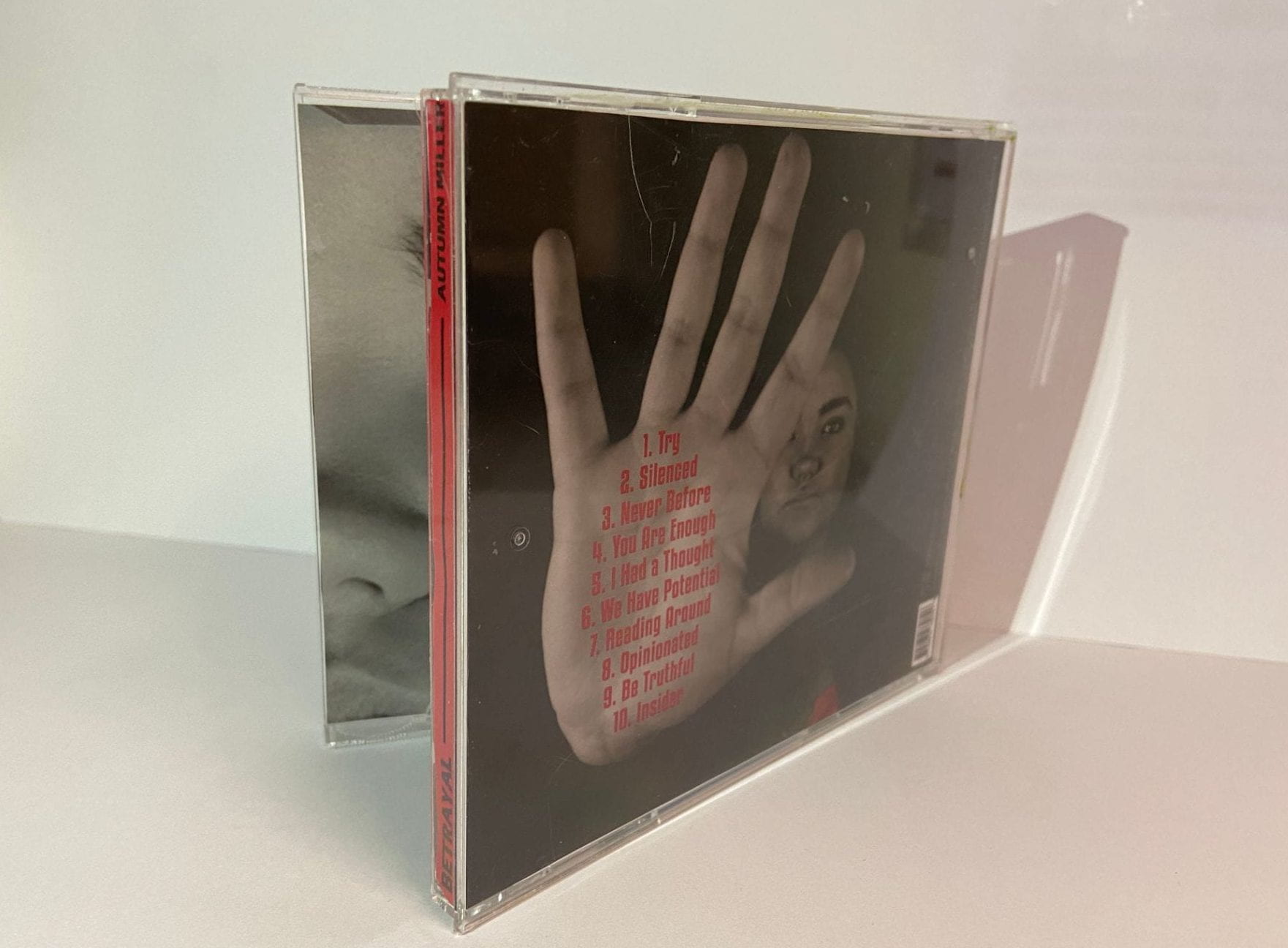
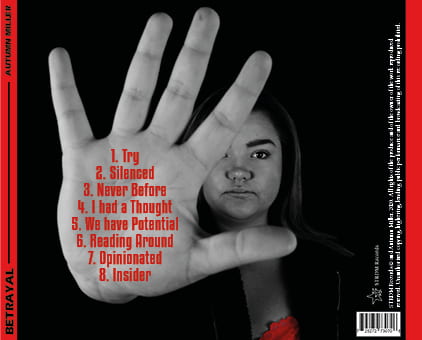
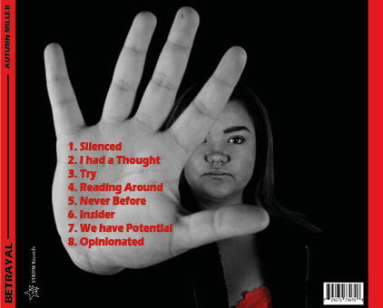
 In our digipak we wanted to demonstrate the negative impact of the media on not only the star but on ordinary people. We also thought about the theory of ‘The Paradox of the Star’ by Richard Dyer whilst making our digipak. It states that ‘a star is both ordinary & extraordinary’ which we focused on. Our star receives extraordinary attention due to her fame and career, but she is equally as ordinary as everybody else and does not deserve the hate and criticism that she receives from the media. We have conjured a metanarrative which precedes the production of the digipak demonstrating that she has been struggling with this for a long time.
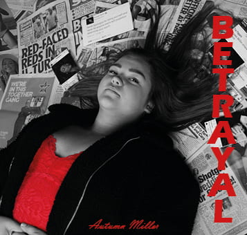
 We used the colour red, as a semi, cultural and symbolic code as defined by Barthes in his perspectives. We used the red in our Digipak not only to imply anger and hatred, but also to create an attack on the Media. The colour scheme represents traditional print and newspapers, where text was normally in black with highlights of red for important phrases to capture the audience’s attention. We used it to reflect the attack that celebrities often receive from the media, for example when their bodies are commented on and shamed. We also used the camera to demonstrate the lack of power for the star, we used a high angle of the camera down onto the star, this highlighted that she was powerless and had been knocked down. It implies her lack of control in comparison to the media and how she is presented as weak. The typeface we used not only implies power because it is bold and striking, but it also is a cultural code
 for the masthead of the article titles in newspaper tabloids. This is making a strong attack against this form of media and what they have written about the star and other celebrities, it conveys that she is ready to fight back, as it shows that she has the same power that they have. It humanises her, and the audience can see the impact that the negative media coverage has on the individual.
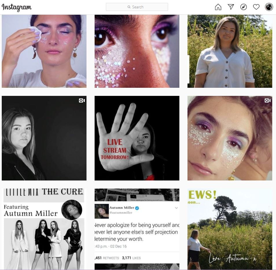
 In our social media page, we really focused on the audience finding their personal identity as referenced in Blumler and Katz’s Uses and and gratification theory. We wanted the audience to change their ways and see themselves as who they really are, not criticizing themselves constantly. We hoped the audience would have a preferred reading from our music video, they needed to decode the ideology and decode the text in a specific way to understand the statement that she was making about being yourself. We chose to present our star as an extra ordinary campaigner who dissents what others often say and present in their music videos.
We followed the AIDA (Attention, Interest, Action, Desire) model, a marketing strategy, used since the 19th century, when we made our social media page, as it would often act as the form of attention. This is because social media is a very good way of attracting people’s attention. We did this by creating engaging posts that the audience could interact with, and word of mouth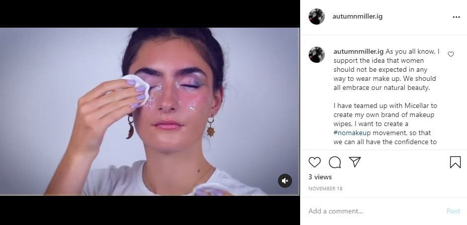 would engage more people. For example, we used hashtags and encouraged her followers to create a post that would reference her campaign. This would lead to greater attention by a wider audience as more people are likely to see and interact with her project. We then tried to grab their interest by giving her a consistently interesting and relatable feed for the audience. We then hoped that through this we could market our products as she would have more people engaging with her page, this would lead to a desire to want her products and hopefully they would take action by purchasing or listening. The posts were also a way of helping people to discover their personal identities. For example, the synergy with Garnier is all about removing your makeup and therefore being your true self. This demonstrates being true to your personal identity and encourages her audience to be themselves.