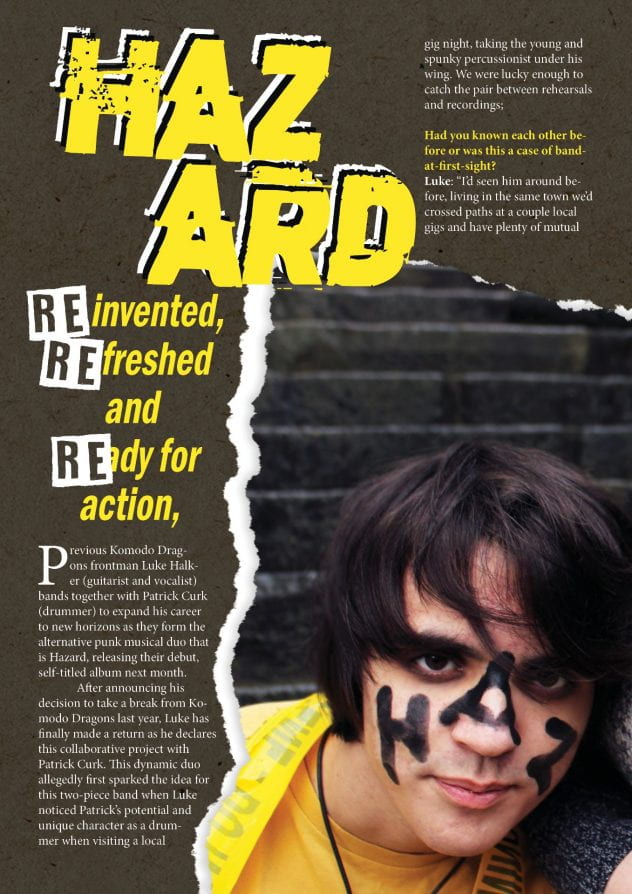
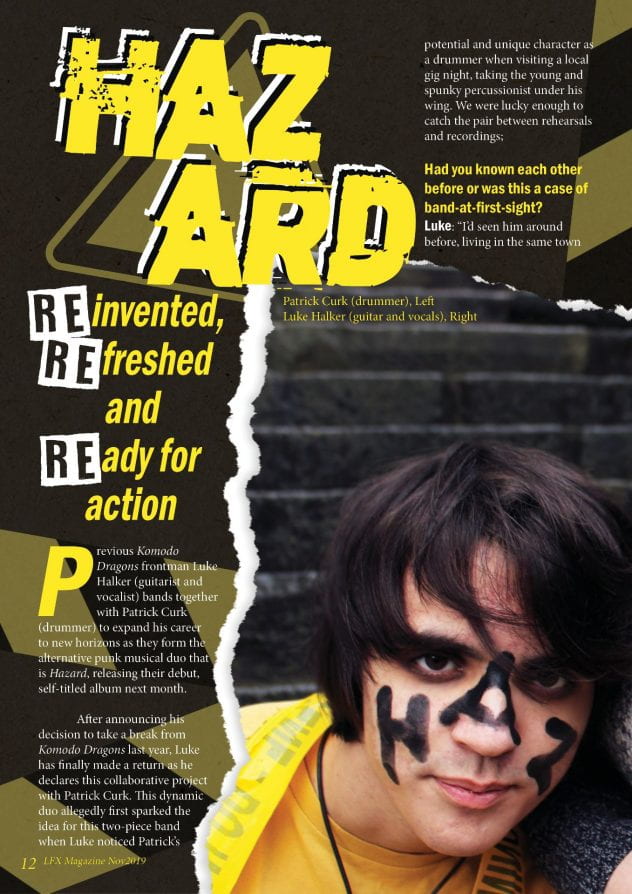
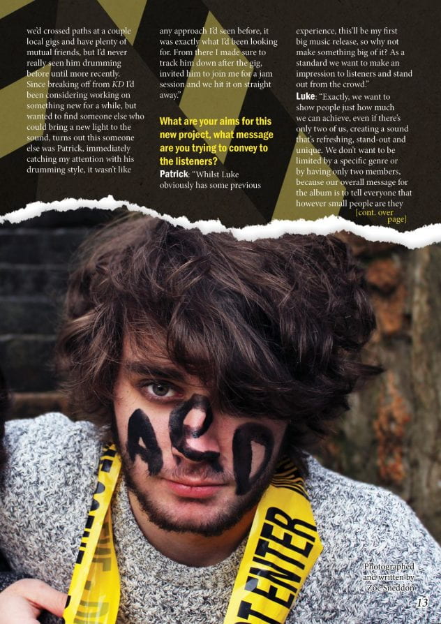
After reflecting on my first draft, I have worked on it and developed it into an improved version. In doing so, I have successfully covered all the issues mentioned in the previous post, as well as adding extra details such as background graphics. Overall I am very happy with these improvements made, however still feel that there are a few areas that I could further improve after talking to my peers;
- Remove the mistake indent in the bottom left
- Give the text a drop shadow to be more easily readable against the background graphics
- Remove the unnecessary capitalisation of the “left” and “right” in the photo caption
- Try a slightly alternative layout for the start of the article body, making it clearer where the reading should begin.
Side by side comparison:


