My Tour Poster

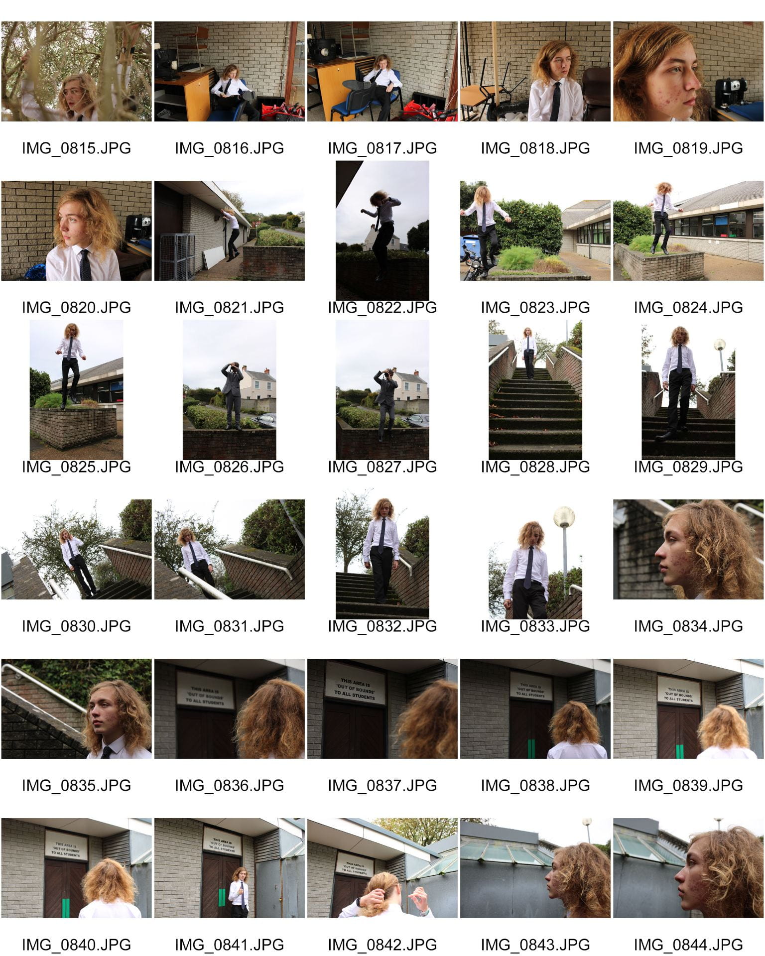
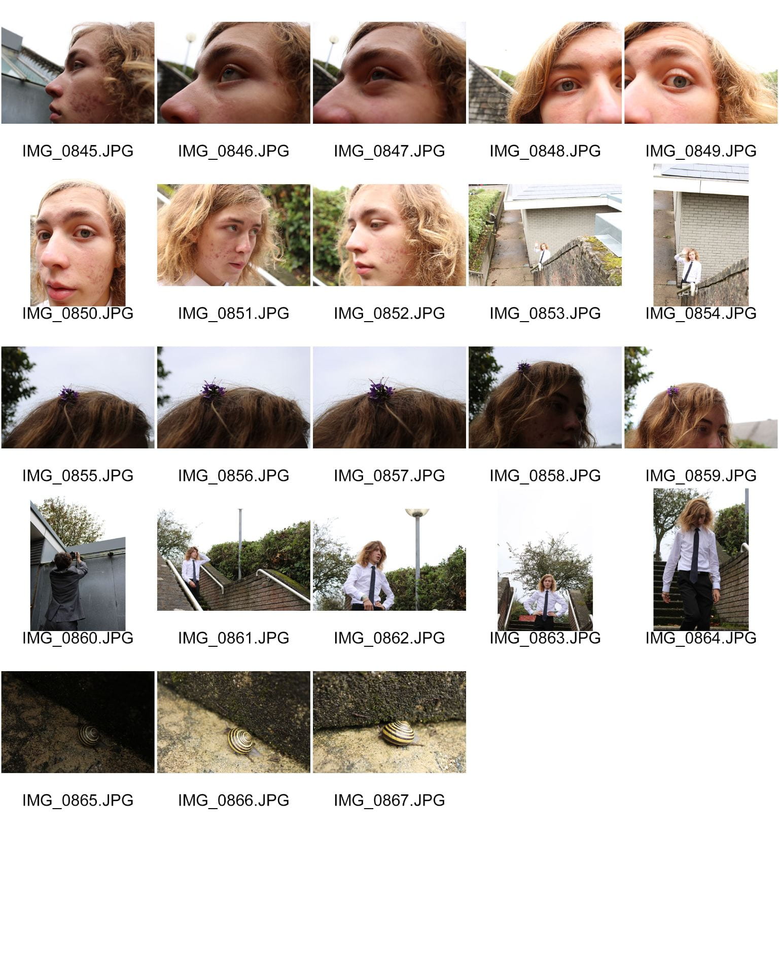
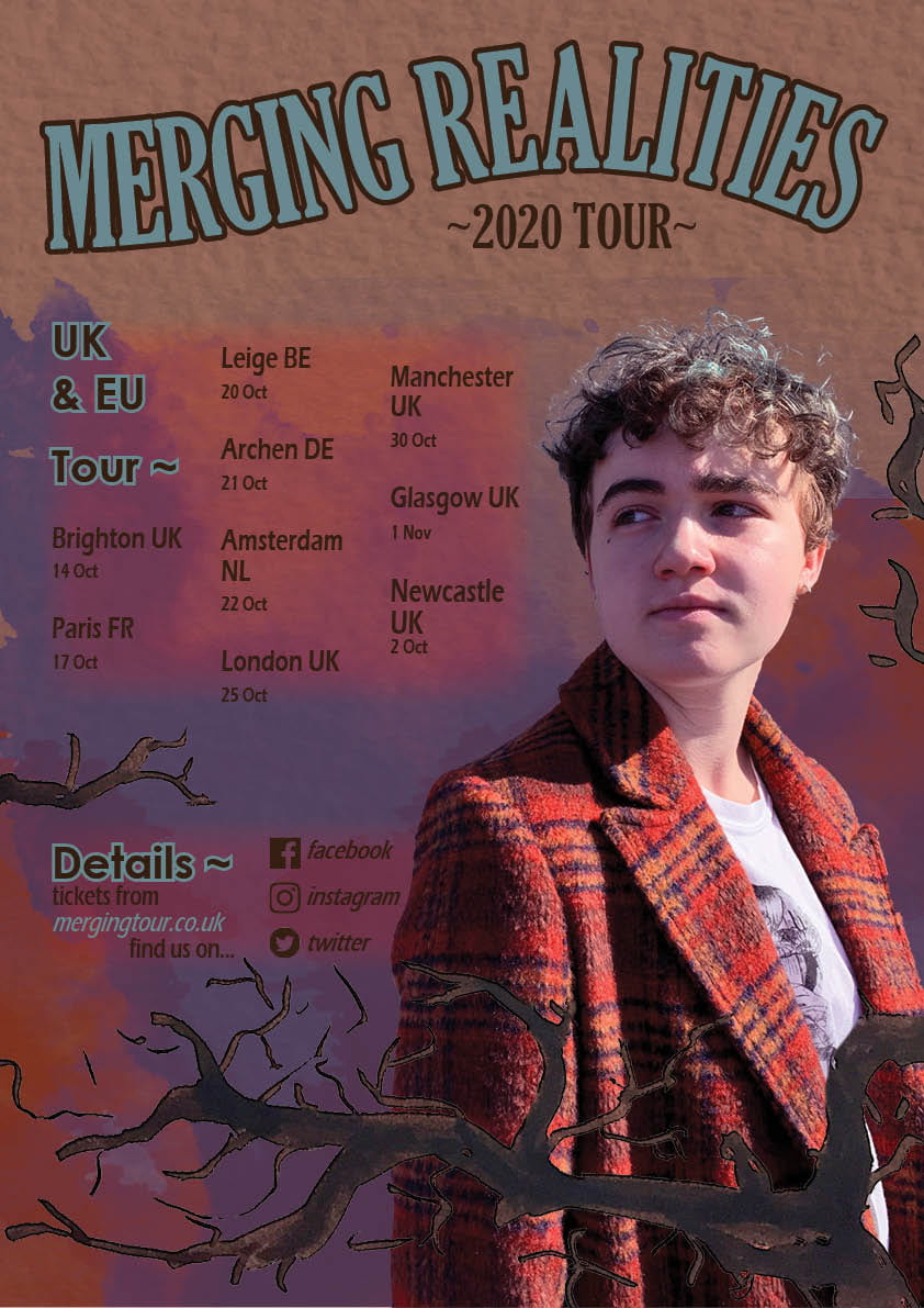
To properly prepare myself for creating a magazine cover and to further familarise myself with the Adobe tools, I worked to create a music tour poster based on the allocated theme and photoshoot done previously, my genre being indie music. To achieve this I compiled a moodboard of other indie album covers and tour posters, taking notes on the genre conventions. As listed in the slides below, this genre often includes faded colour palettes, often featruring subject matter revolving around nature and natural forms, accompanied with surreal concepts and art styles.

I then proceeded to create multiple drafts and concept designs for my poster, also included in the slides, trying out different mediums, styles and colours. I finally settled on a design including some hand-drawn tree branches (nature) and using water-colour paint textures (ilustrative, homemade aesthetic) with my photograph looking inwards, facing the text and cosequently drawing the reader’s attention to the information as they follow the eyes.

Reflection:

Feedback on the Brief

Your comment: 

My tour poster successfully displays;

  • The artist/tour name
  • The dates and venues of the tour
  • Directions of where more information and tickets can be found
Feedback on colours:

  • Has the design used a consistent colour scheme?
  • Is there a relationship between the colours in the image and the colour of the graphic design?
  • Do the colours seem typical of the genre?
Your comment: 

My poster is set to a basic and consistent colour scheme consisting of primarily dark, earthy reds and pale blues, linking to the typicalities of the genre and it’s links with warm, natural forms and colours.

Feedback on typeface:

  • Is all the text legible? 
  • Is the typeface well chosen and does it suit the apparent genre?
  • How many typefaces are used in the design?
Your comment: 

Overall I made sure to keep the text readable, using only two different fonts, and clear against the background, especially as a gradient is used behind it I made sure to sustain readability behind it with the colours.

Feedback on integration of image and graphics

  • Does the text wrap around the image well?
  • Does the eyeline of the model focus attention?
Your comment: 

I made sure to utilise the text wrap tool in Indesign to fit the image, and chose the image due to it’s facing into the text to draw the concentration of the reader.

Feedback on image

  • Does the costume reflect a particular genre?
  • Is the body language of the model appropriate?
Your comment: 

As mentioned before in my photoshoot plan, the costume and posture of the model are designed to fit the Indie theme, and I believe that this is captured well in my poster.

Feedback on copy

  • Do the words on the page prompt a sense of desire?
  • Is there a clear call and a route to action? (AIDA)
Your comment:

The title of the tour itself is one that I chose because of the sense of mystery, it implies that there is a new world to be explored by participating in the tour and the action, prompting the interaction. 

Feedback on connotations

  • What messages and ideas are being communicated in the text?
  • Do those messages and ideas seem appropriate to the genre and purpose of the text?
Your comment: 

The general message of my poster is the idea of “transcending the limits of realities”, an idea aligning with the Indie ideas of the supernatural mixed with nature and real life which I feel I conveyed well with the uses of branches (natural forms) and the title of the poster

My Magazine Front Page Swede

For this task we had to take an existing NME magazine cover and recreate it, as a “swede” to become more confident and comfortable using Adobe InDesign and it’s tools, in practice for the creation of our own music magazines in future.

Below is my resulting swede (on the left) in comparison to the reference I used. Overall I am happy with the final product despite it’s imperfections. In reflection, my three pros and three cons are;

  • Pro- Successfully edited the star image to overlay the title as in the original.
  • Pro- Text styles (italics, line spacing, etc) are accurate and allow the text to remain readable and clear.
  • Pro- Spacing and layout of text is successful and readable, catching theauydiences attention without interfering with visibility of the central image.
  • Con- The star image is lower quality than the original (the best I could find online), decreasing the quality of the overal image.
  • Con- The text/content does not fit the page in the same style as the original, leaving an obvious gap around the edges.
  • Con- Bordering shadows/vingette are not as neat or smooth as the original, with shadows overlapping where they shouldn’t and the inner sahdow of the background not working as desired.

PDF Link:
https://blogs.grammar.sch.gg/zoesneddon/files/2019/10/final-draft-swede.pdf

Three Useful Tutorials for Future Work:

The Camera Talks

After our initial photo shoot, we were to choose our nine best images, labelling them with hashtags that conveyed the camera setting used, a denotation and a connotation each. This allowed me to reflect and understand how successful my photography was at conveying an emotion/message/narrative. My favourite image in the end is probably the photo in the tree, second from the left on the top row of my mood board. This is due to it’s clear, central framing with a dramatic low angle as well as the contrasting darker colours of the model’s suit standing out against the pale branches and sky, also with a slightly high aperture to really bring the model into focus without looking too forced or unnatural. Being able to capture and identify the intended mood in this way will be a useful when photographing my star in a music magazine.

Technical Camera Terms

In this task we were experimenting and learning the different applicable settings and properties of a DSLR camera in order to use them in our future work successfully. This included learning and understanding the three main principles of taking photos with this type of camera;

  • Aperature – The size of the hole which lets light into the lens, represented as F in the camera settings (standing for focal length). The bigger the focal length the smaller the aperature, allowing more light in and keeping all areas in focus. The smaller the focal length the larger the aperature, with less light let in and a more blurred background.
  • Shutter Speed – The speed at which the shutter “blinks” (like an eye), with a higher speed less light is let in and a focused, still image is taken. Meanwhile with a slower shutter speed more light is let in and any motion is blurred.
  • ISO – The sensitivity of the camera to light, with a lower ISO the sensitivity is lower and the image less grainy, whilst a higher ISO is more sensitive to light and the image becomes more grainy.

To better familarize ourselves with this, we then proceeded to do a photo shoot simply experimenting with these settings, as well as considering ideas such as framing, angle, distance, and point of view; each an element that can assist to give a different narrative with each photo.

Contact sheets of my experimentation photo shoot:

By completing this I now have an improved idea and concept of how I can use my camera to achieve appealing images, as well as utilising the perspective of the camera and positioning of a model to tell a story and give an image meaning/narrative when taking photos of my star for the music magazine.

My Image that Uses Mise-en-Scene to Communicate Meaning

In this task, as groups of three we were allocated a genre of music from which to create a mood board to inspire the creation of our own tour posters for that genre. The genre I received was Indie; covering a wide range of music styles due to its meaning being simply “independently produced music”. From this definition we were then able to base the idea behind our look on the idea of somebody with a do-it-yourself ideology, who doesn’t want to fit into the norm. The colours of this genre tend to include warm, faded, low saturation tones to reflect their retro-like aesthetic.

We then did a practice photo shoot within this genre (with me allocated as the model). Based off the mood board and research we did, I was dressed in a orange/brown tartan jacket, white, illustrative graphic tee and dark skinny jeans with messy, uncouth hair. We used an acoustic guitar and a pair of sunglasses as props, and chose to take most photos with an uninterested, distant facial expression, matching many images from our mood board.

(Click on image to open photo shoot folder in Google Drive)

After the photo shoot we then asked the class to come up with adjectives to describe the vibe and feeling that our costumes inspired, testing whether we were able to convey to the audience our message through our mise-en-scene. Our resulting adjectives were as follows;

  • Chill (non-formal, comfortable)
  • Relaxed (non-formal, comfortable)
  • Edgy (different from the norm, alternative)
  • Lazy (non-formal, comfortable)
  • Dull (doesn’t stand out too much, faded colours)

Finally, I needed to choose my favourite (unedited) photo from the shoot. I chose this photo due to it’s useful framing when considering the format for a poster, with good space around the left side of the image for text. It also well encapsulates the costume and appearance choices we made, focusing on the colour from the jacket but still clearly showing the illustrative style of the t-shirt, as well as allowing the natural light from the right side to bring out the messy, untamed style of hair.

Overall, this activity helped me and gave me a better idea of how to use and apply ideas if mise-en-scene when creating imagery and taking photos for my own music magazine, as well as general practice with photography and using natural lighting.

Print Media that Communicates Meaning

In this analysis of a band tour poster, I was able to better understand and exemplify the different techniques used in posters and print, and how they can convey messages and themes to the consumer. The primary aspects I have learnt to focus on fall under the idea of mise-en-scène (what is placed on scene), this consists of the following elements to consider;

  • Costume
  • Lighting
  • Acting
  • Makeup
  • Props
  • Setting
  • Font
  • Colour
  • Content

By completing this exercise I now have a better grasp on how each element of this can be included and the impact it can have, with all the listed components worth considering when producing my own music magazine.