Digipak Draft 3

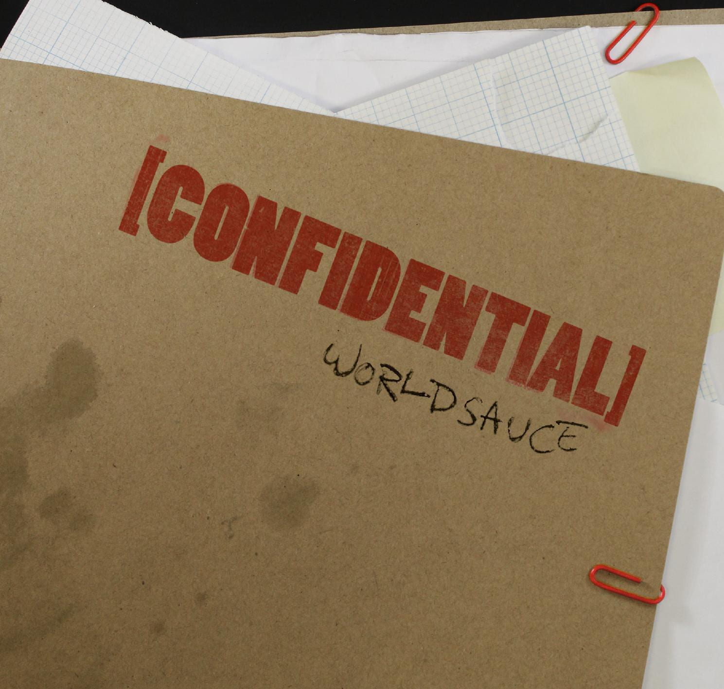
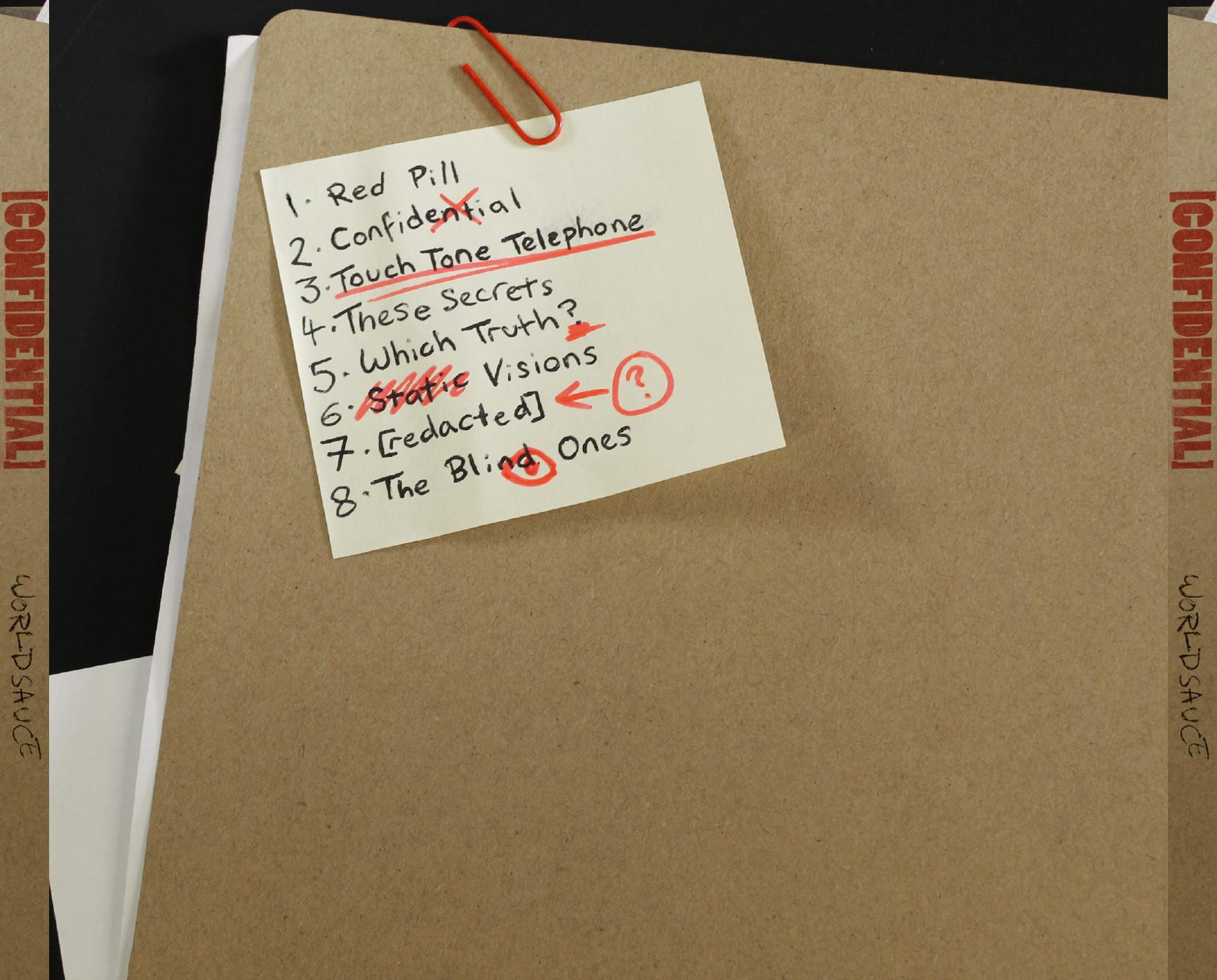
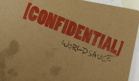
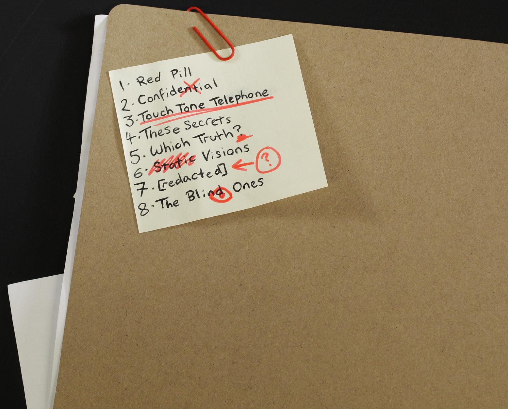
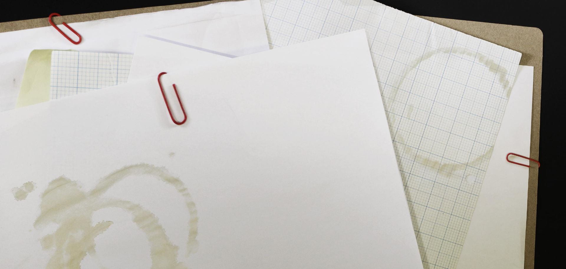
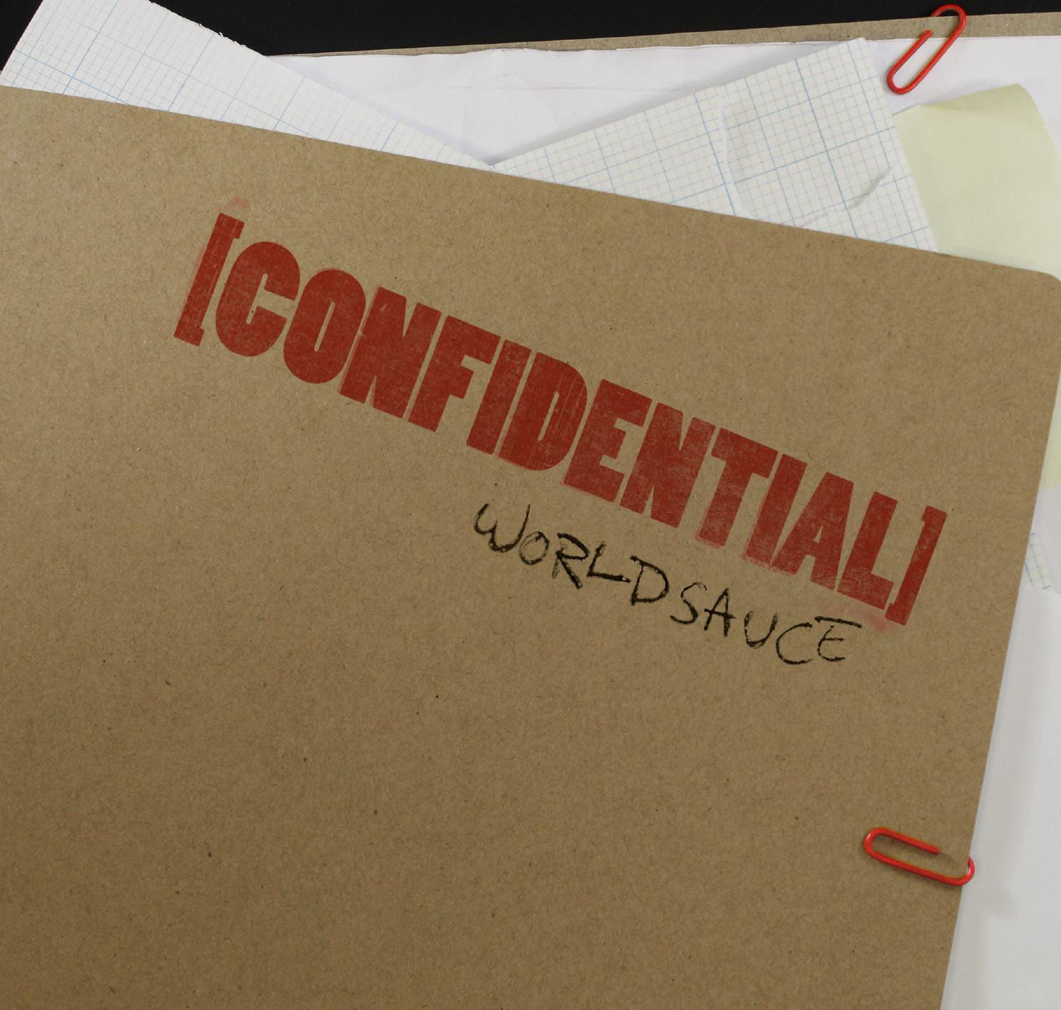
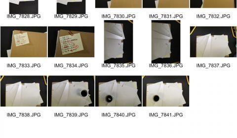
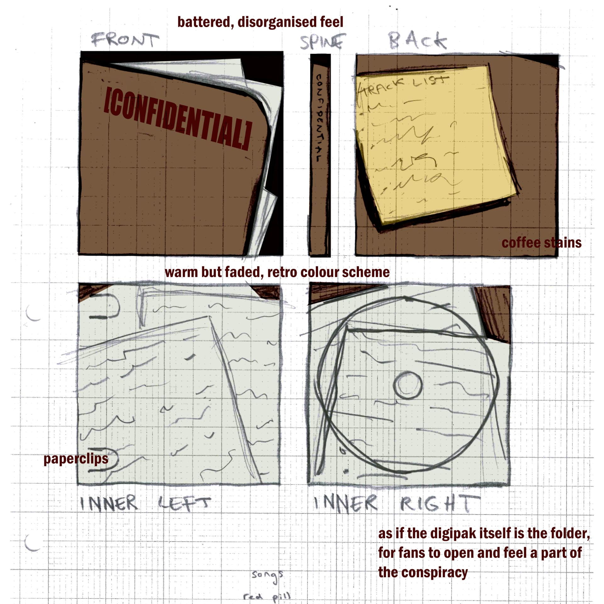
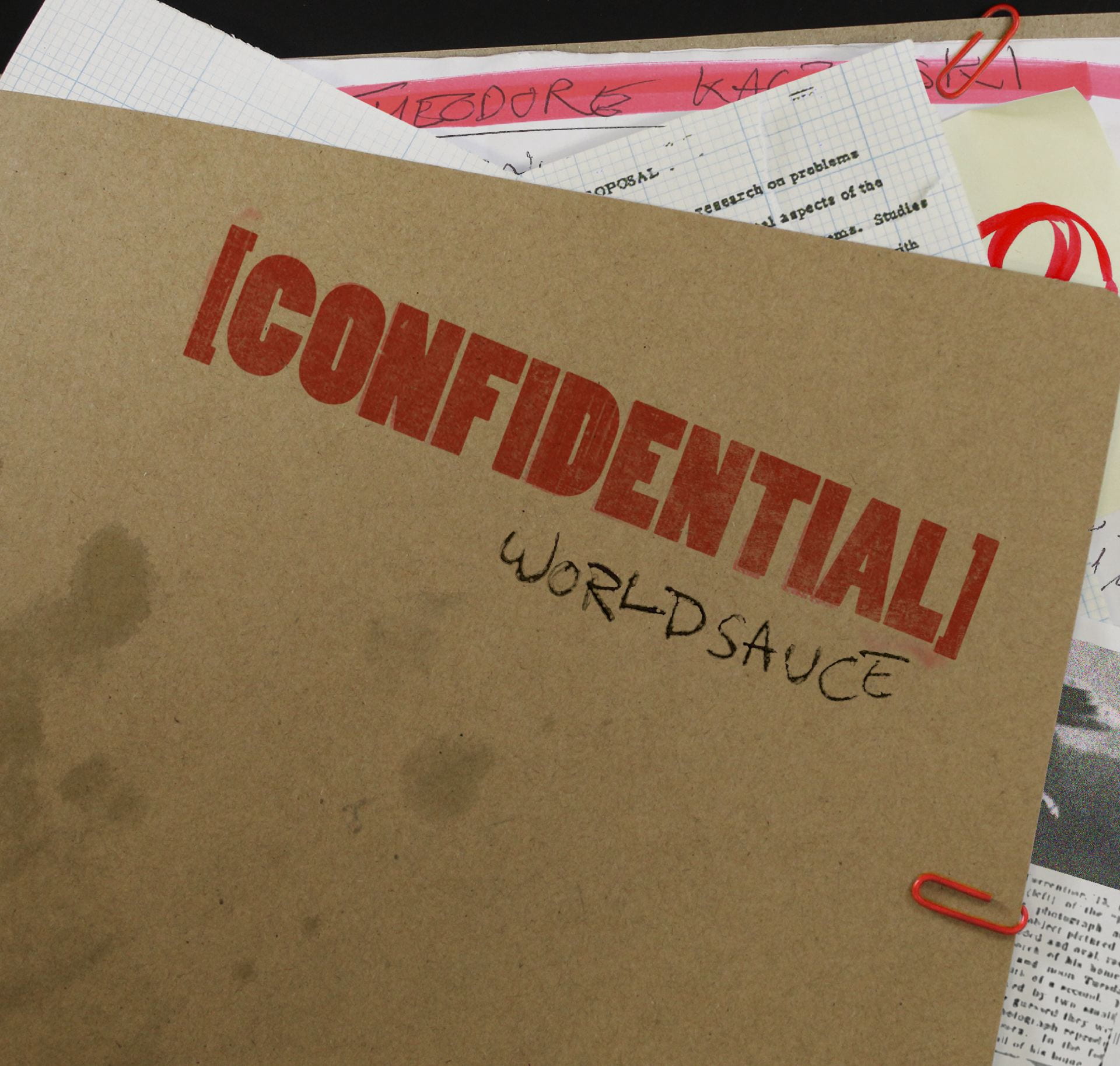
Having reflected on the feedback given, I put together the final draft of the digipak, now including more details and notes on the front cover, cleaner spine design and record label release details/barcode on the back.

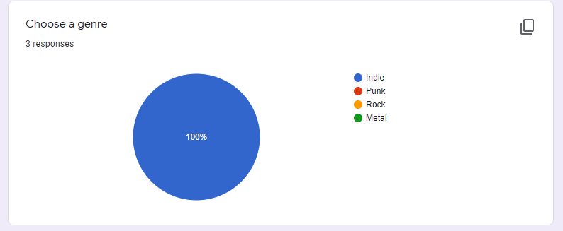
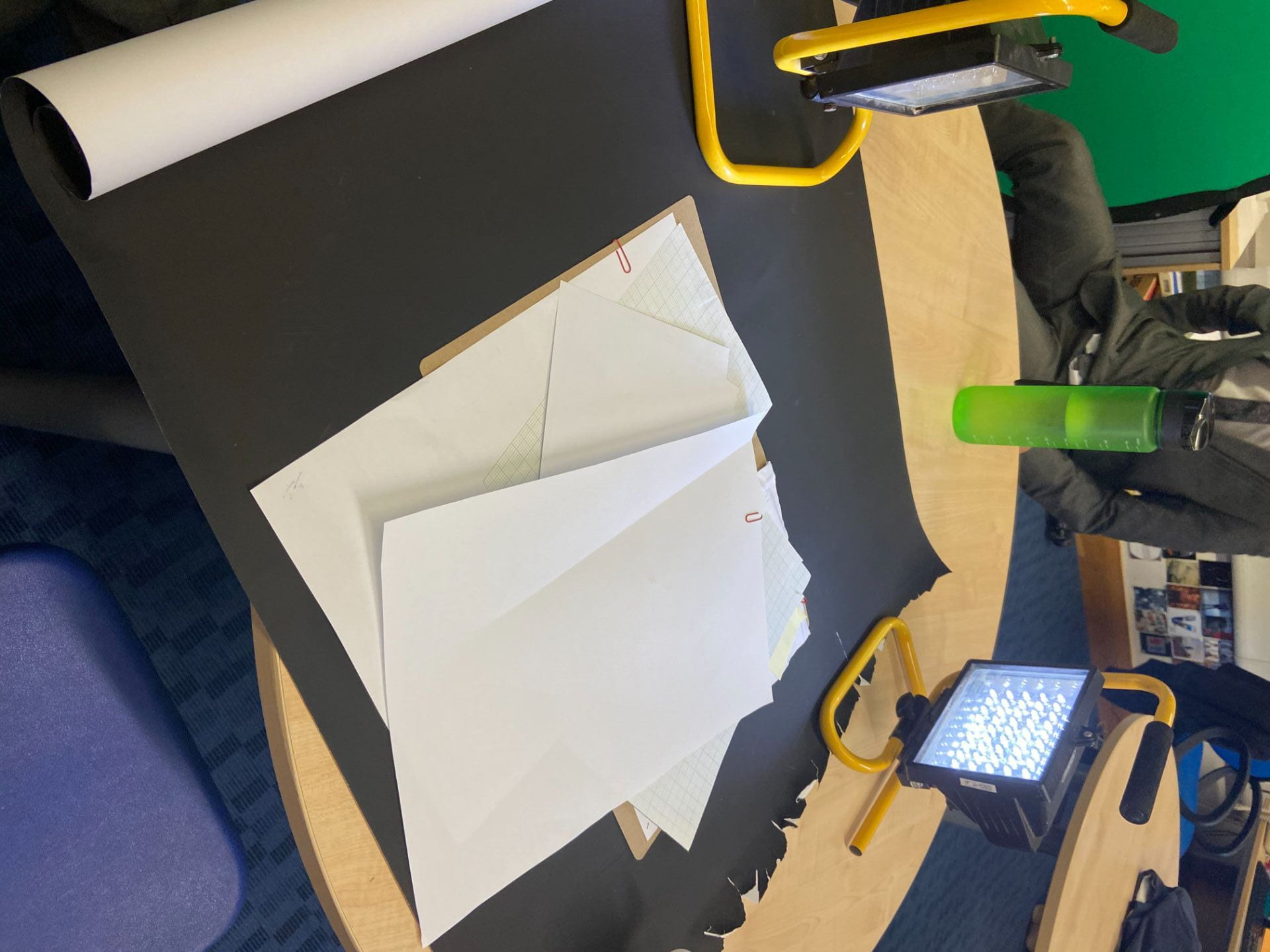
With this polished version, I also printed out a copy of this and set it up as part of a real CD case to better visualise how it’d look as a product to our audience. This was then sent out to peers for their own feedback, asking if the product aligned with their own views on the conventions of the Indie genre, and if this was recognisable from the design. Fortunately, our peers responded positively, all agreeing that the design fits within the conventions and topicalities of the Indie genre and thus delivering the design that fans would expect from this artist.

Digipak Draft 2

Here is the second draft, now adding all of the details and notes inside to give it more character and narrative, compiled from some images and documents used in the music video to create the link between them, as well as adding the spine alongside the back cover.

PDF link:

From this draft, we got our teacher to submit a feedback video and give his opinion on the areas that need improvement for the next draft;

In summary, for the next draft I’ll need to;

  • Fill up the empty space on the back cover, add more stains
  • Add record label and bar code details on back cover
  • Add more notes and a better idea of the theories inside visible around the edge of the front cover
  • Make sure the fold in the centre of the inside cover doesn’t disrupt the design in any way


Digipak Draft 1.5

Here is our next draft of the digipak, having now incorporated the coffee stains we aimed to include from the shoot;

This really adds to the grungy, dirty and disorganized look we’re aiming for.

From this, I compared the work so far with previous student’s work, following the same assessment objectives as them;

The use of camera and Photoshop to take & manipulate engaging images and use a variety of shot distances.
The camera use here is pretty basic, but serves it’s purpose as intended and is adequately lit, however the exposure and balance needed to be adjusted slightly with some photos in order to get them to match.

The selection of mise en scene in the photos and the meaning it communicates.
The mise en scene and visual theming works well an consistently together with the motif of conspiracy theory, with a messy, chaotic collection of notes and theories, communicating the meaning illustrated in our mission statement; reflecting this sense of unkempt obsession and fascination with these theories.

The creative use of DTP to integrate images and text and use colour / typefaces.
I like how I achieved a stamp-like effect with the title with a combination of texture overlays and the smudge tool around the edges. This also worked well alongside the handwritten font, created by physically writing out and scanning out the words that I’d written by hand. The colour scheming is consistent and fitting to the theming, with a bright vibrant red working as a good accent against the more faded paper and brown folder.

Digipack Draft 1

Here is a link to the first draft of our digipak after our shoot.

I’m happy with how we’ve been able to stitch together the inside spread from two separate photos so it seems naturalistic, and the stamp effect used on the title text looks convincing, with the addition of some slight ink smudges around it to add to the authenticity.

In the next draft we’re going to aim to incorporate the coffee stains and add some content to the inside notes, as well as add details such as the bar code on the back cover.

Contact Sheet & Evaluation

Below are the contact sheets from after our shoot, it involved a lot of experimentation in terms of lighting and use of flash, as well as working both with and without the black sheet background, but in the end I believe we came out with plenty of usable and good shots for our project, especially considering how much of a simple setup we had. the resulting images we’re using have come out clearly and cleanly with good lighting.

Below is a photo of the setup we had in order to take the photos, with the plain black sheet background and simple light either side to make the lighting flat and clear;

Photoshoot / Design Production Meeting and Risk Assessment

Since our planned design doesn’t involve a model, only simple overhead shots of some paper and files, we didn’t require a full risk assessment or in depth set up, since this could easily be achieved within the classroom with our teacher’s supervision.

Our plan for this shoot was to put together shots for both the front and back of the folder, the inside, and some coffee stains we created on a piece of paper that we could use in editing as an overlay effect. The prop list we compiled was as follows;

  • Brown paper folder
  • Assorted sheets of paper to act as files within the folder
  • Coffee (and paper to create coffee stains on)
  • Paper clips (red, to match the colour scheme we’re going for)
  • Post-it note (conventional yellow colour, so easily recognisable)
  • Black and red pens to add writing and scribbles to make the file seem more used and actively studied

To perform this shoot, all we’ll need in the classroom is a plain black sheet to use as the background, sufficient lighting so the photos look clear and professional, and a camera, with space to position it directly above and face down over the files we’re photographing.

Hand Drawn Mockup

After gathering ideas from our convention analysis’ and moodboard  we drafted together a sketch of how we’d like it to look.On the inside pages we would include a collection of various notes and collected theories fitting to the theme, pulling from real world believed conspiracies and creating intertextual references to draw in the audience further, catch their attention with details that they recognise, with references to these ideas and trigger words found within the conspiracy theory environment; “Sheeple”, “Dark Secret”, “Big Pharma”, “Black Pill”, “Thought Crime”, “Wrong Think”, “I Want to Believe”. Beginning this with our choice of album title, blending with the design and naming it Confidential, attracting attention and playing with the idea that people will naturally be drawn to discover that which is considered forbidden.

Branding Moodboard

To get our thoughts together clearly and start putting together something substantial for the digipak, we assembled a Padlet moodboard of conventions of the genre and general ideas. This collection of inspiration will help us form a fitting and successful digipak plan of our own.

Made with Padlet

Digipak Conventions Analysis

Before approaching our own digipak it was helpful to look at another digipak design from a related artist to get an idea of the conventions and techniques used and how it is successful, attracting a similar demographic as we are aiming to.

Our Mission Statement – The Package Brand

Approaching this new task, we made sure to highlight are aims and ideas for the task in a mission statement to make sure we achieve what we want to going into this, illustrated belwo in this slideshow.