The online Flipsnack version of my magazine
All Pages of my final magazine


The online Flipsnack version of my magazine
All Pages of my final magazine

Chosen adverts
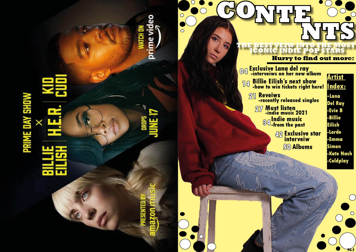
For my magazine I chose to use an advert for a popular music company as it included the famous Indie star Billie Eilish which I knew would resonate with my audience, as well as this the particular advert contains people of the same age demographic to my audience. This advert compliments the colours which Indie pop displays as yellow is edgy and different which is why I used this colour for my contents page. This advert also targets my audience as people who would buy this magazine would listen to artists like Billie Eilish as she is a representative of the Indie pop genre and her name is included in my magazine therefore this advert is specifically chosen due to it promoting the genre.
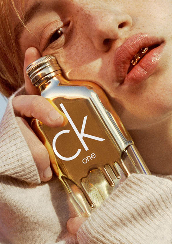
I chose the advert on page 6 because the colour shines but it will not detract from other pages as it stands alone. It is also a popular perfume brand with my audience demographic and the woman portrayed is a similar age to my perfect audience member which is why I included it. Therefore this advert would be something that my audience would be interested in and the colour pallet also resembles the Indie Pop genre as it is quirky and bright.


The feedback from my draft 3 of each page
All of my pages together show how far my pages have come since posting my second drafts of each one and after thinking about the review and targets for each one. So, how are they different?
My front page: I have decided to get rid of the pastel background and go for a darker pink to therefore make this front page stand out, I have also added an opaque blue text box behind the title of ‘indie insight’ to therefore border the title and bring it out more.
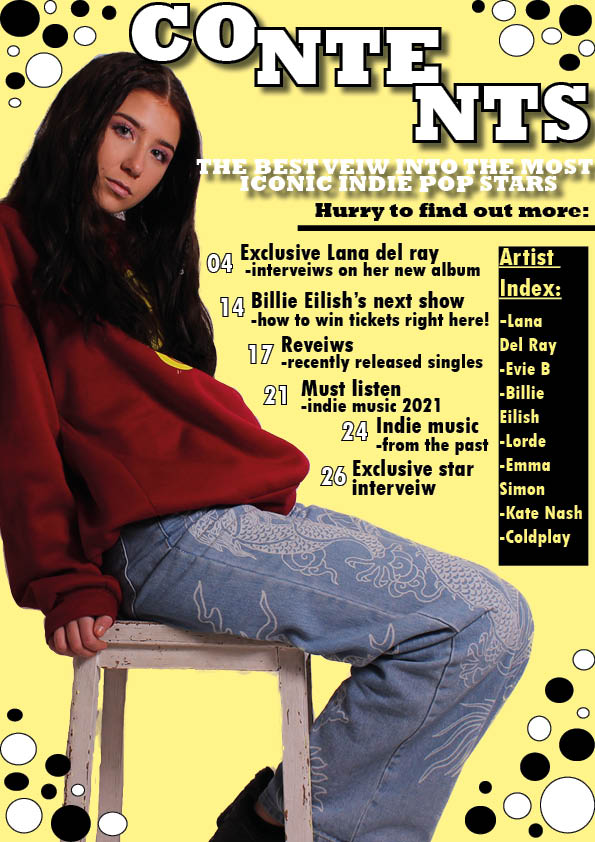
My contents page: I have used a yellow as an accent colour from her jumper and it is a bold, dramatic colour, I have also included more page numbers and as well as this I have added an Artist Index of featured artists in the magazine in a black text box with yellow writing to make the colours continue to stand out.
My DPS: The changes made on this page are the slightly darker background colour which deepens the page instead of mellowing it with the previous pastel cream colour and another change to this page is the small text box about her outfit to therefore give more information and make the target audience have something else to read about.

Whats new?
-The Main title on the left hand page is now staggered so that the design is more interesting and it now fills the black box
-The pug in the left hand corner has been replaced with a smaller pug as well as a spiral black and white background to add affect as well as contribute to the design to make the page intriguing whilst blending in to the black and white on the left hand page
-I have added not only white but black borders in the right page corner as it ties in each page nicely as well as makes something to look at and add something extra to the page
-Lastly I have rearranged the article so that it flows around her head and the writing almost encapsulates the person in which the article is about, tying into the article I have put a text box hinting to the page written about in the article to therefore add a reminder and small detail to this double page spread.
What is next?
-Next I would like to darken the background into a non pastel theme.
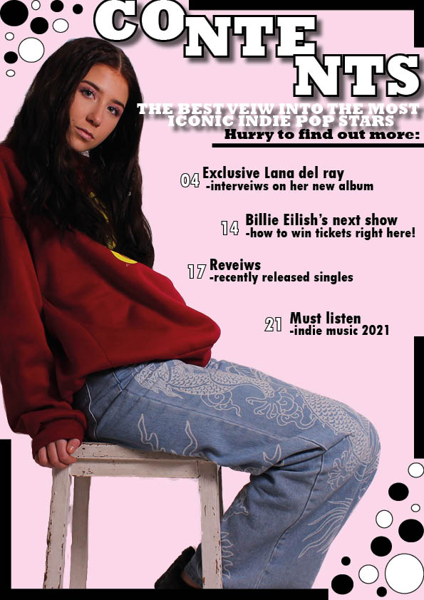
What’s new?
To make the Contents page fresh and more exciting I have:
-added new designs and shapes to add added attraction to the page, through the lines and circles as well as the contrast in colours and shapes it catches the eye without causing the page to be chaotic
-I changed the spacing of the page numbers and references to therefore catch the eye and create some different layout textures to the page
-I Moved the title ‘contents’ higher up at the top of the page, this therefore highlights the title better and the fact it is a contents page is clearer.
What’s next?
For this page I’d like to:
-add more page references
-include a pug to add more to the page and make the page varied in what you can look at and therefore more intriguing
The second draft of my magazine front cover:

What’s New?
What’s next?
My draft article for my magazine double page spread:
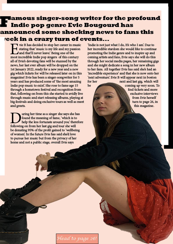
Evie B has decided to stop her career in music stating that ‘music is my life and my passion and that’ll never leave.’ Being one of the most incredible Indie pop singers of this century all of Evie’s devoting fans will be stunned by the news, her last ever album will be dropped on the 1st January 2022, ready for a new year and a new gig which tickets for will be released later on in this page magazine! Evie has been a singer-songwriter for 5 years and has produced some of ‘the most amazing Indie pop music to exist’. She rose to fame age 15 through a hometown festival and recognition from that, following on from this she started to avidly live through music and start releasing albums, playing at big festivals and doing exclusive tours as well as meet and greets.
During her time as a singer she says she has found the meaning of fame, ‘which is to help the less fortunate around you’ therefore following on from her last gig and tour she will be donating 95% of the profit gained to ‘wellbeing of women’. In the future Evie has said she’d love to pursue her music but from the privacy of her home and not a public stage, overall Evie says ‘Indie is not just what I do, It’s who I am’. Due to her incredible stardom she would like to continue promoting the Indie genre and to inspire up and coming artists and fans, Evie says she will do this through her social media pages, her remaining gigs and she might dedicate a song in her new album to her fans. All together Evie has said she’s had an ‘incredible experience’ and that she is now onto her ‘next adventure’. Evie B will appear next in Boston for her next and last gig, which will be coming up very soon. To find tickets and more exclusive interviews from Evie herself turn to page 26, in this magazine.


First draft of double page spread:
What I like –
I like the colour scheme I chose for these pages because it is clean and allows for the writing to be bold, I used the light peach as an accent colour that I drew from the burnt orange dress and used white and black to keep it clean and unchaotic.
I like the layout as it is simple and yet decorative and affective.
I like the fonts that I have used as they stand out and flow well with the layout and genre.
What I need to do –
I need to make the pug image bigger or make the circle smaller so the image fits the circle.
I need to move the article slightly to the left so that there is not a big, blank space
I need to pull the article hook further down so the space between is smaller
I need to lengthen and write more for my article
I need to spell check the article hook

The contact sheet for the second shoot:
Following up from the second shoot that I did for my magazine I produced a contact sheet to display the final images taken and a google docs of my favourite images all together. I chose these images because I had to carry out the shoot on my phone and I felt these were the clearest, brightest pictures which also captured my genre and would go well for my page. For the costume in this shoot I wanted to make it more grunge and quirky for Indie pop so that it contrasts pages that I have done before, therefore I chose a uniquely colored dress, doc boots and two different jackets, one light but oversized and one which would go with the boots. I kept the makeup and hair simplistic to therefore not detract from the costume and took some images for possible pugs to put on my pages as well. I also tried exploring with a mirror to get different angles and shots which she reflected off to add something interesting to the images. The photos are slightly dark but very edgy and serious and I am happy at how they came out especially seeing as I had difficulty trying to take them. I also like the range in medium, low, canted and close up shots that I took as it gives me a variety to choose from an also gives me practice in taking these shots.

First draft of contents page