Reflection
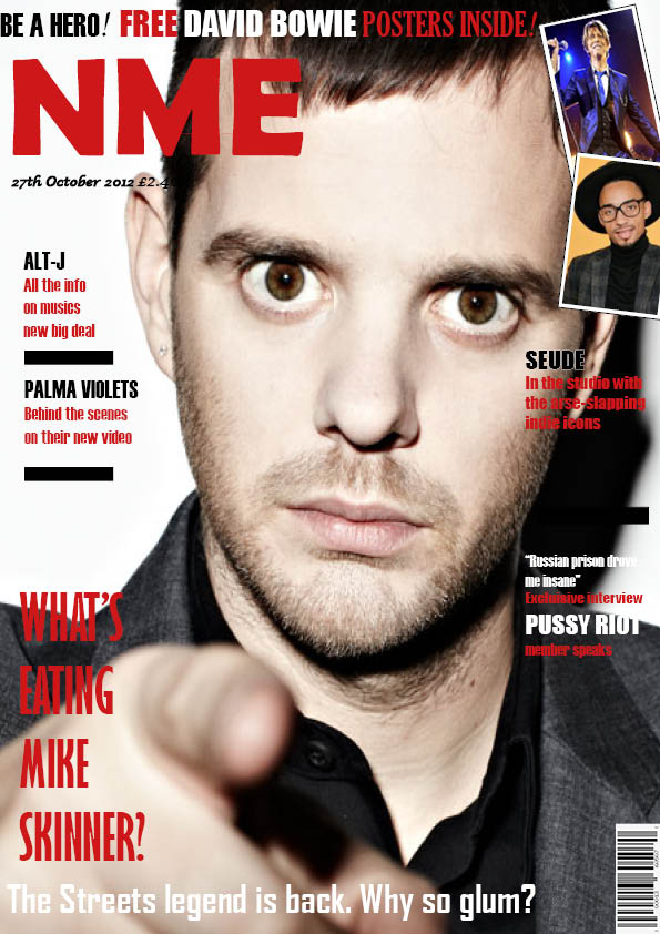
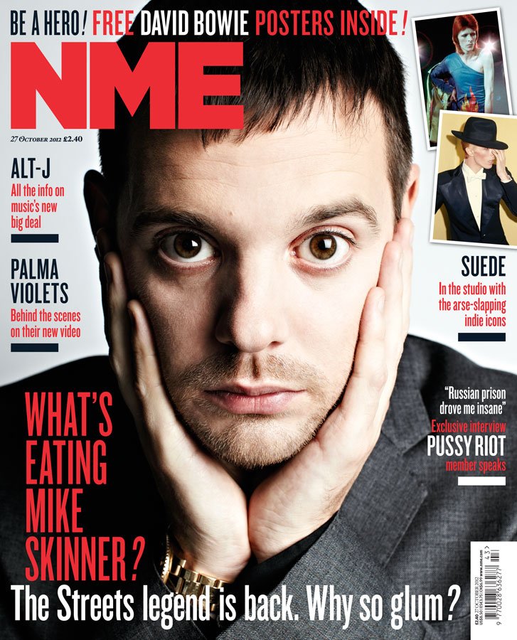
In this task we had to replicate a magazine cover, making it as identical as possible. We did this in order to practice using InDesign which is the design program which we will be using to create our own magazine covers therefore it is important to get used to using it. I was dedicated this magazine cover and given only a similar image of the cover star as a starter. I then had to find typefaces, sizing, colors and the side images that match the original cover.
My interpretation of this NME magazine cover uses a different cover-star image as I was unable to find the identical photo although you can see it is from the same photo shoot due to the lighting and clothing being the same. The side images on my cover also differ from the original slightly although again I chose images which included similar colors and type of camera shots (mid-shot). When choosing the different type faces within the cover I tested out multiple different fonts to compare with the original type face in order to find the one which mirrored the NME cover the best.
When reflecting on my magazine cover I can pick apart 3 things which were successful and 3 things which turned out less successful-
POSITIVES
- I found it easy to find typefaces which were very similar to the ones on the original cover due to the large selection of fonts available on InDesign as well as the ability to make the fonts bold/italic
- I also think that my sizing and proportions on my poster are the same as the sizes on the NME cover which is important to make the covers mirror each other.
- Finally, I think that the side-images I chose and arranged with a white border turned out well and look like the original cover.
NEGATIVES
- I think that my main cover-star image is slightly out of proportion compared to the NME cover as it is slightly more close up although this could be more noticeable due to it being a different image.
- Another thing I would correct is the alignment of the text on the right hand-side, the text should be aligned to the right rather than the left.
- I would also move the text which is intruding the cover-stars face, text should not go into the main focus of the cover-star as it looks unprofessional
Focusing Forward
This practice of how to use InDesign will be very useful when producing my own magazine cover as I now know how to use all of the technical features to aid the process of making a professional cover. It has also helped to show me the importance of simple details within the cover and the importance of choosing suitable fonts which will appeal to your target audience and match with your chosen theme. The main focus of a magazine cover is to attract an audience therefore the magazine cover needs to be attractive so all of the elements on your front cover need to link together otherwise it will look dysfunctional and not be aesthetically pleasing.

