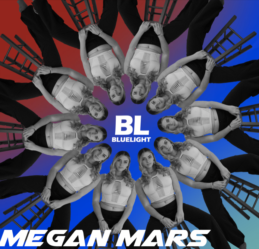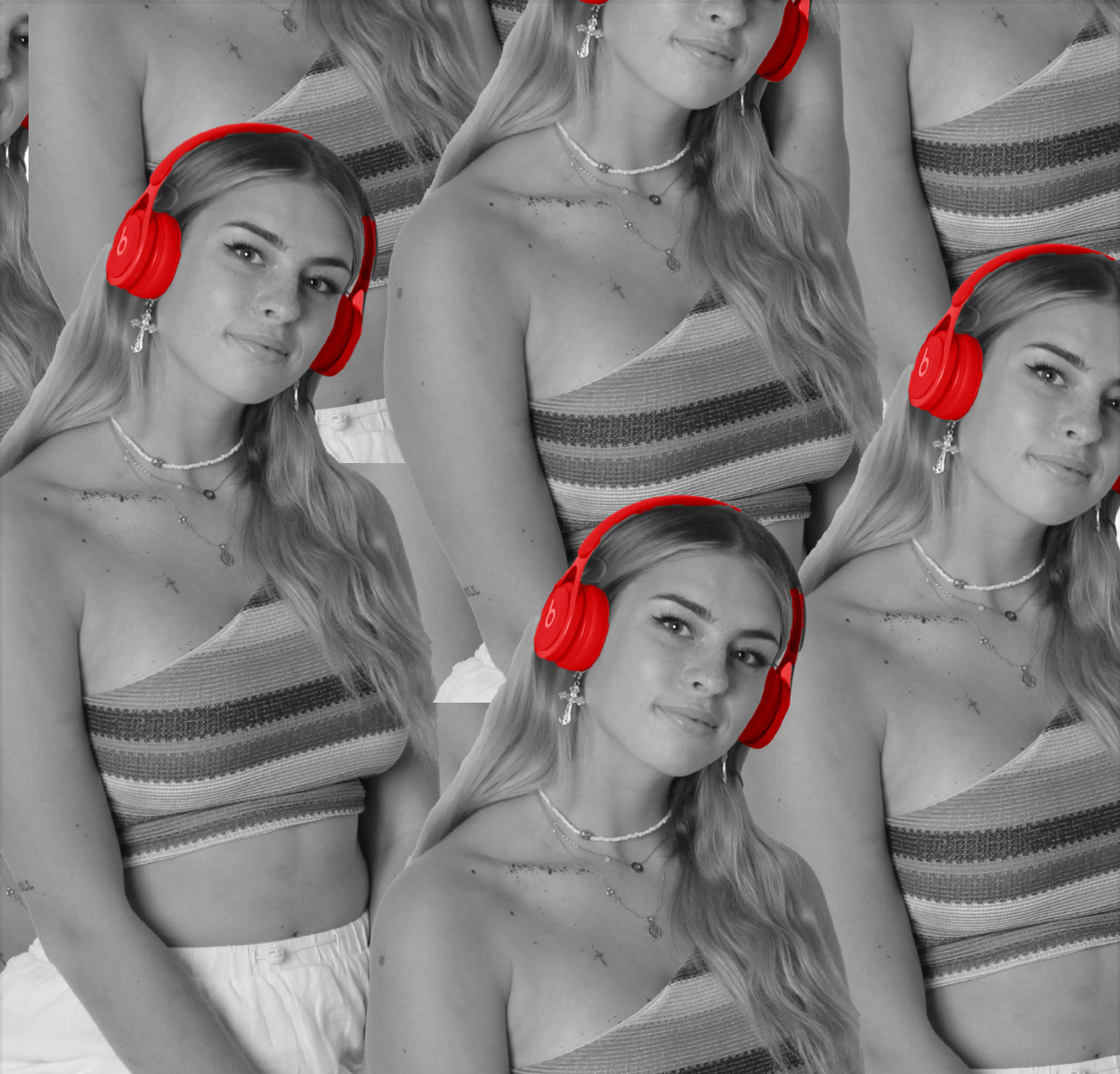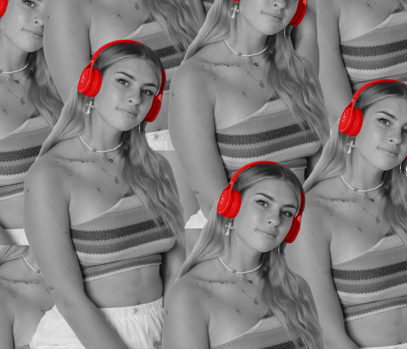


We really didn’t change a lot for our final draft as we worked really hard to make our third draft exactly what we wanted after not being happy with our first or second draft. Therefore it was only small details that needed amending such as rotating the MM on the left spine and slightly altering the position of some of the text. Overall I am really happy with the final draft for our digipak and I think it represents our star and our genre very successfully whilst being very appealing to look at. It also includes all of the necessary conventions such as the barcode and copyright text swell as tracks, album name etc. which are essential for a successful Digipak.
We spent quite a lot of time making sure that the colour palette was coherent through all 4 pages and it think this was successful. Initially we struggled to make sure all pages were recognisable to have come from one digipak although we found a way to match the background colours with the colours used in the glitch effect on the back cover, we then made red a feature throughout the whole digipak so made the beats headphones a feature in the middle two pages. The main form of media text which is shown through our digipak is visual images which portray a meaning towards our EDM genre, this type of media language allows the active audience to decode it and interpret it personally. We used elements such as the beats headphones which we highlighted to ensure they stand out In order to represent the stereotypical DJ look, this will require cultural competence to understand this representation although I think we successfully ensured that these same EDM themes can be picked up through other elements of the digipack such as the type face and graphics used. After doing market research from our third draft I was happy that our digipak was identifiable as belonging to the EDM genre which was key for it to attract the desirable audience.