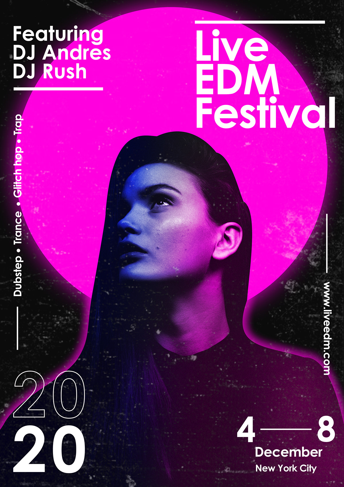
Here are my two chosen adverts for page 2 and 6 of my music magazine. I am including adverts in my magazine to allow it to form a mini magazine which I need a page 2 and 6 for. It was important for me to realise that a brand would not advertise their product/event In my magazine if it is not expected to attract my target audience, keeping this in mind helped me chose my adverts.
Psychographics and demographics were useful when finding what adverts would interest my audience most. I thought about my readers psychographics as this is an insight into their personalities and insights which can help dive me an idea of the types of adverts they would be interested in aswell as demographics which refer to the individuals age, race and overall identity factors which can also be useful when choosing which adverts appeal most as some adverts would attract a much younger generation.
When choosing my adverts I focused on ensuring they would appeal to my magazines target audience. Therefore I chose one advertising a upcoming EDM event which should attract my readers as it is a EDM magazine therefore they should be interested in events linked to this genre. My second advert is advertising headphones which I believe would appeal to my target audience as EDM genre is a lively genre which links in well with this adverts main headline ‘The Game Before The Game’. This is advertising top sound quality in Beats products which create an atmosphere of concentration before a game.
Although these pages in my magazine will not be marked they enhance my understanding around my genre and target audience associated with my magazine.
This is a screen castify which gives me an overview of what I can improve within my music magazine.
click to see PDF
What’s new?
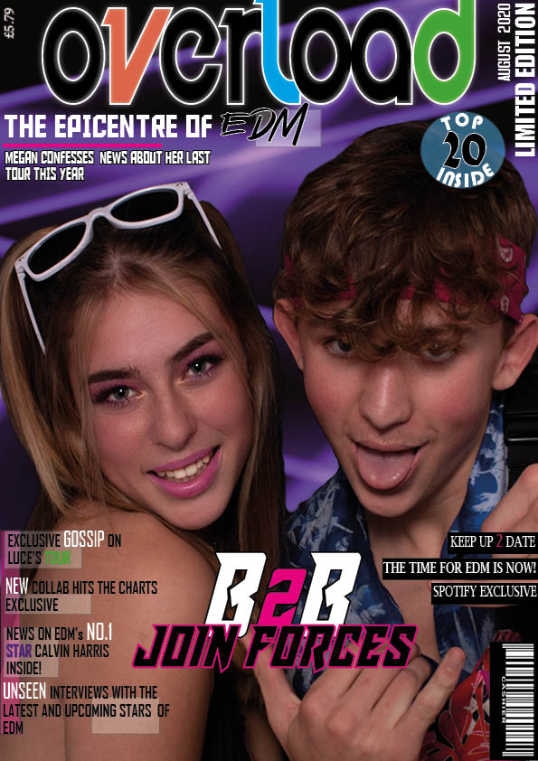
I changes a lot between my second and third draft after looking at more expamples of front covers and realising it was not busy enough for a EDM front cover.
I added features such as ‘Top 20 Inside’ which helps show my range of skills on indesign
Adding lots of cover lines on both sides of my front cover made it a lot more busy and gave a lot more of an insight to what is included in my magazine
I changed my background as the plain background was quite bland and this graphic background I created on photoshop gives a ‘rave’ effect to my cover
What’s next?
I am not completely happy with the typefaces and layout of my coverlids on the left
I need to enlarge my title so that it is the main focus of the front cover and not fighting with the main cover line
I am also going to put ‘Spotify’ in the actual Spotify logo type face as an additional feature
I also need to check my wording for my headlines ad I do not want to overuse words like ‘exclusive’
click to see PDF
What’s new?
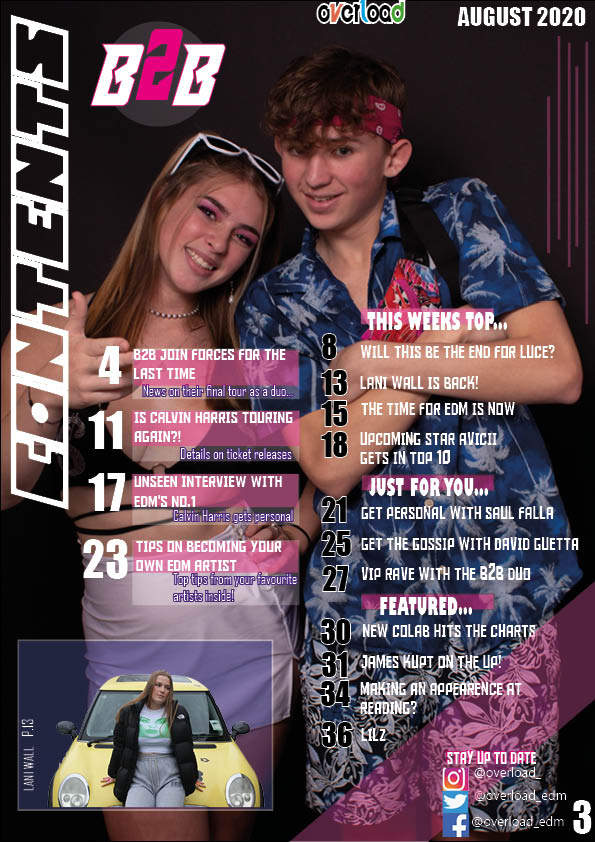
I added a tinted slash through the corner of my contents page to add dynamics
I also played around with my cover lines and page numbers adding more colour and strikes to make them stand out more
Rearranging the ‘B2B’ logo to where there was more space
What’s next?
I am going to try and cut out my background image as I think It would look better put onto a contrasting background
I also do not need to date at the top of my contents page so am going to remove that and possibly re-arrange the ‘overload’ logo into the top right
I am going to add a page number under the ‘B2B’ logo to link it with the cover line
I need to ensure that all of my columns are lined up
click to see PDF
What’s new?
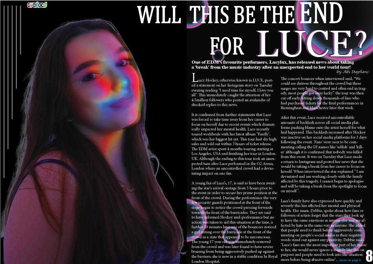
I added a heading to my model to link her with the article
I also added a album cover which is the album mentioned in my article
Another feature I added was more straight lines on the other side of the model which gives more business and details to my ups
What’s next?
I am going to try moving ‘LUCE’ to the bottom of the model as this area is boring
I also need to enlarge my heading to make it stand out even more
I am going to play around with my article text and try justifying the second column to the right
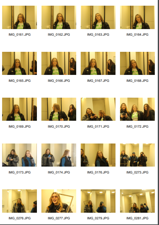
This is my second draft for my double page spread, I didn’t change that much in this draft but I did add a few details…
what’s new…
I ensured to add details such as the author of the article and where to continue reading the article which I missed in my first draft
I also worked on the heading and added a coloured text behind “LUCE” to make it stand out more swell as rearranging the heading so that it doesn’t read over the fold in the middle of the page which could be cut out when stapled into a magazine
Another detail I added was the overload logo in the top left which I also included in my contents page so followed this on
what’s next…
I am not completely happy with my artists name ‘Luce’ and so may change it to a more extra-ordinary dj name to fit the EDM genre
I may try to follow the background onto the left page so that the design flows
I am also going to play with some small designs which I could add as “Luce’s” logo somewhere to help link my models image to the article
I changed quite a lot after my first draft as I wasn’t happy with the overall aesthetic. The main thing I changed was the background, I had a pink translucent layer over my image on the first draft which I got rid of for the second draft and also moved around the page numbers and headlines to expose the models face.
I also changes the image in the bottom left which I cut out and I am pleased which this as it bring another model into my magazine giving my readers another insight of what to expect throughout my magazine
I also spent time lining up all of my headings as they were out of line. and looked messy
I then added details into my contents page such as the ‘overload’ logo and a reference to my models who are ‘B2B’
another detailed I added was a white strike to the right hand numbers to make them stand out from the dark background
What’s next…
I realised after saving this that I have left a line In under the contents heading which I need to remove. (silly mistake)
I am still not 100% sure about the layout and text colours etc as not sure if the white typeface blends into the background too much
the social media details are also quite hard to read as the type face is very small so I may try add a background to make the text stand out from the model
I might replace the pink line details with something else as I also used this on my double page spread and don’t want a theme to be continued from th4e contents to the dps
another comment I was given was about linking the two rows of contents more as the right side has a translucent pink block heading them but the left doesn’t and therefore they feel slightly separate
in this draft I changed my background to a plain colour as I think the gradient made it look to busy and too many colours would have attracted a younger audience whereas my genre, EDM, will attract an older audience
I also changed some of the typefaces and colours on the fonts, such as ‘Join Forces’ to make them more aesthetic
Another feature which I had missed in my first draft was the price which I have now added in the top left.
I also added a strike to some of the cover lines to make them seem of more importance
what’s next?
I am still not 100% sure on the background so am going to try out some background using the effects on photoshop
I also may add some more cover lines to make the front cover slightly more busy
I am going to play around with different type faces for the cover lines as I have used this simplistic bold font quite a lot
This is my first draft for my double page spread. I am pleased overall with how it has turned out although I am aware of a few changes I need to make in my second draft.
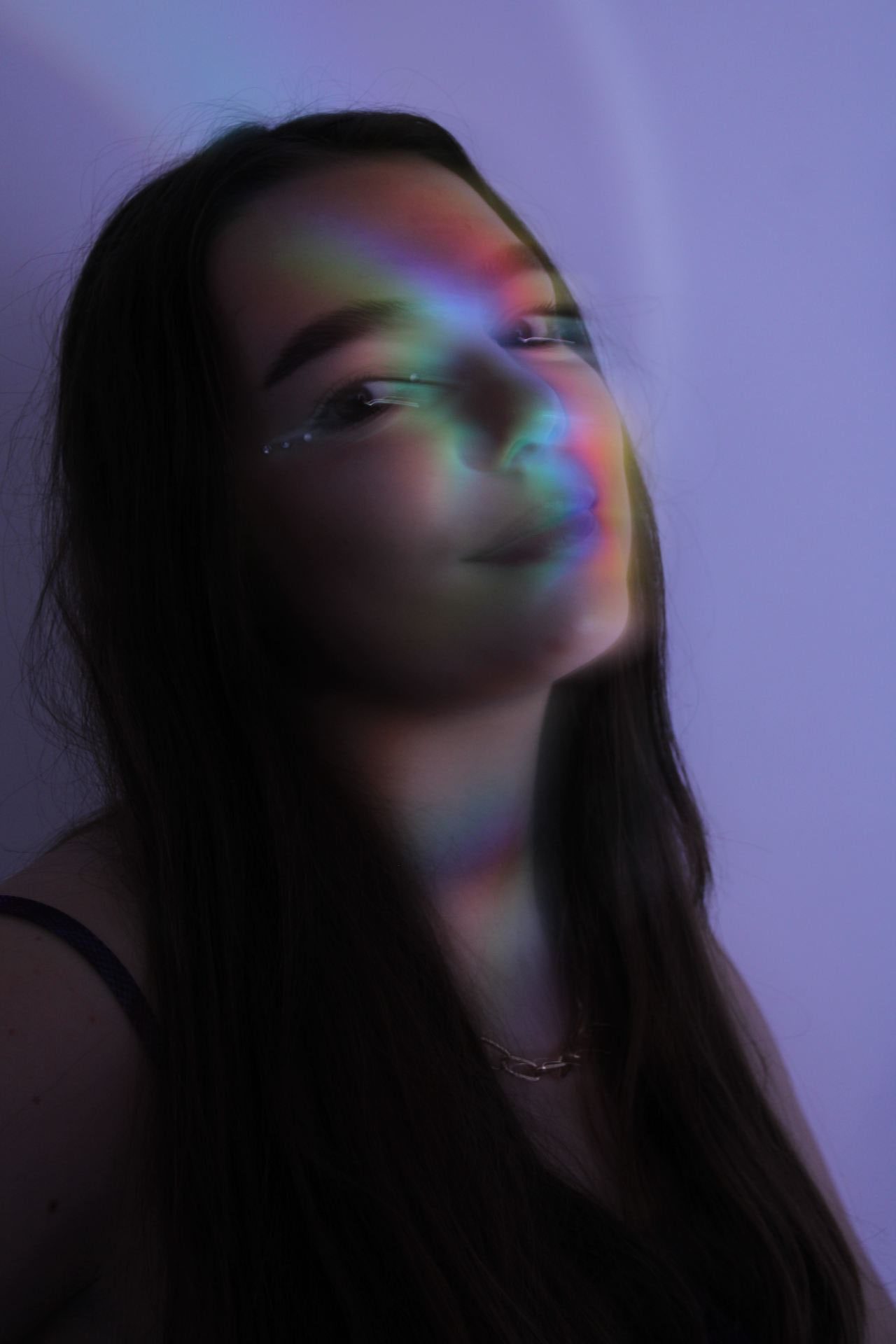
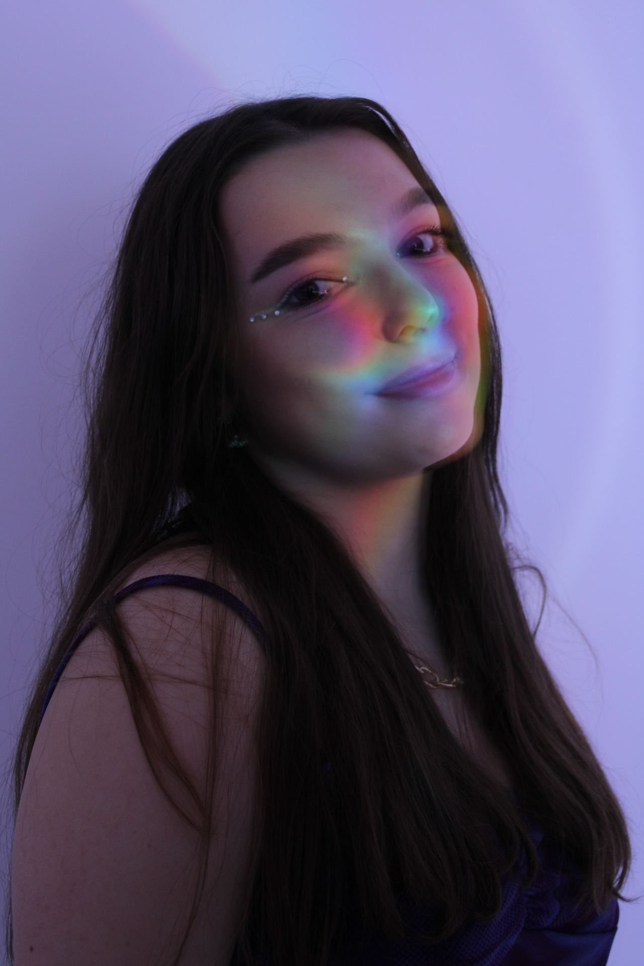
My main feature on my double page spread is my ‘funky photo’ image which I used a CD to make a colourful reflection on the models face. I then edited the image to enhance the colour and I am really please with how it turned out, I also wanted a dark background to go with the image as a colourful background may have taken away from the image.
5 things I like –
I really like how my main image turned out from this shoot as I think the colorful reflection will really catch the readers eye
I am pleased with my background, i went for a dark background with white text to allow the model’s image to pop more
I also like the neon circular details i added onto the background to make it less plain
5 things I would like to change in my second draft-
I am aware that my header overlaps in the fold of the magazine which may cut off some of the title when folded
I need to add text directing the reader to where they can continue reading the article as the whole article is not on the page
I would like to continue the circular designs onto the other half of the dps so that they follow on
I need to add details such as the author of the article (me) which is a common feature on a dps.
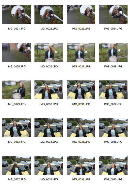
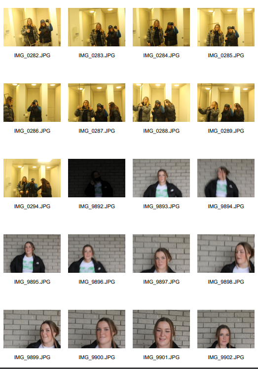
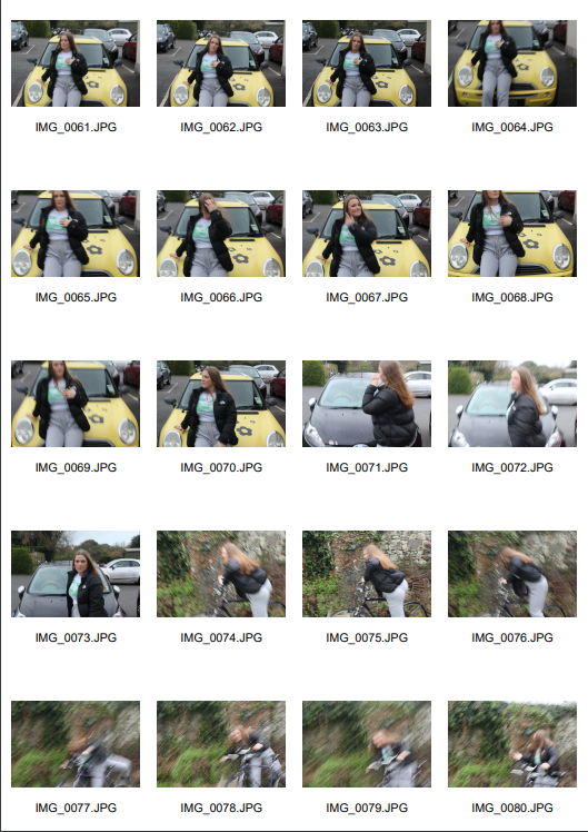
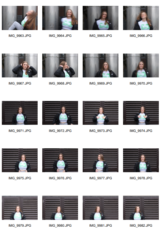
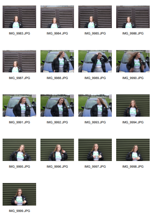
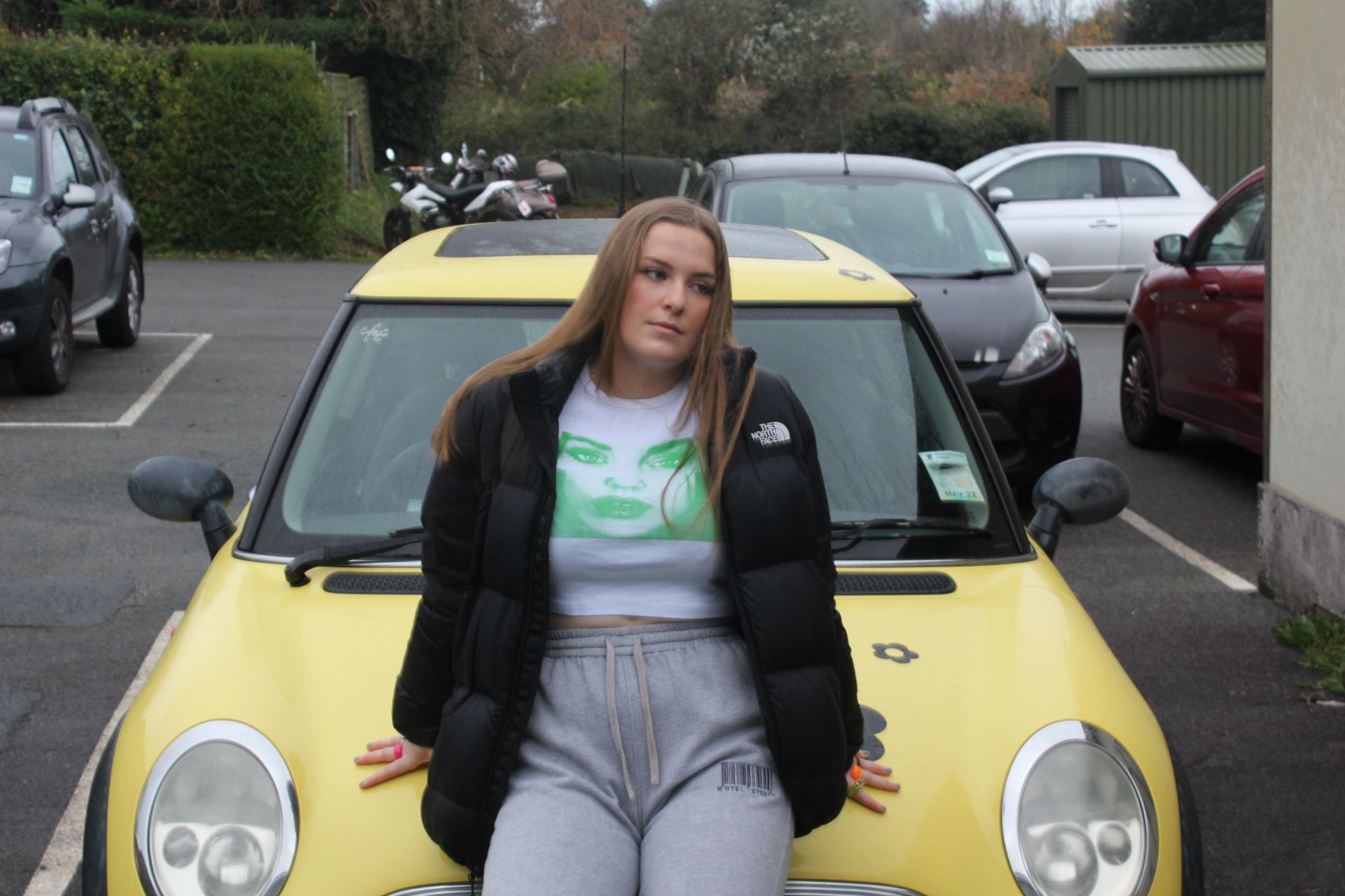
These are my ordinary images which I took in different locations outside. The purpose of these images is to allow the audience to relate with the model by looking at them in ordinary places. I am happy with how these images turned out and got photos in a lot of different places to give me different options which I can then edit using photoshop.
These are my favourite images from my ordinary shoot as I think they really help my future audience to relate with the star in the photos due to them not being extra-ordinary images. The photo on the yellow mini is in a normal carpark which normalises the star. Although for this image I would cut out the model and the mini and place onto a new background as the car park background takes away from the model image.
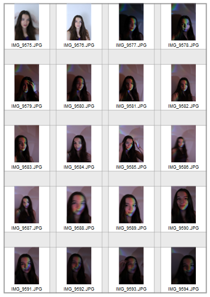
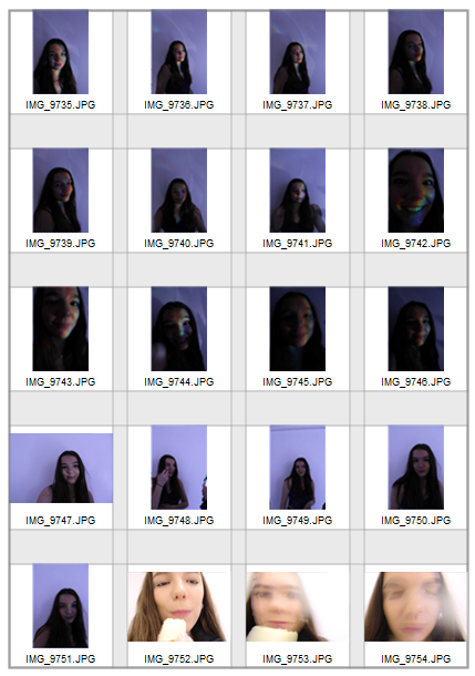
Funky photoshoot
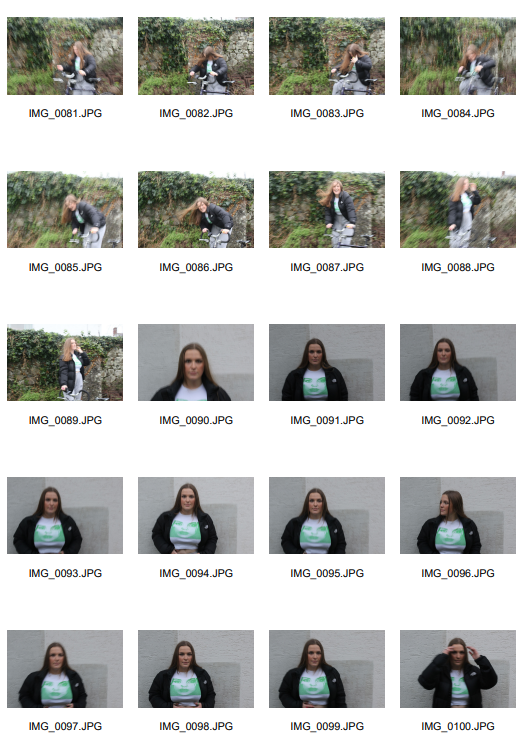
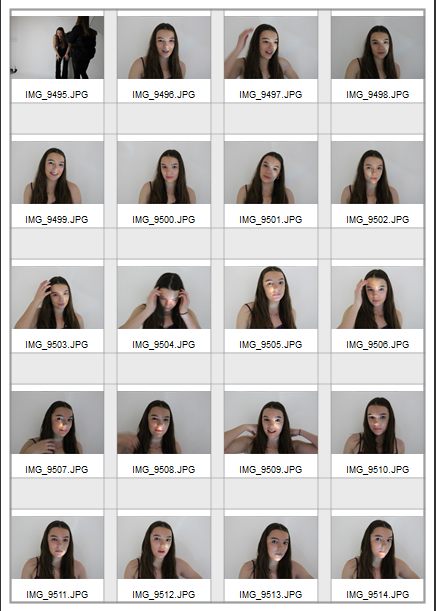
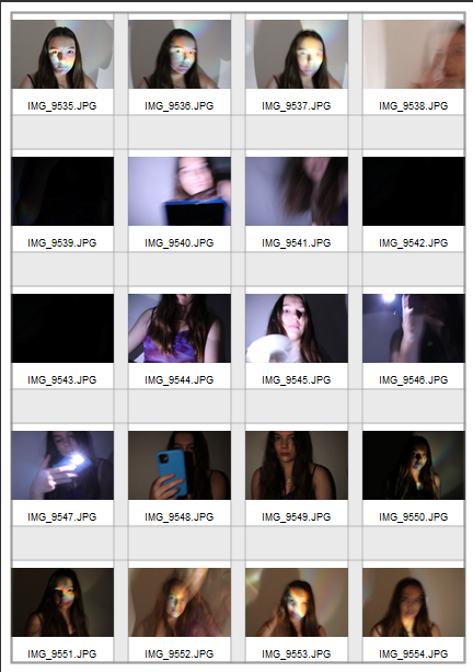
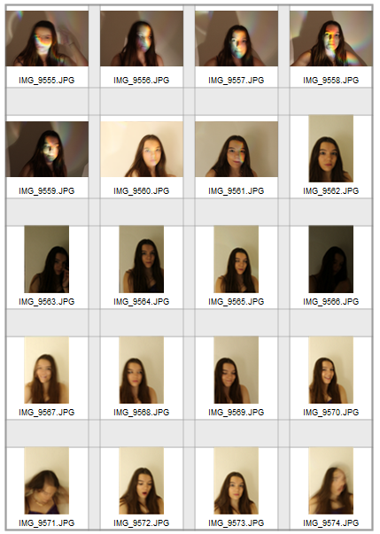
These are my ‘funky photos’ which makes the model seem extra ordinary compared to my ordinary photos. For these images I used a CD to create a colourful reflection on my models face. I did this by shining a light onto the CD to create the reflection, as you can see by the contact sheets there was a lot of trial and error before I got some images which really worked. I am really pleased with how these came out as the colour shows up better than expected and makes what could be a boring image more exciting.
These are my favourite two images from this shoot due to the colourful reflection and you can also see the makeup on my model (gems) which was important to me as these shots were quite close up and therefore don’t show a lot of my models costume so it was important that these images captured the gems and chain on my model.
I think these images make my model seem ‘extra-ordinary’ by something so simple compared to my ‘normal’ photoshoot of Lani outside which makes the model seem more ‘ordinary’. It is important to have both extraordinary and ordinary photos within a magazine as it allows the readers to relate to the model swell as look up to them.
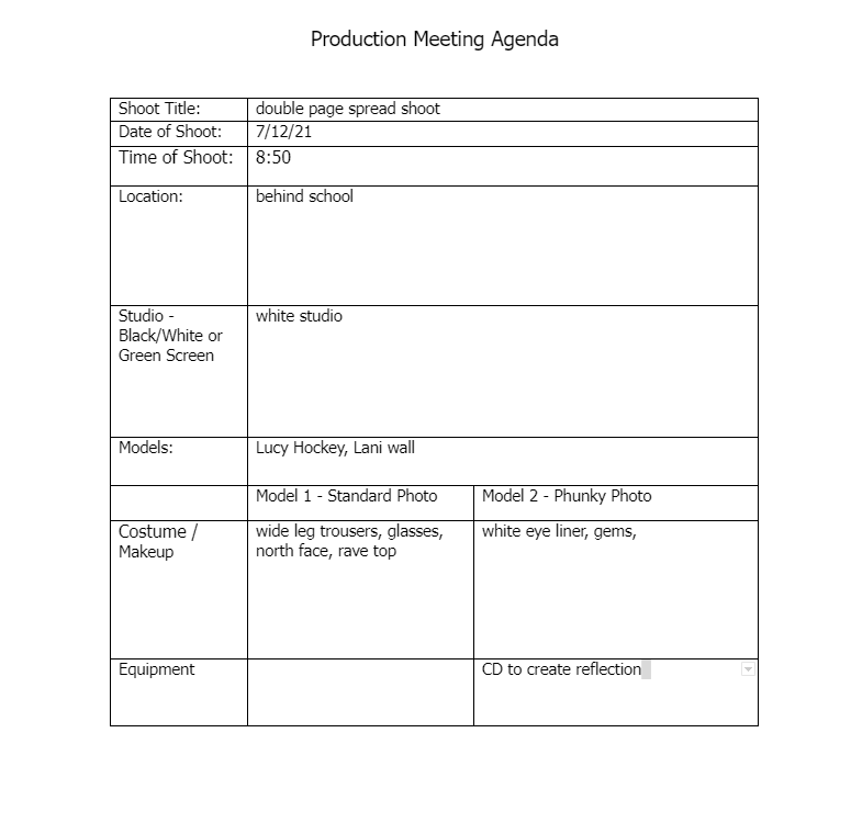
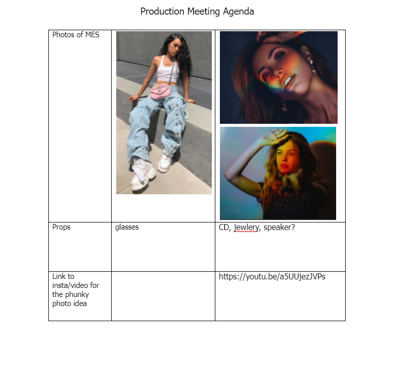
This is my production agenda for my second photo shoot. These are the photos which I will be using for my double page spread article. For this task I am doing two shoots, one is a standard photo shoot which will be an outside shoot and my model is Lani Wall, these photos will be more casual and seem more ordinary to the reader. For this shoot I am going to dress my model casually – joggers, a cool graphic top and a puffer jacket.
My second shoot is going to be ‘funky photo’ shoot, model – Lucy Hockey, which I am doing in the white studio and using props such as a CD to create a colourful reflection making it a more exciting and extraordinary photo to my audience. For this shoot the model needs to seem extraordinary therefore I am going to use gem’s and eyeliner on my model to create a powerful makeup look aswell as a trendy and colourful outfit.
By doing two contrasting shoots gives me double the amount of options for my double page spread and I can create lots of contact sheets to decide which images I prefer. I also chose to use different models for the two shoots as it gives my magazine a range of ‘artists’ giving the reader more of an inside to who is included in my music magazine
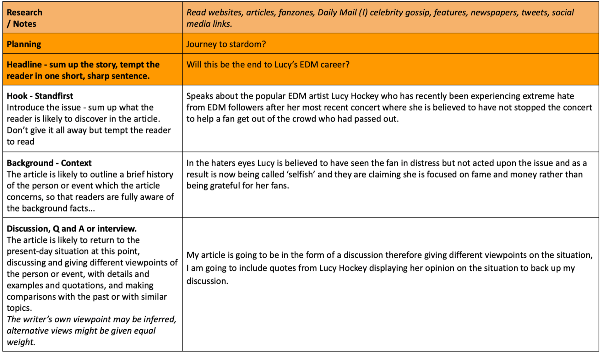
One of EDM’s favourite performers, Lucy Hockey, has released news about taking a ‘break’ from the music industry after an unseen end to her world tour!
Lucy Hockey posted a statement on her Instagram story on Tuesday evening reading “I need time for myself, I love you all”. This immediately caught the attention of her 4.5million fans.
It is confirmed from further statements that Lucy was forced to take time away from her career to focus on herself due to recent events which dramatically impacted her mental health. Hockey recently toured worldwide with her latest album ‘firefly’, which was her biggest hit yet. This tour had sky high sales and sold out within 3 hours of ticket release. The EDM artist spent 4 months touring starting in LA, USA and finishing her tour in Manchester, UK. Although the ending to this tour took an unexpected turn after Lucy performed in the O2 Arena, London where an uncontrolled crowd had a devastating impact on one fan.
A young fan of Lucy’s, 17, is said to have been awaiting the star’s arrival onstage from 3 hours before the event in order to secure her prime position at the front of the crowd. During the performance the very few security guards positioned at the front of the stage began to notice the crowd pressing forwards towards the front of the barricades. They are said to have informed Lucy Hockey mid-performance but no action was taken to aid this situation at the time, a further 20 minutes later one of the bouncers noticed a girl resting over the barricade at the front of the crowd that appeared to be unconscious. The young 17 year old was immediately removed from the crowd and was later found to have severe bruising from being aggressively pushed up against the barriers; she is now in a stable condition In Royal London Hospital. The concert bouncer when interviewed said, “We could see distress throughout the crowd but these surges are very hard to control and often end in tragedy’s, most people got away lucky”. The tour was then cut off early, letting down thousands of fans who had purchased tickets for the final performances in Birmingham and Manchester later that week.
After this event, Lucy received uncontrollable amounts of backlash across all social media platforms pushing blame onto the artist herself for what had happened. This backlash increased after Hockey was un-active on her social media platforms for 3 days following the event. ‘Fans’ were seen to be commenting calling the DJ ‘selfish’ and ‘killer’ although it is confirmed that nobody was killed from this event. It was on Tuesday that Lucy made a return to Instagram and posted her news that she would be taking a break from her career to focus on herself. When interviewed the star explained ” I am devastated and am working closely with the family affected by this tragedy, I cannot begin to apologise and will be taking a break from the spotlight to focus on myself”.
Lucy Hockey’s family have also expressed how quickly and severely this has affected her mental and physical health. Her mum, Debbie, spoke about how fans or followers of artists forget that the stars they look up to have the same emotions as anyone else and are affected by hate in the same way as anyone. She added that people need to think before aggressively commenting on people’s social media as their negative words stand out against any positivity. Debbie said – “Lucy’s fans are the most important part of her music to her, she would never ignore a tragedy like this on purpose and people need to look into the situation more before being abusive online”.
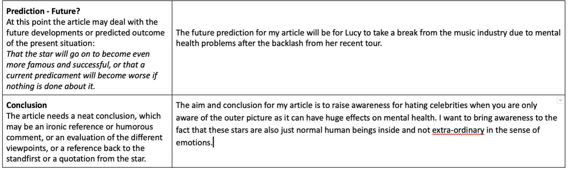
The EDM performer already had plans to attend multiple music festivals this summer including Reading, Leeds and Creamfields although it is unclear whether she will continue to attend these events or return in the future at all.
Loyal fans are showing their sympathy for this young artist, just 4 months after her newest album was released which is what had brought her to the attention of the EDM world in the first place. One fan added “Lucy had just begun to grow and it’s a shame for her to have a setback this early on, I think people are being harsh on a situation which was out of her control”.
-Abi Stephens (overload)
Article Draft 2
Will this be the end of Luce’s EDM career?
One of EDM’s favourite performers, Luce, has released news about taking a ‘break’ from the music industry after an unexpected end to her world tour!
Lucy Hockey, otherwise known as LUCE, posted a statement on her Instagram story on Tuesday evening reading “I need time for myself, I love you all”. This immediately caught the attention of her 4.5million followers who posted an avalanche of shocked replies to this news.
It is confirmed from further statements that Luce was forced to take time away from her career to focus on herself due to recent events which dramatically impacted her mental health. Lucy recently toured worldwide with her latest album “Firefly”, which was her biggest hit yet. This tour had sky high sales and sold out within 3 hours of ticket release. The EDM artist spent 4 months touring starting in Los Angeles, USA and finishing her tour in London, UK. Although the ending to this tour took an unexpected turn after Lucy performed in the O2 Arena, London where an uncontrolled crowd had a devastating impact on one fan.
A young fan of Luce’s, 17, is said to have been awaiting the star’s arrival onstage from 3 hours prior to the event in order to secure her prime position at the front of the crowd. During the performance the very few security guards positioned at the front of the stage began to notice the crowd pressing forwards towards the front of the barricades. They are said to have informed the star mid-performance but no action was taken to aid this situation at the time, a further 20 minutes later one of the bouncers noticed a girl resting over the barricade at the front of the crowd in a state that appeared to be unconscious. The young 17 year old was immediately removed from the crowd and was later found to have severe bruising from being aggressively pushed up against the barriers; she is now in a stable condition In Royal London Hospital. The concert bouncer when interviewed said, “We could see distress throughout the crowd but these surges are very hard to control and often end in tragedy, most people got away lucky”. The tour was then cut off early, letting down thousands of fans who had purchased tickets for the final performances in Birmingham and Manchester later that week.
After this event, Luce received uncontrollable amounts of backlash across all social media platforms pushing blame onto the artist herself for what had happened. This backlash increased after Hockey was inactive on her social media platforms for 3 days following the event. ‘Fans’ were seen to be commenting calling the DJ names like ‘selfish’ and ‘killer’ although it is confirmed that nobody was killed from this event. It was on Tuesday that Lucy made a return to Instagram and posted her news that she would be taking a break from her career to focus on herself. When interviewed the star explained ” I am devastated and am working closely with the family affected by this tragedy, I cannot begin to apologise and will be taking a break from the spotlight to focus on myself “.
Luce’s family have also expressed how quickly and severely this has affected her mental and physical health. Her mum, Debbie, spoke about how fans or followers of artists forget that the stars they look up to have the same emotions as anyone else and are affected by hate in the same way as anyone. She added that people need to think before aggressively commenting on people’s social media as their negative words stand out against any positivity. Debbie said – “Lucy’s fans are the most important part of her music to her, she would never ignore a tragedy like this on purpose and people need to look into the situation more before being abusive online”.
The EDM performer already had plans to attend multiple music festivals this summer including the sold out events Reading, Leeds and Creamfields although it is unclear whether she will continue to attend these events or return in the future at all.
Loyal fans are showing their sympathy for this young artist, just 4 months after her newest album was released which is what had brought her to the attention of the EDM world in the first place. One fan added “Luce had just begun to grow and it’s a shame for her to have a setback this early on, I think people are being harsh on a situation which was out of her control”.
The future for this upcoming EDM star is unknown ,everyone is unsure of the impact this has had so early on in her career and whether the spotlight is for her!
-Abi Stephens (overload)
MP3 recording of my second draft:
Targets for myself based of this recording:
I am not completely happy with the name of my EDM artist ‘Luce’ and not sure if all of the abbreviations of her name are confusing.
There are also definitely elements in this article which I would like to improve making it easier to read for my magazine and things which I could have written in a better way
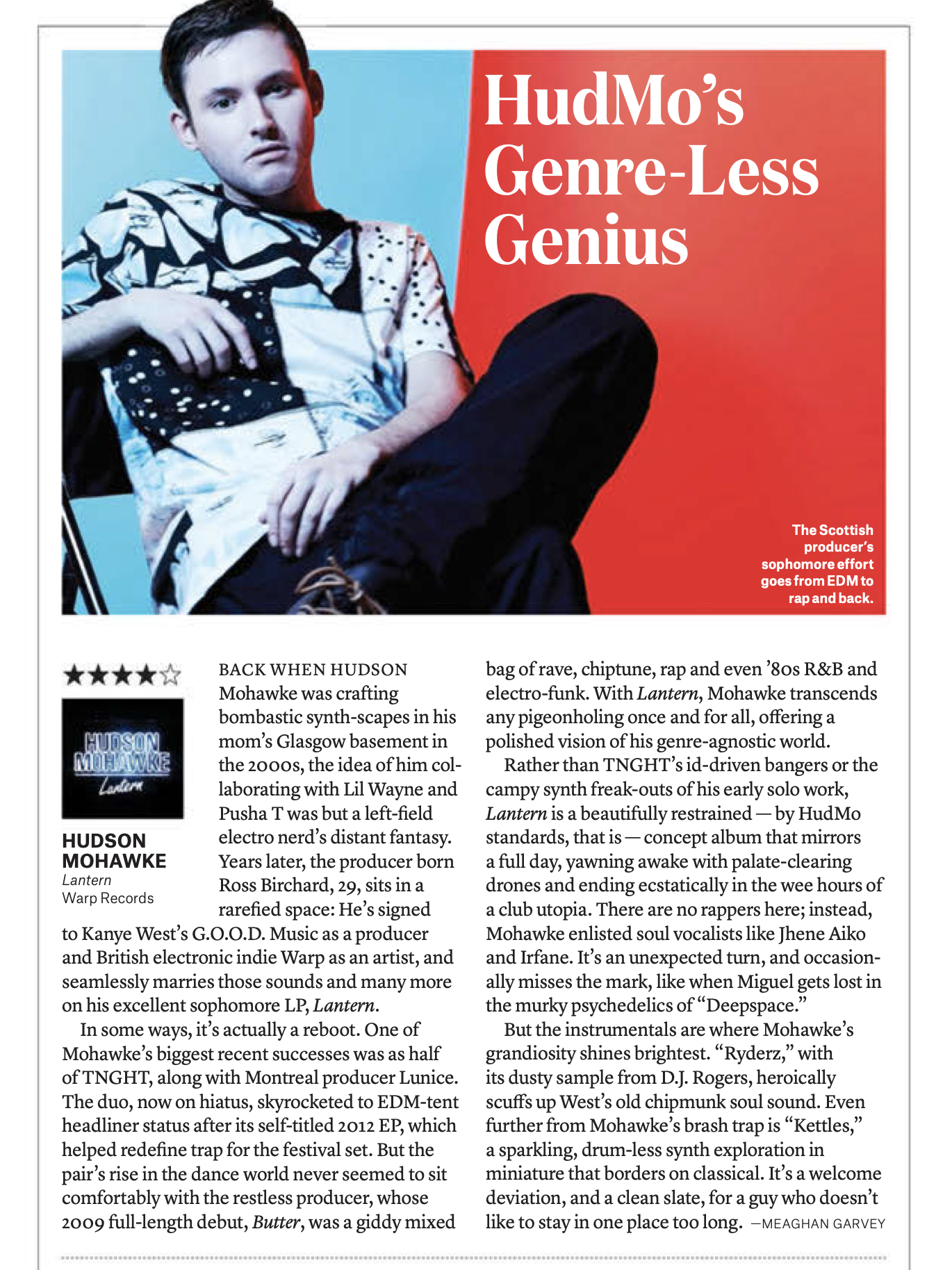
This article is reviewing a new album from Hudson Mohawake, the Scottish producer. The journalist, Meaghan Garvey, has written in third person. He initially looks into Hudson’s history and his childhood dreams speaking about how he would never expect to do the collab which he just landed, this makes the produced seem extraordinary as he has exceeded his dreams working with top artists. This gives some background context for his article and works as an alternative introduction to the article to hook the audience making them want to read on to see whether he did fulfil his dreams.
The headline for this article is also catchy as It is a play on words with Hudson Mohawke’s name. This will draw the attention of EDM fans and Mohawke’s fans.
This article is a review as it is written from the journalist’s perspective giving his opinion on Mohawake’s work therefore is not factual. It is laid out as an essay formatted article rather than structured paragraphs or bullet points. Therefore this article would be of more interest and more suitable to the fans of this producer who are interested in his work and want a detailed read on his new releases rather than the younger generation who would potentially prefer Q&A formatted articles which are more separated and easy to read.
Due to the journalist writing in third person, this article is not an interview therefore he is writing from his perspective so you are aware of his presence throughout the read. The impact of this is it results in a detailed article with opinionated details giving the article a personal feeling. Although there is no clear introduction and conclusion to this article, I think it is beneficial as it keeps the article short and sweet and jumps straight into the point.
This article is written quite detailed using language linked with the music and review industry so therefore may not be an easy read for everyone, the journalist has used a few embedded quotes within the article which makes it of a high standard.
Reading this article the reader will gain a better understanding in the world of music producers and the latest news on Hudson Mohawake therefore it is informative but also entertaining.
Overall I think that the journalist represents the producer positively giving a good opinion on Mohawake and his past as well as upcoming career.
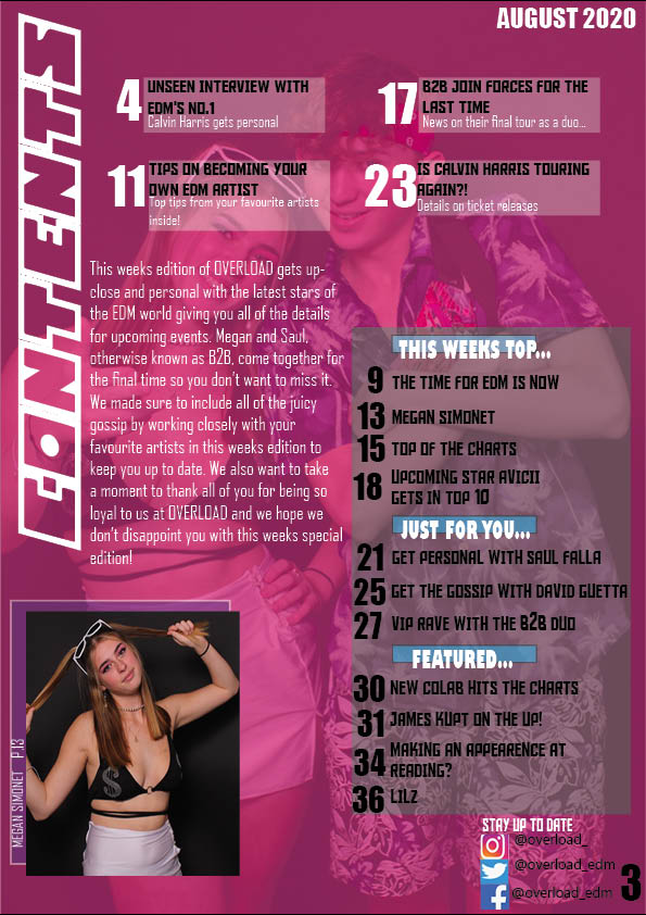
This is my first draft for my contents page of my music magazine, I am please with it although there are a few details I would like to add or change for my final contents page like maybe add some more coloured text to stand out rather than just using black & white type faces. I would also like to add a small detail of having my magazine masthead branding somewhere small on the cover page to carry the branding of my magazine on through. I am pleased with the visual aspects of my contents page as it is interesting and I have focused on attraction and entertainment when designing my contents page. I also remembered to think about AIDA when designing – Attractive, interesting, desire, call to action.
CONTENTS PAGE PEER ASSESSMENT
What type of shots have been used to create a variety of shot distances and how has the camera been used to communicate meaning?
In Abi’s contents page I can see that she has used both long and mid shot images as her background and cover star. This attracts the audience because you are able to see the main star which is what the audience wants to see.
What choice of Mise en scene is appropriate for the star image and genre?
The choice of Mise en scene used for her models relate well to the genre of EDM, this is because they are wearing festival type clothing, which goes well with her theme. They are also positioned in a confident, bold stance which helps the audience to engage and relate with the stars.
What technical conventions of a Contents page are present and used effectively?
Abi has included numbered categories which is what is needed to guide the reader around the magazine, she has also used a colour theme which relates to her chosen genre. Abi has also made sure to include typefaces and the correct fonts which help to make it stand out.
How has Indesign been used to layout the page to convey a brand
She has used InDesign to help connect from her front cover to her contents page nicely, she has also included the same colour theme and made sure to edit her pictures through this software.
How well have the text and visuals been integrated together?
She has used a font and language which connects with the audience well, she has kept the costumes ordinary but extraordinary at the same time, The text and costumes work together without clashing.
Where has photoshop been used to manipulate the photos to enhance the star image or genre?
Photoshop has helped her to create an extraordinary effect as she has used the tools on the software to edit their appearance slightly. She was also able to create her background as well as editing her models’ features.
How is the language used appropriate for the genre and target audience?
The language she has used is appropriate for her audience as it will engage and attract. She has used different colours on the key features of her headlines, aswell as it being catchy and relevant.
5 targets
make the text bold to stand out more
cut Megan out and put on a different background
add different coloured text as it is all black & white
Here I have selected 9 examples of successful contents pages which caught my eye as some inspiration for my own contents page. Some of these contents pages like the second slide are very busy and include lots on images and colours whereas the first slide is a very simple contents page with only 2 colours and no images, it simply has numbers and headlines. Although these examples are very different I think they are both successful as they both tell the reader what is inside the magazine and where to find it which is the main purpose of a contents page.
This task also allowed me to pull apart the details of a contents page which will help me to ensure I have all the required details in my contents page. Some of these elements include page numbers, headlines, relative images and section headings. One of my favourite examples Is the 4th one as it is very unique and has some complex details but is also simplistic enough to make it easy for the reader to find what they want. In a lot of these examples the page numbers are a large element and are generally in a larger type face than the surrounding headings, this is in order to draw in the reader to where they can find all of the information within the magazine.
My contents page is going to be a single page therefore most of my chosen examples are single page content pages excluding 2 examples where the contents is more spread out and therefore spreads across a double page.
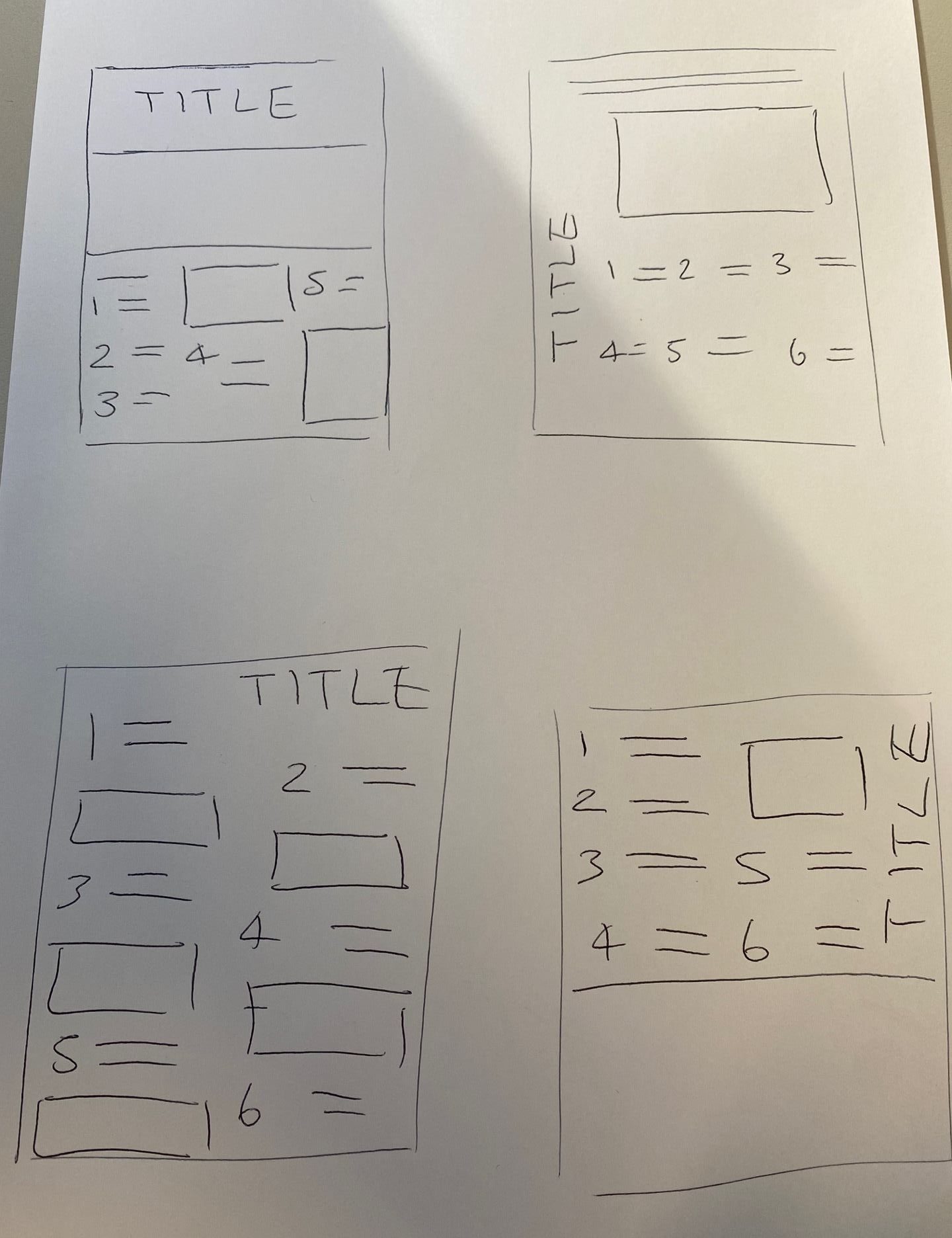
Here are some design ideas i sketched out to give me some ideas for the layout of my contents page. Some of these were inspired from my example content pages and some I designed myself. These will help give me ideas when designing my contents page on InDesign. My contents page needs to follow AIDA (attract, interest, desire, call to action) these 4 elements help create a popular successful piece of media. My contents page also needs to follow on with similar designs and colours from my front cover in order for my magazine to work together as a whole. Another key thing I need to keep in mind when designing my contents page is that the main purpose of this page is for it to be informative for the audience and therefore making it attractive should not take away from this.
5 Catchy Headlines
B2B Join Forces For The Last Time
Unseen Interview With EDM’s NO.1
Tips To Become A EDM Star
Is Calvin Harris Touring Again?!
The Time For EDM Is NOW
Next I have thought up 5 catchy headlines to use in my contents page. These headlines need to be very catchy to the audience in order to draw them into reading more therefore it is best if they are short rather than really long. Imperative words such as ‘NOW’ , ‘LAST’, ‘UNSEEN’ also grab the audiences attention making them feel as though they have to read it! Other language features such as alliteration and hyperbole are also very effective in headlines. Creating headlines which make the reader want to find out more is the main focus otherwise your audience may not be interested past the first page of your magazine.
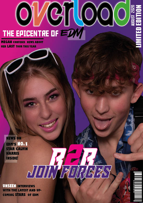
Overall I am pleased with my front cover drafting think that some elements work really well but there also some elements which I can definitely improve on for my final cover.
MASTHEAD, COVER MODELS & DESIGN PROGRAMME
My masthead is one of the elements of my front cover which I am really please with, I think that the different coloured letters within the title make it unique and help it stand out. Originally my brand name was going to be “electric overload’ although when I came to create my masthead I found that this heading was too long and that a one work heading would work better and allowed it to be bigger. When positioning my masthead I wanted it to be as big as possible and big enough to stand out from the other text on the cover, I also added a white strike around the masthead to help the colours stand out and be separate from the background gradient. When positioning my masthead I pushed it to the very top of my page making the ‘L’ and ‘D’ run off the page which added another small detail to the cover.
I am very pleased with my cover models and how their image turned out as I think that the Mise en scene is very successful. Their body language reflects the vibe associated with EDM as a genre which was very important to me as well as the eye contact making a direct interaction with the audience. I chose to use a close up image focusing on the top half of my models and their faces in order to capture their emotion whilst still showing their costumes, I think this was successful.
I have used the programme InDesign well to layout my whole front cover and add detail such as low opacity rectangles as a backing to some my cover lines, pushing them away from the image. InDesign also gave me a huge range of fonts to use for my front cover which was important to help match the font to the genre. Another programme which I used was Photoshop which helped me to cut out my image from its background so that I could place it onto a different background. I also successfully used other elements on Photoshop such as skin blurring and brighting, lipstick filters and exposure settings to improve quality and enhance details on my models making then of a high level.
COLOUR PALETTE, FONTS & MISE EN SCENE
I think that I successfully chose a colour palette relative to my genre which focused on bright pinks, purples and whites. These are a few of the classic rave colours which influenced my decision for choosing them, I also included accents of orange, green and blue to display the fun vibe of EDM to my audience. After choosing my colour palette I used accents of these colours throughout the front cover in order to help it all link together.
My fonts are very bold and the majority of my text is capitalised which does a excellent job of attracting my audience into reading these headlines. A lot of my typefaces are the same for my cover lines in order to not over complicate the design and allow the masthead and main cover line to stand out in different typefaces.
My costumes are bold but also minimalistic as EDM clothing portrays a festival vibe therefore I chose costumes with colours swell as including accessories like like sunglasses and bum bags. My models makeup also has a element of fun to it which pink eyeshadow and this is reflected in my models facial expressions which show excitement drawing In the audience by showing the genre to be positive. My models body language is confident but also cheeky and displays my main cover line of these two popular EDM artists joining forces.
LANGUAGE & MAGAZINE
When looking at the language I have used in my front cover and within my cover lines I think that they are bold phrases which will attract the audience although when editing this draft to make my final cover I would like to add a few more pugs and cover lines to my design. Creating my cover lines I looking into language which draws in a audience like imperatives and hyperboles.
It is clear that my front cover is a magazine as It include the majority of the conventional features such as masthead, main cover lines, cover lines, cover star image, issue, barcode.
Other important elements I focused on when creating my front cover was ensuring I had elements meeting all expectations of media – personal identity, social interaction etc. To do this I used language to make it seem like I was speaking straight to my audience directing it at them personally. When editing my front cover draft to make my final draft I would like to add a few more cover lines and details around the cover star as it potentially looks too empty at the moment for a front cover.
What I did well-
cut out and edited my image on photoshop
created a bold masthead
designed a bright eye-catching background
What I can improve on-
possibly adding more small design features (shapes)
ensuring I have all of the necessary conventions including price etc.
adding more catchy cover lines around the cover star
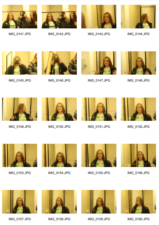
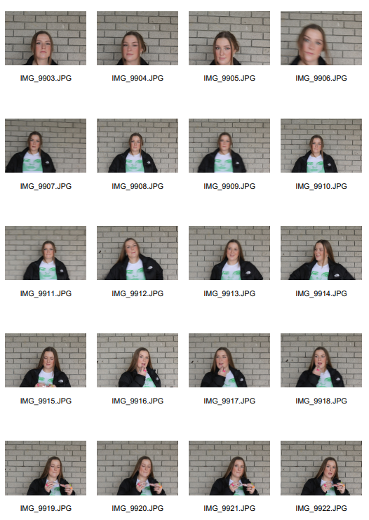
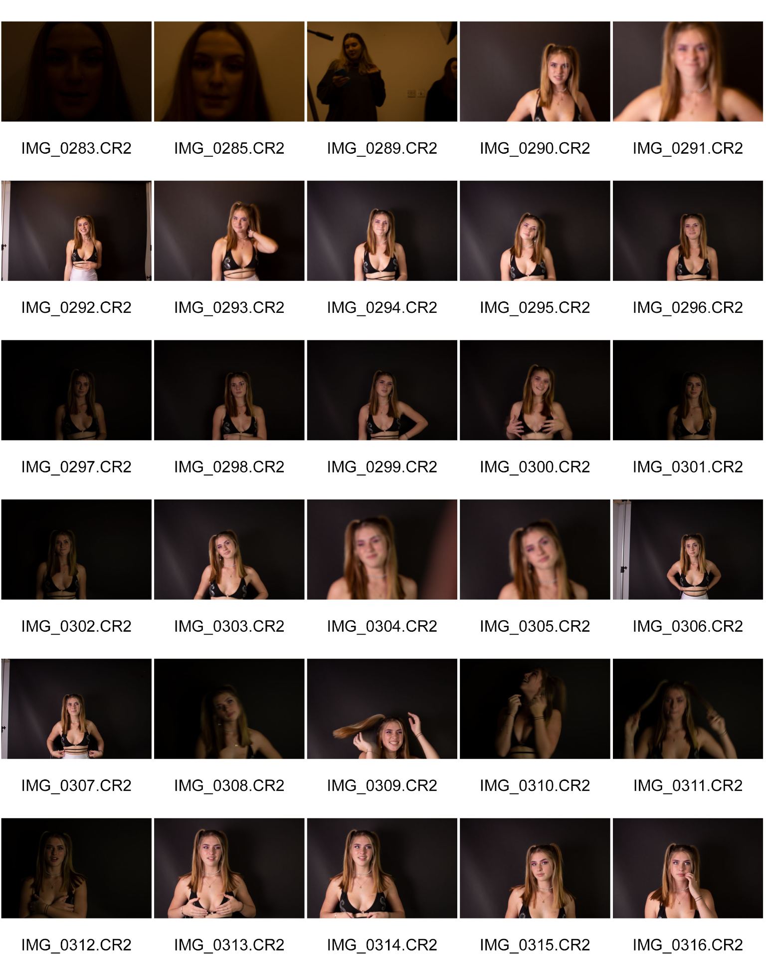
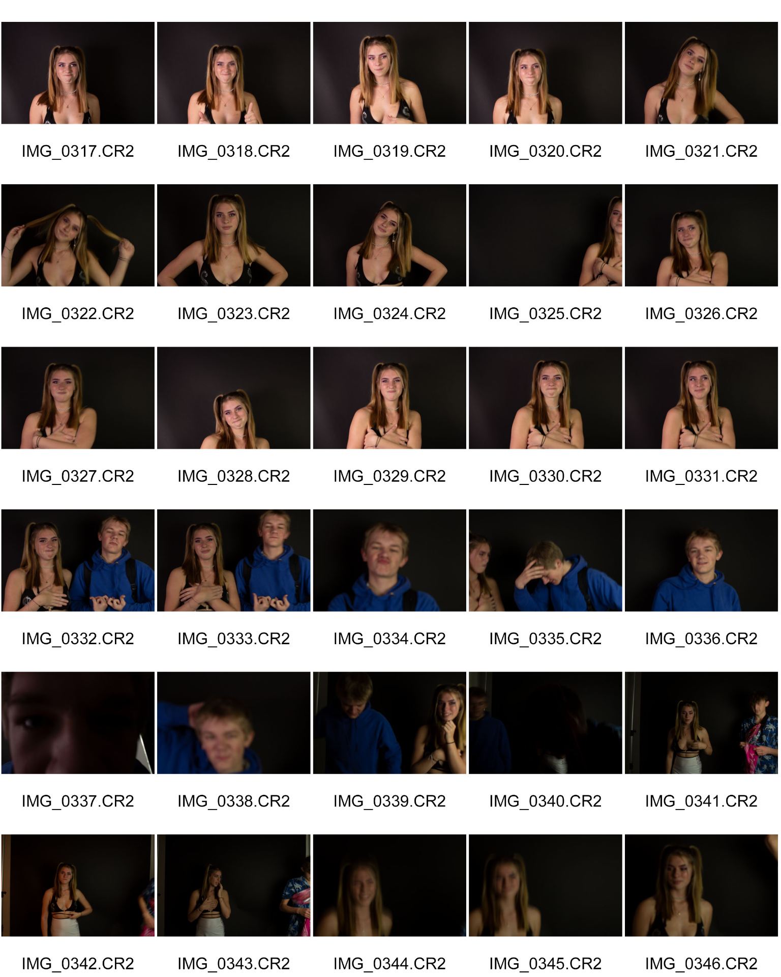
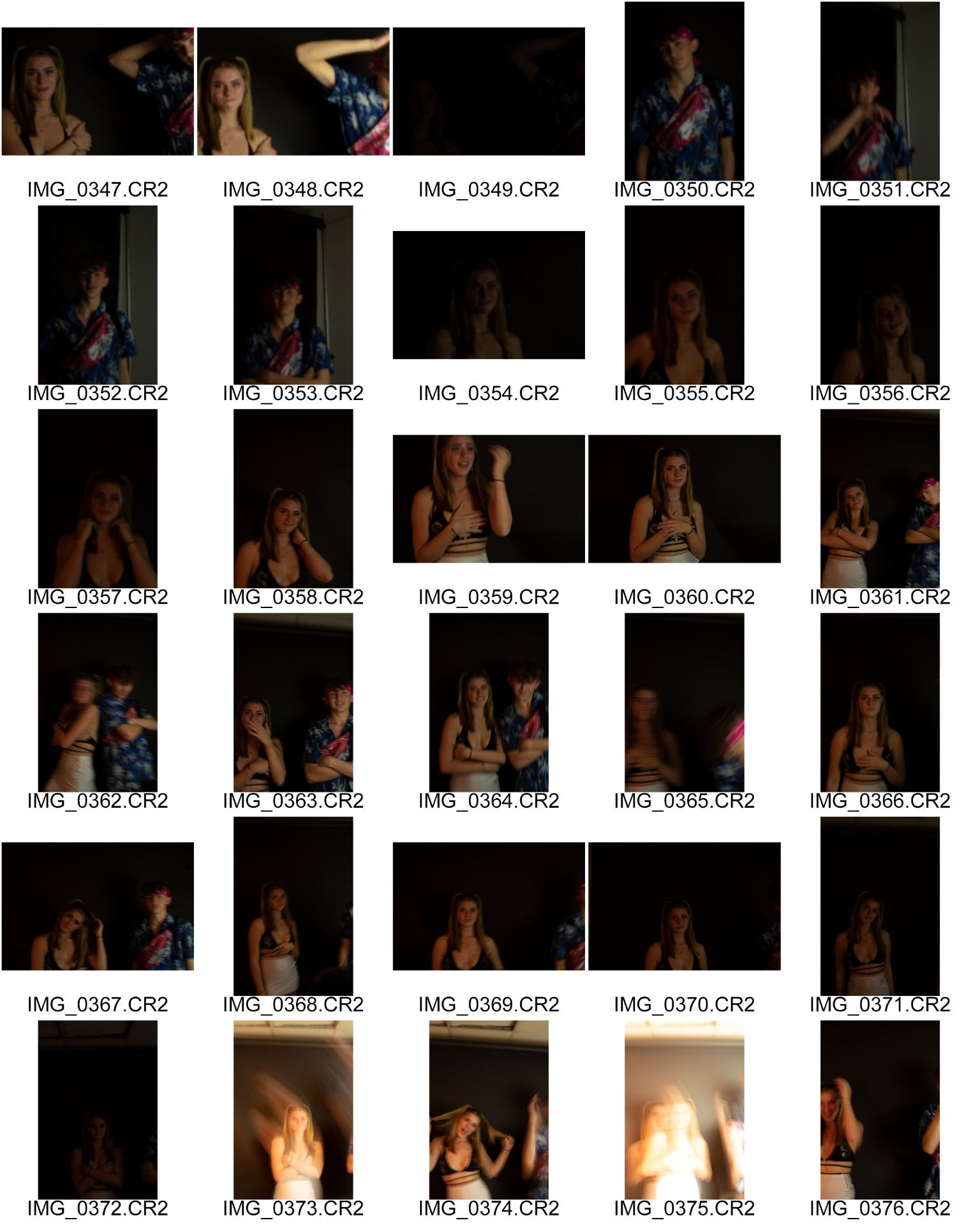
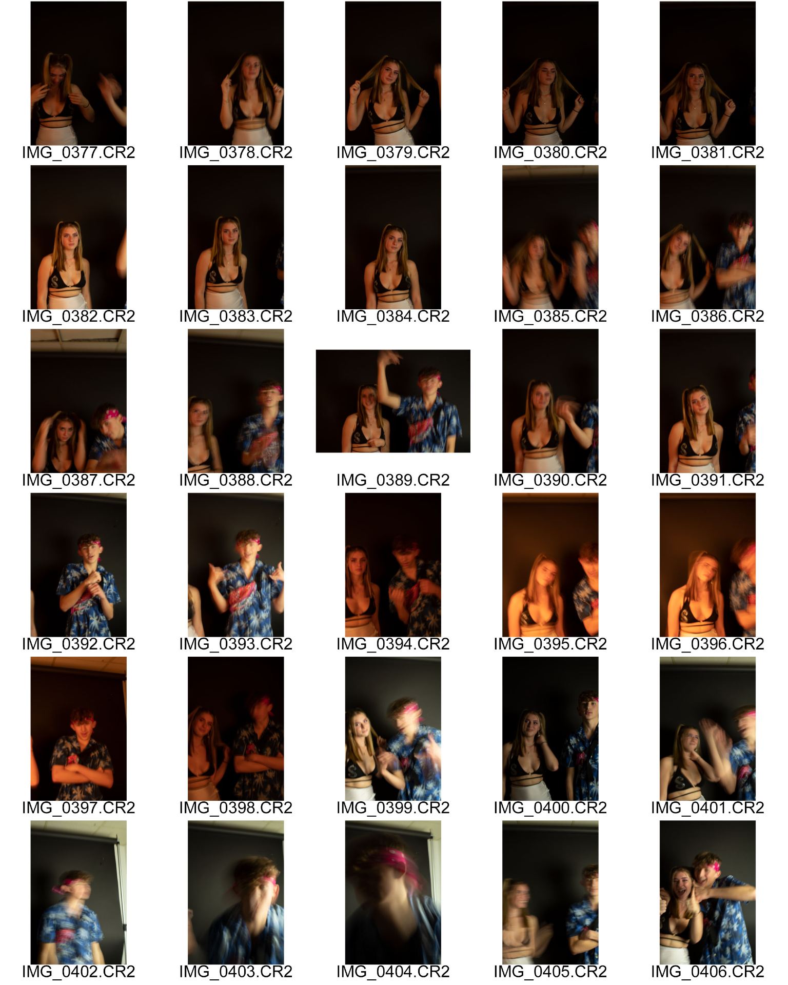
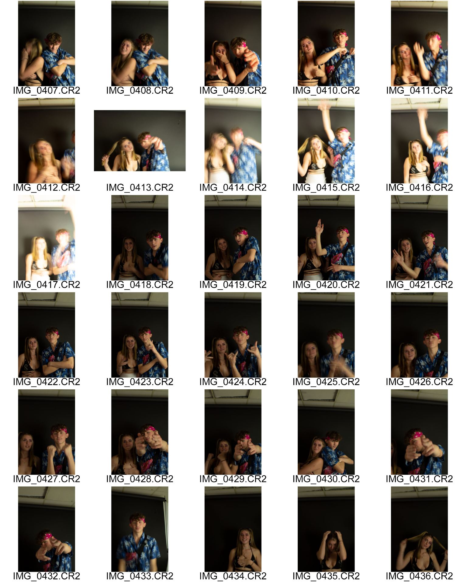
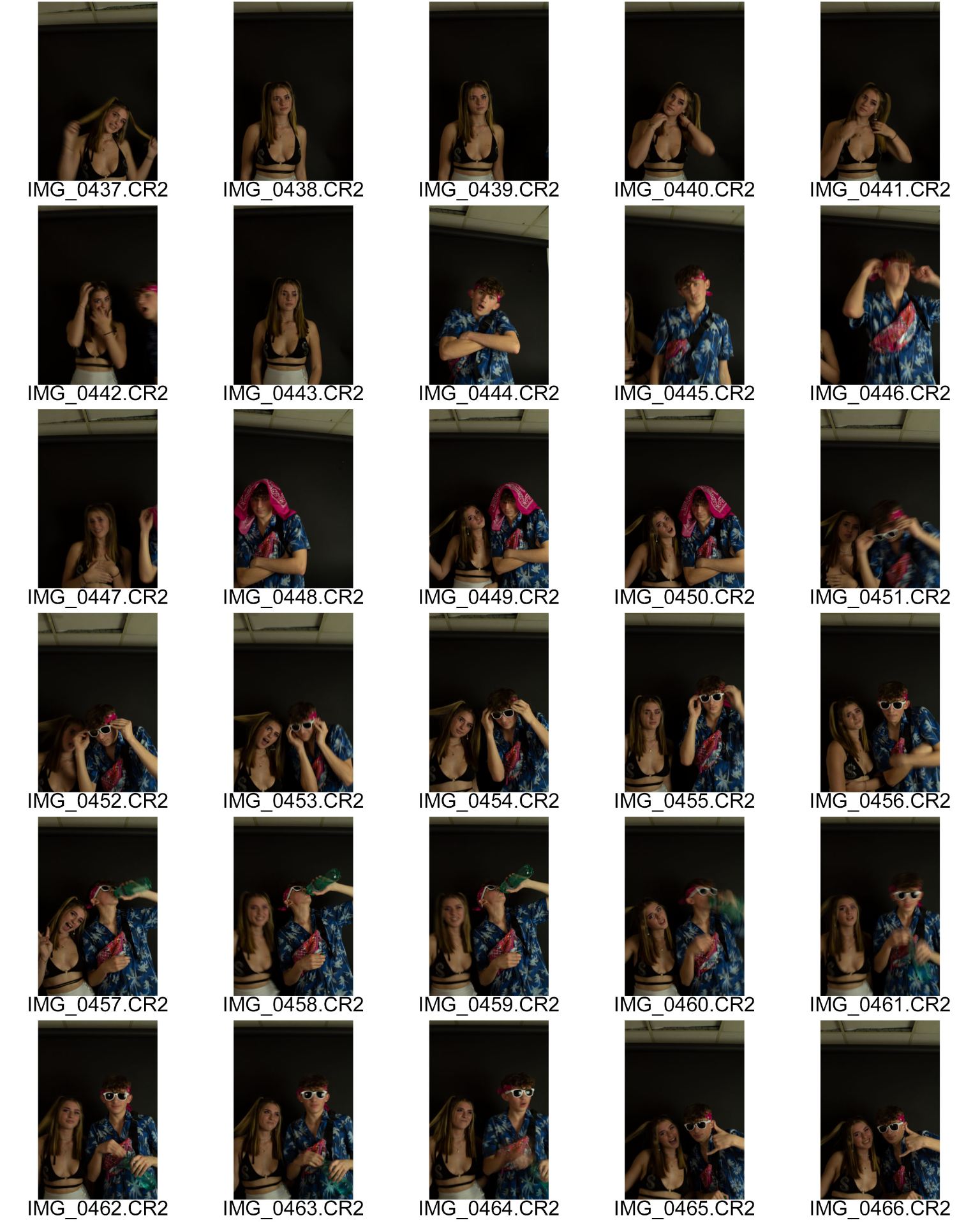
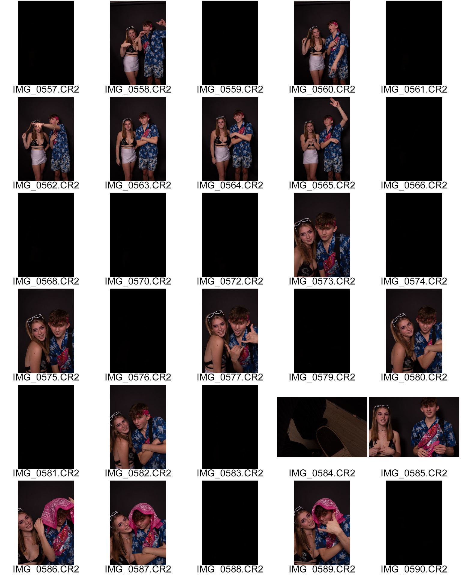
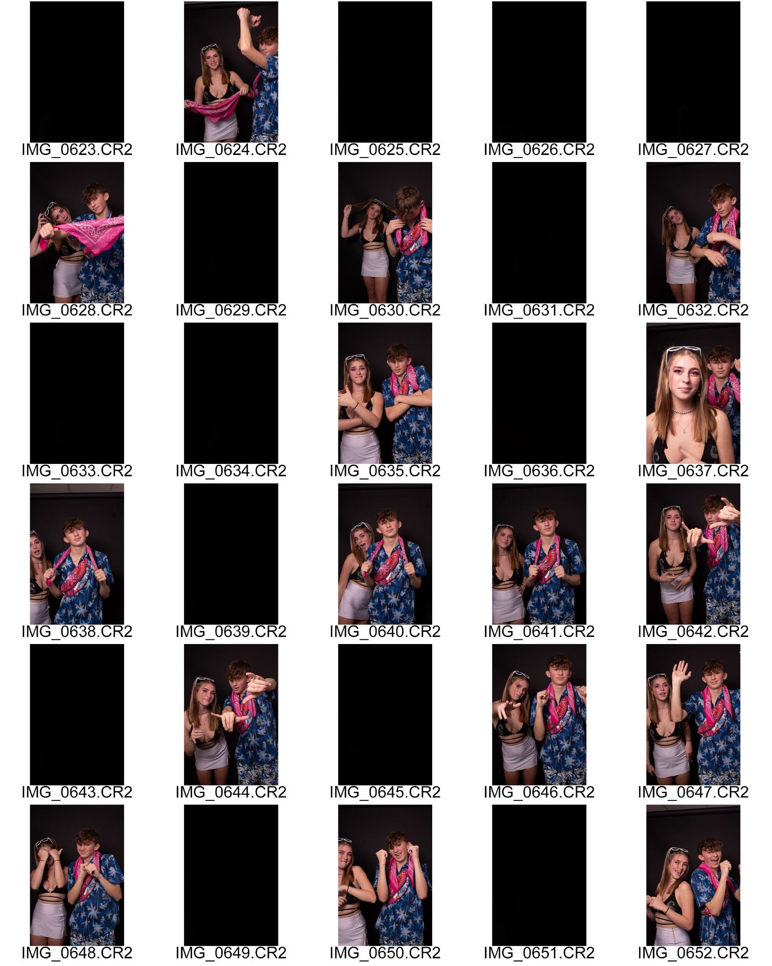
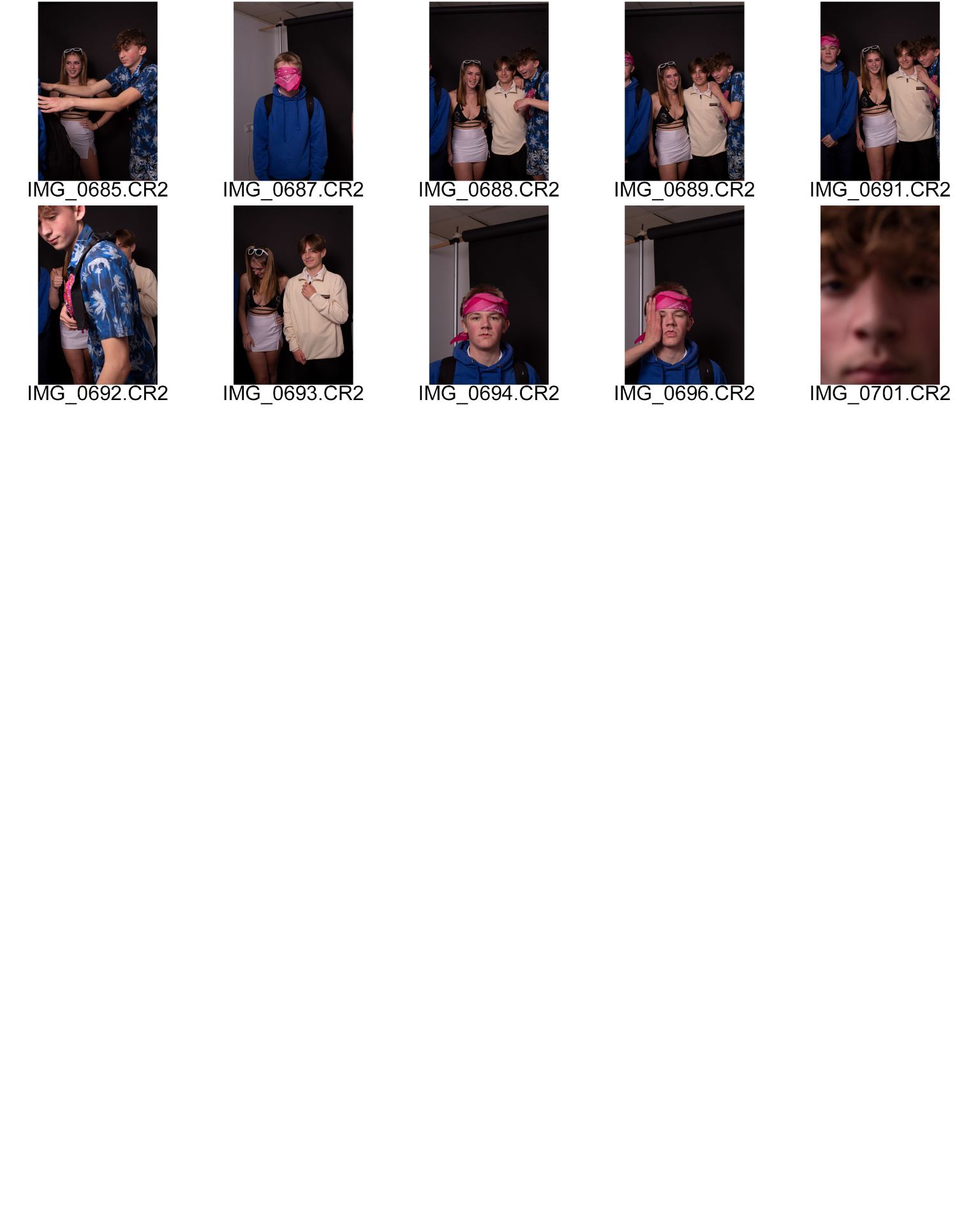
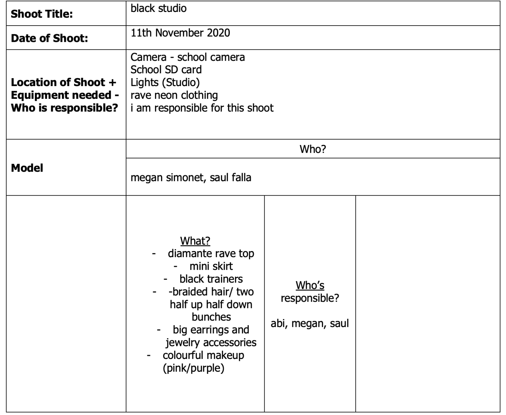
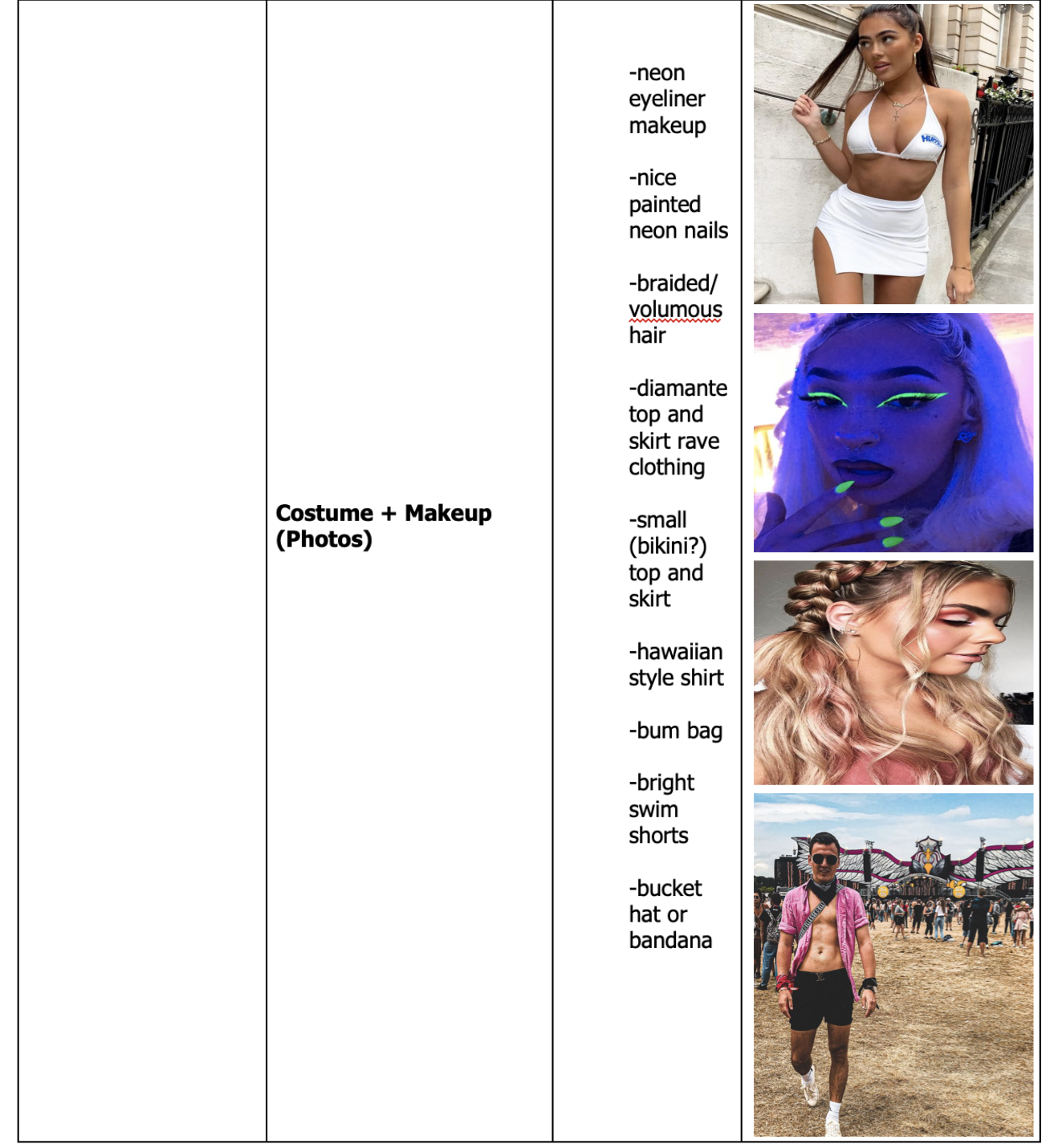
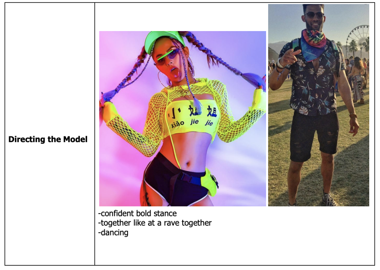
Here are my contact sheets for my cover shoot. I chose to use the black studio for my photoshoot as I am envisioning my front cover to have a dark background so this gave me more of an idea of the final result. My models are Megan Simonet and Saul Falla. I decided to have two models as I wanted my cover to create a party image as EDM is a party genre. Therefore I thought that this vibe would be easier to create with two models who could interact with each other.
I am happy with how my models costumes and make-up turned out and think it is similar to the image which I created on my cover shoot plan. The accessories like Saul’s bum bag and bandana gave the festival vibe which I was looking for and Megans pink eyeshadow also stands out as a feature. When taking my photos I also ensured to take them in multiple different camera shots including long shots, mid-shots and close ups. This allowed me to have selection which I can chose from at the end and see what works best.
When looking at my images now I think that then close-ups work the best as they show the emotion of the model more and allow their eye-contact to interact with the audience. It is important that these close-up images still showed enough of my models costumes though otherwise I would lose what connected these models to my genre
After taking all of my photos I realised there were a lot of black images which I chose to keep in to show my errors which I have learnt from fro my next photo shoot. This is due to having the shutter speed too slow and so the flash was not on for these photos which is what resulted in a dark image. You can also see from these contact sheets that the photos at the beginning are not as good lighting and quality as the ones at the end, this is also due to me recognising my mistakes of having the flash and exposure too low during the shoot and correcting them which resulted in much better photos at the end.
Overall I am really happy with how my photos turned out and I have a good selection of images with, successful use of mine en scene, to chose from for my front cover.
My Favourite Images
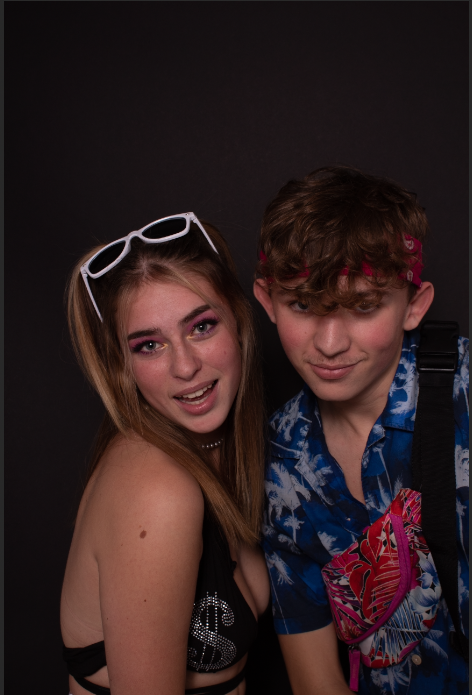
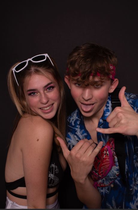
After going through all of my images and contact sheets I had to choose 1 or 2 favourites which I want to use as my front cover image. I chose to use an image which was more of a mid shot rather than a long shot in order to show more emotion of the model but still capture Mise en scene. It was important that the image I chose displayed body language reflecting my genre, EDM. Therefore I chose images where my models looks positive but also professional as they are DJ’s swell as using hand gestures to portray body language. Lighting was also an important factor when choosing my favourite images as some of my photos did not come out well due to the lighting being too dark or too bright whereas these ones came out very well.
I think that I am going to use the bottom image for my front cover as the Mise en scene is more exciting than the first image and tells more of a story relating to my genre than the other image. This is my favourite image as it shows the costumes well and the models are interacting with the audience by looking into the camera. There body language portrays a fun vibe which is associated with Electronic Dance Music and this was important when choosing my main cover star image as the models have to draw in an audience from a first glance.
Here I have gathered some magazine covers which appealed to me. These are not music magazine covers they are predominantly fashion magazines as I was just looking at the front cover designs. I was attracted to these magazine covers because of their bright colour palettes. I chose the ‘Allure’ and ‘Fabulous’ magazine covers because in liked the cover stars makeup. I also looked into the cover lines on these magazine covers as they are bold important statements to attract an audience to the magazine and want them to read more. It is important that these cover lines are short and catchy as the target audience does not want to read a lot on the front cover. Another element which I noticed from these magazines is that the cover star is looking into the camera in the photo, this makes the model interact with the audience through the magazine.
In one of these magazine covers which I collected, the cover star image and masthead is all upside down. This makes the magazine cover very unique and stand out from its competitors. It was an interesting choice for the designer to put the masthead upside down as although it follows the cover star image it potentially makes the branding difficult to recognise and identify. Although clearly the design still works as the magazine caught my eye due to the neon hair colour of the model swell as the bright costume which matches the hair. Therefore this is a very cleverly designed front cover as it is unique but still captures attention of the audience due to small details. This has inspired into thinking about potentially doing something funky like this on my own magazine cover.
Another thing I noticed on some of the other covers was the use of drawing over the cover star. For example the top middle and bottom right have both been ‘doodles’ on with bright colours in order to add a feature to the cover star which could have potentially been a boring image. This use of colour and doodling is what attracted to me to these front covers so clearly the design is working to draw the audience in.
This task also allowed me to see the layouts of successful magazines and I immediately noticed the big bold mastheads which was a prominent focus of the cover. I also recognised colour to be an important element as the designers linked colours within the cover star to back ground images, for example the ‘Bazaar’ magazine is purely a baby point colour scheme and the cover stars lipstick has been chosen to match this.
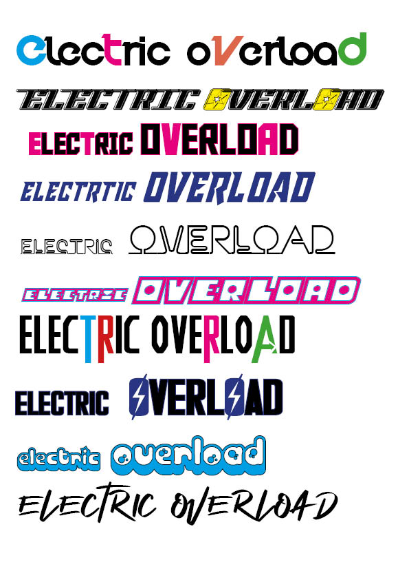
Here I have started playing around with different typefaces which I can use for my Masthead on my front cover. I used a range of very different fonts to get an idea of different fonts as well as sizes and colours. I also played with the idea of ‘electric’ being smaller and ‘Overload’ being the main focus of the title, since this is quite a long mastheads this would work well. I also liked how it looked when I changed a few letters within the name to be different colours to add a feature to a what would otherwise be potentially boring masthead.
Although when I was designing these it was on a white background, I am envisioning my actual front cover to have a darker backdrop therefore where I have used the black in these mastheads I would replace with white to allow it to stand out. I also thought about possibly positioning ‘Overload’ diagonally beneath ‘electric’ to give different heights in the title and give overload the importance, being bigger.
The branding of my magazine is very important and therefore doing this task allowed me to compare very contrasting fonts to see what style I preferred, for example some of these type faces are very bold and blocky whereas some are more delicate. It was important when designing these mastheads that I thought about my genre which is EDM therefore the lightning bolts and bold colours reflect this vibe. It was also key to make sure the fonts were eye catching and bold as this is one of the first things that my audience will see when looking at my magazine.
My favourite type faces which I designed are the 1st, 3rd and 6th one. I think that these link best to my genre and are very bold so will stand out on my cover which is very important.
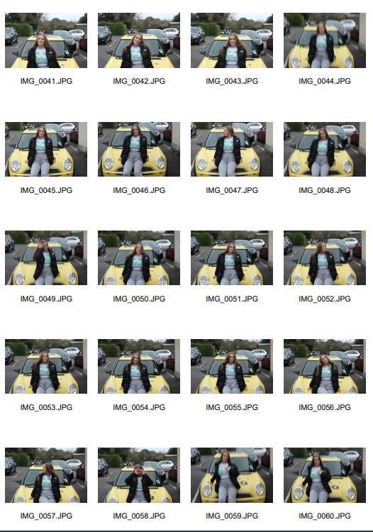
Here is my initial photoshoot agenda which is going to help direct me when taking my photos. It will help give me a sense of direction when doing my photoshoot as it gives me a clear idea of the outcome which I want to achieve. When choosing my model I chose someone who I know is confident to do the bold stance I need for my front cover. In order to create my perfect final outfit I used the inspiration from my perfect model moodboard.
I am going to use this agenda when taking my photos and getting my model ready to ensure I get the photos I need.
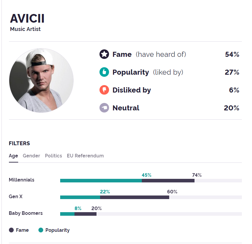
In order to understand the importance of the cover star on a music magazine I looked into how media can portray one single star. As my chosen genre is EDM I chose Avicii as my star image and looked at how the media displayed that individual. How an individual is displayed through media that we see everyday is what helps to form our impression on someone. Therefore how you chose to display your cover star on your music magazine could have an effect on how your target audience see that person. This displays the importance of a cover star and all of the details which go into it such as – clothing, camera shot/angle, emotion & props.
In order for fans to connect with your media you need to allow the star to interact with them and seem ‘ordinary’ as-well as seeming ‘extra-ordinary’. Media reports and images can display a cover star as being ‘extra-ordinary’ sometimes by commenting on their fame and success where as looking into Avicii’s paparazzi images where he is dressed in casual streetwear this helps bring him back to an ordinary status that fans can then relate to. The idea of being ordinary and extra-ordinary is also reflected in the stars actions, for example they will perform at concerts and festivals seeming so out of reach to the fans but then in a music magazine there will be details of how to interact with these stars through social media etc.
Picture Perfect
Next I created a mood board with ideas of my perfect model. I used pictures which gave out the same vibe to allow me to try and recreate my perfect model. I gathered ideas of makeup, costumes and poses which would be perfect for my magazine shoot. This will give me good inspiration when deciding my final makeup, costumes etc. As-well as costumes and makeup I also chose photos where the model stood in a bold confident stance which is what I would like my model to do.
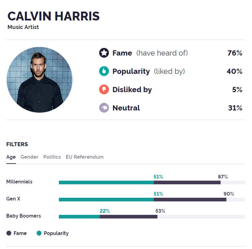
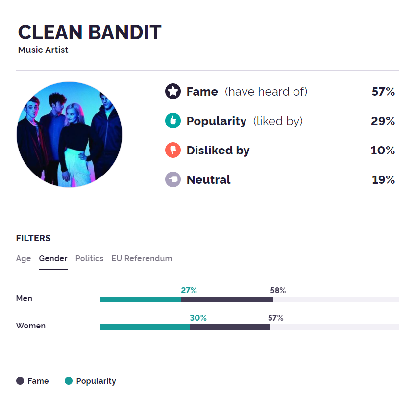
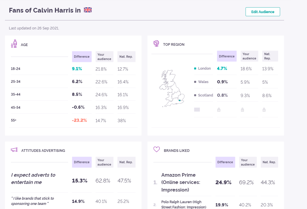
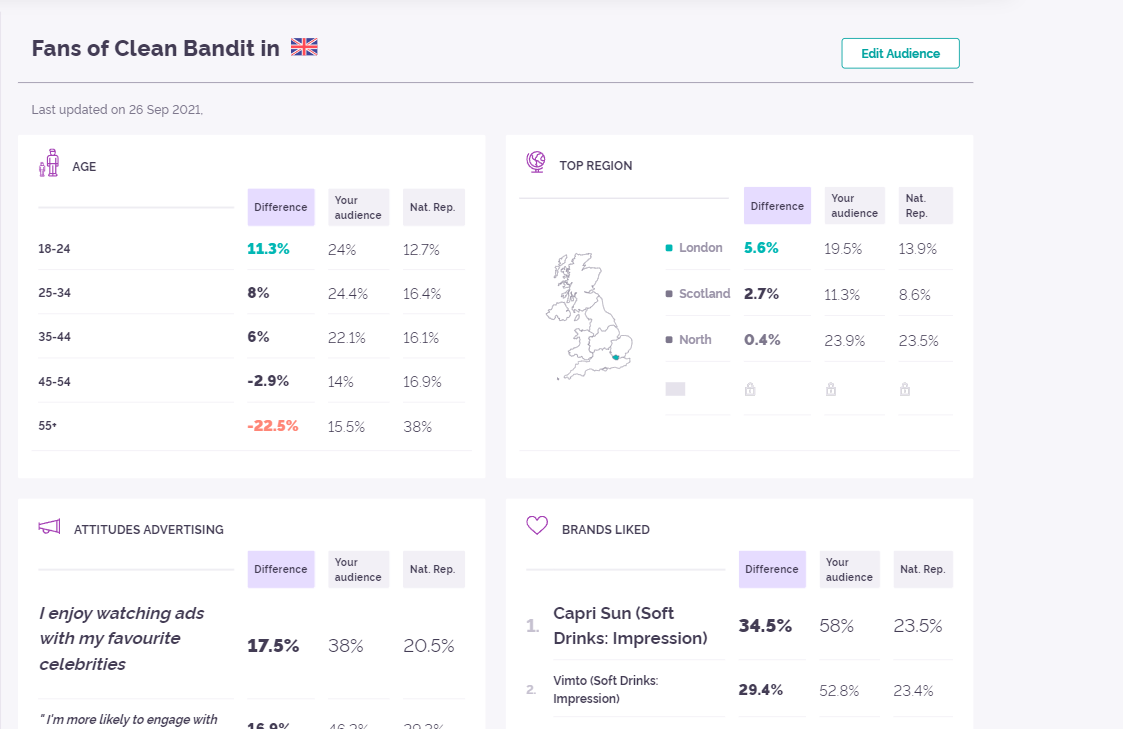
In order to create my magazine for a specific audience who enjoys Electronic Dance Music I did some research into the fans of some popular EDM artists. To do this I used YouGov which displays statistics for each artist. YouGov tells me if the artist is most popular with males or females, which age group as-well as politics statistics. It also shows me the top regions where people listen to EDM. All of this knowledge allows me to get an understanding of who my genre is most popular with so that I can understand my target audience for my music magazine.
After researching 3 chosen EDM artists I can see that the the majority of the artists are most popular with people between 18-24 which is the younger generation. I can also see that this genre is most commonly listened to in London which I think links with the younger generation as it is a lively city filled with baby boomers.
Perfect Audience Member
Reflection
Our next task was to create a dating profile based on someone within our target audience, a made up person who we can aim our magazine at. I designed my individual based of the demographics from my research. This will help us when making our music magazine as we will have an example of our target audience to work from and make sure we fit their likes and dislikes. For example, I created a young man who I imagined being into EDM and made up his psychographics including his likes/dislikes. Jack is stated to not like reading which is what I was imagining for the type of audience who would be interested in my Genre of music magazine. As EDM is most popular to the young generation this age group generally likes to read less and would be more interested in details such as upcoming artists, popular new EDM songs, upcoming events etc. Therefore when designing my magazine this is what I need to think about.
Other important aspects which I need to include in my magazine are the 4 types of media – personal identity, social interaction, entertainment and information. It is important to give the reader a sense of involvement to the magazine letting their music genre be part of their personal identity. Social Interaction is also important as EDM fans will want to interact with the magazine and their favourite artists.
Focusing Forward
When creating my own music magazine the target audience is so important as if it does not meet their expectations it will be unsuccessful. I can now use my dating profile as an example of my target audience and make sure to fit my design with their psychographics.
Doing this research helped me look into my competition in the EDM magazine world. I can see that it is a competitive market and therefore need to focus upon details which I can include in my magazine which will make it stand out against the already existing magazines. Doing this research allowed me to look into my target audience and see what they like by looking at popular and clearly successful magazines focused on the EDM genre. These magazines can give me inspiration for some things which need to be included to make my magazine successful. In order to stand out away from the other EDM magazines I need to make sure to include AIDA
ATTENTION – my magazine needs to be attractive to my target audience (young) and stand out from neighbouring EDM magazines in order to draw an initial audience in.
INTEREST – it needs to have an initial interest to the viewer to draw them in more
DESIRE – they audience needs to feel a desire to be involved with the magazine
ACTION – the magazine needs to include a ‘call to action’ so that the reader is aware of where to buy everything or how to be involved.
Focusing Forward
I have listed things at the bottom which I am going to include in my magazine as-well as things I will do differently which I can refer back to when designing my magazine. These will help me to remember AIDA which is key to making my magazine work and be successful.
I have decided to do my music magazine based around the genre Electronic Dance Music (EDM). I chose this genre as I wanted to do something with a positive up-beat vibe. My tour poster and precious media work had been based around POP which is a popular modern genre representing popular music. I was keen to do a genre not too dissimilar from this in order to be able to use what I had already learnt from working on POP in my next music magazine. I came across the dance genre and chose Electronic Dance Music as it is modern and uses similar style as POP (e.g. colours etc). This genre is known most to be played at raves such as in night clubs or rave festivals. It is commonly most popular with the younger generation below the ages of 25.
After looking more into the genre and creating my word cloud I decided to name my magazine ‘ELECTRIC OVERLOAD’.
Reflection
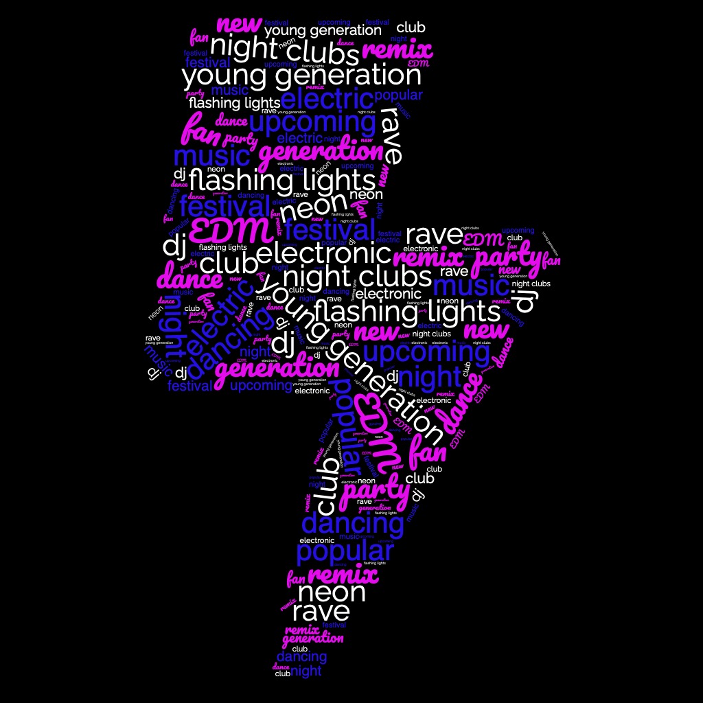
I created a word cloud using words which I think link with the genre EDM. I thought about where you would hear the music, would would listen to the music and what vibe the music gives off to help me do this. The purpose of this task is to help me when coming up with my mission statement as I will be able to use these words in my mission statement. It also allowed me to do some early research on this genre as I am not too familiar with it.
My Mission Statement
Our magazine ‘Electric Overload’ focuses on making young people love our genre even more than we do. We introduce you to all the upcoming stars in EDM as-well as our weekly favourites. Make sure you don’t miss out on our exclusive interviews with the biggest of EDM, speaking about their upcoming events which you won’t want to miss!
Focusing forward
from doing this task I now understand how certain words can have a impact on attracting an audience therefore when making my magazine cover I need to think about what words are bold and clear at telling may audience what my magazine involves as-well as telling them about the genre just from the front cover. This word cloud has given me ideas of words which may be good as part of my magazine cover.
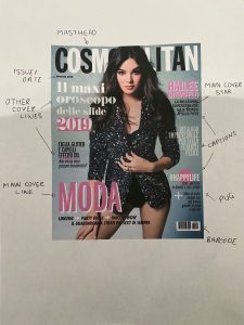
Here I have annotated magazine cover, this allows me to see the importance of each element within the design. I analysed the formal and technical conventions of a magazine cover. For example most magazine cover include all of the following conventions-
masthead
main coverline
plug
main coverstar
issue/date
price
captions
coverlines
pug
issue date
barcode
All of these things together are what make up a good and informative magazine cover as well as being key to meeting audience expectations. The point of the cover page is to attract your magazine to your target audience at a simple glance before they have started reading. Therefore, the use of colour, your chosen image and titles are very important as they are going to be the main attractions to your magazine. The front cover should give a simple idea of what your magazine includes therefore making your readers want to read more and be interested at your content. In order to entice readers into your magazine your masthead and main cover line should be in large bold text so that it stands out. The other elements included in a magazine cover such as barcodes, issue date and price are essential piece of information needed to purchase the magazine and keep record of which issue it is. Captions on magazine covers always anchor insets to add detail and in order to add complex unique design photos and pugs have a graphic shape with them (circle).
Focusing Forward
This research into the main elements of a magazine cover are going to be very important when creating my own magazine cover as I will need to include all of the conventions as well as remembering the key purpose of the magazine cover which is to attract people to your magazine. If my magazine looks boring from the front cover it is not going to be very popular and therefore will not be successful, this demonstrates the importance of little details such as text size and font.