Tour Poster

Here I have created a mood board with images of ‘POP’ tour posters to give me inspiration and ideas for creating my own tour poster. Doing this allowed me to see the details within a tour poster and the important things which need to be included such as-

  • tour dates
  • price
  • where to purchase tickets from
  • name of artist

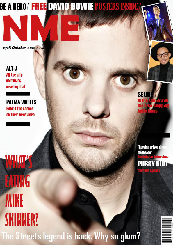
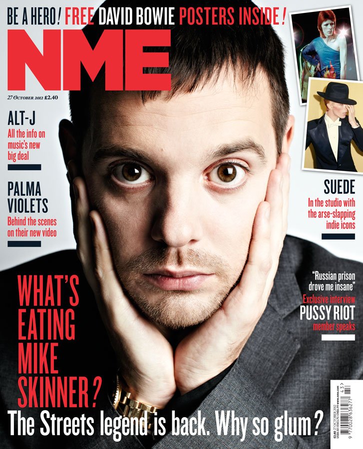
When creating media one of the most important things before you start is research. By researching into what makes a good piece of media and researching into your target audience allows you to know what will attract and draw in the audience to your media in order to be successful. When researching and looking into tour posters ‘AIDA’ is important, this stands for –

  • ATTRACT – initially attracting the audience drawing them into your poster
  • INTREST – interesting the audience making them want to be like your cover star artist
  • DESIRE – the desire for your audience to want to buy a ticket after seeing your tour poster
  • CALL TO ACTION – details on the poster which allows the audience to then purchase the tickets

After looking into AIDA and also looking art already successful tour posters, I now understand key factors which I need to focus on in my tour poster such as color palettes, type faces, body language and costumes on the image. These elements are what will help me to create my own successful tour poster. By looking at the example tour posters included in my mood board I noticed that the designers used bright color palettes to stand out with bold contrasting type faces making the information clear to the reader.

Focusing Forward

When looking forward to creating my own poster I am now aware of the important design elements I need to include in order to link my tour poster with the genre POP and for it to be successful.

Please click on the image to see the PDF

Reflection

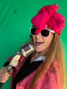
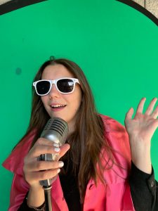
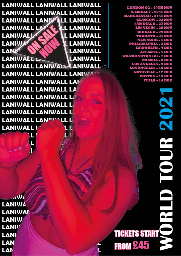
In my tour poster I focused on ensuring that my poster was attractive as-well as informative to the audience to advertise my artists tour.  To create my tour poster I started with using the app Photoshop to cut out the background of my image which allowed me to place the image on top of my own background. After I had cut my image out I then inserted my image into InDesign where I was able to edit my background and add text to my poster. InDesign has a huge range of fonts available which was very useful when deciding which fonts fitted my poster best.

3 things that went well –>

– I am pleased with my editing on my main image

-I like my use of colour and my chosen colour palette as the whole poster works well as a result

-I am pleased with my use of fonts and size to create bold and clear text making an informative poster

3 things I could have done better –>

-If I was to do this poster again I would enlarge the main image to fill up more space

-I would ensure to ass the last part of AIDA (call to action) by adding a website link as to where to get tickets for the tour

-I would potentially add in one more contrasting colour as I have used my 3 colours quite a lot and a contrasting colour for one piece of text could have a bold effect

Focusing Forward

This task was very useful as it allowed me to get used to using the apps InDesign and Photoshop which are two of the apps which will help me create my magazine. Now that I have practiced using the different tools I have learnt things that I can apply to editing my magazine cover to make it better.


My Magazine Front Cover Swede

Reflection

In this task we had to replicate a magazine cover, making it as identical as possible. We did this in order to practice using InDesign which is the design program which we will be using to create our own magazine covers therefore it is important to get used to using it. I was dedicated this magazine cover and given only a similar image of the cover star as a starter. I then had to find typefaces, sizing, colors and the side images that match the original cover.

My interpretation of this NME magazine cover uses a different cover-star image as I was unable to find the identical photo although you can see it is from the same photo shoot due to the lighting and clothing being the same. The side images on my cover also differ from the original slightly although again I chose images which included similar colors and type of camera shots (mid-shot). When choosing the different type faces within the cover I tested  out multiple different fonts to compare with the original type face in order to find the one which mirrored the NME cover the best.

When reflecting on my magazine cover I can pick apart 3 things which were successful and 3 things which turned out less successful-

POSITIVES

  • I found it easy to find typefaces which were very similar to the ones on the original cover due to the large selection of fonts available on InDesign as well as the ability to make the fonts bold/italic
  • I also think that my sizing and proportions on my poster are the same as the sizes on the NME cover which is important to make the covers mirror each other.
  • Finally, I think that the side-images I chose and arranged with a white border turned out well and look like the original cover.

NEGATIVES

  • I think that my main cover-star image is slightly out of proportion compared to the NME cover as it is slightly more close up although this could be more noticeable due to it being a different image.
  • Another thing I would correct is the alignment of the text on the right hand-side, the text should be aligned to the right rather than the left.
  • I would also move the text which is intruding the cover-stars face, text should not go into the main focus of the cover-star as it looks unprofessional

Focusing Forward

This practice of how to use InDesign will be very useful when producing my own magazine cover as I now know how to use all of the technical features to aid the process of making a professional cover. It has also helped to show me the importance of simple details within the cover and the importance of choosing suitable fonts which will appeal to your target audience and match with your chosen theme. The main focus of a magazine cover is to attract an audience therefore the magazine cover needs to be attractive so all of the elements on your front cover need to link together otherwise it will look dysfunctional and not be aesthetically pleasing.

A Front Cover Analysed


Reflection

In order for a magazine to be successful, all of its design elements need to be be focused upon meeting the expectations of your chosen target audience. Every magazine has a target audience which is the audience that their specific magazine would interest best and therefore they chose language, colour, font and images which will attract that target audience.

The target audience is split two ways, into demographics and phsycographics. Demographics refer to statistical data such as age, gender etc whereas phsycographics refer to an individual being categorised based on their opinions and interests. By understanding your audiences demographics it can help you find the best way to get your media out to your target audience e.g. via social media or newspapers. It is not only important to understand who your target audience is but also why they are your target audience.  This is where physcographics are useful to determine what type of content will interest your target audience based on their interests.

By analysing a magazine cover it has allowed me to research into different aspects of the design and think about why these specific colours, fonts, images and language has been chosen in order to meet their chosen target audience. The designers use technical design conventions in order to get messages across and appeal to their audience.

I chose to annotate a pop magazine cover to link in with my ‘pop’ genre which I have been focusing on. In my chosen magazine cover, as stated in my analysis, the designer has used the cover star image to be the main attraction for this magazine cover as Billboards target audience is stated to be younger generations who would appeal more to pictures rather than a magazine full of essays. Therefore they have chosen to use limited writing only presenting the main cover lines in bold fonts to make them stand out and therefore be a easy read for the audience.

Focusing forward

This task will help me when going forward and thinking about my own music magazine cover as it will make me ensure that all of my design elements link together to meet my target audiences expectations. If my magazine is not designed to meet one chosen design audience and includes elements to please multiple age groups and genders then it will not be successful as it will not attract enough readers.

The Camera Talks

Reflection

This collage of images shows us experimenting with different camera-shots, we linked our work on mine-en-scene with the use of different camera angles to create very contrasting images. This Is important as you can show even more through an image by using the correct camera angle. Some examples of different shots we tried out are-

  • longshot
  • low-angle shot
  • high-angle shot
  • close-up
  • extreme close-up
  • mid-shot
  • two-shot

For example to show an individuals emotion we found that you could use a close-up shot in order to capture all of the details from their facial expression whereas if you were trying to get across the idea of someone being powerful you can use a low-angle shot to make the individual look higher up and bigger than the audience watching. Choosing the correct camera shot can make an image a lot more powerful and successful at getting your desired message across.

This is going to be very important when we are creating out music magazines as not only do we need to think about the appearance of our model (costume, makeup, facial expression) but also which camera shot suits out image the best. You need both mine-en-scene and the correct camera-shot to create a narrative to your audience therefore it is important that we link both of these techniques when creating the perfect shot. Therefore, when creating my front cover for my music magazine I will make sure to focus on using both of these elements to ensure that my image portrays its chosen genre as well as giving an insight into what else is within the magazine.

My Image That Uses Mise En Scene To Make Meaning

Made with Padlet

Moodboard

This is a mood board of certain images which to me reflect the genre ‘POP’. As you can see from this selection of photos, showing makeup, locations, body language etc, I interpret pop as a very bright and colorful genre. Generally pop music will be joyful and energetic therefore the photos which I think link to pop the best are the ones in which reflect this. It is important for all the photos in this mood board to display the same emotion and vibe as they are all expressing my opinion of pop.

This mood board is key to helping with my understanding of music genres and the importance of all elements within them. When creating my music magazine which will be focused upon the genre pop I need to think about multiple elements like the make-up and hairstyle of my model, the chosen body language and location for my photo shoot aswell as specially chosen props and costumes. Each of these things need to be chose to fit with the genre pop so that they all link together and it is clear to my audience what genre my music magazine is trying to portray.

Post-it notes

These images were our impersonation of photos which represent the genre ‘POP’. They reflect the positive emotions associated with the genre. When creating these photos we focused upon using bright colored costumes as this links in with the bright colors in our mood board. When I did some audience research people generally described the genre pop as ‘energetic’ and ‘young’. Others said that they associated the genre with ‘fun’ therefore when doing our photoshoot we made sure to try and convey these emotions through our photographs.

The bright pink colors and sunglasses give off a fun vibe along with the positive facial expressions which display happy connotations to the audience. We also made sure that the lighting for our photoshoot was appropriate so we chose to use natural bright sunlight as dim lighting would not have worked to convey the positivity the rest of our elements were trying to show.

Focusing forward

By researching into the genre ‘POP’ and creating a mood board displaying all the elements which I link with that genre helped me understand the importance of making my music magazine link in with my chosen genre. Doing my own photo shoot also helped me extend my understanding by putting this into practice, I knew that it was important to think about each individual element in order for the whole image to work as a whole.


Deconstruction Of Tour Poster

Reflection

This is my deconstruction of Justin Bieber’s tour poster, focusing on how the producer has used colour, font, emotion, body language etc. to display a certain image/meaning to the audience. When making this tour poster the producer would have had to think about the main target audience of Justin Biebers fans and use language suited to that age group. It is also important that all of the necessary information is on the poster, in this case it is advertising his upcoming world tour therefore the tour dates and locations need to be clear. The finest details can also be analysed such as the fact that grain has been used over this image to possibly take the centre focus away from the details on Justin Bieber and put more emphasis on the writing and colours used.

Focusing Forward

This will be useful for me to be able analyze the importance of little details so that when I produce my own music magazine I am aware of the importance of these elements in order to create a aesthetically pleasing poster. The main objective of the poster needs to be clear to the reader as-well as the images/language being appropriate for the target audience. The details within a poster are very important for example the facial emotions Justin Bieber is displaying in his image portrays a very confident image whereas if he was facing the camera it would give off a very different message.