FINAL Digipak Draft

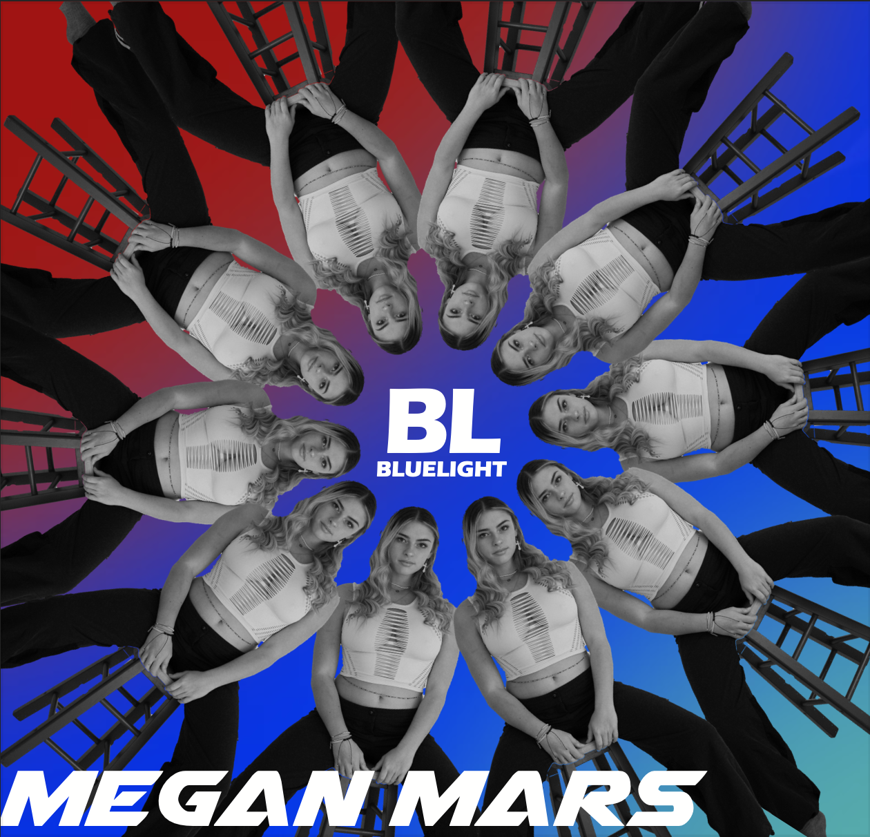
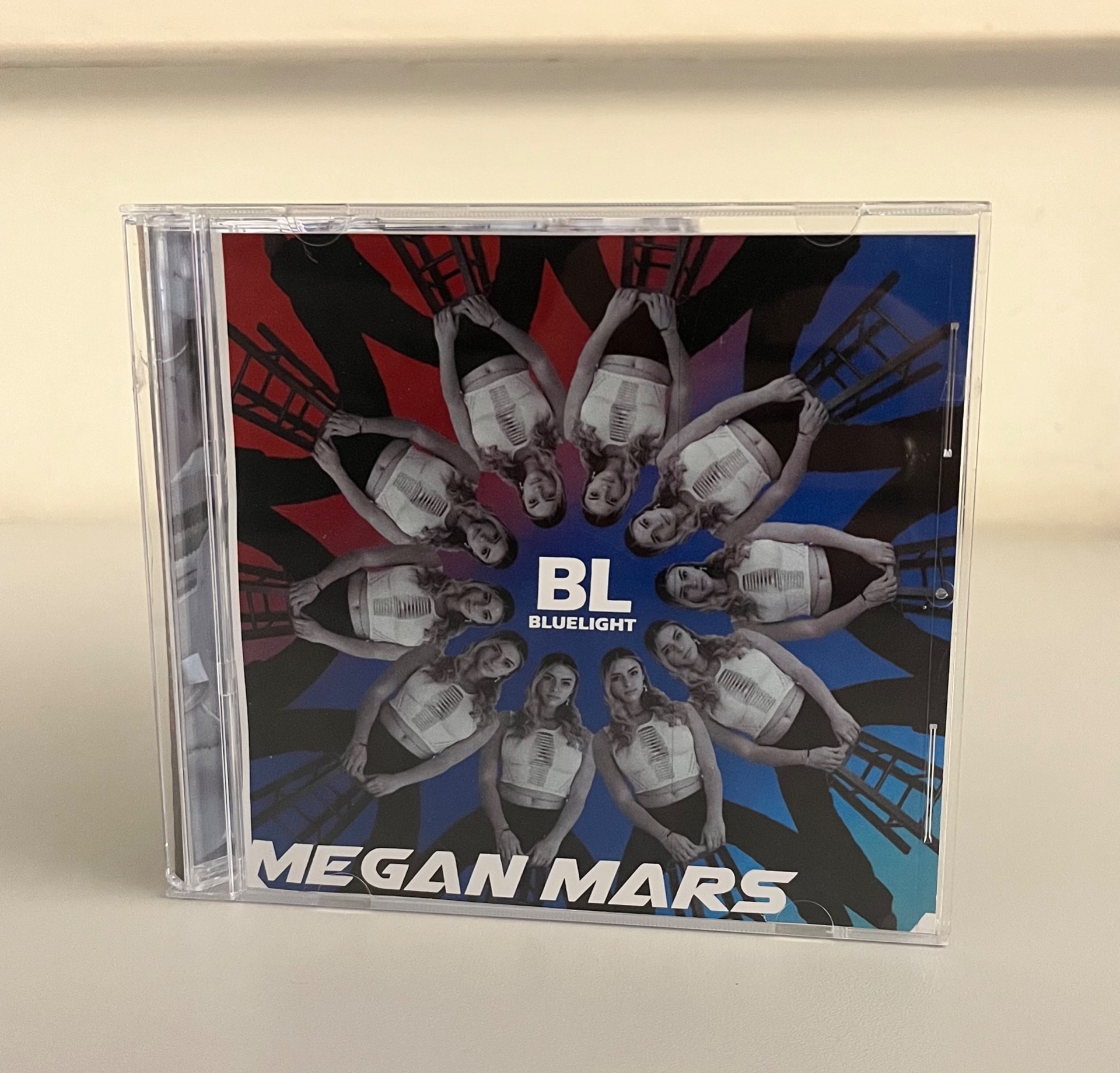
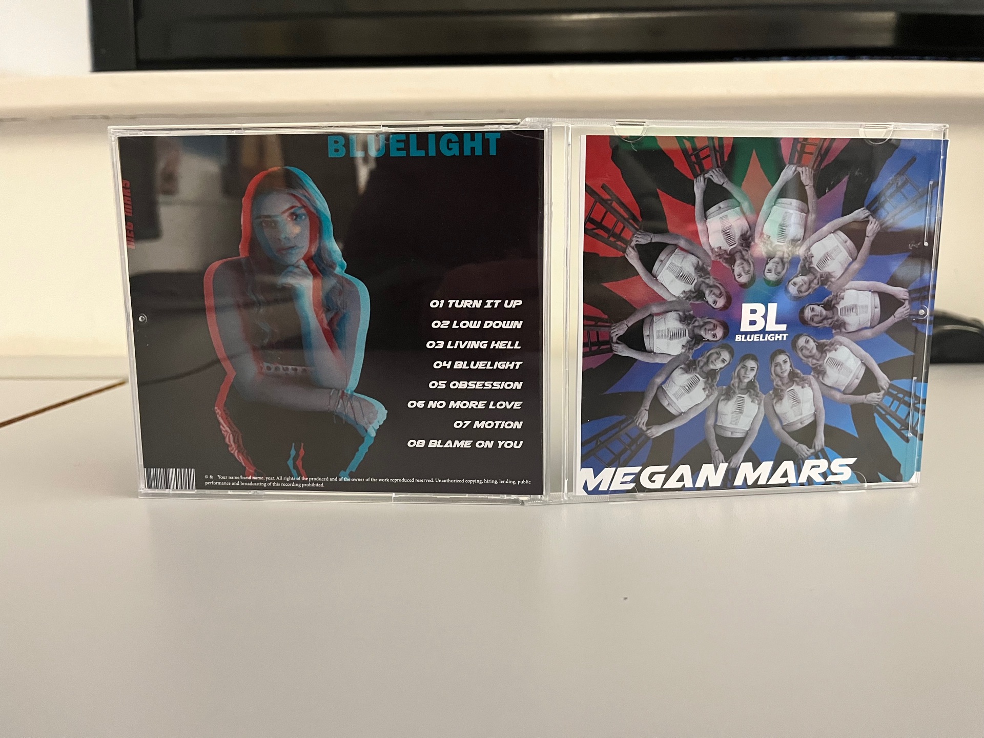
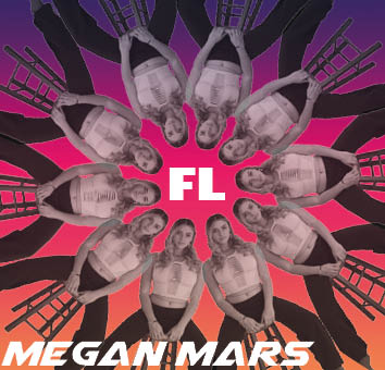
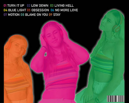
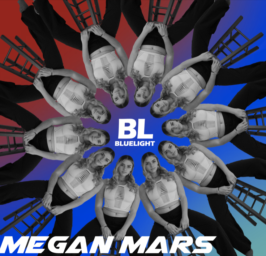
We really didn’t change a lot for our final draft as we worked really hard to make our third draft exactly what we wanted after not being happy with our first or second draft. Therefore it was only small details that needed amending such as rotating the MM on the left spine and slightly altering the position of some of the text. Overall I am really happy with the final draft for our digipak and I think it represents our star and our genre very successfully whilst being very appealing to look at. It also includes all of the necessary conventions such as the barcode and copyright text swell as tracks, album name etc. which are essential for a successful Digipak.

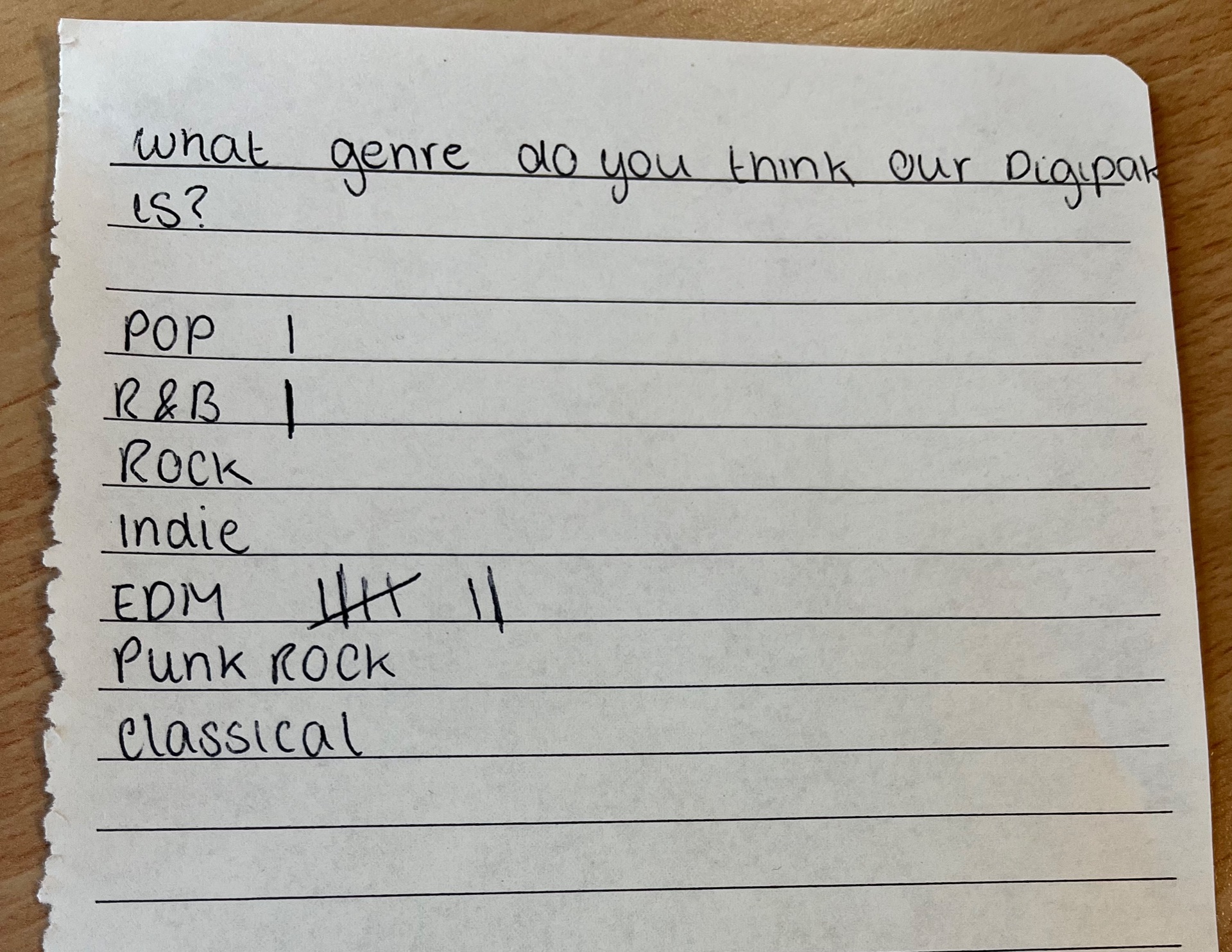
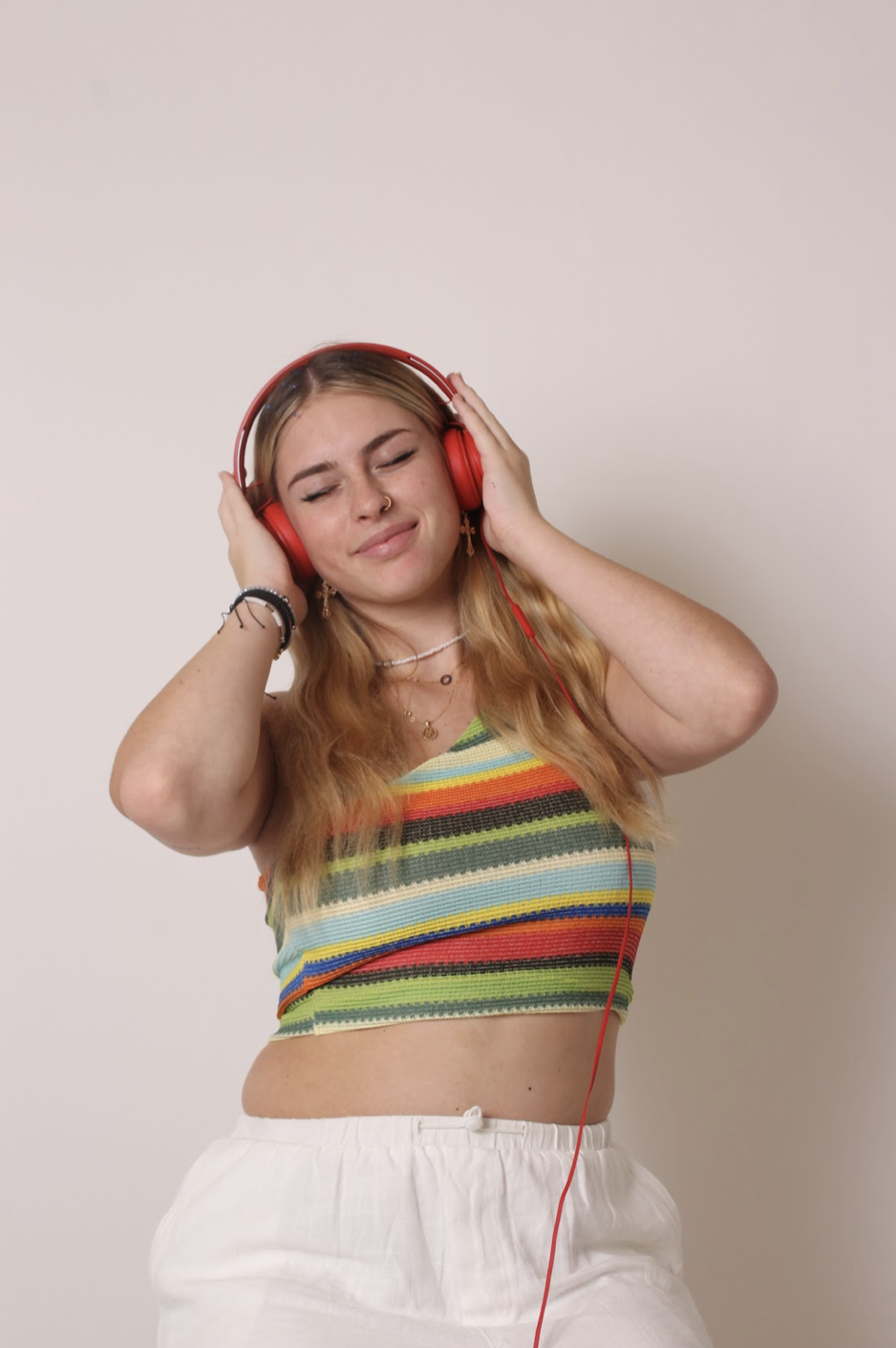
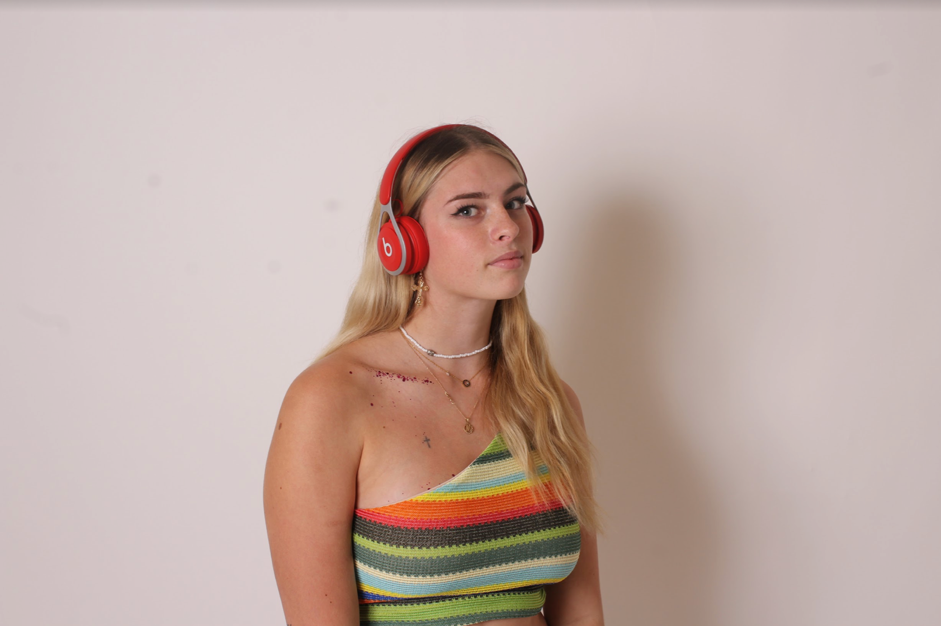
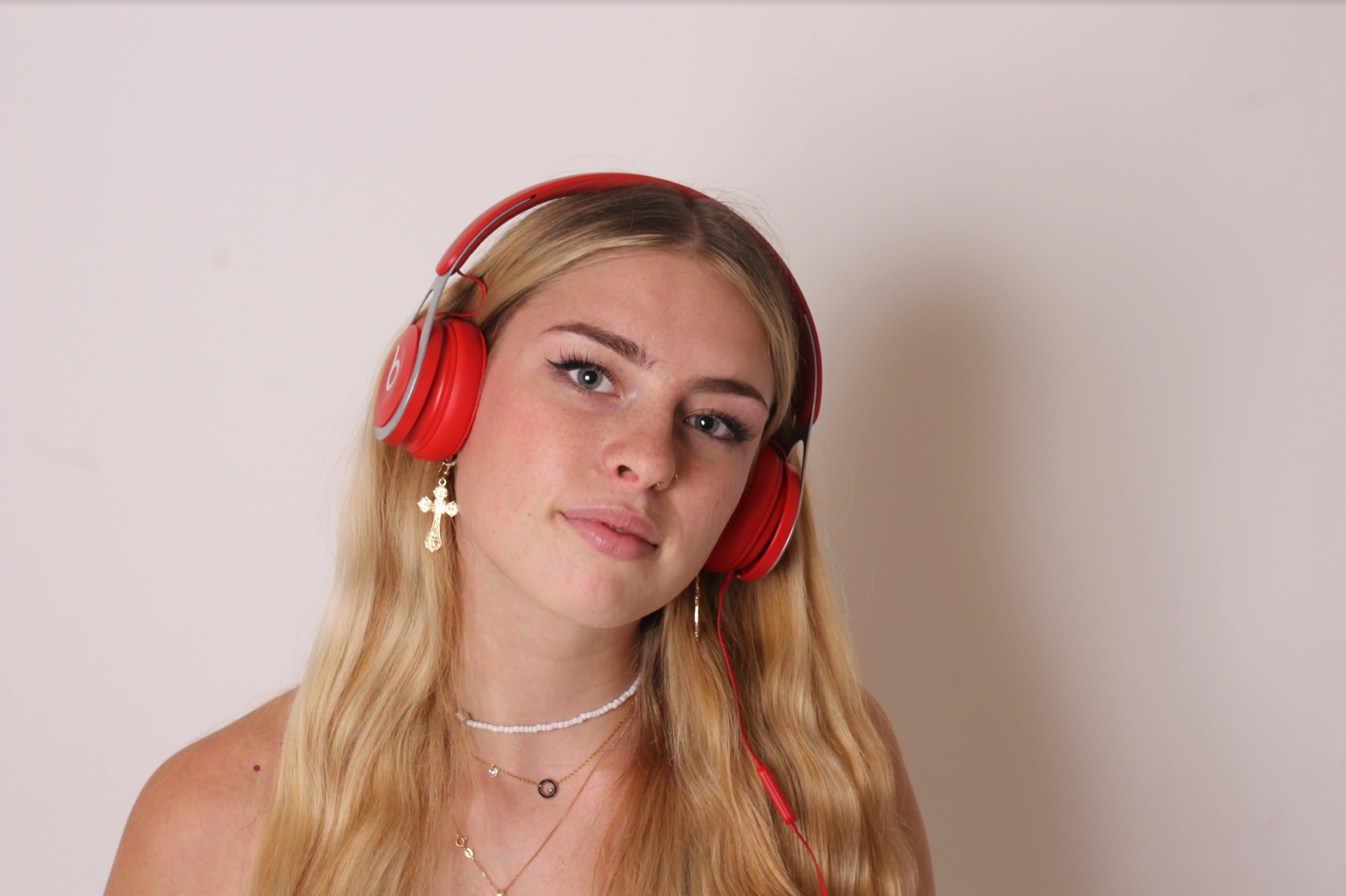
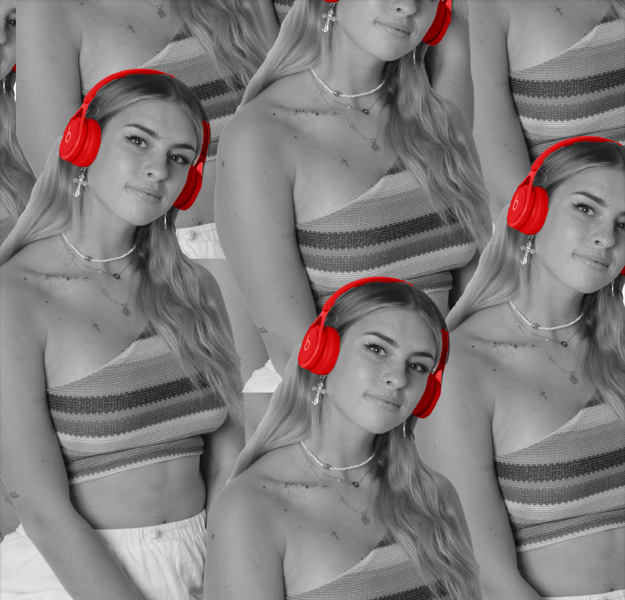
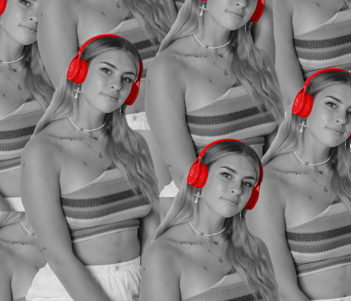
We spent quite a lot of time making sure that the colour palette was coherent through all 4 pages and it think this was successful. Initially we struggled to make sure all pages were recognisable to have come from one digipak although we found a way to match the background colours with the colours used in the glitch effect on the back cover, we then made red a feature throughout the whole digipak so made the beats headphones a feature in the middle two pages. The main form of media text which is shown through our digipak is visual images which portray a meaning towards our EDM genre, this type of media language allows the active audience to decode it and interpret it personally. We used elements such as the beats headphones which we highlighted to ensure they stand out In order to represent the stereotypical DJ look, this will require cultural competence to understand this representation although I think we successfully ensured that these same EDM themes can be picked up through other elements of the digipack such as the type face and graphics used. After doing market research from our third draft I was happy that our digipak was identifiable as belonging to the EDM genre which was key for it to attract the desirable audience.

Digipak draft 3

What has changed?

we changes a lot from our draft 3 digipak including :

  • we changed the background colour on the front cover
  • we redesigned the two middle pages completely as in the last draft we rushed these pages
  • we also redesigned the whole back cover by editing a new image with a glitch effect
  • we made sure all 4 pages aligned with a colour scheme to make them come together more as in the second draft there wasn’t a clear theme and they all looked quite separated
  • we then ensured we had all of the necessary conventions that we missed in draft 2 – barcode, copyright text etc.


Here is our draft 3 for our Digipak, I am really happy with this draft and we presented it in a actual Digipak to see the full effect of it.

We then did some market research to see what genre people thought it was. The majority (7/9) people guessed correctly and said EDM which shows that we have represented our desired genre successfully.

Draft 4 changes

  • rotate the ‘MM’ on left spine to fit with the rotation of ‘BlueLight’

Digipak Draft 2

Here is our draft 2 for our digipak. We have now completed all four pages of the digipak which makes it easier to see the digipak as a whole and have more of a vision. There are definitely still elements of this that we don’t like and need to change although are happy with the overall ideas. The middle two pages are very basic currently as we rushed to get them done in order to get a draft up and get feedback from our teacher.

Summary of feedback – 

The feedback we received was very useful to see another opinion on our second draft. Miss gave us very useful tips on how to improve such as ensuring the star image on the front cover doesn’t blend into the background by brightening the clothing to make it stand out. it was also suggested that we change our album name from Firelight to one of the songs we already have on our album such as ‘BlueLight or ‘LivingHell’ as both of these titles could also be abbreviated to BL or LH. We definitely also need to work on the middle to pages to make them fit in with the colour scheme more and ensure we have all of the necessary conventions.

Things we like:

  • we like the design concept on the front page
  • the different coloured numbers for the tracks on the back are very effective
  • we have used a range of images from different shoots throughout the digipak which looks appealing

Things to improve:

  • im not sure about the background on the front cover as it seems too much and takes away from the main image, it also discolours the star image
  • the middle pages are very basic and don’t match the theme of the two other pages
  • we need to add the conventions such as copyright on the back cover as well as the album name and artist

Digipak shoot 2

We decided to do a second shoot for our Digipak to gather some more images as we have to design 4 pages and wanted to use a range of images not just from one shoot. These are the most successful images from the second shoot and I am really happy with how these turned out. We chose festival/rave related costumes such as Adidas track pants and crop tops to represent out genre as well as accessories like belly chains and chunky earrings.

Digipak Draft 1

Here is our draft 1 front and back cover for our digipak, I do not like a lot of this first draft although this allowed us to start seeing what works and doesn’t work. We need to work on making sure representing our genre EDM is clear through the digipak as currently the genre of this cover is unclear. The colour palette is not currently portraying the key qualities of EDM and the design needs more modern design graphics to make it exiting. The star image is presented well although a variety of different shots would benefit the digipak.

Things to improve –

  • I would like to try and redesign the cover using different images in the shoot to create an echo image which changes as it gets smaller. I think this would create a very modern and EDM style Image using different colours to separate each image as it dissolves rather than all pink images.
  • We also need to look into other EDM style fonts which could be appropriate as the current fonts are very basic and not clearly EDM related.
  • We need to design the spines on the back cover
  • we need to ensure we have all conventional elements such as copyright text and barcode.


Digipak Shoot Contact Sheets and Shoot Evaluation

Here are some contact sheets from our digipak cover shoot. We decided to do some shots in both the white and black studio although found we preferred the outcome in the white studio as the lighting produced a brighter image. Our model wore a colourful festival style top and gold summer style jewellery to demonstrate our EDM genre. We also used props like bright red beats headphones to create the image of a DJ. It was important to ensure we got a variety of different shots including close ups and mid shots as we are not completely decided on the image we want for out digipak covers so having different shots gives us more options to play with when designing the cover in InDesign.

Here are some of my favourite images from the shoot which could be used for our front cover. I chose two images where the star is holding eye contact and two where they are looking away from the camera as these images create very different images for the audience. Overall I am happy with how this first shoot went as we have a few options which can be used for the cover of our digipak although we may decided to do a further shoot in order to gather more images for the inside and back cover of our digipak so that the whole album is not complete with images from one shoot in the same MES.

DigiPak mock up

This is a digipack mockup sketch that we did to show our initial idea for our digipack cover. Our main idea was to have one mid shot/close-up image which is duplicated 3 times across the cover and the images fade out over each other. We came up with this idea as it is unique and also modern and creative which are 2 qualities of EDM, we think this design does represent our genre. We would also like to use to effects to add neon lighting strobes across the images to further display the EDM genre. This design allows the star image to be the main focus of the cover which is important to promote the artist.  On the back cover we are going to print a firework image behind the song text. In the middle two pages we came up the the idea to have a close up image of the star which is printed over the two inside pages so when opened the face is together. We then annotated the image to explain the elements within our design.

This mockup will be useful when designing our digipak o indesign as we can look back to what our desired design was.

Colour Palettes

We used a colour palette generator to find colour swatches which we liked.

DigiPak Production Meeting Agenda & risk assessment

The importance of doing a PMA ensures that we have a detailed plan of the costumes and MES that we want for our desired DigiPak. Without a plan like this we would go into the shoot not having a clear idea of the image we are trying to achieve and would not be able to ensure we have all of the costumes and props needed. This production meeting agenda is also important to make sure we are aware of the equipment we need for the shoot and to plan the time, location of our shoot. We are both able to look back at this during the shoot to see what we had planned so that we don’t come away from the shoot without the desired photos we had planned.

Digipak Conventions Analysis

Analysing this Digipak allowed me look at some of the competition in the same genre as well as allowing me to pick up on the key technical conventions that are part of an album cover such as the album name, artist name, copyright, tracklist, barcode and record label logos.

This Digipak displays the common bright colours which are seen throughout the EDM genre and features design elements such as the colourful border surrounding the album which follows onto the back of the album to making it coherent. This cover shows elements of creativity and design which are key traits within the EDM genre. It is important that the genre of the album can be recognised from the digipak and therefore the colours and design used should be specifically chosen to portray the desired emotions and genre.

It is important to understand the difference between denotations and connotations as this digipack simply is a edited side portrait  where the facial features are replaced with a blend of colours although to me this connotes fun, dance and creativity which are 3 main themes in the EDM genre.

Focusing forward this task has given me a more clear understanding of the technical conventions within a Digipak and also a look into the competition within our genre. This will help me when designing our own Digipak as I need to remember to include all of these elements in order to have a successful Digipak.

The Look Book

This padlet has created a detailed moodboard of any images which we think relate to our genre and what we envision for our digipack. These images represent EDM stars, colour schemes, moods and qualities associated with EDm and by writing about how it links to the genre helped me to create an image in my head of the type of colours, emotions and qualities we are hoping to express through our digipack. Some of these images at a glance may not seem like they relate to EDM but when the connotations of the image are looked into further there are qualities within it which align with the qualities of EDM. From this task I am able to sum up this genre as bold, exciting, loud, powerful and uplifting. These descriptors will be useful to take forward into producing our digipak following these themes.

Focusing forward, this padlet gave us inspiration and a better understanding of our genre by gathering inspiration and figuring out a repertoire of elements for our audience. This task will influence us when creating our brand to advertise and promote our star image in our own style.

Made with Padlet

Digipak And Mission Statement

Reflection

The first step in creating our DigiPak was identifying our audience, competition, USP and identifying how we are going to sell and promote this digital pack.

We created a slideshow to display our research upon each of these topics and this task was very useful in getting some initial ideas of the type of audience our DigiPak needs to attract and how we can make it stand out from others similar in the market. This helps to create our brand for the album in order to promote our star image. This package’s purpose is to promote our star and create a way which our audience can interact and with our artist through purchasing the album or through a social media page. We took time to create our mission statement really thinking about the values and attitudes we wanted to portray through our star across all three products.

Final mission statement –

Megan is taking over EDM with her electrifying energy. The rising star is bringing modern dance music promoting a creative and upbeat atmosphere. Her aim is to take over the festival world with a new spin on EDM combining emotion with electronic dance, with her upcoming album BLUELIGHT. Bringing female power into the electric genre, Megan presents an extraordinary image to her audience.